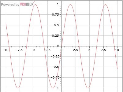
This post demonstrates how to re-template a Visiblox Chart to render data with mathematical-style "on-chart" axes.
Mathematical charts are usually drawn around the zero point, with the X and Y axes crossing at 0,0, and the plot drawn on top of the axes. In other fields, quantities which are never negative are plotted, and this means the zero point (or origin) may be the bottom left of the chart. Otherwise 0 may not be plotted, or horizontal axis may be time or some discrete scale. In each case the axes are fixed at the outside of the chart.
Visiblox Charts supports this latter type of chart out of the box. What about the mathematical axes-crossing style? At the moment that's not supported, but here I'll show you how simple it is to achieve this effect by re-templating the chart.

Templating a Visiblox Chart
An Visiblox chart is an instance of the Chart control. As with any WPF/Silverlight custom control, this can be retemplated to alter its visual appearence. Of course as the control has all the rendering logic to draw complex charts, there is a limit to what you can achive, but it's surprising how much can be done to alter the layout of the chart. (Other examples might include embedding some custom data display within the chart.)
Firstly, consult the API documentation to see the default template of the chart (the Visiblox API documentation reproduces default or sample templates for most templatable controls, but in general you can find this out for yourself using a tool such as StyleSnooper or Reflector). You'll see that there is some complexity to support axes on all four sides of the chart, and other nice default behaviour - but here we'll cut back to basics.
We'll use a Grid with 2 rows, the first being the title, the 2nd containing the chart. Notice that the default template has a more complex grid. Important parts of this are the plot area (containing all the elements rendered "on chart" in their own individual containers), and the axis containers.
At this point I'm going to digress a little regarding axes. A Visiblox axis is responsible for 2 things: calculating based on data values where points should be rendered in that dimension, and actually rendering the axis itself. Note that in the default template the Y axis container is in a grid cell adjacent to the plot area, it thus has the same height as the plot area, and thus the ticks on the axis correspond to render positions within the plot area. Similarly the X axis is the same width as the plot area.
In order to render our axes within the chart, we'll simply move them into the same grid cell as the plot area. The Y axis will have the same height as it did before, and the X axis will have the same width, so everything will render correctly using the default Visiblox axis implementations.
<!-- Chart control template placing axes inside plot area -->
<ControlTemplate TargetType="vis:Chart" x:Key="ChartTemplate">
    <Grid x:Name="LayoutRoot" Background="{TemplateBinding Background}" Opacity="{TemplateBinding Opacity}">
        <Grid.RowDefinitions>
            <!-- Title -->
            <RowDefinition />
            <!-- Plot Area -->
            <RowDefinition />
        </Grid.RowDefinitions>
        <TextBlock Text="{TemplateBinding Title}" Grid.Row="0" Grid.Column="0" Style="{TemplateBinding TitleStyle}" />
        <Grid Name="PlotArea" Style="{TemplateBinding PlotAreaStyle}" Grid.Row="1" primitives:Clip.ToBounds="true" >
            <Border Name="PlotAreaBorder" Style="{TemplateBinding PlotAreaBorderStyle}" Canvas.ZIndex="120" />
            <Grid Name="SeriesContainer" />
            <Grid Name="GridlinesContainer" Canvas.ZIndex="-100" />
            <Canvas Name="BehaviourContainer" />
        </Grid>
        <Canvas Grid.Row="1" primitives:Clip.ToBounds="true" IsHitTestVisible="False">
            <Grid x:Name="YAxisPrimaryContainer" Canvas.Top="0"/>
            <Grid x:Name="XAxisPrimaryContainer" Canvas.Left="0" />
        </Canvas>
    </Grid>
</ControlTemplate>
All that remains to be done is to shift the axes to the correct 0 position in order to achive the desired visual effect. The following code repositions the axes. The Y axis is positioned by asking the X axis where it plots 0, and vice versa.
private void RepositionAxes()
{
    if (Chart.YAxis == null || Chart.XAxis == null) { return; }
    var yAxisContainer = VisualTreeHelper.GetParent(Chart.YAxis.Element) as FrameworkElement;
    var xAxisContainer = VisualTreeHelper.GetParent(Chart.XAxis.Element) as FrameworkElement;

    if (yAxisContainer == null || xAxisContainer == null) { return; }

    var xPos = Chart.XAxis.GetDataValueAsRenderPositionWithZoom(0.0);
    var yPos = Chart.YAxis.GetDataValueAsRenderPositionWithZoom(0.0);

	// Account for the width of the Y axis, as it is the right side which should be plotted at 0
    Canvas.SetLeft(yAxisContainer,  Math.Floor(xPos)+0.5 - yAxisContainer.ActualWidth);
    Canvas.SetTop(xAxisContainer, (Math.Floor(yPos) + 0.5));
}
The axes will have to be repositioned when either the layout changes (eg the chart changes in size or the Y axis becomes wider/narrower), or the position to plot 0 changes (eg because the chart range has changed). Putting it together, the following chart plots a sine curve, and adds a panning behaviour to demonstrate that the usual interactivity of a Visiblox chart is available.
public MainPage()
{
    InitializeComponent();
    var chartRelay = new ChartAxesEventRelay(Chart, AxisEventEnumeration.ActualRangeEffectiveLimitsChanged | AxisEventEnumeration.ValueConversion);
    chartRelay.AxisEvent += RepositionAxesEvent;
    Chart.SizeChanged += RepositionAxesEvent;
    Chart.Loaded += Chart_Loaded;

    AddSeries(x => Math.Sin(x));
}

private void Chart_Loaded(object sender, RoutedEventArgs e)
{
    Chart.ApplyTemplate();
    RepositionAxes();
    Chart.XAxis.Element.SizeChanged += RepositionAxesEvent;
    Chart.YAxis.Element.SizeChanged += RepositionAxesEvent;
}

private void AddSeries(Func<double,double> f)
{
    var ds = new DataSeries<double, double>();
    for (double x = -10; x <= 10; x += 0.01)
    {
        ds.Add(new DataPoint<double, double>(x, f(x))); ;
    }
    Chart.Series.Add(new LineSeries { DataSeries = ds });
}

private void RepositionAxesEvent(object sender, EventArgs e)
{
    RepositionAxes();
}
Conclusion
In this article I showed how to re-template a Visiblox chart to render its axes within the main plot area. I didn't consider many features Visiblox provides, such as a legend or multiple axes, but for those that need it, a custom template can provide flexibility to meet your particular situation.
You can download source for this example in this project.
