This article presents a critique of radar charts, a chart type commonly used to display multivariate data, highlighting how they are poorly designed to effectively communicate information in the underlying data, and presents a number of more effective alternatives.
Introduction
Radar charts, sometimes known as spider, start or web charts, are a two-dimensional chart type designed to plot one or more series of values over multiple common quantitative variables by providing an axis for each variable, arranged radially as equi-angular spokes around a central point. The values for adjacent variables in a single series are connected by lines, and, frequently, the polygonal shape created by these lines in filled with a colour. Beyond this there are many subtle variations that have different consequences with respect to the efficacy of the chart. These variations will be covered at appropriate points in the following critique.
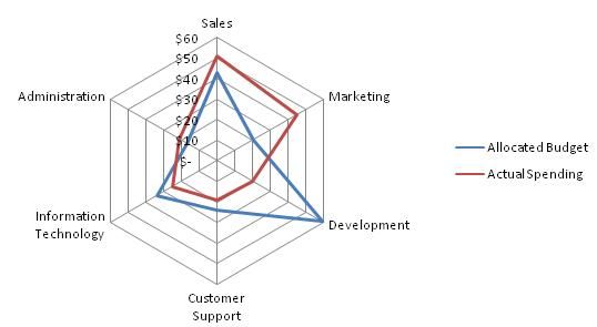
Chart 1: Radar chart from Wikipedia
Critique
Axes and Values
The axes of radar charts represent independent scales for each of the quantitative variables under consideration. Therefore, barring occlusion, comparing values for a single variable between series is straightforward and relatively effortless since it merely consists of assessing their position along a line, something we are able to do without any thought. However, a number of distinct issues arise when attempting to compare values across different axes.
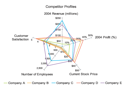
Firstly (and most easily grasped), by definition there is nothing prohibiting axes representing wildly different scales since they are nominally independent. This is shown at its extreme in Chart 2. Clearly comparison across variables is pointless in this case, yet it is something a radar chart is designed to encourage us to do. Hopefully from this extreme example you are also able to appreciate that even in subtler cases where the scales are genuinely independent, whether that be the inversion of the scale on one axis or slightly different ranges of values being represented, comparison is rather absurd. So much so that very few charting libraries or applications support this in any way.
Chart 2: Artificial radar chart by Stephen Few to show independent axis scales
Unfortunately, even with a common scale between axes, comparing values across them remains cumbersome and error-prone. This is because rather than the simple straight-line comparison our visual perception is hard-wired to perform that is found in "conventional" chart types, comparison in radar charts requires conscious thought to mentally project a sort of arc of rotation to map a value from one axis onto another, something we are not particularly adept at.
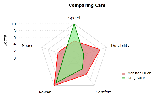
Chart 3: Radar chart byVisiblox
In order to help general perception and, in particular, comparison across axes, radar charts usually display gridlines connecting axes when they share a common scale (giving them their traditional spider-web-like appearance). However, even with these gridlines it remains cumbersome to compare values on non-adjacent axes. For example, try comparing the Space and Comfort scores for Monster Truck in Chart 3. It requires a surprising amount of conscious effort, doesn't it?
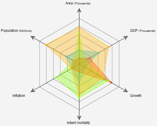
Chart 4: Radar chart by Kap Lab
Aside from the non-data ink gridlines inevitably add, they also introduce further issues to radar charts. Mainly, they tend to add confusion around axis value labelling by breaking the association by proximity used to associate a particular value label with a mark on an axis. This is very clearly demonstrated in Chart 1. It requires active thought to disassociate the labels from the gridlines over which they inadvertently lie. For example, what is actually the $60 gridline appears to be labelled $50 instead. Chart 3 demonstrates a commonly attempted solution to this problem that unfortunately makes the chart just as difficult to read, only in a different way. Here the labels are so far away from the axis that, once again, conscious effort is required to comprehend what should be an inconspicuous, almost sub-conscious interpretation aide for the chart.
Chart 5: Radar chart by Dundas Data Visualisation
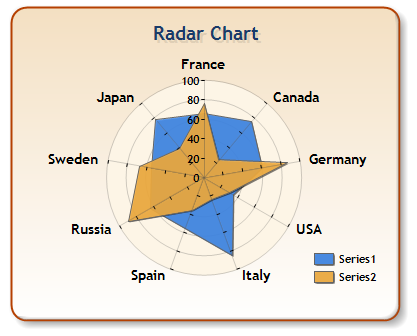
Occasionally the gridlines on a radar chart are presented as circles rather than straight connecting lines between equivalent values on adjacent axes, as in Chart 5. Conceptually, I do not understand how a chart can combine circular connections between axis values and straight line connections between series values. Surely they must adhere to the same notional underlying data space?! Otherwise the chart is fundamentally broken. If anyone feels like creating a radar chart using strictly polar data space for both gridlines and series shapes, could you please send me a link? I've never actually seen one, and always like a giggle...
Connecting Lines and Nominal Scales
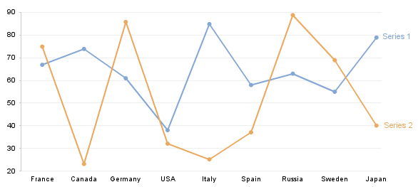
The quantitative variables and their values represented on the various axes of a radar chart are, with the exception of some less common cases such as when plotting timeseries data, distinct and unrelated. Yet, by design, radar charts force the suggestion of some relationship between the variables by having a connecting line between values on different axis in order to create the series grouping, thereby misleading the user. To help clarify this point, the chart below is identical to Chart 5 except that the information is plotted using "conventional" cartesian coordinates rather than the (pseudo-)polar coordinates of a radar chart.
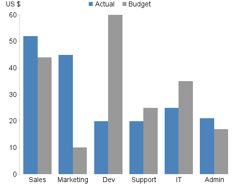
In this more familiar, non-circular format it is hopefully much more obvious that we are in fact dealing with a nominal scale on the x axis. That is, the categories on the x axis are simply named entities that have no intrinsic order and do not represent quantitative values. As such, the relationship and incline or decline in value the connecting line implies is grossly misleading since we could arbitrarily change the relationships by rearranging the categories (something we are free to do because of their lack of intrinsic ordering). When shown this way, many of you will recognise that this kind of information is likely to be best presented as a bar chart in some form, depending on the specific purpose of the chart, as shown for 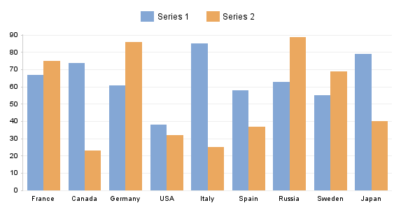
Occlusion
Occlusion, in data visualisation, refers to the phenomenon where a part of the visualisation obscures another part. Clearly this should be avoided, or at least minimised, since hidden visuals prevents you from interpreting the information correctly. Unfortunately, the design of radar charts means significant occlusion is inevitable when multiple series are plotted, since they must be "on top" of each other. In cases where the fill colour of the shape of a series is relatively or completely opaque, such as Chart 5, it can be nigh on impossible to see particular values. In these cases, the gridlines are also at best partially obscured, thereby making it even more cumbersome to discern the value any any given point. In Chart 5 this is has been somewhat overcome by adding tick marks on top of the series, which, unfortunately, also adds to the overall clutter on the chart.
When transparency is used to circumvent the problems caused by solid fill colours it creates a new problem: the unavoidable tinting effect can make differentiating the underlying series or matching them to a legend very difficult. As such, the approach that suffers least from occlusion is when no fill colour is used, as in Chart 1.
Shapes
One argument given by proponents of radar charts is that we are naturally adept at seeing and evaluating simple shapes. Although this is true, it overlooks the major issue that the overall shape presented for a series on a radar chart does not leverage any of the pre-attentive attributes we perceive quantitatively. In essence, this means we are unable to attribute much genuine meaning to the shape of a series. The only patterns our visual perception can really discern in a data set presented as a radar chart are similarity and extreme outliers. Both patterns are just as easy, if not easier, to recognise in more effective alternative visualisations, such as line and bar charts, where the shapes also have quantitative perception. Consider the example radar charts above, can you reliably say anything useful about the respective series based on their shapes other than where they are similar or there is an outlier?
A further issue with the shapes presented by radar charts are that the area of the shapes increases as a square of the values rather than linearly. This can cause us to misinterpret the data since a small difference in values results in a significant difference in area, thereby exaggerating any difference when we follow our natural inclination to compare the size of the shapes.
Alternatives
There are numerous more effective alternatives to radar charts, depending on the information being presented. These include bar charts, as shown above, line charts (particularly for timeseries data), parallel coordinates charts and, quite simply, tables showing the raw figures. The latter is commonly overlooked, but when dealing with relatively small, simple data sets it is frequently the most immediate and clear way to represent the information. In more complex cases, a more effective alternative to a radar chart can be to use a concept called small multiples, devised by Edward Tufte, in conjunction with bar charts. Using this approach, individual series are separated onto individual charts, all sharing a common x and/or y axis scale to enable meaningful comparison across them. This way it is easier to gain both a higher level overview and investigate at more detail because the clutter, occlusion and related issues common to complex charts, and particularly radar charts, are removed. The following chart is a redesign of 
Note that the x axis scale labels have been omitted because they were not present in the original example and, even after a little background research, I was unable to deduce them. As far as I can tell, the data used to create the original chart is fictional. If the genuine figures are of interest, I would suggest using Google's Public Data Explorer.
An immediate advantage of using tables, bar columns or small multiples is that they naturally support ordering. With a radar chart, introducing ordering would require the starting point and direction to be explicitly indicated somehow since neither can be inherently deduced from the radar chart design. In the aforementioned alternatives, left-to-right or top-to-bottom ordering is immediately evident. Although ordering is rarely a strict necessity for a chart with a nominal scale, it can provide useful structure to the information that reinforces or enhances the story being told. For example, an ordering of best to worst for some value can add a great deal of clarity to a chart.
Worked Example
Based on what has been explained so far, it is hopefully clear that there are many more effective ways to represent the information shown in radar charts. To further underscore this and to show how a little more thought and effort put into the design of a chart can have a significant effect on its efficacy, here follows a worked example based on Chart 1.
As previously highlighted, the axis categories of a radar chart are frequently a nominal scale, meaning there is no relationship between their respective values. Therefore, it is immediately clear that a bar chart would be a better representation of the data shown in Chart 1.
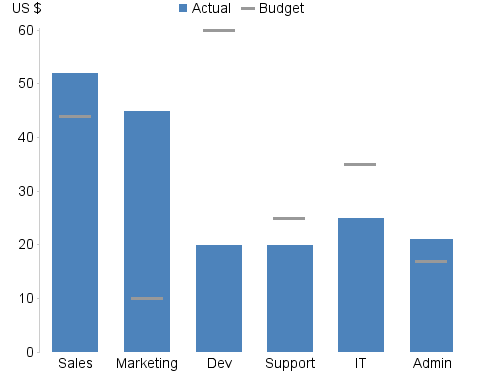
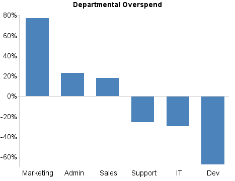
In the particular case of Chart 1, it is a fairly safe assumption to say that the chart is ultimately trying to convey the over- and under-spend of the respective departments. As such, the following redesign focuses on the more important value, the actual spending, and its relationship to the budget, by reducing the visual salience of the budget values.
Furthermore, it can be assumed that in this case the relative over- and under-spend of the respective departments is the primary concern. By charting this difference as a percentage of the original budget and ordering the resulting bar chart from biggest overspend to biggest underspend, we have a very clear story of which departments are the worst offenders at both ends of the scale.
Conclusion
Hopefully it is clear that radar charts, despite the initial appeal due to their interesting appearance, are ultimately useless, in that they are unable to efficiently and effectively communicate information to users. Regrettably, many vendors of charting products continue to include them and users seem more interested in that first 5-second "cool" reaction than their ability to serve their purpose. Furthermore, vendors are, quite justifiably, assumed to be experts in their field, or at least to have more expertise than consumers. Therefore, so long as vendors of charting products continue to support and encourage fundamentally flawed features like radar charts, users will, unless educated otherwise, understandably continue to assume these features are perfectly suitable. Vendors then often argue that consumers request these features. And so a feedback loop of delusion has developed...
So I implore vendors of charting products to take a "brave" stance: please stop pointlessly including functionality that allows users to create flawed visualisations. Or, at the very least, stop implying they are good practice by featuring them on your websites and marketing material. You are collectively undermining the power of data visualisation by encouraging users towards cumbersome, frustrating charts that do not work, when really you should know better.

