This article presents a concern I have regarding the development of infographics and shows an example of the kind of critical thinking I believe the world of infographics is unfortunately all too often missing.
In recent years, numerical infographics have become prevalent in print and on the web. There are even popular sites dedicated to aggregating and archiving them, such as Visual.ly and Daily Infographic. The sheer number of numerical infographics being produced inevitably means there is disparity in quality, but it is important that an overall quality is maintained to ensure the format remains compelling and, more importantly, trusted. Unfortunately, due to the primarily design backgrounds of most producers of infographics, including high-profile proponents such as David McCandless, the critical focus appears to be on aesthetic quality rather than numerical or analytical quality. By definition, infographics are the graphical communication of information, so if the either the information or communication elements fail under scrutiny then all we're left with is a pretty, meaningless picture.
If the UK were a village of 100 people, it would have a population of 108...
I recently came across a collection of numerical infographics, Britistics, by a talented graphic designer called Matthew Rowett. At first glance the collection is an attractive and engaging proposition because of its wonderfully simple style and interesting subject matter.
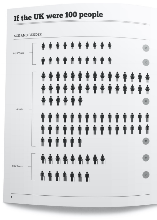
However, on slightly closer inspection some serious problems with the information are apparent. In the first visualisation in the collection, a view on the UK population is presented by reducing it to 100 people grouped by age and gender:

Unfortunately, a quick bit of maths shows that 10 + 10 + 36 + 9 + 7 = 108, i.e. the 100 people have somehow become 108. After assuming I had misinterpreted the visualisation somehow and trying to figure out what was going on, including running it past colleagues, we were none the wiser. Tracing the data source seemed like the best option and, luckily, Matthew had followed the good practice of including data references. In this particular case the data came from an article in the Independent. Strangely, the data presented there suggested altogether different figures, with 17 youths mentioned. Furthermore, the numbers appear to not match in other ways as well. It is, of course, entirely possible that the numbers in the source article have changed since being sourced.
In case you are interested, a check against a genuine primary source, in this case the Office for National Statistics, suggests the following breakdown:
| 0-15 years | Male | 9.54% |
| Female | 9.10% | |
| Adults | Male | 32.39% |
| Female | 32.41% | |
| 65+ years | Male | 7.28% |
| Female | 9.27% |
The issue here is that unlike most other design, data visualisation relies on factual accuracy that cannot be toyed with. If the underlying numbers are no good then the visualisation is fundamentally flawed, no matter how pretty it is. Furthermore, basic numerical mistakes in one graphic undermine all confidence in any associated material. In the case of Britistics, the various slipups - the aforementioned population breakdown issue is by no means the only numerical error - rather unfortunately cripple the entire piece.
Visualisation Design
Numerical issues aside, Britistics also exhibits the other worrying trend in numerical infographics: an apparent ignorance of the design fundamentals of data visualisation and human perception. That is the communicative, analytical element of the visuals are too readily compromised in favour of aesthetics, thereby at best merely frustrating those seeking to absorb the information or at worst distorting it or making it incomprehensible. The common result is that the graphic becomes little more than an awkwardly presented data table.

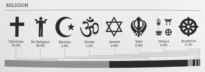
The Religion section of Britistics, for example, presents a religious breakdown of the UK population. Although there is a bar chart of sorts, it is relegated in favour of the more attention-grabbing religious symbols used to label the chart. However, despite their prominence, the symbols and associated labels have been equally sized and therefore do not aid our understanding of the information in any immediate way. The bar chart itself has been "stacked" to represent 100%, thereby making it all but impossible to accurately compare segments since they do not share a common baseline. The result of this rather convoluted diagram is that although it seems interesting to a cursory glance, all we can usefully do when looking more closely is read the labels and values presented, i.e. it is no better than a simple table in assisting our analytical understanding of the information, and, arguably, even makes this worse than a table by introducing useless distraction.
An exceptionally useful starting point to gaining a suitable understanding of visualisation (and table!) design, I recommend a copy of Show Me The Numbers.
A critical eye?
It is perhaps unfair of me to have focused entirely on a single example by an upcoming designer, but both the Britistics collection and the reaction to it embody my concern about the direction numerical infographics are heading in. David McCandless highlighted the work on his blog, describing it as "soothingly nostalgic and fascinatingly simple", but apparently failed to recognise either the numerical or visualisation design issues. Maybe the piece fell into McCandless' "it can just look cool" category. Similarly, other comments about the work are all (justifiably) positive, but appear to amount to "it's pretty" rather than an evaluation against its full intended purpose: to beautifully and effectively communicate real data stories.
Infographics lie on the boundary between the scientific and artistic realms. Unfortunately this means they must adhere to the principles of both worlds. Therefore, a deeply critical eye must be cast over both the numeric and aesthetic aspects of a design. This is the only way to ensure the infographic format remains relevant and trusted. Ultimately, I suspect that due to the somewhat conflicting disciplines involved, the most effective, insightful and beautiful numerical infographics will come from collaborations between scientific and artistic individuals rather than the largely design-led examples we see churned out so regularly these days.
