In this post I'll run through the development of DOM-Raphael, a basic CSS3 based JavaScript library which acts as a replacement for Raphael and can be used to improve performance when running on iOS. The source code for the JavaScript for this post is available on GitHub.
The driver behind the creation of this library was that we'd finished developing a new Raphael based web application, "tradestack" (see below for a screenshot), and found that the animation on the iPad (tested on all but the "newest" iPad Retina) was pretty jerky. Instead of altering the application itself, we came up with the idea of creating a replacement for Raphael, which would implement exactly the same interface as far as the application was concerned but render in a completely different way (i.e. no SVG) to be performant on the iPad.
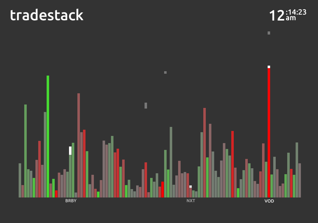
In this application, each bar represents the trading volume for a stock, using the WebSocket API, it is notified of live incoming trades which are represented as falling blocks. When the blocks reach the top of their bars, they flash white, the labels shows up, then they fade away and are absorbed. The colour of each bar represents the difference between the average trading volume and the current trading volume up to that point in the day.
Since we wanted the application to remain web-based (instead of making it a native app), we ruled out the possibility of using an HTML Canvas, as again, the performance of canvas based animations isn't that great on an iPad without the use of a some form of native wrapper like Ejecta. The alternative was to switch out SVG elements for regular DOM elements and use hardware-accelerated CSS transitions instead.
Switching from SVG and HTML/CSSFortunately, tradestack only makes use of simple text and rectangle elements, both of which can be easily mocked with regular HTML elements; it would have made things extremely tricky had there been any complex paths being rendered! The animation it uses too - although relatively complex with a number of phases, could be pulled off animating only the opacity, x, y, width and height SVG attributes - this turned out to be crucial when it came to rendering performance with CSS transitions.
In DOM-Raphael, each Raphael element is represented by an instance of a JavaScript class and a simple HTML div element; the canvas is represented by a relatively positioned div with it's overflow hidden, rectangle elements are simply absolutely positioned divs and text elements become the HTML structure:
<div>
    <div style="-webkit-transform: translate(-50%, -50%)">
        The Text to Show
    </div>
</div>
The transform applied to the inner div is so that be easily centered around a given point (as text elements are with Raphael).
When an attribute is obtained/set on a Raphael element, a call to get/set an "equivalent" CSS property on its corresponding div is made. In the most basic, default case, we just set the CSS property with the same name as the given attribute, however, there a few special cases where the mapping is non-trivial:
| SVG Attribute | CSS Property |
|---|---|
| x | translate-x property of WebKitCSSTransform ("e") |
| y | translate-y property of WebKitCSSTransform ("f") |
| width | scale-x property of WebKitCSSTransform ("a") |
| height | scale-y property of WebKitCSSTransform ("d") |
| fill | "color" for Text elements, "background-color" otherwise |
| stroke | border-color |
| stroke-width | border-width |
The mapping for opacity is also altered but for a bug fix - it turns out that setting it to a value of zero prevents it transitioning; therefore when an attempt is made to set the value to zero, we set it to some small positive "eplison" value which is small enough to render the element invisible but prevents it breaking.
CSS TransitionsThe mapping in the table above may not seem the most obvious; you may ask - why don't the SVG attributes x, y, width and height just map to top, left, width, height respectively?
The reason for this is two fold - firstly, only certain properties can be transitioned efficiently using hardware acceleration (opacity and webkit transform included) and by having the same property animate both dimension and secondly, position, we can ensure that they stay in sync. This last point is important for tradestack - when a bar gets too big, all the bars are rescaled; when this happens the bars must change their size and position at exactly the same rate or else they move around unpredictably. The following example (note: webkit only!) shows the difference between transitioning on top and height (the red box) and making the same change via changing just the transform (the blue box).
Note that (on Chrome v. 22 at least!) the bottom of the red box sometimes flickers slightly, whereas the base of the blue box remains in a constant position; it may not seem that bad here but when there are many bars (a la trackstack) it's really obvious.
Improving Performance Application performance isn't always as simple to judge as simply "good" or "bad". When using CSS transitions this is certainly the case - what you are doing is off loading some of the rendering work to the GPU so you can achieve smooth animations, but, it comes at a cost - the time spent executing your JavaScript code can decrease.
This is exactly what we saw after an initial version of the library was swapped in for Raphael. The animation of a block falling has several steps - firstly the block falls, when it reaches the bottom, another transition fires and it's opacity is set to one, then it waits, then it's opacity is set to zero and finally the element is removed. With the Raphael implementation the whole thing was jerky - the blocks moved in stutters but it was consistent and updated at the correct time. When we switched in an initial version of DOM-Raphael, the blocks fell in a super smooth fashion - great, but ... when they got to the bottom, nothing happened.. then about 2 seconds later the next step of the animation kicked in.
After investigating via the debugger timeline feature, it seemed that the system was so busy creating / removing hardware layers and recalculating styles that there was little time for the JavaScript to get a look in. To see where the different hardware rendered layers are in your page you can use the "Composited render layer border tool", which is available in both Chrome (via the "chrome:flags" page) and in Safari (via the debug menu which can be seen after running: defaults write com.apple.Safari \IncludeInternalDebugMenu 1 in a console). If you see that an element's green border is flickering, it means that a new layer is being created many times over.
In the end we managed to get the animation consistently smooth on both Desktop and iPad; something I think would have been infeasible using SVG. A few things that helped were:
- Only triggering hardware rendering on an element when it's strictly required - i.e. to ensure a smooth transition. This can be done consistently on different versions by setting the
webkitBackfaceVisibilitytohiddenfor an element with a transform on it (even a 2d one now). - Ensure that once an element is hardware rendered it remains that way - don't remove the transform or the webkitBackfaceVisibility property and check with the layout debug tool that nothing odd is going on
- Ensure that your not getting / setting styles too often or altering the DOM. This causes styles to be computed which is an expensive operation. Take a look at the webkit debugger timeline - if you've got lots or purple "rendering" bars then you maybe causing unnecessary style calculations. In DOM-Raphael we cache the state of the webkit transform and ensure that we only make a single call to request computed styles when necessary.
- Remember to clear unnecessary timeouts and intervals. Doing a clearTimeout / clearInterval on something which is
undefinedor already cancelled is a no-op and preferable to allowing the function to execute even if it just to check whether it needs to run.
For the DOM-Raphael source code see: GitHub.