
2017 update
A lot has changed in the world of JavaScript and D3 since this post was written. Check out the d3fc project to see what some of the ideas in this post have evolved into!
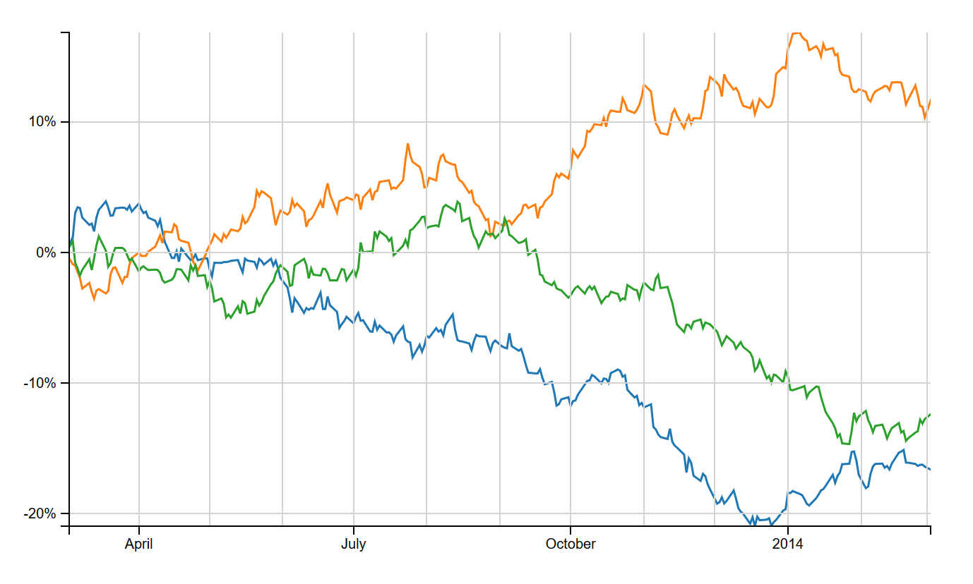
Comparison charts, as their name suggests, are great for comparing the percentage price change of multiple stocks in time. In this post, we’ll make one using D3.
This post continues a series of posts on making financial charts using D3. We’ve seen how to use the pattern of reusable components to make simple OHLC and candlestick charts with annotations, technical studies and interactive navigators, as well as how to boost performance when panning and zooming.
Here’s what we’ll be making.
Comparison Series Component
First, a word about data. We’ll assume that our chart data is an array of objects, each with name and data properties. The data property will be an array of price objects with date, open, high, low, and close properties, sorted by date. Our component will plot the percentage change of the close prices for each named series.
// Example data
var data = [
    {
        name: "Series1",
        data: ohlcData
    },
    {
        name: "Series2",
        data: ohlcData
    }
];

var ohlcData = [
    {
        date:  new Date(2014,8,25),
        open:  120,
        high:  121,
        low:   119,
        close: 120.5
    },
    {
        date:  new Date(2014,8,26),
        open:  121,
        high:  122,
        low:   119,
        close: 120
    }
];
We’ll take Mike Bostock’s Multi-Series Line Chart as a starting point. It plots a line for each data series, each with a colour given from a d3.scale.category10 ordinal scale that maps series names to colours. We’ll package the line drawing and colour mapping into a component using the usual D3 component convention. Our component will also need to calculate the percentage change of prices from an initial date (the leftmost date on the x axis), and update the y scale to reflect the minimum and maximum visible percentage changes.
Below is an outline of the comparison series component. We’ll create/update the lines and update the yScale domain in the comparison function. The lines themselves will be drawn using the d3.svg.line component.
sl.series.comparison = function () {

    // Set Default scales
    var xScale = d3.time.scale(),
        yScale = d3.scale.linear();

    var percentageChange = function (seriesData, initialDate) {
    // Compute the percentage change data of a series from an initial date.
    };

    var calculateYDomain = function (data, xDomain) {
    // Compute the y domain given the percentage change data of every series.
    };

    var color = d3.scale.category10();

    var line = d3.svg.line()
        .interpolate("linear")
        .x(function (d) {
            return xScale(d.date);
        })
        .y(function (d) {
            return yScale(d.change);
        });

    var comparison = function (selection) {
        // Create/update the series.
        var series, lines;

        selection.each(function (data) {

            data = data.map(function (d) {
                return {
                    name: d.name,
                    data: percentageChange(d.data, xScale.domain()[0])
                };
            });

            color.domain(data.map(function (d) {
                return d.name;
            }));

            yScale.domain(calculateYDomain(data, xScale.domain()));

            series = d3.select(this).selectAll('.comparison-series').data([data]);
            series.enter().append('g').classed('comparison-series', true);

            lines = series.selectAll('.line')
                .data(data, function(d) {
                    return d.name;
                })
                .enter().append("path")
                .attr("class", "line")
                .attr("d", function (d) {
                    return line(d.data);
                })
                .style("stroke", function (d) {
                    return color(d.name);
                });

            series.selectAll('.line')
                .attr("d", function (d) {
                    return line(d.data);
                });
        });
    };

    comparison.xScale = function (value) {
    // xScale getter/setter
    };

    comparison.yScale = function (value) {
    // yScale getter/setter
    };

    return comparison;
};
Gridlines
The standard way to draw gridlines with D3 is by obtaining ticks from a scale using scale.ticks(), and drawing lines using the tick values. Guess what? We can encapsulate this as a component!
sl.svg.gridlines = function () {

    var xScale = d3.time.scale(),
        yScale = d3.scale.linear(),
        xTicks = 10,
        yTicks = 10;

    var xLines = function (data, grid) {
        var xlines = grid.selectAll('.x')
            .data(data);
        xlines
            .enter().append('line')
            .attr({
                'class': 'x',
                'x1': function(d) { return xScale(d);},
                'x2': function(d) { return xScale(d);},
                'y1': yScale.range()[0],
                'y2': yScale.range()[1]
            });
        xlines
            .attr({
                'x1': function(d) { return xScale(d);},
                'x2': function(d) { return xScale(d);},
                'y1': yScale.range()[0],
                'y2': yScale.range()[1]
            });
        xlines.exit().remove();
    };

    var yLines = function (data, grid) {
       // Similar to xLines.
    };

    var gridlines = function (selection) {
        var grid, xTickData, yTickData;

        selection.each(function () {
            xTickData = xScale.ticks(xTicks);
            yTickData = yScale.ticks(yTicks);

            grid = d3.select(this).selectAll('.gridlines').data([[xTickData, yTickData]]);
            grid.enter().append('g').classed('gridlines', true);
            xLines(xTickData, grid);
            yLines(yTickData, grid);
        });
    };

    gridlines.xScale = function (value) {
    // xScale getter/setter
    };

    gridlines.yScale = function (value) {
    // yScale getter/setter
    };

    gridlines.xTicks = function (value) {
    // Get/set number of xTicks
    };

    gridlines.yTicks = function (value) {
    // Get/set number of yTicks
    };

    return gridlines;
};
Putting it Together
One of the biggest strengths of the component pattern is the ease in which we can add new components to an existing chart, or swap out components of an existing chart to make a new one. Suppose we had a chart set up with margins, scales, axes, a plot area, and a series (like the OHLC chart from this post). Then we can build a comparison chart with gridlines using our new components very easily.
First we make instances of our components.
var series = sl.series.comparison()
    .xScale(xScale)
    .yScale(yScale);

var gridlines = sl.svg.gridlines()
    .xScale(xScale)
    .yScale(yScale)
    .xTicks(10)
    .yTicks(5);
Then we add them to the preexisting plot area:
// Draw gridlines
plotArea
    .call(gridlines);

// Draw series.
plotArea.append('g')
    .attr('class', 'series')
    .datum(data)
    .call(series);
We’ll get zooming and panning working by using a D3 zoom behaviour. We’ll implement semantic zooming, and we’ll use Andy Aiken’s trick of limiting the panning extent by compensating for any overshoot of the zoom behaviour’s x translation. Our zoomed listener looks like this:
function zoomed() {

    var xDomain = xScale.domain(),
        xRange = xScale.range(),
        translate = zoom.translate()[0];

    if (xDomain[0] < fromDate) {
        translate = translate - xScale(fromDate) + xRange[0];
    } else if (xDomain[1] > toDate) {
        translate = translate - xScale(toDate) + xRange[1];
    }
    zoom.translate([translate, 0]);

    g.select('.series')
        .call(series);

    g.select('.x.axis')
        .call(xAxis);

    g.select('.y.axis')
        .call(yAxis);

    plotArea
        .call(gridlines);
}
Finally, we need to format the y axis to show a percentage.
yAxis.tickFormat(d3.format('%'));Geometric Zooming
In an earlier post, we discussed the differences between semantic zooming (redraw an element to reflect new scale domains) and geometric zooming (transform the element to where it should be given the new scale domains). We saw that geometric zooming generally performed better, with some caveats.
A disadvantage of geometric zooming was the relative complexity of the implementation compared to semantic zooming with features like an automatically updating y scale. This is true for our comparison series component as well. On zoom, we can’t just apply a single transformation to the comparison series element - the series lines need to be moved independently to their new positions.
A solution is to have the component itself implement geometric zooming of the series lines, by internally computing a transformation for each line. Each transformation is the composition of 2 transformations - one to move the line to reflect the new initial date on the x axis, and one to reflect the updated y scale domain.