Every year Scott Logic takes on a number of interns who spend 12 weeks writing code, working on projects and having a great time in the offices. My name is Ruth, and along with Chris Barrett, I am an intern in the Newcastle office; and this summer we’ve been working on creating a real-time financial charting application. The application is built on top of Scott Logic’s own open source d3fc library, which itself is built upon the increasingly popular d3.js (Data driven documents) library for javascript.
Our goal was to create an application similar to many commercial, mid-range chart offerings, and in doing so test the approach and capability of d3fc. Our chart has a number of typical features, including:
- A range of graph types to choose from (i.e. Candlestick, OHLC)
- A number of common financial indicators (i.e. Moving Average)
- Optional Secondary Charts (i.e. RSI)
- An interactive navigator chart
- Ability to load and stream real data (in this case, data about bitcoin prices)
- Pan and zoom functionality on every visible chart
What is D3?
D3 allows us to bind data to the DOM, which can then be accessed and used to manipulate the document. A simple example would be generating a HTML table from an array of data, but it’s not much harder to use the same data to generate a bar chart!
Each point of data gets paired with a DOM element, whose attributes you can set as functions of its corresponding datum. D3 also provides a neat way of dealing separately with nodes that need to be created, updated or destroyed as the data set changes (the enter, update, exit pattern).
If that sounds abstract, here’s an example using D3’s simple chainable:
d3.select('body')
  .selectAll('p')
  .data([4, 8, 16])
  .enter()
  .append('p')
  .text(function(d) { return 'My data is: ' + d; });
This will select the body of your HTML document, then select any paragraph elements within it, and bind a set of data to them – in this case, a short array of numbers. We use enter() to select the nodes which will need to be created, and add a new paragraph, whose text depends on the data paired with it. By default, the nodes and data are paired by index.
The output, then, is:
My data is: 4
My data is: 8
My data is: 16
View in jsfiddle.
So What is d3fc?
d3fc is an open source library based on, and influenced by, D3.js. It is built with a variety of re-usable components. There are relatively low-level examples like gridlines, or very many useful chart types, such as the line, bar or area series.
There also are higher level components made out of a number of sub-components, like linearTimeSeries, and components for financial indicators In these components, algorithms calculate new data - such as that needed for a set of Bollinger bands – and a separate renderer will draw it to the screen. Each component has options for customisation and many even allow customisation of the internal logic using the decorate pattern.
For an example of how simple it can be to create charts using d3fc:
var data = fc.data.random.financial()(50);
var chart = fc.series.candlestick();
d3.select('#an-svg-element')
    .datum(data)
    .call(chart);
More d3fc examples
And that’s it!
Our main reason for using d3fc was to develop upon the original code, discover improvements and criticisms as an external developer. Starting off using it was remarkably simple and accessible, with only the basic knowledge of d3.js required. One of the more miraculous properties of d3fc was the ability to handle multiple features at a time - yet still retaining the flexibility to prioritise features.
Finding a Websocket
One of our tougher jobs early on in the project was finding a source to use for our historic and real-time data. The original idea was to create a Websocket to the Yahoo Finance API, however this turned out to be an impossibility due to the privacy of the real-time information.
Finally we found a good API with the Coinbase exchange API reference Websocket feed, which gave us the real-time market data updates:
coinbaseSocket = new WebSocket('wss://ws-feed.exchange.coinbase.com');Source of Websocket
To begin the feed messages we had to send in a subscribe message to the Coinbase server indicating which product type we wanted:
var msg = {
    type: 'subscribe',
    'product_id': 'BTC-USD'
};
Unfortunately the information came through in a format that was not suitable for our needs, with just the price of the latest transaction being shown along with the size. Therefore we inserted the data into ‘buckets’ of Open, High, Low and Close:
Bringing the data together
One of the more problematic tasks we faced, was when working with combining the live data stream from the Websocket with the historic data from Coinbase.
The Websocket gave individual transactions, whereas the historic feed gave its data in OHLC form:
[
    [ time, low, high, open, close, volume ],
    [ 1415398768, 0.32, 4.2, 0.35, 4.2, 12.3 ],
    ...
]
In comparison to the Websocket, this is a collection of transactions over a period of time. While this wasn’t in itself an incredibly challenging task, it highlighted the difference between the coding we’d previously done and what was expected in a professional environment.
We began by writing a large class which did everything, including the logic for combining individual transactions into OHLC form and combining this with the historic data, along with caching the results of historic API calls.
In practice the size of this class and the coupling of a few different elements made it difficult to test and hard to maintain or change, the caching especially being more trouble than it was worth - often introducing bugs when trying to change functionality.
Therefore we split up the Websocket class, to deal with streaming in live data and another separate class dealing with converting the individual transactions into a bucket of Open, High, Low and Close:
// Expects transactions with a price, volume and date and organizes into candles of given periods
// Re-call OHLC whenever you want to start collecting for a new period/product
// In seconds
var period = 60 * 60 * 24;
var liveFeed = sc.data.feed.coinbase.webSocket();

function updateBasket(basket, datum) {
    if (basket == null) {
        basket = createNewBasket(datum, datum.date);
    }
    var latestTime = datum.date.getTime();
    var startTime = basket.date.getTime();
    var msPeriod = period * 1000;
    if (latestTime > startTime + msPeriod) {
        var timeIntoCurrentPeriod = (latestTime - startTime) % msPeriod;
        var newTime = latestTime - timeIntoCurrentPeriod;
        basket = createNewBasket(datum, new Date(newTime));
    } else {
        // Update current basket
        basket.high = Math.max(basket.high, datum.price);
        basket.low = Math.min(basket.low, datum.price);
        basket.volume += datum.volume;
        basket.close = datum.price;
    }
    return basket;
}

function createNewBasket(datum, time) {
            return {
                date: time,
                open: datum.price,
                close: datum.price,
                low: datum.price,
                high: datum.price,
                volume: datum.volume
            };
        }
Creating the Chart
The key component of creating our Primary Chart was a fantastic and easy to use component from d3fc - multi. This gave us the ability to use multiple components from d3fc and our own code at the same time:
var gridlines = fc.annotation.gridline();
var candlestick = fc.series.candlestick();
var annotationLine = fc.annotation.line()
	.orient('horizontal')
    //annotation line is set at where the last price is
	.value(function(d) { return d.close; })
	.label('');
//use multi to bring everything together (see below)
multi.series([gridlines, candlestick, annotationLine]);
This would give us the chart with an x and y axis, gridlines in the background with the candlesticks of data in the front, and an annotation line pointing out where the last candlestick’s close point is.
Multiple Series
For our chart to become what we visualised at the start of the project, we needed the functionality to render, and change between, several different series:
var candlestick = fc.series.candlestick();
var line = fc.series.line();
var area = fc.series.area();
var multi = fc.series.multi()
	.series([area, line, candlestick])
	.xScale(xScale)
	.yScale(yScale);
This would give our simple chart 3 series, with the candlestick showing on top of the line and area.
The multi component has been a great help with many other things as well, giving us the ability to show all the aspects of the chart with one line of code:
multi.series([gridlines, currentSeries, closeLine, currentIndicator]);Which would look something like this:
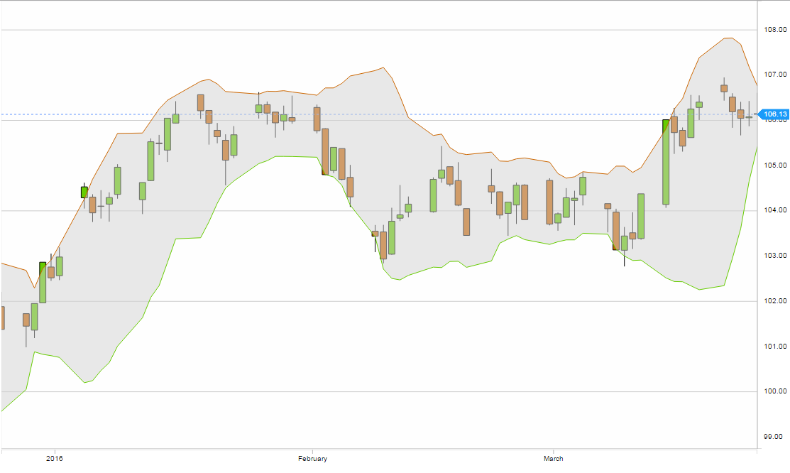 Assuming the
 currentSeries = candlestick and currentIndicator = bollingerBands.
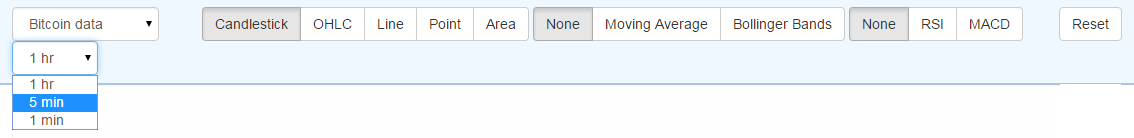
Adding a Menu
For our chart to become interactive, it has to have a menu bar. In this bar we decided to include the functionality to change the series, indicators, secondary chart, data type and reset the primary chart to the latest transaction.
The main functionality to change between the series, indicators and secondary chart was done using a button group for each created with D3:
function layoutButtons(sel) {
    sel.selectAll('label')
        .data(sel.datum())
        .enter()
        .append('label')
        .classed('btn btn-default', true)
        .classed('active', function(d, i) { return (i === 0); })
        .text(function(d, i) { return d.displayString; })
        .insert('input')
        .attr({
            type: 'radio',
            name: 'options',
            value: function(d, i) { return d.valueString; }
        })
        //check the first button for each component
        .property('checked', function(d, i) { return (i === 0); });
}

function optionGenerator(selection) {
    selection.call(layoutButtons);

    selection.selectAll('.btn')
        .on('click', function() {
            var selectedOption = d3.select(this)
                .datum();
            dispatch.optionChange(selectedOption);
        });
}

d3.rebind(optionGenerator, dispatch, 'on');

return optionGenerator;
The buttons are styled as bootstrap buttons
The reset button was the first to enter the menu, as functionality to the end of the available data was necessary for a real time chart:
function resetToLive() {
    var data = dataModel.data;
    var extent = fc.util.extent(data, 'date');
    var timeExtent = (extent[1].getTime() - extent[0].getTime()) / 1000;
    var navTimeExtent = timeExtent / 5;
    var latest = data[data.length - 1].date;
    var navTimeDomain = [d3.time.second.offset(latest, -navTimeExtent), latest];
    onViewChanged(navTimeDomain);
}

function onViewChanged(domain) {
    dataModel.viewDomain = [domain[0], domain[1]];
    render();
}

container.select('#reset-button').on('click', resetToLive);
The indicators are added on to the multi.series when their corresponding button is active, giving a responsive interaction for the user. For both of these, a none button is originally checked on the menu, giving the user a wide range of options for the visualisation of the chart. The secondary chart (either RSI or MACD) are included through the render function when their respective buttons are activated.
To change indicators using the buttons, we created an option function:
sc.menu.option = function(displayString, valueString, option) {
    return {
        displayString: displayString,
        valueString: valueString,
        option: option
    };
};
This meant we could lay out every indicator and series in a similar manner, making the selection of each one simple and consistent:
//Use the sc.menu.option function to generate all the different series'
var candlestick = sc.menu.option('Candlestick', 'candlestick', sc.series.candlestick());
var ohlc = sc.menu.option('OHLC', 'ohlc', fc.series.ohlc());
var line = sc.menu.option('Line', 'line', fc.series.line());
var point = sc.menu.option('Point', 'point', fc.series.point());
var area = sc.menu.option('Area', 'area', fc.series.area());
Finally, the most important button to be added to the menu is a dropdown for changing the data stream between randomly generated data, and real time data coming in through the Coinbase websocket. This functionality also included the ability to change which time period the chart was rendering on (either 1hr, 5mins or 1min):
function setPeriodChangeVisibility(visible) {
    var visibility = visible ? 'visible' : 'hidden';
    d3.select('#period-selection')
        .style('visibility', visibility);
}

var dataTypeChangeOptions = function(selection) {
    selection.on('change', function() {
        if (this.value === 'bitcoin') {
            setPeriodChangeVisibility(true);
        } else {
            setPeriodChangeVisibility(false);
        }
        dispatch.dataTypeChange(this.value);
    });
};

sc.util.filterDataInDateRange = function(data, dateExtent) {
    // Calculate visible data, given [startDate, endDate]
    var bisector = d3.bisector(function(d) { return d.date; });
    var filteredData = data.slice(
        // Pad and clamp the bisector values to ensure extents can be calculated
        Math.max(0, bisector.left(data, dateExtent[0]) - 1),
        Math.min(bisector.right(data, dateExtent[1]) + 1, data.length)
    );
    return filteredData;
};
Refactoring
One of our bigger hurdles in the project was having to refactor everything in our 3rd Sprint. The aspects of the chart so far had all been written into one main.js file for ease and access - however this discouraged from testing, developing and maintaining the code.
Due to the conflicts we were getting in git, we decided to take action and modularise the main.js into separate components (i.e. charts, navbar, series, zoom etc.). This was an essential, yet tough piece of work - requiring a lot of time and thought to complete with good quality code for when it was finished.
We created a global object class for the project, with references to every component we have worked on:
var global = null;
/* jshint ignore:start */
global = (1, eval)('this');
/* jshint ignore:end */

global.sc = {
    chart: {},
    data: {
        feed: {
            coinbase: {}
        }
    },
    menu: {
        generator: {},
        primaryChart: {},
        secondaryChart: {}
    },
    series: {},
    util: {}
};
We created a key rendering function in our main.js to bring the main components together. Namely the primary and secondary charts, the nav chart and their axis which was shared by all three:
var primaryChart = sc.chart.primaryChart();
var secondaryChart = sc.chart.secondaryChart();
var xAxis = sc.chart.xAxis();
var navChart = sc.chart.navChart();

function render() {
    svgPrimary.datum(dataModel)
        .call(primaryChart);

    svgSecondary.datum(dataModel)
        .call(secondaryChart);

    svgXAxis.datum(dataModel)
        .call(xAxis);

    svgNav.datum(dataModel)
        .call(navChart);s
}
Which would give us our original three standard charts just like they were before refactoring:
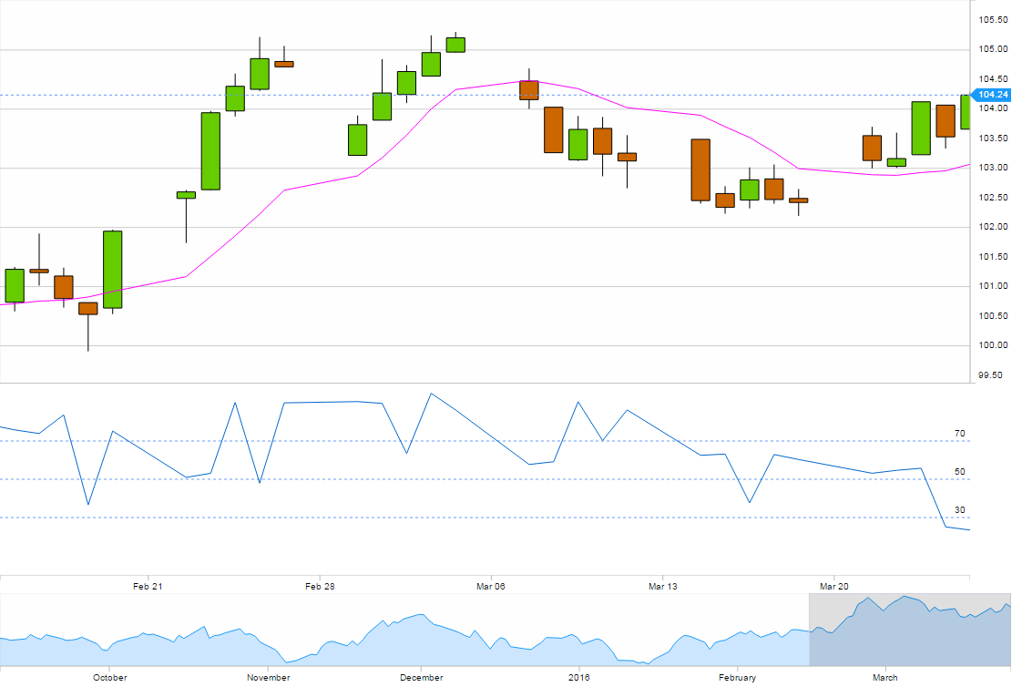 In this case the
 secondaryChart() is an RSI (Relative Strength Index) chart, and the primary chart’s indicator is the moving average.
Testing
During development it’s useful to be able to write unit tests for modules of code you’ve written before committing it into the shared codebase. This lets you test for sure that the code works as expected, and also forces you to define exactly what a piece of code ought to do and consider the edge cases. Often, if a piece of code is hard to unit test it’s a suggestion that the code isn’t modular enough. These tests will then provide advance warning if someone inadvertently breaks your code in the future.
We also did standard test, however without any testers for our cause we had to do them all ourselves. One of the greater challenges from this was producing our chart into one with good UX and UI. This had to be determined by our own perceptions and judgement; of course in our eyes the chart looks clean, simple and concise.
Project Development
We ran the project on an agile development regime (scrum). This was the first time for both us interns to work in this way, with our project being split into 4 sprints of 2 weeks long each - at the end of each sprint we would give our customer (in this case the head of development) a demonstration of our most recent release.
Each day we had a 15 minute session (stand-up) where each person would explain what they did yesterday, what they’re doing today and any issues that they encountered. The set routines of stand-ups everyday, sprint planning and reviewing, and demonstrations of the project was consistent, keeping the work at a steady rate.
We had some fantastic support from members of the company, they lead us in every meeting and helped us out with any part of the project we were on. No question was too silly, and they always explained everything in full which develop our knowledge further.
Development
This project has potential to develop a lot further than what we have begun. The need of a mid-range chart for developers who need something efficient, easy, flexible yet reliable is growing in this day and age of programming. Along with open source projects becoming the popular go-to, the d3fc-showcase is an excellent example of what the future for charts holds. With the ability to use d3fc to create a simple chart that can then be extended into something more complex in nature, yet simple in design.
One of the more intuitive outcomes of this project has been the inclusion of live streaming data in from an external source. We believe it would make a great additional feature to the constantly improving d3fc, and hopefully will be included in an upcoming build.
Conclusion
Scott Logic has provided an incredibly supportive atmosphere in which to learn new skills and develop this piece of software, and we are greatly in debt to our mentors for all the help they’ve provided us. As an intern, one is to expect to be treated more poorly in the work environment; however at Scott Logic being classified as an intern is disregarded (not entirely), and you are brought fully into the work ethics of the company - with the occasional game of foosball.
It has been a fantastic learning experience, from new languages, libraries and software to the experience of working with a team in a professional company. The culture of Scott Logic is diligent, yet relaxed, and the people have been extremely welcoming.
We’d like to give our special thanks to Drew Milley and James Leftley, for all their time and effort in helping us with the project. We’d also like to thank Tom Simmons, Simon Watson and Paul Schofield.
Chris Barrett and Ruth Caulcott-Cooper, Newcastle Interns 2015