At Scott Logic, we’ve been developing a collection of charting components building on the popular d3 library. These components should complement d3, making it easier to build complex charts. You can see what we’ve done so far on the d3fc website. I’ve been adding a few data samplers into d3fc, and this post will show the results.
When you have datasets in the order of tens or hundreds of thousands, it’s not feasible rendering every data point on a small chart, especially on mobile devices. Therefore, some method of choosing which data points to render that accurately represent your data is required.
d3fc uses two sampling techniques defined in the thesis Downsampling Time Series for Visual Representation by Sveinn Steinarsson: Mode-Median Bucket and Largest Triangle (with one- and three-bucket variations). These data samplers allow large datasets to be plotted at much lower cost than drawing each data point by creating a smaller sample of the data which still encapsulates relevant details.
The two data samplers in d3fc tend to produce different outputs: Largest Triangle will capture more of the extreme values, whereas Mode-Median Bucket tends towards the average.
Bucketing
The two algorithms implemented both require data to be grouped in buckets – arrays of data points. The implementation of this is fairly naive, but intends to group data into sets of roughly equal sizes.
This is where d3fc departs from the thesis. The thesis evenly distributes data points across a fixed number of buckets, whereas d3fc uses a fixed number of data points per bucket. Additionally, d3fc partitions the data slightly differently. In the thesis, the data is partitioned into buckets then the first and last data points form the first and last buckets. In d3fc, the first and last data points are always their own bucket, with the remaining data points distributed into buckets. This ensures that all data points are considered for selection, regardless of their position in the data series.
The Algorithms
Mode-Median Bucket
Mode-Median Bucket is a simple algorithm. Each bucket is analysed for the frequency of y-values. If there is a single most common value (mode) in the bucket, then that y-value is chosen to represent the bucket. If there are multiple values with the same frequency, then some tie-breaking is required to choose a mode (d3fc chooses the last mode it comes across). If there is no mode, however, the median is taken.
Performance isn’t great for this algorithm, due to the constant modification of the object that tracks the modes. However, for smaller data sets (like in this example), the performance is acceptable.
As previously mentioned, this algorithm tends to smooth peaks and troughs in the dataset due to their low frequency.
Largest Triangle
Largest Triangle is a more complicated algorithm. The premise of the algorithm is that, given two pre-determined points, the point in the bucket that forms the largest triangle has the largest effective area and so is the most important in the bucket. The Largest Triangle implementation comes in a one bucket and a three bucket form.
Because the importance of a point is determined by the size of its effective area, extreme values naturally have higher likelihood to be chosen. Therefore noisier data sets produce noisier subsampled data.
One Bucket
The “one bucket” implementation is where the two other points are the points before and after the current point being checked. This algorithm naturally chooses points with highest difference relative to its neighbours and not the bucket. This brings with it the advantage of being able to pre-compute all the points’ effective areas before checking for maxima, reducing code complexity.
Three Bucket
The “three bucket” implementation is where the two predetermined points are chosen from the buckets before and after the bucket being evaluated. The first point is the point chosen to represent the bucket before the current bucket. The second is a “ghost point” representing the next bucket, which in this case is simply an average of the x and y values of that bucket.
Implementation
These algorithms were implemented in fc.data.sampler, and using them is easy. Setting up the sampler is a case of telling it how big the buckets should be, and how it can access the x and y components from each datapoint.
var sampler = fc.data.sampler.largestTriangleThreeBucket()
    .bucketSize(10)
    .x(function(d) { return d.x; })
    .y(function(d) { return d.y; });
And to sample:
var sampledData = sampler(data);This simplicity means that the algorithms themselves are ‘dumb’ – they do exactly what they’re told. They aren’t aware of the data types used, nor its range. Data that’s exponential in nature will behave differently on the Largest Triangle algorithm, since the area between points is much larger. To accommodate this, using the scale function when defining the accessor is recommended.
The Demo
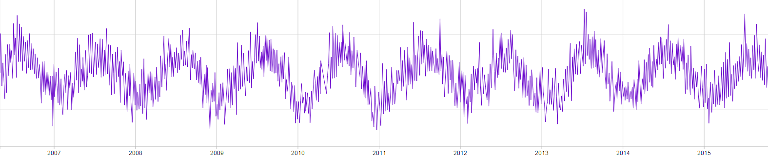
The weather demo uses data from the University of Edinburgh’s weather data set. The largest data set contains a massive amount of data – observations every minute spanning almost 10 years, amounting over 200MB. This huge dataset was subsampled to roughly half-hourly data points, retaining only the time and temperature data (3MB).
Of course, in a post about subsampling, the method of downsampling data is important! The data was divided into 30-minute buckets, and the average temperature during that window was taken. This was to ensure that data had as little noise as possible. The data was also sanity checked, so that irrational values (such as 1000°C on the 24th December or -227°C) were discarded.
The chart has two components – the main viewport and the navigator providing an overview of the entire dataset. Both of these components were subsampled to improve performance. The navigator through Largest Triangle Three Bucket, and the main viewport through the user’s choice (or none at all) in order to compare the algorithms.
Animations are used to show and test how smoothly the chart performs when it undertakes these calculations. The chart can zoom and pan to random areas of the data. Naturally, responsiveness of the chart during these transitions and redraws is dependent on the zoom size (the lower the zoom the slower the chart) and the algorithm used. Largely, the animations remained smooth on non-maximal zooms.
Because the data is divided into buckets and the chart data can be moved and resized, the data points in each bucket changes over time. That’s why, when you scroll through the data, the chart appears to ‘jump’ data points, as the data point selected for that bucket changes.
Have a play below and try it for yourself! The code for this example is available on GitHub.
The algorithms I’ve outlined here work to varying degrees of success. They give some choice into how to represent the dataset – preferring extremes or not. They all speed up chart rendering time and so makes the chart more responsive. If you need to render or use large sets of data, I’d recommend having a look at d3fc and its components, and especially the samplers (though I might be biased).