
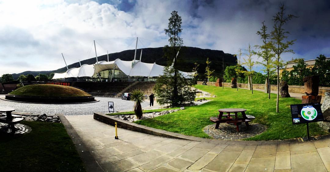
Last week I attended the UX Scotland conference held at the impressive setting of Our Dynamic Earth in Edinburgh. The 3-day conference, sponsored by Scott Logic, contained a selection of interesting case studies, workshops, hackathons and other social events. Graham Odds, Head of UX Design at Scott Logic presented two talks at the conference, about conversational commerce and how we perceive data.
The main themes I picked up throughout the conference were designing for context, examples of misused design patterns and our responsibility as designers.
Designing for context
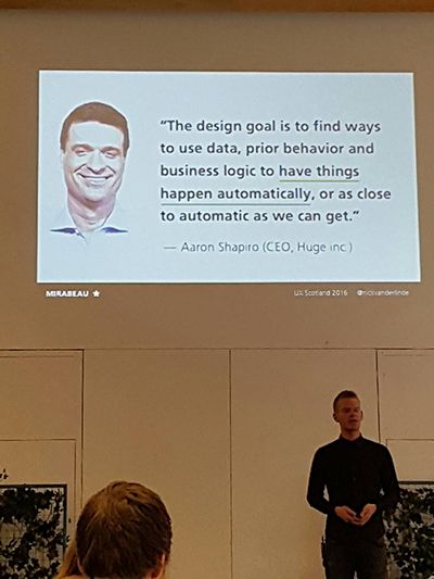
Nick van der Linde, principal designer at Mirabeau, presented a talk entitled “Context is king – creating smarter adaptive, digital products today”. He explained how contextual design is all about the key belief that the “future is about less interactivity, not more.” A quote by Aaron Shapiro, CEO at Huge, reinforced Linde’s message, commenting that anticipatory design is “where we eliminate as many steps as possible and find ways to use data, prior behaviours and business logic to have things happen automatically, or as close to automatic as we can get”. This in turn has the power to create “less work for our users” and unfortunately “more work for us” as designers.
Linde went onto explain the importance of “focusing on what really matters” because designing for context is “all about purpose, not pixel-perfectness”. This was an issue that was also discussed in Kevin Richardson’s talk, “Making Racing Data Useful”, where he stated that “good design is more than visualisation”. Richardson talked about his experience using his motorbike racing tracker. The device was sold with a software package which attempted to visualise an unreadable volume of data, and justified this by calling itself “performance software”. Richardson redesigned the software, and using the same data, was able to produce much more meaningful visualisations. Instead of complex multi-layered line graphs, his redesign broke each lap down corner by corner, and allowed the users to compare different lap performances. Despite presenting the user with less data, Richardson’s redesign of the software allowed users to analyse their performance in more detail than the old design, proving his point that “data isn’t information – people act on information”.
A further key theme of the talk was that designers should focus on “making sure your product works everywhere” which he explained was more liberating for the designer and allowed them “to move on quickly and focus on more cool stuff.” He described that designing for different platforms is all about prioritising context and features and not about eliminating them.
Interestingly, he went on to question whether the future of technology would evolve in such a way that every device we owned would have its own interactive screen. To elaborate, he used an example where a touchscreen had been implemented onto a wine bottle that allowed the user to find out more information about the wine and order another. He identified where this is happening today by highlighting the concept of a smart fridge such as Samsung’s ‘The Family Hub’. Linde argued that technology has not been used in either of these instances to create a meaningful experience for users and that “the best ideas emerge at the intersection of user needs and business goals”.
Misused design patterns
Zoltan Kollin used the same Samsung Family Hub smart fridge example in his talk, “Misused UX Design Patterns”; questioning the usefulness of being able to view the contents of a fridge without opening the door. Kollin was speaking in one of the smallest rooms at the conference, which due to the interest in his talk, was full to bursting. His talk focused on UX design patterns, highlighting how they can often be misused if people fail to realise they can alter them if it will improve the user’s experience. He stated that “technology should solve people’s problems not creative new ones”.
He began by describing the importance of using techniques that your users already know. He stated that “if you don’t have to reinvent the wheel then users don’t need to relearn how to use it”. For example, with skeuomorphism the aim was to bridge the gap between the physical and digital by interface elements that were similar to their physical counterparts. Through time, when users began accustomed to this, a more simplified, flat design developed.
![]()
This idea also applies to icons, with Kollin stating that “GUI is about metaphors” and users need to understand the connection. This issue was backed up in Vitaly Friedman’s keynote talk on ‘Cutting-Edge Responsive Web Design’ when he gave an example of a slider that had a tortoise at one end and a hare at the other – a meaningless metaphor to those unfamiliar with Aesop’s fable. To sum up his point he used the quote “a user interface is like a joke - if you need to explain it, it’s not that good!” Dan Whaley made a similar point in his talk on ‘Designing voice and natural language experiences’,highlighting that successful products need to be low effort intelligent experiences for the users.
Kollin also went on to discuss some specific UX pattern elements that were often misused, and offered some solutions to make these more meaningful. For example he suggested that adding descriptive label buttons instead of dots to a carousel would add more value, which corroborated with the advice given by Friedman, who suggested adding thumbnails as an alternative. As you might expect both Kollin and Friedman also referenced the pitfalls of the infamous hamburger menu and suggested more effective implementations.
Our responsibility as designers
Alberta Soranzo, Head of Experience Design and Innovation at Tobias & Tobias, discussed the ethical responsibility designers have in relation to users in her talk, ‘We’re just like superheroes!’. Soranzo argued that, as designers, we have the power to influence the decisions and behaviours of the people that use our products. With this power comes the responsibility to use these powers for good.
Naturally, there are ‘villains’ who use this ability to influence for evil – by designing interfaces which aim to mislead consumers for the financial gain of a business. This brings a whole new meaning to the concept of ‘bad design’ – not simply the lazy use of design patterns, or ambiguous icons - but rather carefully crafted interfaces which aim to mislead. These nefarious designs are referred to as “dark patterns”. You are likely to have come across examples of them, whether you noticed or not. Airlines also tend to be skilled super villains in this field, bombarding users with all sorts of suggested add-ons: priority boarding, seat selection, travel insurance, and car rental, all of which is presented in a way which aims to trick a rushed user into parting with more money. Soranzo demonstrated another example of a payday loan website riddled with language and visuals designed to panic the user, rushing them into loans at exorbitant interest rates they may not be able to afford.
Soranzo then presented a case study of a design she worked on which she felt demonstrated the idea of ethical design. The design was for an investment platform aimed at empowering low-income consumers to make financial choices that would benefit their future selves. The resulting signup process was transparent and unintimidating, aiming to inform rather than scaremonger. Users were encouraged to invest through a slow and steady approach, with the aim of minimising the risk involved with investing, even though it would likely be less profitable for the business. This ethical, customer-focused approach was also discussed by Kollin, who summarised that a successful design was “focused on the long term user experience, not quick wins”. ‘Quick wins’ gained by tricking users may lead to short term profit, but the more these ‘dark patterns’ are employed, the more likely consumers are to recognise them, and avoid the companies that use them.

Image courtesy of Jeremy Keith
Hearing about other UX professional’s experiences, I found it uplifting to discover designers worldwide were facing the very same design challenges I face on a daily basis working at Scott Logic. I also found it very inspiring to be reminded how exciting the field of UX design is and with Intel predicting that there will be 200 billion connected devices by 2020, there is still plenty for us all to learn to make sure we are all ready for that future.

