
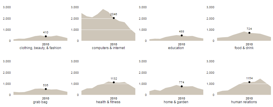
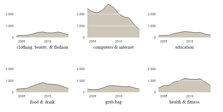
Small multiples repeat the same basic chart, typically with the same axes, to display different slices of a dataset. They are an excellent way of showing rich multi-dimensional data, without becoming a dense mess of lines. They are also one of my favourite charts!
The repetitive nature of small multiples makes them highly suited to rendering with D3. This blog post describes the process of building the following visualisation:
(View the interactive version)
This small multiples visualisation is both interactive; as you mouse-over the closest year is highlighted on all of the charts; and responsive, with the number of multiples per row depending on the overall screen width.
The data for the above chart was taken from an excellent article on Interactive Small Multiples on the Flowing Data website.
A Simple Chart
Small multiples repeat the same chart multiple times, therefore a good starting point for this visualisation is to determine how to render the individual charts. The data from the original article is in tab-delimited format:
"year"	"category"	"n"
"2004"	"clothing, beauty, & fashion"	141
"2004"	"computers & internet"	2489
"2004"	"education"	151
"2004"	"food & drink"	275
"2004"	"grab bag"	285
"2004"	"health & fitness"	379
"2004"	"home & garden"	344
"2004"	"human relations"	245
"2004"	"law & government"	292
...
The first step is to load this data and shape it into an array of values by category. The following code uses the D3 tsv loader / parser to load the TSV data, and coerce the values into the correct types. Following this the nest component groups the data based on the category of each item.
d3.tsv('askmefi_category_year.tsv')
  .row((r) => ({
    category: r.category,
    n: Number(r.n),
    year: Number(r.year)
  }))
  .get((data) => {
    var nested = d3.nest()
      .key(k => k.category)
      .entries(data);
  });
With this code the data is now an array of objects, one per category, each of which will be represented by a chart within the small multiples visualisation.
[
  {
    "key": "clothing, beauty, & fashion",
    "values": [
      {
        "category": "clothing, beauty, & fashion",
        "n": 141,
        "year": 2004
      },
      {
        "category": "clothing, beauty, & fashion",
        "n": 203,
        "year": 2005
      },
      ...
    ]
  },
  {
    "key": "computers & internet",
    "values": ...
  },
  ...
]
Rendering a chart with D3 involves creating data joins that construct paths and other SVG elements that represent the underlying data. For this blog post I’m going to be using d3fc, a library of D3 components that we’ve been developing that extend the D3 vocabulary from paths, rectangles and groups to series, annotations and charts.
The following code takes the datapoints for one of the categories and renders it as a simple line chart:
// pick one of the data series
const dataSeries = nested[7].values;

// use the d3fc extent component to compute the x & y domain
const yExtent = fc.extentLinear()
  .accessors([d => d.n])
  .pad([0, 0.2])
  .include([0]);

const xExtent = fc.extentLinear()
  .accessors([d => d.year]);

const line = fc.seriesSvgLine()
  .crossValue(d => d.year)
  .mainValue(d => d.n);

const chart = fc.chartSvgCartesian(
    d3.scaleLinear(),
    d3.scaleLinear())
  .yDomain(yExtent(data))
  .xDomain(xExtent(data))
  .yOrient('left')
  .plotArea(line);

// render
d3.select('#small-multiples')
  .datum(dataSeries)
  .call(chart);
(View the source code for this chart)
The above code uses a few d3fc components:
- The d3fc extent component is used to compute the domain range for each scale. The
yExtentshows a few interesting features of this component, padding the upper bound by 20%, and ensuring the domain range includes zero. - The line series component is used to render the data for this category as an SVG path.
- The cartesian component renders the standard chart ‘furniture’, creating axes, chart labels and rendering a series.
The d3fc components follow the standard D3 pattern, allowing them to be rendered via the call method on a D3 selection.
At this point, adapting the line series component with a repeat component, provides an excellent illustration of the power of small multiples.
With the following simple change:
const repeat = fc.seriesSvgRepeat()
  .orient('horizontal')
  .series(line);

const chart = fc.chartSvgCartesian()
  ...
  .plotArea(repeat);
The chart now renders the data for all the categories … and is a bit of a mess:
(View the source code for this chart)
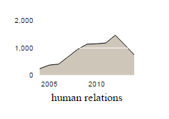
Small Multiple
It’s time to scale this chart down and apply a bit of styling. Each multiple chart has a few components, a filled area, a line and horizontal gridlines.
The following adds these additional components, using the multi series component to combine them all together. The multi series renders the same data via multiple series components. It also has a mapping function that can supply different data to each. In this case all of the series render the values array, which was created by the D3 nest.
const area = fc.seriesSvgArea()
  .crossValue(d => d.year)
  .mainValue(d => d.n);

const line = fc.seriesSvgLine()
  .crossValue(d => d.year)
  .mainValue(d => d.n);

const gridlines = fc.annotationSvgGridline()
  .xTicks(0)
  .yTicks(3);

const multi = fc.seriesSvgMulti()
  .series([area, line, gridlines])
  .mapping(function(data) {
    return data.values;
  });

const chart = fc.chartSvgCartesian()
  ...
  .yTicks(3)
  .xTicks(2)
  .xTickFormat(d3.format('0'))
  .plotArea(multi);
The fill colour, gridline colour and overall chart size are configured via CSS:
.area {
  fill: #cec6b9;
}
#small-multiples {
  width: 200px;
  height: 185px;
}
.x-axis .domain, .x-axis .tick path,
.y-axis .domain, .y-axis .tick path {
  display: none;
}
.x-axis {
  height: 1.5em !important;
}
.gridline-x {
  stroke: white;
}
If you inspect the rendered you’ll notice that the cartesian chart component uses a mixture of SVG graphics and HTML DOM, with flexbox used to arrange the labels, axes and plot area. As a result, you can hide elements via CSS and the chart layout will update accordingly.
With these changes, we now have a single small multiple:
(View the source code for this chart)
Rendering Multiple Charts
Rendering multiple copies of this chart is really quite straightforward using a D3 data join. The following code creates a div element for each category via the enter selection. Because the cartesian chart following the D3 component convention it can be ‘called’ via a data join in order to render multiple chart instances.
d3.select('#small-multiples')
  .selectAll('div')
  .data(nested)
  .enter()
  .append('div')
  .call(chart);
With a small tweak to the styling:
#small-multiples > div {
  display: inline-block;
  width: 240px;
  height: 185px;
}
We now have a small multiples visualisation:
(View the source code for this chart)
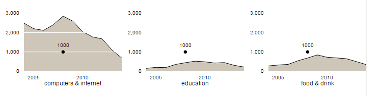
Adding A Trackball
This is where things start to get a bit more fun!
The basic principle of d3fc is that visualisations should be data-driven, this includes interactive features such as tooltips and crosshairs. Using a unidirectional data-flow concept that is familiar to React developers, interactions should update the underlying data bound to the chart / visualisation. Whenever the data changes, the entire visualisation should be re-rendered in order to reflect this change.
This approach makes use of the idempotent nature of D3 data joins and the efficient way they update the DOM via the different selections (enter, update, exit). For further information and worked examples take a look at the excellent article on D3 data join by Chris Price.
This approach allows us to split the problem in two - the first is the rendering of the small ‘trackballs’ that follow the mouse position.
We’ll start by adding a dummy trackball point to each of the nested categories:
nested.forEach((g) => {
  g.trackball = [{
    year: 2008,
    value: 1000
  }];
});
The trackball is basically a point series with a single point, so we’ll add another series to the visualisation:
const point = fc.seriesSvgPoint()
  .crossValue(d => d.year)
  .mainValue(d => d.value)
  .size(25)
  .decorate((selection) => {
    selection.enter()
      .append('text');
    selection.select('text')
      .text(d => d.value)
  });
The above code illustrates another interesting d3fc feature, the decorate pattern, which allows you to access the underlying selection used to render a component. This allows you to add / update additional elements as part of the enter / update selections. In this case a text element is added that renders the value associated with the trackball.
The final step required to render these dummy trackball points is to add them to the multi series:
const multi = fc.seriesSvgMulti()
  .series([area, line, gridlines, point])
  .mapping((data, index, series) => {
    switch (series[index]) {
    case point:
      return data.trackball;
    default:
      return data.values;
    }
  });
Notice that the mapping function is now a little more complex, with the point series that represents the trackball rendering the trackball property value.
With these changes each chart now has a non-interactive (and somewhat useless) trackball:
(View the source code for this chart)
You’ll notice that even though all the charts have the same trackball value, they have their own trackball property in the underlying bound data, which will allow them to move independently.
Adding Interactivity
Now that we’ve got a trackball that renders, it’s time to add event handlers that update the underlying data and re-render the chart.
The following code wraps the small multiples data join in a render function that is invoked whenever the user moves their mouse over any of the charts:
function render() {
  const update = d3.select('#small-multiples')
    .selectAll('div.multiple')
    .data(nested);
  update.enter()
    .append('div')
    .classed('multiple', true)
    .merge(update)
    .call(chart);

  const pointer = fc.pointer()
    .on('point', function(event) {
      // update the data here
      render();
    });

  d3.selectAll('#small-multiples .plot-area')
    .call(pointer);
}

render();
There are a few things going on in the above code: - Previously the data join used to render the small multiples only had logic in the enter selection. The above updates this to correctly handle enter and update. - The d3fc pointer component is used to add an event handling for each of the small multiple charts. The pointer component is very simple, it adapts mouse events returning an array containing the mouse location. It’s sole purpose is to make it easier to wire up mouse events to the underlying data which ‘drives’ the visualisation.
Now that the basic render-loop is in place, it’s time to update the event handler to snap to the nearest year and display the correct value for each small multiple.
This is a pretty straightforward task, if the event contains a non-empty array the mouse is located within the plot area. The xScale can be used to determine the nearest year, then for each small multiple it’s simply the case of finding the value for this year:
const pointer = fc.pointer()
  .on('point', (event) => {
    if (event.length) {
      // determine the year
      const year = Math.round(xScale.invert(event[0].x));
      // add the point to each series
      nested.forEach((group) => {
        const value = group.values.find(d => d.year === year);
        group.trackball = [{
          year: year,
          value: value.n
        }];
      });
    } else {
      nested.forEach((g) => {
        g.trackball = [];
      });
    }
    render();
  });
With this in place the trackball is now interactive and highlights the value for each series:
(View the source code for this chart)
I’ve also added a bit of extra logic to hide the x axis when the trackball is visible, and a vertical line annotation to render the ‘tracked’ year on the axis.
Responsive Multiples
Small multiple visualisations are generally quite large, making it a challenge to render them on smaller screens. As they are basically a grid of small charts, the obvious approach to making them responsive is to vary the number of columns based on the overall screen width, using a similar approach to the bootstrap grid system.
For most D3-based visualisations this is quite a complex task as the layout calculations are often performed manually using patterns such as the margin convention.
As mentioned previously, the d3fc cartesian chart uses flexbox for layout, so there is no need to compute margins or manually layout the individual charts. It also has another useful feature; the chart uses d3fc element to create its rendering surface, which brings the benefit that it redraws itself when the size of the containing element changes.
As a result, all that is needed to make this visualisation responsive is some simple media queries:
#small-multiples > div {
  display: inline-block;
  height: 185px;
  width: 50%
}
@media (min-width: 600px) {
  #small-multiples > div {
    width: 33%
  }
}
@media (min-width: 800px) {
  #small-multiples > div {
    width: 25%
  }
}
@media (min-width: 1000px) {
  #small-multiples > div {
    width: 20%
  }
}
To see this in action, try out the final visualisation full-screen and change the browser window width. You can also see the final source code for this example.
Hopefully you’ve found something useful in this article, and if you’ve built an interesting small multiple visualisation using D3 or d3fc please share!
Regards, Colin E.
