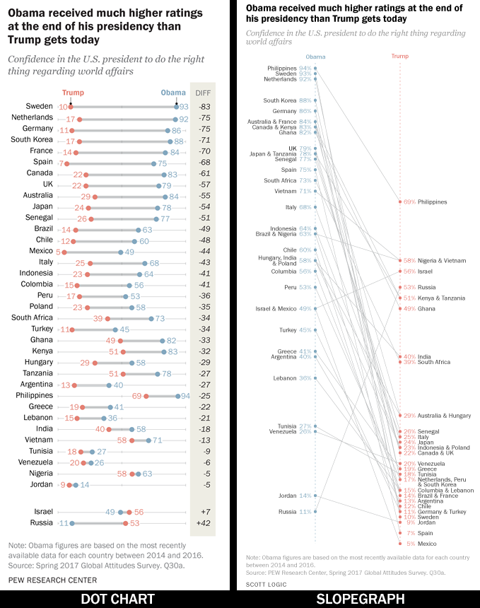
A few days ago I stumbled across the following visualisation from a PEW Research article, ‘U.S. Image Suffers as Publics Around World Question Trump’s Leadership’.
The visualisation (as well as the underlying story!) intrigued me because I’m a sucker for a slopegraph and this struck me as a perfect opportunity for one. For those unfamiliar with slopegraphs, they are an effective way of plotting the difference between two instances of the same measure, typically a change between two points in time.
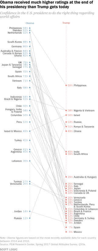
I wanted to better understand why the authors might have chosen the dot chart form, so recreated the visualisation as a slopegraph, maintaining similar styling to keep any comparison from off into aesthetics.
How They Compare
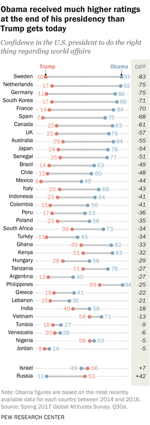
The original dot chart is designed to highlight the change in particular: the difference is called out explicitly as a value and the countries are listed from biggest negative change down to smallest and then back up to the biggest positive change. The visualisation also emphasises this value by plotting it as horizontal lines, allowing readers to easily compare their relative lengths.
By contrast, the magnitude of the difference is represented by the slope of the lines in the slopegraph; making it slightly trickier to make accurate comparisons between values. This anecdotal observation is supported by Cleveland’s and McGill’s ranking of elementary perceptual tasks. Their findings suggest length (as used in the dot chart) allows more accurate judgements than angle (as used in the slopegraph).
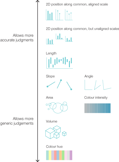
Cleveland’s and McGill’s ranking of elementary perceptual tasks visualised
based on a visualisation from Alberto Cairo’s The Functional Art
However, arguably, the overall trend and outliers are more immediately obvious in the slopegraph in part because the lines all occupy the same visual space. The slopegraphs more abstract overall appearance also encourages a more “big picture” view at first, where the dot chart’s more tabular layout invites the reader to dive straight into the details.
The outliers, in particular, are more prominent in the slopegraph. The inverse gradient of Russia’s and Israel’s lines stand out, as do those countries where the difference is less significant. All these cases are at the bottom of the dot chart’s list and do not stand out at a glance. Furthermore, it takes a little concerted attention to identify that Russia’s and Israel’s confidences have changed for the better rather than the worse. Given the context of the overarching story being presented by PEW Research, this lessening of the outliers better supports their message.
Although the slopegraph is less strongly on-message, it does better support additional insights around the data in question. By plotting the values along two separate scales it is straightforward to see the order and distribution of the the values on each individual scale. That is, it is easy to discern countries’ confidences in Obama and Trump separately. Similar insight can be obtained from the dot chart but it requires more explicit effort because the order of the Obama and Trump values are jumbled.
Unfortunately, the slopegraph’s plotting of values along scales rather than the per-item listing of the dot chart does introduce the problem of occlusion, i.e. values can obscure one another. In this particular case, I combined the labels of countries with matching values, but various other strategies exist for dealing with this problem. However, this results in moments of significant ambiguity. For example, is it Israel or Mexico that has more confidence in Trump than Obama?
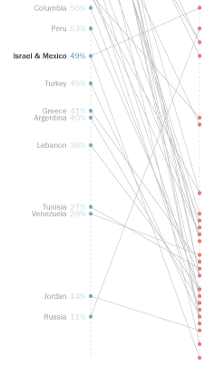
Answering that question when looking at the Obama value requires one of the lines to be traced in order to find the corresponding Trump label. With an interactive visualisation this would likely be less of an issue, but as a static graphic problematic scenarios can easily arise and there are no bulletproof solutions.
Better or Worse?
Surprisingly (to me), the exercise of creating the slopegraph my gut told me might be a better form than the dot chart has actually reinforced the appropriateness of PEW Research’s chosen approach. It focuses attention on their key message that “Obama received much higher ratings at the end of his presidency than Trump does today”, whereas the headline supported by the slopegraph would likely focus on the Russia and Israel outliers.
It highlights how important it is to have a good design process that carefully considers context, message and audience and to make strong, informed decisions based on those insights. It is not a question of better or worse, these two forms of representing change are simply different, with subtle but significant differences in their communication emphasis.
At least, that’s my opinion. What do you think?