Polymer 3.0 was announced over the summer, introducing a whole raft of changes to modernise a Polymer developer’s workflow and provide a consistent toolset more in line with other major JavaScript frameworks.
It’s worth noting that at the time of posting Polymer 3.0 is still a preview, and so any code featured here might become stale when a stable version is released in the future.
The announcement contains some cool changes, like removing Bower in favour of NPM. However what really got me interested was the switch to ES6, particularly replacing HTML imports. This post will showcase how to combine these new features to write a simple page in a very similar way to how I’ve shown before with both Angular and React, shown in one of my previous posts. This should provide a neat direct comparison with the other current leading front-end JavaScript frameworks.
The tech
For this demo I’ll try and stay latest and greatest, using TypeScript, Webpack 2, cssnext and yarn. For more information on yarn vs npm check out a previous post here!
I’ll also be showing how to split out the styling, content and JavaScript out into separate files.
Splitting files
Before this update files could be included using HTML imports, i.e.
<link rel="import" href="http://some.url.com">
and a single file might contain the HTML, CSS and JavaScript, in style and script tags.
When the browser sees this link it will synchronously (by default) fetch the document and its content. If there are any more links in that document they will be fetched too. An advantage of links is that if the same dependency is present in several files, it will only be downloaded once, known as ‘de-duping’. However, this isn’t bulletproof. De-duping only works on exact URL matches for dependencies. HTML imports also have the advantage of not requiring any bespoke build tools to load the content.
To allow the styles and content to be split out we need to configure our build and TypeScript to understand how to import HTML and CSS. The magic for the webpack build is housed within:
rules: [
  {
    test: /\.html$/,
    use: ['text-loader']
  },
  {
    test: /\.ts?$/,
    use: 'ts-loader',
    exclude: /node_modules/
  },
  {
    test: /\.postcss$/,
    use: ['text-loader', 'postcss-loader']
  }
]
Then in our TypeScript files we can import the rest of the component:
import * as view from './page.component.html'
import * as css from './page.component.postcss'
and use
static get template() { return createTemplate(view)(css) }
where I’ve split out the creation of templates into a helper function to be re-used across the codebase:
export const createTemplate = view => css => `<style>${css}</style> ${view}`
Because Polymer expects the template to be a string, we use text-loader to import both the styles and the content as a single string, and combine them in the template in the appropriate form. Now every component we create can follow the same pattern.
Of course if your preference is to include the content or the styles in with the component’s JavaScript that’s still possible in Polymer 3.0!
The components and transclusion
Transclusion is a powerful technique that allows generic components to have custom content injected into them. A component skeleton is written, and includes predefined sections in which extra content may be inserted from any calling component. Transclusion existed in Polymer since version 1, with the originally called content and then changed to slot. This looks to remain the same in Polymer 3.0. To show a direct comparison with Angular and React I’ll create the same semantic components as in a previous post. In that post a simple set of page components were created, each using some form of transclusion to allow the content of the page and header, respectively, to be inserted from the parent.
As before we have a Page component, except this time the selector is imaginatively called my-page. This is because for custom components in Polymer the name must contain a dash (the full rules are explained here).
Due to the separation, and the use of helper functions, the TypeScript isn’t all that interesting:
import { Element } from '@polymer/polymer/polymer-element'

import * as view from './page.component.html'
import * as css from './page.component.postcss'

import { createTemplate } from '../util'

class Page extends Element {
  static get is() { return 'my-page' }

  static get template() { return createTemplate(view)(css) }
}
The real functionality now resides solely in the HTML file:
<div class="page">
  <slot name="page-header"></slot>
  <div class="body">
    <slot></slot>
  </div>
</div>
Here we have a default slot into which any content specified as a child of the page element will be inserted by default. There is also a named slot, to provide an optional header.
The page-header works in a very similar way, with a minor adjustment.
The header accepts a title, so this must be specified using Polymer’s properties property:
static get properties() {
  return {
    title: {
      type: String
    }
  }
}
and then this can be used as normal inside the template:
<div class="header">
  <h1>[[title]]</h1>
  <slot></slot>
  <div class="side-header">
    <slot name="page-side-header"></slot>
  </div>
</div>
Again we see the use of multiple slots.
Putting it all together
Now we have our components we can combine them to create our semantically laid out page! As before, the TypeScript is not particularly interesting – when we start to add more functionality, interactivity and responsiveness this would become far more rich, but for the purposes of a static page there’s really quite little to add.
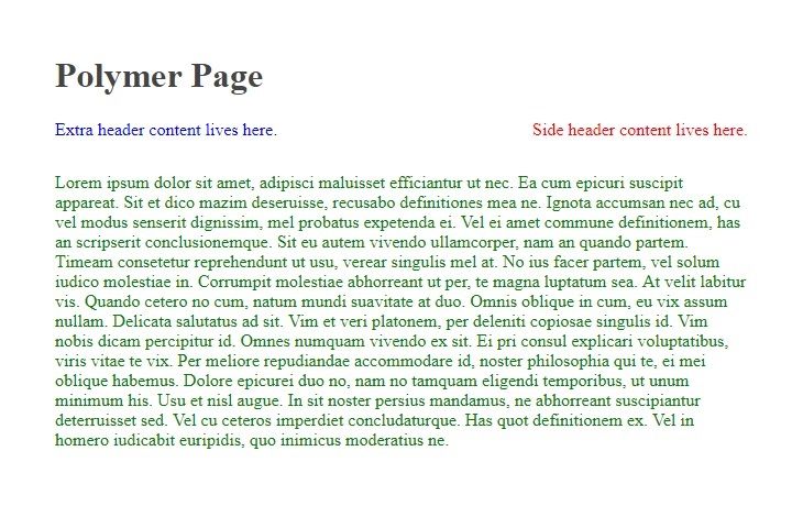
<my-page>
  <page-header slot="page-header" title="Polymer Page">
    Extra header content lives here.
    <div slot="page-side-header">Side header content lives here.</div>
  </page-header>
  <div>
    Lorem ipsum dolor sit amet, adipisci maluisset efficiantur ut nec. Ea cum epicuri suscipit appareat. Sit et dico mazim deseruisse, recusabo definitiones mea ne. Ignota accumsan nec ad, cu vel modus senserit dignissim, mel probatus expetenda ei.

    Vel ei amet commune definitionem, has an scripserit conclusionemque. Sit eu autem vivendo ullamcorper, nam an quando partem. Timeam consetetur reprehendunt ut usu, verear singulis mel at. No ius facer partem, vel solum iudico molestiae in. Corrumpit molestiae abhorreant ut per, te magna luptatum sea. At velit labitur vis.

    Quando cetero no cum, natum mundi suavitate at duo. Omnis oblique in cum, eu vix assum nullam. Delicata salutatus ad sit. Vim et veri platonem, per deleniti copiosae singulis id. Vim nobis dicam percipitur id.

    Omnes numquam vivendo ex sit. Ei pri consul explicari voluptatibus, viris vitae te vix. Per meliore repudiandae accommodare id, noster philosophia qui te, ei mei oblique habemus. Dolore epicurei duo no, nam no tamquam eligendi temporibus, ut unum minimum his. Usu et nisl augue.

    In sit noster persius mandamus, ne abhorreant suscipiantur deterruisset sed. Vel cu ceteros imperdiet concludaturque. Has quot definitionem ex. Vel in homero iudicabit euripidis, quo inimicus moderatius ne.
  </div>
</my-page>
And there it is!
To me this looks incredibly similar to a corresponding Angular page. The naming of the slot, for example with the page-side-header I feel is less readable than its Angular counterpart, however passing data down the components (title="Polymer Page") is less opaque than Angular’s [title]="'Angular Page'". Overall though there’s really not much between them. The syntax of slot plays a little nicer with me than the branded ng-content too.
Loading this up in Chrome we see
It goes to show how Polymer’s shifting to ES6 and away from HTML imports can dramatically change the code presentation to be much closer with other frameworks. The Polymer team themselves admit that HTML imports have not “gotten traction”, and ES6 is now supported in most of the major browsers.
Conclusions
I see the next version of Polymer as a great step forwards into the ever-changing ‘modern web’. To increase its competitiveness and potentially grow its user base the changes they’ve detailed are almost necessary. Also despite only in preview it has been relatively easy to create a full build using some of the latest tools.
What these changes might mean for WebComponents remains to be seen, and will probably become clearer when the new version is officially released.
I for one will look forward to seeing this fully released and giving it a real test drive in a more complicated setup.
Nick
Full source code for this app is available on Github.