
What R you talking about
I recently found myself on a bus journey with nothing to do but talk to my partner! She’s a Statistical Programmer and uses a programming language called SAS, however she informs me there is a lot of talk in her industry around the new kid on the block, R. Now this isn’t the first time I’ve heard of R and it’s uses for analysing data sets, indeed the 2017 Stack Overflow survey shows R as the programming language used by 4.5% of respondents. Now those are hardly stunning figures, coming in just under Assembly but that’s still over 3000 people who took the survey using it. So having a spare 20 minutes I thought I’d have a little play and see what the fuss is all about.
What R the setup steps?
First up, technically S is the name of the programming language and R is an implementation of S which includes the language and a suite of tools. It’s an interpreted, case sensitive, expression language with a fairly simple syntax which is not to hard to pick up if you have done some programming before.
There are a few tutorials about, most of which use sandboxes to allow you to type commands and view results directly in your browser (I found Code School to be a good start point), however I wanted to run it on my machine and be able to have a play with my own setup.
I’m using a Windows machine so I headed over to the R project site and downloaded the R .exe for Windows.
Once installed this comes with it’s own GUI which you can simply open up and start typing into the console window.
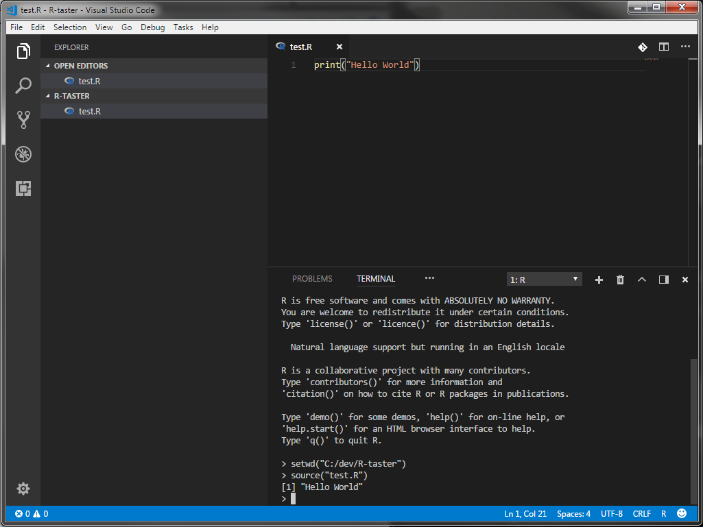
So the setup is pretty simple however the GUI leaves a bit to be desired and call me snobby but I much prefer to work with VSCode or IntelliJ where I can. This, as it turns out, is not a problem. First I set the R.exe path in my environmental variables. Next I created a new directory for my R code and added a file called test.R with VSCode. then all I had to do was open up a terminal window in VSCode and run a couple of commands to get up and running. If you want to replicate this follow the above steps then in the test.R file add a line of code:
print("Hello World")
next in the terminal:
$ R
This should start the R interpreter then you can type:
setwd("<path/to/your/R/files>")
To set the working directory, and lastly:
source("test.R")
To run the contents of your file. This should print out:
[1] "Hello World"
What R the basics?
Great so now we’re all setup lets have a quick whiz through the basics. I’ve not used many statistical languages before but I have had a bit of experience with MatLab in University and it feels very similar to that in both syntax and operation.
Because it’s interpreted we can have a quick play in the console to evaluate some expressions:
> 1 + 1
[1] 2

> "Hello World"
[1] "Hello World"
We can assign variables using the = operator but convention seems to be to use <- instead, for example.
> x <- 2
> x
[1] 2

> x == 2
[1] TRUE
So far so good. The main data structures we are going to work with in R are Vectors, Matrices and Data Frames.
Vectors
Vectors are defined using c for combine as follows:
> c(1, 2, 3)
[1] 1 2 3
There are however a couple of gotchas. Elements are 1 indexed rather than the conventional 0 and whilst all elements are required to be of the same type, if you pass different types rather than error, R will simply convert the values to characters:
> c(1, "2", TRUE)
[1] "1" "2" "TRUE"
We can do some nifty tricks though so it’s not all bad. We can populate a Vector with a sequence as using seq(1, 4) or 1:4 for short. This gives us a Vector with the values 1 2 3 4. We can also pass an optional third argument to seq to define the increments to count up in. For retrieving the data from a Vector we can access the Vector in the usual square bracket manner (remembering it’s 1 indexed) or we can pass a second Vector defining the indices we want back. Let’s have a play with an example:
# Define a Vector with values
myVector <- 1:4
> myVector[1]
[1] 1

> myVector[c(1, 3)]
[1] 1 3

> myVector[3:4]
[1] 3 4
Lastly we can assign a name to each element in a Vector and retrieve values by the name.
> names(myVector) <- c("a", "b", "c", "d")
> myVector["b"]
2
Matrices
We define a new Matrix using the matrix function and pass the initial value for each element, a row height and a column height.
> myMatrix <- matrix("a", 3, 3)
> print(myMatrix)
    [,1] [,2] [,3]
[1,] "a"  "a"  "a"
[2,] "a"  "a"  "a"
[3,] "a"  "a"  "a"
As with Vectors we can pass a Vector instead of a value to initialize the matrix. In the printout above you may note that rows and columns have their indices referenced, we can use these values to extract rows or columns from a matrix:
> myMatrix <- matrix(1:9, 3, 3)
> myMatrix[,2]
[1] 4 5 6
It’s worth noting at this point the dim function that allows you to reshape the dimensions of a Vector by passing a Vector representing the required number of rows and columns:
> v <- seq(1, 5, 0.5)
> print(v)
[1] 1.0 1.5 2.0 2.5 3.0 3.5 4.0 4.5 5.0
> dim(v) <- c(3,3)
> print(v)
    [,1] [,2] [,3]
[1,] 1.0  2.5  4.0
[2,] 1.5  3.0  4.5
[3,] 2.0  3.5  5.0
Data Frames
Data Frames are a list of Vectors of equal length, essentially analogous to a database or Excel table. For example we can create a couple of Vectors and then use them to create a new Data Frame.
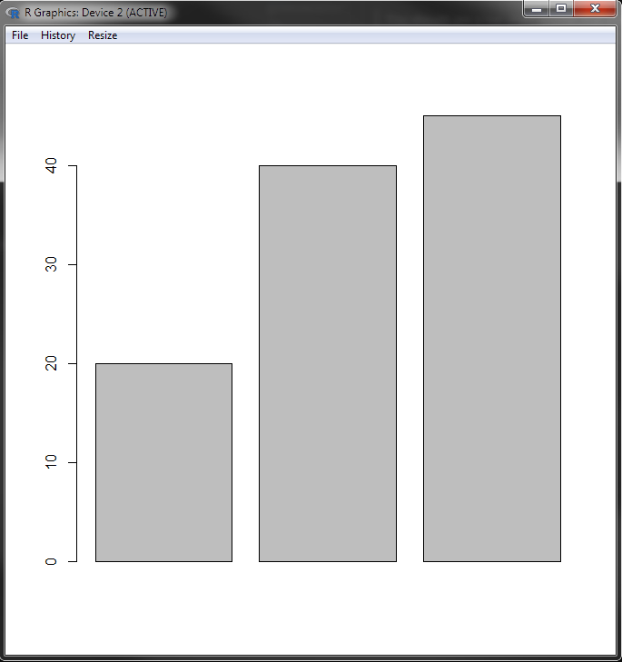
> hats <- c("hat 1", "hat 2", " hat 3")
> cost <- c(20, 40, 45)
> df <- data.frame(hats, cost)
> df
   hats cost
1  hat 1   20
2  hat 2   40
3  hat 3   45
Data Frames provide some extra functionality compared to a Matrix, one being that we can load a .csv straight into a Data Frame using read.csv("path/to/file"). We can also extract columns from the Data Frame using $ notation. For example if we want to get the costs of all hats:
> costs <- df$cost
> costs
[1] 20 40 45
sum(costs)
[1]105
R you ready for the Charts?
While this isn’t nearly all there is to know, it’s a good start and we’re just about ready to have a play with making some graphs. R comes with a basic charting library straight out of the box which will let us do quite a lot. Let’s have a go at a basic bar chart using our hat data:
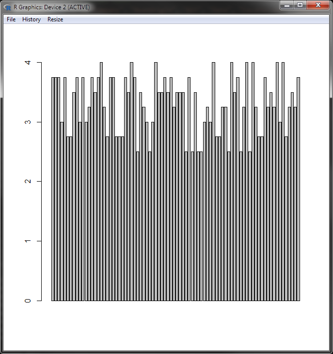
barplot(df$cost)
You should see a bar chart appear that looks a bit like this:
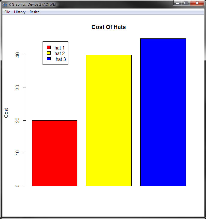
That’s great, and to be fair pretty easy, but we can do a bit better by passing in some of the optional parameters that will add labels and colour to our chart:
barplot(df$cost, main="Cost Of Hats", ylab="Cost", legend=df$hats, col=c("red", "yellow", "blue"), args.legend = list(x=1.0))
The extra options to set are as follows:
main- the main title for the chartylab- y axis labellegend- Vector of values for the legendcol- Vector of colours for the barsargs.legend- an x offset for the legend to stop it overlaying the bars
Nice, let’s shift it up a gear now and try loading in a bigger data set. I’m going to use the Chocolate Bar Ratings data set, publicly available from Kaggle for the next part. To follow along you should download the flavours_of_cacao.csv file from Kaggle.
Once you have that it’s time to put some code into the test.R file. First we need to load the csv into a Data Frame.
data <- read.csv("flavors_of_cacao.csv")
Now before we go any further let’s have a look at what we have. Typing data into the console will print the entire csv to screen, you can do this if you like but what we are more interested in are the csv headers. R has a command we can use to get the headers from the csv file:
> colnames(data)
[1] "Company ...Maker.if.known."       "Specific.Bean.Origin.or.Bar.Name"
[3] "REF"                              "Review.Date"
[5] "Cocoa.Percent"                    "Company.Location"
[7] "Rating"                           "Bean.Type"
[9] "Broad.Bean.Origin"
As we can see some of the column names that ship with the csv file are not optimal. Fortunately we can change them easily using the same command. Add another line to the test.R file under the data load:
colnames(data) <- c("Company", "BeanOrigin", "REF", "Date", "CocoPercent", "CompanyLocation", "Rating", "BeanType", "BeanOrigin")
Save and run the file using source("test.R") then use the console to check the column names again:
> colnames(data)
[1] "Company"         "BeanOrigin"      "REF"             "Date"
[5] "CocoPercent"     "CompanyLocation" "Rating"          "BeanType"
[9] "BeanOrigin"
Much better, let’s make a graph! Looking through the data we can see that companies have different ratings on different years and for different products. That’s a lot of data so we’ll start simple and filter out a specific year that we are interested in getting an insight into. Say we want to look at 2012, we need to create a subset of the data we have, we can store this as a separate variable or simply overwrite our existing data.
data <- subset(data, data$Date == "2012")
Next we want to have a look at the rating for each company in that year, however some companies with multiple products have more than one rating. We are going to filter our data again, this time using the aggregate function to get the maximum rating each company received in 2012:
maxRatings <- aggregate(data$Rating, by=list(data$Company), max)
If we run the code and have a look at maxRatings you should see that the returned Data Frame has two column headings: Group.1 - which is our Company name and x - which is the maximum rating the Company received that year.
Let’s use the x value to create a chart.
barplot(maxRatings$x)
Not bad for 5 lines of code! Once again we’ll add in a few parameters to tidy things up and make it look pretty, your code should now look like this:
...
maxRatings <- aggregate(data$Rating, by=list(data$Company), max)
par(mar=c(12,5,5,1))
barplot(
   maxRatings$x,
   col=rainbow(20),
   main="Ratings for 2012",
   ylab="Rating",
   names.arg=maxRatings$Group.1,
   las=2,
   cex.names=0.8
)
First we use the par function to adjust our plot parameters, we are going to pass in some custom values for the margins to make everything fit nicely.
In the barplot function itself we will pass our data as before but also:
- a col value using the handy rainbow function to give us 20 rainbow colours
- a main title
- a y axis label
- some names for the x axis
- las indicates the orientation of the tick marks
- cex.names allows us to define a font size percentage for the x axis ticks
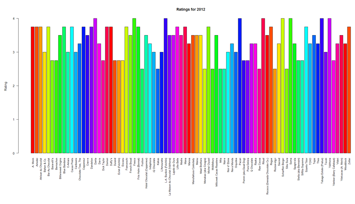
That’s looking pretty good, we can change the year by changing the value in the subset function or we can use a mean average instead of max in our aggregate function with the keyword mean.
MoRe Charts
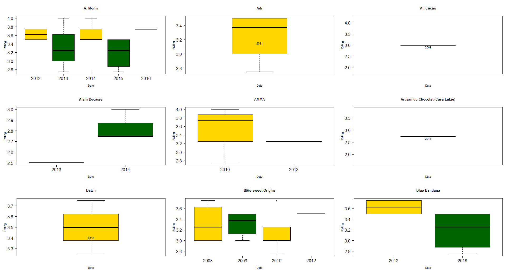
Let’s go a bit deeper and see if we can’t represent some other data from the file. This time we are going to have a look at all years and all ratings for a select number of the companies and create some box charts to show that data.
First we need to comment out the code that filters by year, aggregates and plots our data using the comment character #. Next we are going to create a factor from our data to allow us to have a look at unique companies:
types <- factor(data$Company)
If we now use the console and examine the levels of our factor
> levels(types)
We should get a print-out of all the companies in our Data Frame. Let’s pick a random nine to use for some graphs:
limitedCompanies <- levels(types)[c(1, 3, 5, 7, 15, 21, 27, 37, 41)]
This time we are going to create a graph for each company and display them all in a grid, just to be fancy! We’ll need the par function again:
par(mfrow=c(3,3), mar=c(5,5,5,1), las=1, cex.axis=1.5)
Most of these parameters we encountered before with the exception of mfrow which lets R know that we want to display our graphs in a 3 x 3 grid. Now for the code to create the charts:
for (cname in as.character(limitedCompanies)) {
   # get the subset containing just a single company
   companyData <- subset(data, data$Company == cname)
   boxplot(
       companyData$Rating ~ companyData$Date,
       main=cname,
       xlab="Date",
       ylab="Rating",
       col=(c("gold", "darkgreen"))
       )
   if(length(unique(companyData$Date)) == 1) {
       text(c(1:length(companyData$Date)), mean(companyData$Rating) - 0.1, companyData$Date)
   }
}
In the above code we first create a loop to iterate through each company name. We then create a subset of the data using the name of each company. Next we create our boxplot with some arguments we’ve seen before. If a company only has ratings for a single year the default boxplot behaviour is to not label the x axis tick, so in the if statement we’ll do a quick check to see if this is the case and if so add our own label into the chart.
And that’s it!
R We done yet?
We’ve had a look at just the basics of manipulating data sets with R and there’s plenty more that could be done. R makes it pretty easy to load in large files and quickly produce insights into the data they contain. For some simpler data you might be just as well using Excel but for more custom charts or larger data sets R might be more appropriate and you can ebbed R graphics into MS Office documents.
We’ve just used the inbuilt graphing library for the examples in the post but you can create some really nice visualisations by using some of the R libraries, easily included with install.packages command followed by library(<your library>) at the top of your R file. I’ll leave you with a few examples of what can be achieved.
All the code for this blog can be found here.
