Design specifications (specs) are guidelines that developers will use to implement a design. Think of an architect providing building blueprints to the construction team.
Many designers think of specs as mindless zombie work. They may even recruit a spec monkey (or more junior designer) to do it for them so that they can get on with the ‘real’ design stuff.
However, taking time and care to produce great specs can be fundamental to the success of your project.

Why are good specs important?
Designs are implemented correctly ✅🤩
If you fail to communicate your design properly, what gets built could have crucial differences from what you intended. A great design poorly communicated can easily turn into a clunky and frustrating user experience.
Helps you to spot holes in your design 🔍😬
Going over your designs with a fine-toothed comb will inevitably help you spot errors and edge cases you would otherwise have missed.
Saves time for everyone ⏰🥳
With good specs the development team have fewer unknowns, fewer bugs and fewer questions, because your specs will answer the questions for you.
Overall, great specs mean designs can be implemented quicker and to a higher quality. This is better for the team, the business and, ultimately, the users!
Creating specs is design
A good way to create better specs is to approach it like any other design task. When we design, we research our users. We uncover their goals, their pain points and their workflows.
Our approach to specs should be no different — we are creating a product for a user so should design it to best suit their needs.
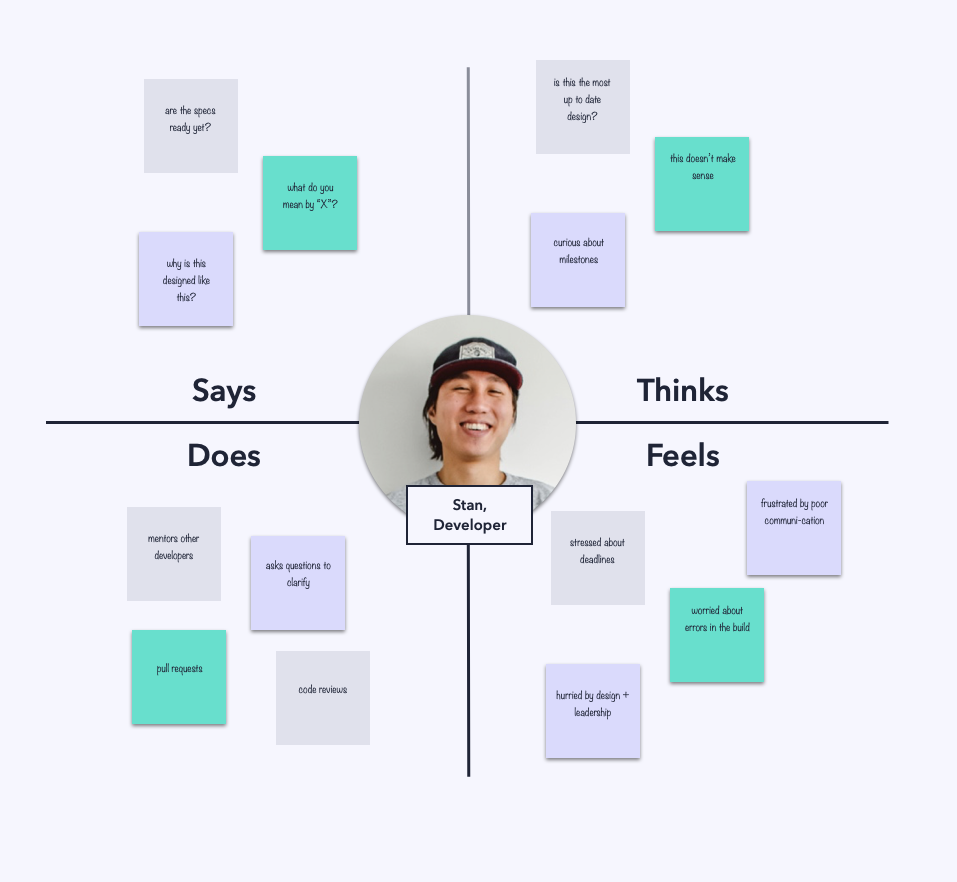
Talk to your developers — find out what their process looks like, what frameworks they are using, what can make their lives easier and what can drive them crazy!
When you begin to understand your team’s mindset and workflows, you can start to align your specs to them.
Start with a style guide
Style guides document the colours, text styles and other basic elements in your design. This is useful not just for ensuring consistency in your designs, but also for speeding up development and future spec work.
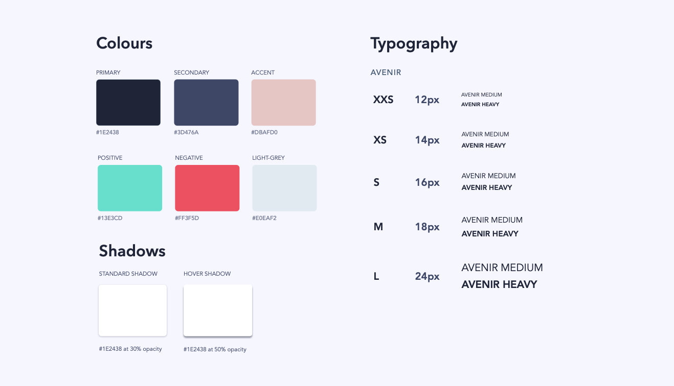
Now, instead of having to write out the styles for every element, you can just reference them in your style guide.
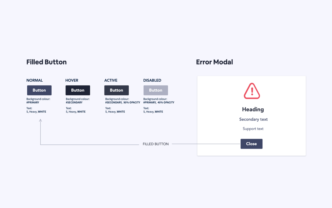
Component libraries
As your design progresses you can expand your style guide to include more complex UI components. Here you could include things like buttons, form elements and modals. Anything you find yourself reusing multiple times in your design should be defined here and referenced externally. Now, instead of having to specify the styles and behaviour of a component every time, you can do it once and refer back to it.
Why are these useful?
The advantages of style guides and component libraries for the design workflow have been heavily documented. But did you know they are also a dream come true for developers? A basic principle of good development is D.R.Y — Don’t Repeat Yourself. It states that “every piece of knowledge must have a single, unambiguous, authoritative representation within a system”.
This means that instead of repeating code in several places, you should write it once and refer back to it. Sound familiar?
This is exactly the mindset we are using when creating style guides and component libraries. By mirroring this workflow in your specs, you make it much more efficient to translate designs into DRY code.
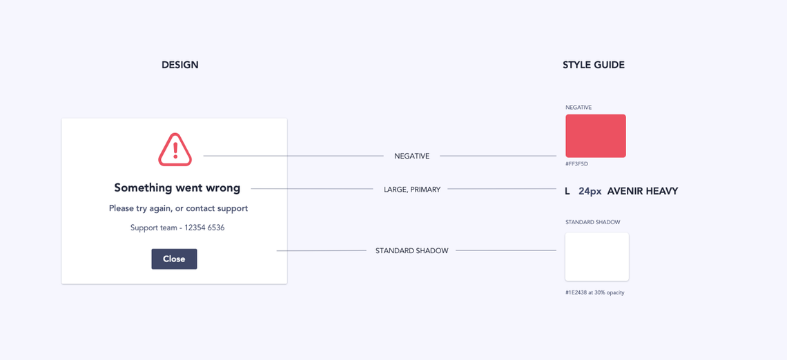
Visual Specs
Visual specs document all the styles and spacings on your designs, to ensure that your beautiful designs actually look good when they’re translated into code.
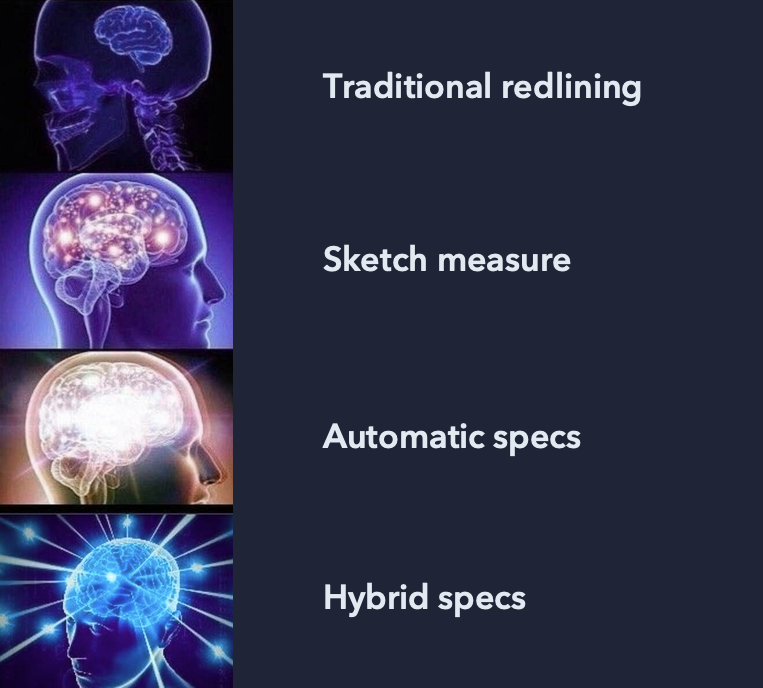
Manual vs. Automated Specs
Recently, a whole range of tools have been introduced promising to fully automate visual specs. Tools like Zeplin, Invision Inspect, Google Gallery and many more allow you to upload your design files and share them with developers, who can inspect and extract the styles of every element.

Just like other forms of automation, there are pros and cons to this method. Although they are a great way to save time, they only capture a static version of a screen. It’s likely that you will still need to do some kind of annotation to communicate interactive states and responsive behaviours.
That’s why my preferred method of creating visual specs is a hybrid approach — use the automated tools as a back up to communicate simple styles, but add your own annotations to demonstrate behaviours and point out the more important visual elements.
Visual Specs: Top Tips
Simplify, simplify, simplify
When creating your visual specs, don’t try to display all information about a screen in one go. Chances are it will be completely overwhelming and difficult to read.
As designers, we’d never subject our users to a screen of cluttered, unorganised information, so why do we do it to developers?
Instead, break the spec down into sections.
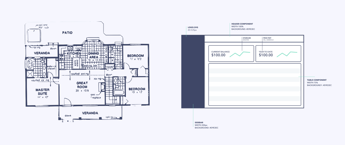
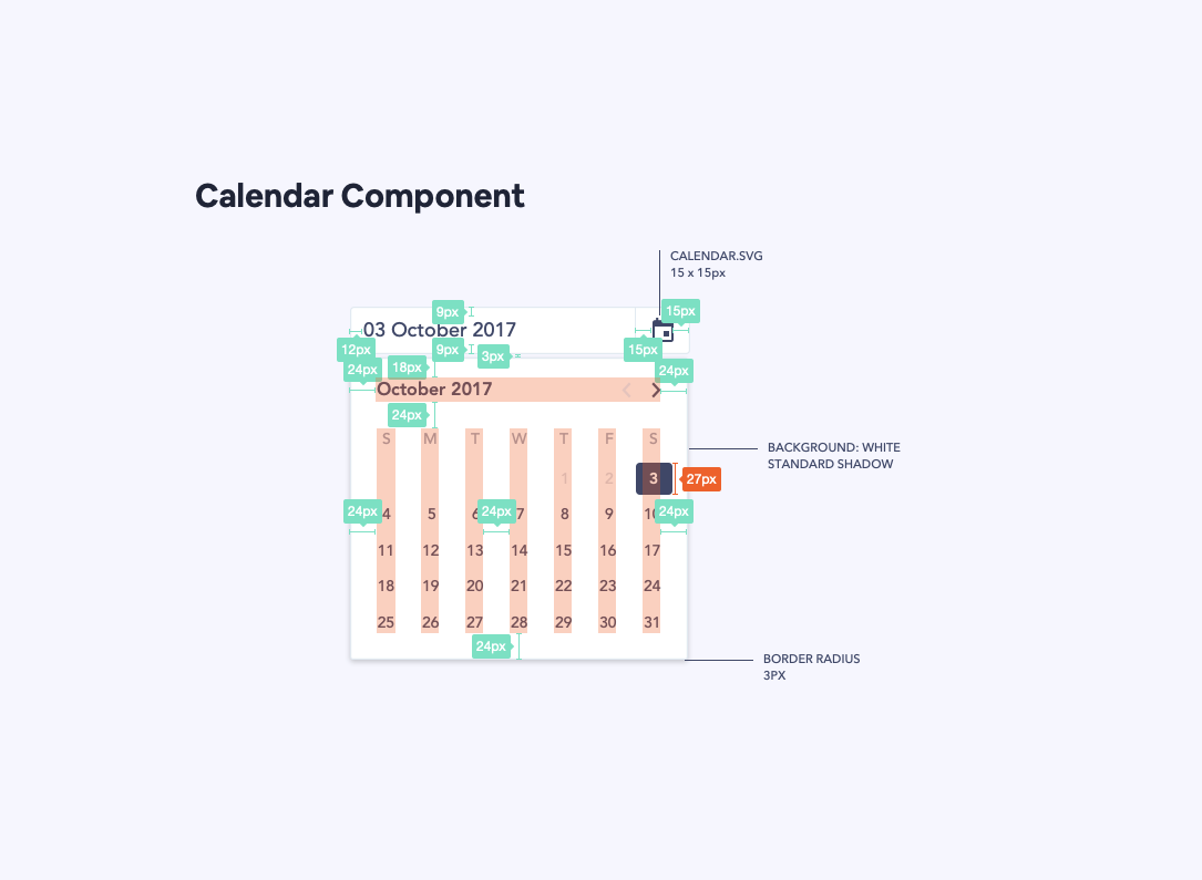
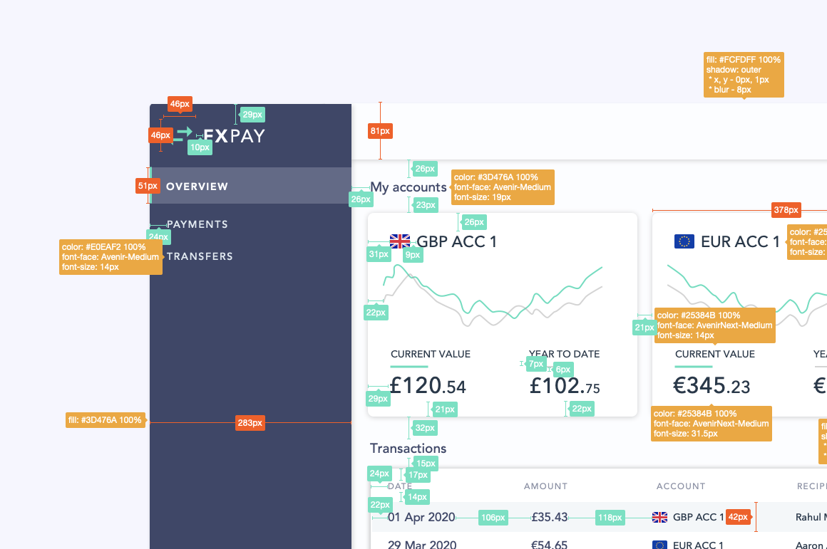
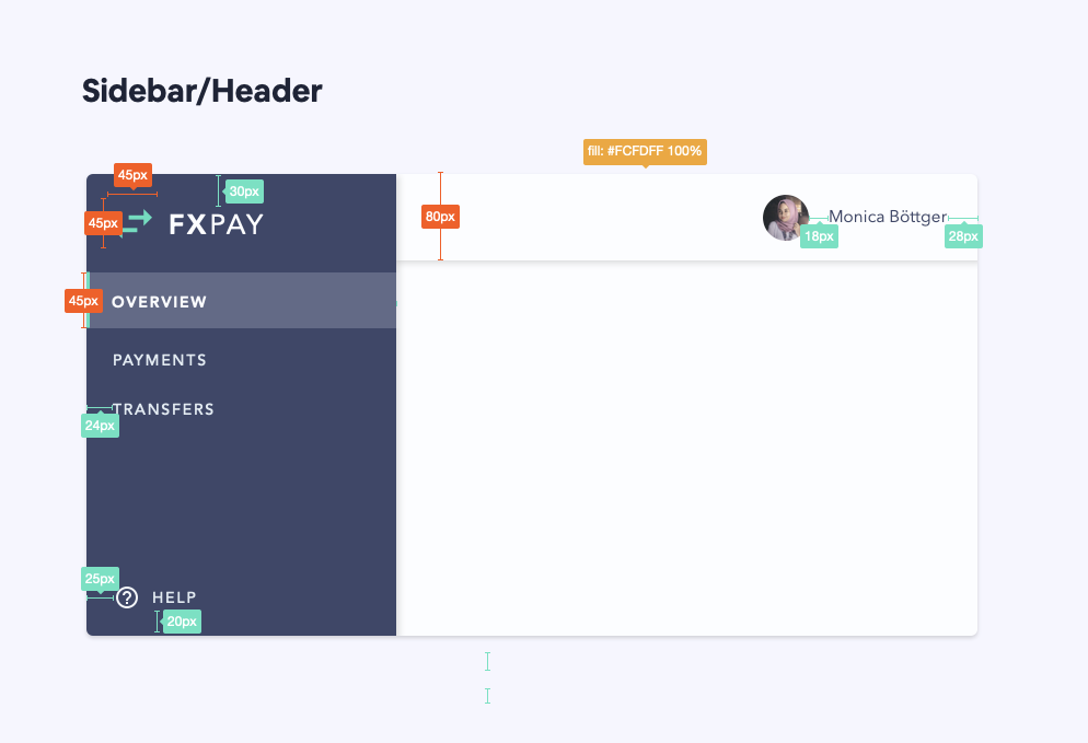
For example, you could start by speccing the outer area of a screen:
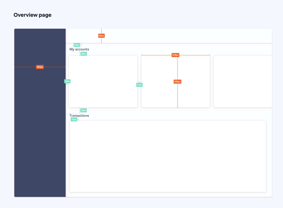
And then move on to how the different components fit within that screen:
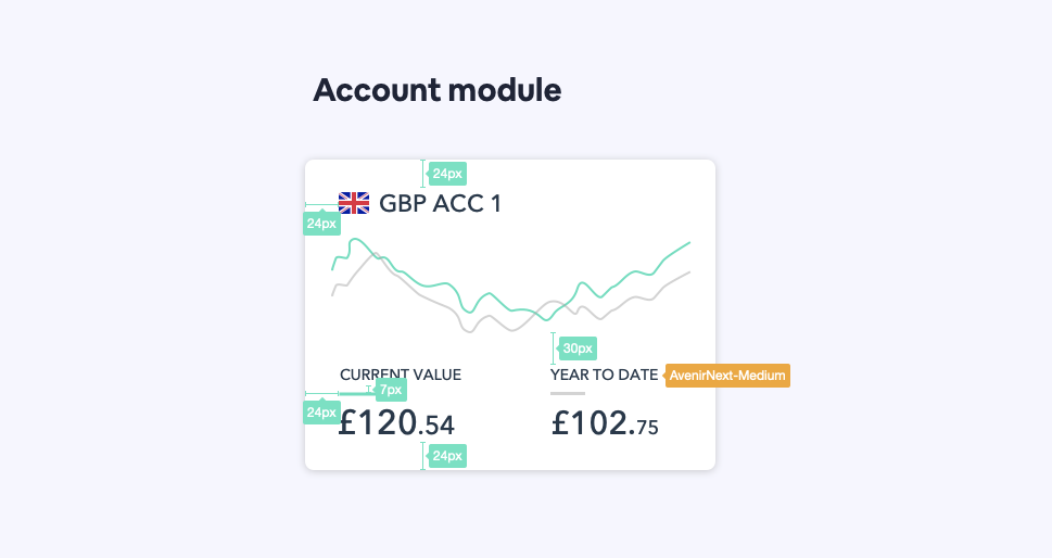
And finally, the inner styles of the component.
If a component is particularly complex, break down the specs into several parts, for example:
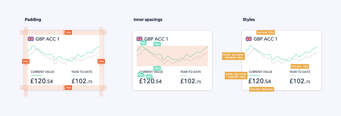
This will make the spec more digestable and there are less likely to be errors in implementation.
Always ask yourself, “is this clear and easy to read?” If not, you probably need to simplify!
Behavioural Specs
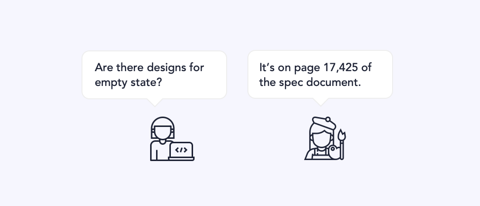
Behavioural specs are where you define the rules around how your design actually works. Sometimes we assume that a simple image is enough to communicate behaviour, but that’s rarely the case. Developers are not mind readers, and we should never assume that a user’s thought process is going to match our own.
Clearly defining your behavioural rules is the best way to ensure that your design actually works like you want it to.
Here are some ways to make sure your behavioural specs are clear to the person reading them:
Set context
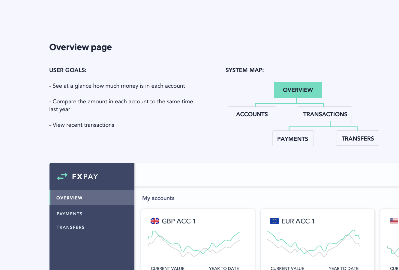
Imagine picking up a book halfway through and trying to understand what’s going on. No one likes to be thrown into the details without understanding the wider context. It’s important to communicate the background and surrounding context of a design before getting too specific.
Start your spec document with an overview of the feature. This could include user needs, site maps, user flows - anything that is useful in explaining the overall goal of this piece of work. You could also link to a walkthrough document or prototype if these resources exist.
When developers understand the background to a design, they can make more informed decisions and recognise why certain choices were made.
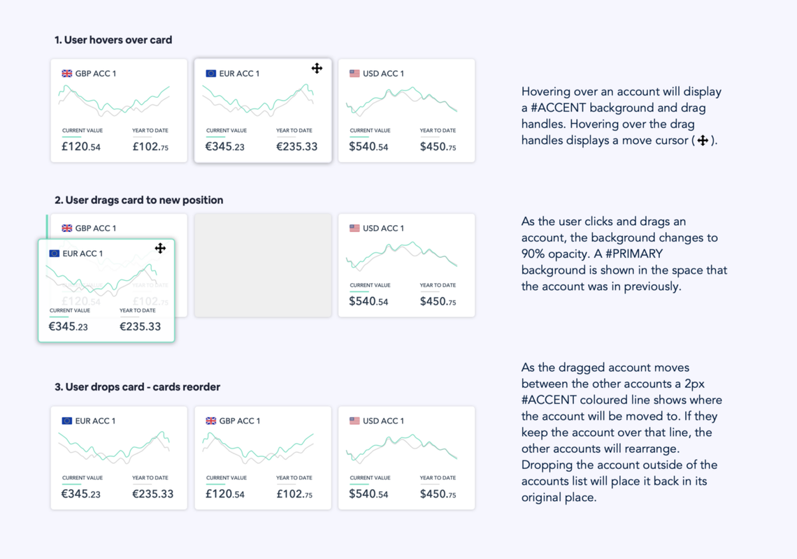
Show & Tell
Combine descriptions of behaviour with examples of how it will look. It can be very difficult to get an idea across with just pictures or just images, but together they can communicate almost anything.
Use simple, concise language. Give examples of things that are hard to explain. Ask yourself if you’d understand the behaviour described if you weren’t the one who had designed it.
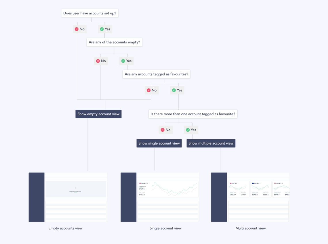
Tables & diagrams
You don’t need to stick with annotated hi-fidelity mockups to get your behaviours across. Sometimes using simple tables or diagrams can be a better way of communicating, especially if it involves complex logic or a lot of steps.
Combining traditional diagrams with wireframe versions of your screens can help link the abstract concepts and flows to how the real thing will look.
Organisation
So you’ve written your visual and behavioural specs. But if you just throw a gigantic document to your developers, there’s little chance they are going to read it or find what they’re looking for.
This circles back to understanding the context of use — how and why are people going to read this? What is the user’s workflow?
Most development teams will follow some form of agile process. They will usually break features down into individual stories, small enough for a single developer to tackle in a couple of days to two weeks.
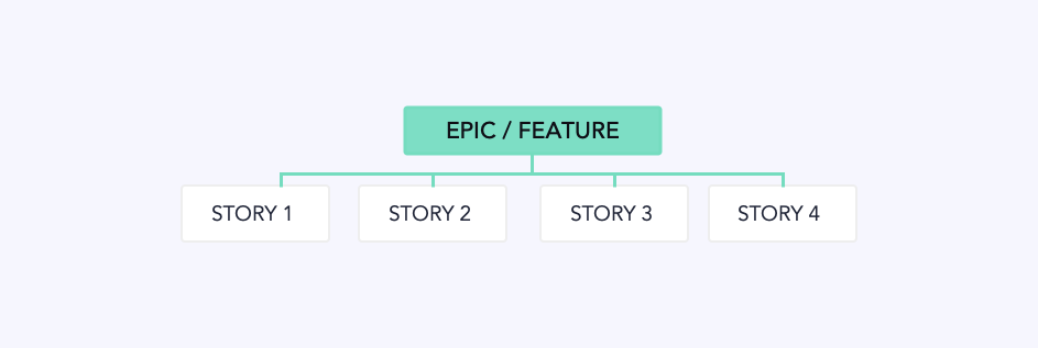
Breaking your specs down in a similar way can help make sure that people only get the information they need, without all the extra stuff.
Try to imagine what stories might be written in order to build this feature, and break your specs down to cover this. This might take some time to get used to how your particular team breaks down features.
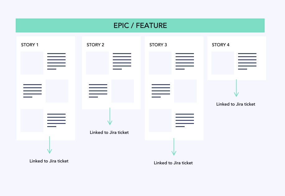
I organise my specs in Figma similar to the layout above. Each frame/artboard describes a story-sized slice of functionality. I can link to this frame straight from the corresponding story in Jira. It’s obvious what part of the spec relates to each story, and developers can also see the context surrounding that story in the other frames.
Iterate and improve
It can sometimes take several iterations to perfect a spec. This may seem like a waste of time, but we’d never dream of pushing out the first design that we come up with to our users.
How to create the perfect spec?
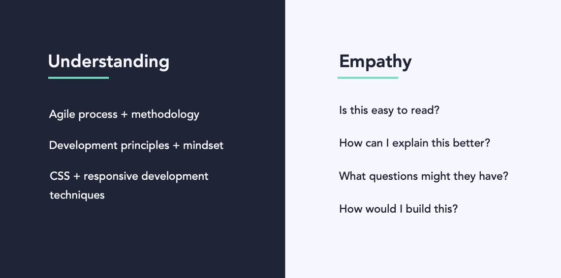
The key to good specs is the key to any good design: understanding and empathy.
Understand development workflows, principles and mindsets. Empathise with your end user: would you understand this in their shoes? Would you want to read it?