
As a test engineer, it can be difficult to appreciate just how many considerations there are for creating software that everyone is able to access. You may have heard of screen readers such as NVDA to aid those hard of sight, but how does your software react when zoomed in 400%? You may understand the importance of site navigation using only a keyboard, but you should be sure that you don’t end up running into any keyboard traps – and that you can tell just what is highlighted at any given point. You are able to confirm that all the links on your page are working, but are they as accessible on a smaller screen, or if a person is using their finger or a stylus pen?
Where do you start?
When it comes to ironing out the more common accessibility problems, automated tools make for an excellent aid! Such tools require a user to input their URL and generate a report based on that. However, the two that I had come across when looking into this can be run directly from the browser on which you would like to test. These two tools, which I personally found much easier to use, are WAVE and (the free version of) aXe DevTools, both of which work in similar ways.
If you are trying to get a quick and free overview of how accessible your webpage is, how do these two tools compare?
Testing tools in action
To demonstrate how each of these tools operate, the following site – a testing resource page – will be used. This site contains various engaging testing challenges that make it worth visiting. I would highly recommend trying out the dice game, though be wary that inspecting the console may spoil answers. This site also contains two of the most common types of accessibility problems: poor contrast and nondescriptive links. Before we start comparing in more detail, let’s see how both tools mentioned work!
WAVE
WAVE is a downloadable extension available for Chrome, Firefox and Edge. It can be run by clicking on the extension icon or through right-clicking the page and choosing the “WAVE this page” option. The same option can be used to close the WAVE extension – something that took me a small while to work out!
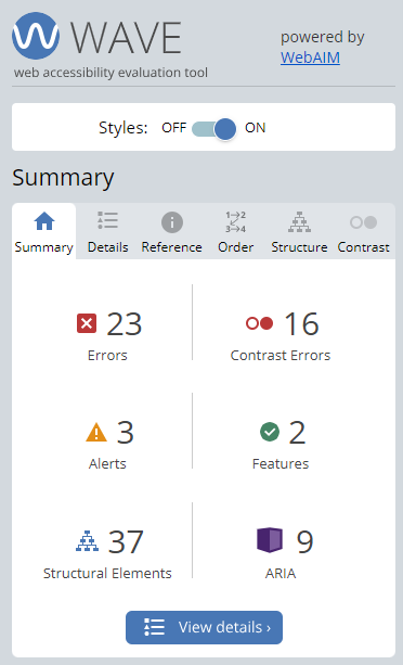
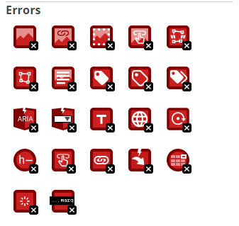
The icons that populate the page link to matching icons in the WAVE dashboard describing what the icon means in more detail. The red (error) and yellow (alert) icons are likely of most interest to the user. These icons are reflected on the page that is being tested – though depending on the contents of the page, it can suddenly make the page unreadable with both the density of the icons and the way in which they alter the formatting of the page! Thankfully, WAVE allows the page styling to be disabled so that each page component can be more easily viewed in isolation.
To jump to any specific error listed by WAVE, navigate to its ‘description’ tag and click on any of the individual icons underneath the various elements that WAVE has detected.
aXe
aXe is a downloadable extension available for Chrome, Firefox and Edge. It can be run by opening Devtools and clicking on the aXe extension offered by it, and then by clicking “scan full page” – most of the other features are locked behind the paid version of aXe, which is something I have not yet explored.
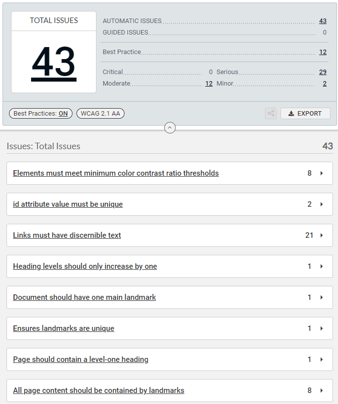
Once the scan is complete, the “Best practices” option is set to “on” so that everything that aXe has captured is present. Unlike WAVE, the page being tested does not get populated by icons. Instead, under each error there is an option to highlight the region in question that had caused the error to manifest. Most features that aXe offers are a part of its paid service but plenty of information is still offered.
How these tools should be utilised
Both accessibility tools have their uses for accessibility testing but they can never be used in isolation for full accessibility coverage. Both WAVE and aXe will also emphasise the need for manual testing. WAVE will do this if no errors are detected on the page. aXe will mention the need for this as a selling point for its paid service, which include guided tests.
The example I gave at the start of this blog post about keyboard navigation is the best example of something that accessibility tooling will never catch. Additionally, a single execution of either WAVE or aXe will usually not be enough as they only capture the current state of a website. This may miss, for example, errors in contrast when text changes after hovering over it with a mouse. WAVE’s colour contrast error description has specific mention of cases in which it would miss any potential contrast error. If a user wishes to use tools to verify that these colour changes still meet accessibility requirements, the accessibility tool will have to be run again once these changes in state are persisted on the page.
Also important to note is that any errors that are flagged up should be double-checked to verify that the issue is genuine. For example, text that is part of a logo or part of an inactive UI component (such as a ‘login’ button that can’t be clicked until the required fields are filled) may return ‘false positives’ from either tool.
What is found by both tools
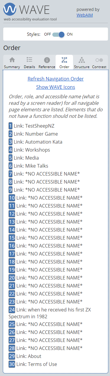
The information that both tools give on the lack of accessible links and contrast errors is extremely important. For the lack of accessible links, aXe supplements this information via snippets of the code from where the error originated, in which the user can note the lack of an alt text tag. WAVE goes one step further with this using its ‘order’ heading. This emulates the text heard when tabbing through a page with a screen reader such as NVDA, which is an aid for people with poor or no vision. If the text *NO ACCESSIBLE NAME* is seen, then NVDA would only inform someone using it that they have tabbed to a link, without any context.
On the latter point, both also indicate the actual contrast – and on this particular page highlights the difficulty that would come with manual testing of such a thing. The main text does fail accessibility checks, but at 4.44:1 ratio compared to the minimum of 4.5:1 ratio that would be hard to see by the naked eye, especially for a tester who does not have low vision or colour blindness.
How the information is presented
WAVE’s errors are presented as definite issues that need to be addressed whilst alerts are things that may or may not be an issue. In a similar vein, the information around features, structural elements and ARIA labels are presented as an explanation of what they are and why they may lead to an accessibility error. For example, any alt text is flagged as a feature, but WAVE will advise that it should cover the image’s content ‘accurately and succintly’. Whilst it’s highly unlikely for a webpage to contain every detectable error or alert, WAVE offers an icon index that a user can look through if curious. The extra information given serves as an excellent aid to manual accessibility testing once the errors picked up by automatic testing have been resolved.
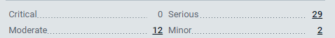
aXe, instead of separating by error and alerts, will include tags listing the severity of the found accessibility bug, ranging from ‘minor’ to ‘critical’. The number of each issue ranked by severity is presented in a table, and a user is able to filter the issues by clicking on the number. This would help a user prioritise found accessibility bugs for resolving.
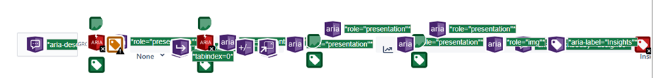
Additional information around what the accessibility tools have picked up also differs between the two. Whilst both tools offer solutions to fix the problems found, WAVE also provides a brief run-down on how the error can affect accessibility with links to official WCAG documents provided. For aXe, which will highlight the area of code which has triggered the accessibility errors, an explanation of ‘Why it matters’ is to be found in an external link. What will also be provided, where appropriate, are examples of code which would not fail the detected issue. This code I found particularly useful in understanding why landmarks need to be considered in relation to accessibility.
What extra information is provided
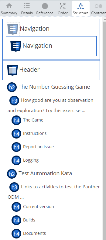
WAVE gives some additional information about the page that is not present in aXe. The list of features and ARIA labels already mentioned are an example of that but hidden links are also indicated, which become visible when formatting is disabled. As well as the ‘order’ tab mentioned earlier, the ‘structure’ tab presents the main sections of the page, including the heading, navigation and footer. Human judgement is needed here to check whether the page structure makes sense. Any errors around, for example, the heading order will be flagged up once again on this tab.
aXe is able to detect at least a few extra accessibility errors (based on testing of the TestSheep web page) that WAVE did not pick up on. The two extra errors – non-unique IDs and content not contained by landmarks – are both considered “best practice” by aXe. Whilst the presence of unique IDs prevents invalid markup, digging a little deeper reveals that a requirement for valid markup is no longer a requirement as of WCAG 2.0. In addition, whilst using landmarks (header, nav, main, footer) is encouraged, these can be replaced with div sections with specific roles instead. Nevertheless, consideration of both will be able to give that much more confidence in the accessibility of a user’s site.
The following table is a summation of the different information on page accessibility detected by the two tools.
| Feature | WAVE | aXe |
|---|---|---|
| Able to detect contrast errors | Yes | Yes |
| Able to detect lack of alternative text | Yes | Yes |
| Errors in heading structure checked | Yes | Yes |
| Directly detects if certain key landmarks are missing | No | Yes |
| Missing characteristics on ARIA role checked | No | Yes |
| Presence of duplicate Ids checked | No | Yes |
| Lists tab order of page with NVDA text shown | Yes | No |
| An overview of page structure is provided | Yes | No |
To conclude…
Since both WAVE and aXe are relatively easy to use, using both together can be beneficial. Here’s a use case from my own testing: when aXe flagged that the page content needed to be contained by landmarks, I used WAVE’s ‘structure’ tab to verify that there was no ‘Main’ landmark around the content of the page. This technically means that WAVE does provide information around landmarks, but if a user doesn’t know to look out for it (or to check for ARIA labels, which can be a substitute for landmarks) then it can easily be missed.
If choosing to utilise both, make sure that they are both used in isolation. The icons that pop up when using WAVE are mistakenly interpreted by aXe as being part of the page and will lead to false positives in accessibility checking.
There are of course many other options for automatic accessibility checks. This includes implementing them as part of automated code, sites that will generate more formal reports, and using a paid accessibility checker, such as that which aXe offers. However, if you are looking for a quick and free automatic accessibility check and only want to consider one, then this blog post will hopefully help with that. You can use the information here to form our own opinion, but to summarise my takeaway from using these two tools:
Use WAVE if:
-
You are also interested in the contents of the features that make up your website
-
You prefer a more visual ‘at a glance’ indicator of where detected accessibility errors exist on your page
-
You are also looking to check hidden elements on the page
-
You prefer more condensed explanations for any errors or alerts that have been picked up, which don’t require links away from the page
Use aXe if:
-
You are looking to catch as many accessibility errors as possible before the start of manual testing
-
You want to avoid having to disable page formatting, or dislike the way in which the WAVE icons are presented
-
You are more interested in quickly viewing the area of code which is causing the accessibility error
-
You find the more detailed breakdown of the accessibility problems useful, alongside code examples of how to fix them