The size of things is relative to the scale that we set. This might sound like a trivial notion, but it is key to creating meaningful data visualisations.
While attending a lecture on nanotechnology a few years back, I was introduced to The Powers of Ten, a documentary that perfectly illustrates this idea of scale. The documentary explores the relative scale of things in the Universe according to a magnitude based on a factor of ten. The film starts at a picnic in a park, and repeatedly zooms out by a factor of ten, going from the picnicker to the cosmic. It then takes us back to the picnicker, zooming to his hand, into the microscopic.
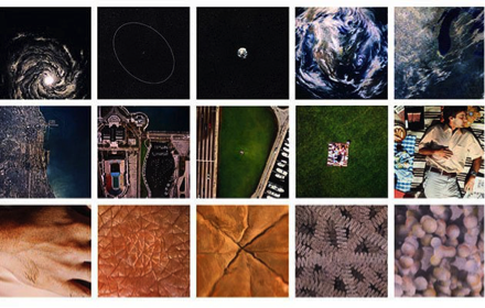
The main idea in the documentary is that the size of something is relative to what we compare it to. The hand of the picnicker is huge compared to the proton of a carbon within a DNA molecule, but it is tiny compared to the Universe. The less obvious point is that certain things become irrelevant at certain scales. For example, If we try to visualise the proton at the Universe scale, we will find it difficult to get anything meaningful. Each magnitude allows us to perceive a certain type of data.
When visualizing data, scale is inevitable. The minute we represent data, we make a decision about the scale at which we represent it. We sometimes make that decision subconsciously. Data visualization is much more powerful when we consciously set the scale, because it allows us to think about how to make the data meaningful at different levels of the scale.
One artist that does a remarkable job leveraging scale in data visualisation is Maya Lin. In her design of the Vietnam War Memorial Wall, she uses scale to portray different layers of her message.
When we first look at the wall from afar, we can see that it is under the ground level – it is actually six feet under ground at its center, which is the depth at which bodies are buried. Lin conveys her message symbolically as well by alluding to the gravity of the lost soldiers, through an opening in the ground. When we walk closer towards the wall, we start seeing the huge number of names engraved on it. This shows the brutality of the war and the number of people who died as a result of it. As we get closer to the wall, we can start reading the names of the people who died. We can also see our own reflection on the granite wall, maybe an image of our double, a reminder of the immanence of death.
The commemoration of the dead is portrayed from the macro level to the micro level, unwrapping a layer of the message at each stage, and evoking emotions at each scale. The memorial captures meaning at every level of the scale.
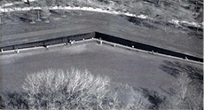


Vietnam war memorial wall, Maya Lin
This type of visualisation can be equally applicable to other formats. Ben Fry, in a project entitled The Preservation of Favoured Traces, uses scale to provide a new perspective on Darwin’s theory, one that highlights its evolution throughout his lifetime. Darwin published On the Origin of Species in 1859 but continued revising it over the years. In Fry’s project, the words are colour-coded based on the edition they appeared in. At a macro level, we can view the extent of changes in Darwin’s theory and how much he adapted it over time. On a micro level, we can look at the exact edits and see how the theory evolved.
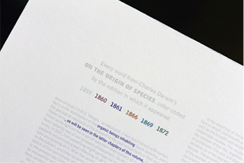
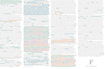
The preservation of Favoured Traces, Ben Fry
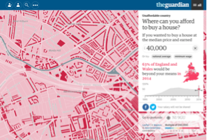
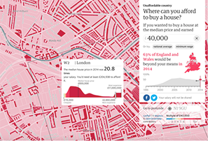
Maps are another common example of visualization in which zooming is often used to navigate between the macro and micro. As an example, we can look at a data visualization created by The Guardian entitled Unaffordable country: Where can you afford to buy a house?
On a macro level, the map shows the evolution of the gap between income and house prices over 19 years. For a £26,500 salary from 1998 to 2005, the map goes from blue/green to pink/red, indicating that buyers need a much higher multiple of their salary to afford a house.
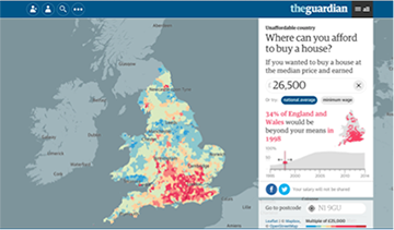
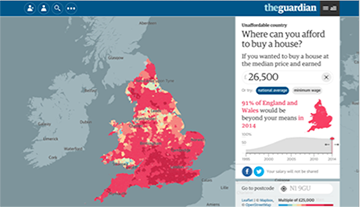
Unaffordable Country: Where can you afford to buy a house?, The Guardian
On a micro level, we can look at the median house price in an area and a more detailed view of the house prices at a street level. The level of detail is kept appropriate to how far we are zoomed in or out.
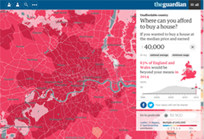
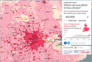
Scale and distance seem intertwined in all of these examples. In Maya Lin’s installation, we have to physically move closer to experience the different levels of the scale. In the Powers of ten, Ben Fry’s project, and the Guardian example, distance is still physical, but it is represented virtually through a digital zoom in and out.
Some interactive UIs take this a step further. They leverage a layered design that allows a separation between scale and distance. For example, dashboards typically present an overview of complex information and then a drill down into specific details for additional information. Scale is embedded in the layers, and we navigate it independently of distance.
Consider the design of a calendar for example. Similar to the examples I mention above, an interactive calendar allows us to navigate distance: we move from the yearly to the monthly, weekly, then daily view. The data displayed in each view should be tailored to our needs.
The yearly view provides an overview. The monthly view highlights days on which we have upcoming events. At that scale, we are less concerned with the exact time of the event or its description. The weekly and daily views are much more time sensitive. They present an itinerary.
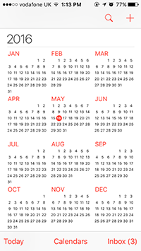
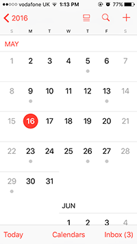
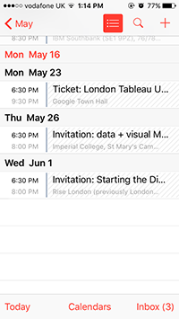

If we navigate a calendar from the yearly drilling into the daily, scale would reflect distance. However, interactivity allows us to navigate it in a non-linear way. Let’s take the calendar in the Windows 10 design as an example. A live tile on the home screen presents an overview of the calendar. It displays upcoming events. We tap on the live tile to navigate to a full view of the calendar. The user can customize the calendar and choose its default view. The user can also dynamically switch between the default view and the other calendar views on the same page. The live tile is the first layer of the scale, and the custom view is the second. Scale is reflected in the layers of navigation. It is no longer defined by the yearly, monthly, weekly or daily view of the calendar.
Interactive data visualisation allows us to play on a notion of scale that is independent from distance, because it allows us to layer different levels of the scale on the same surface.


