Text rendering has been a problem for both Silverlight and WPF for a while. This blog post looks at ClearType in Silverlight v3 and compares it to WPF and WinForms text rendering.
Text clarity is something that concerns me quite a bit. In financial applications, often large quantities of both graphical and textual data are rendered to the screen. Users of these applications need to be able to rapidly digest information, hence clarity is very important.
I was very happy to see that text rendering in Silverlight has been improved by the introduction use of the ClearType sub-pixel rendering algorithm. The following table contrasts the same Tahoma text rendering using Silverlight, WPF and WinForms in order to compare the text clarity.
| To scale | Zoom x4 | |
| Silverlight v2.0 | 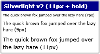 |
 |
| Silverlight v3.0(ClearType on) | 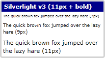 |
 |
| WPF(ClearType off) |  |
 |
| WPF(ClearType on) |  |
 |
| WinForms(ClearType off) | 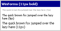 |
 |
| WinForms(ClearType on) | 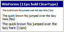 |
 |
From the above table you can see the tell-tale colour-halos around text in Silverlight v3.0 indicating that ClearType rendering is being used. Previously Silverlight used the same anti-aliasing approach used by WPF.
The text rendering of WPF has been criticised quite a bit. The main problem is that text glyphs are not snapping to pixel boundaries, which results in some rather unpleasant artefacts when text is animated. However, the good news is that this will be fixed in .NET 4.0.
The addition of ClearType text rendering in Silverlight v3.0 is certainly good news. However, if you compare the images above, I still find that the WinForms ClearType rendered text is clearer that its WPF / Silverlight counterparts. If you inspect the word 'bold' which is rendered in white text on a blue background, the WinForms text is much clearer. The WPF / Silverlight fonts appear much 'fatter' with less space between the letters. All the above applications used exactly the same font (Tahoma) and the same font size.
Regards, Colin E.
