This blog post looks at a recently published set of charts in a UK newspaper and how they fail to help in the comprehension of the data which they visualise. I will also look at much more effective ways of displaying this same data.
At Scott Logic we tend to spend quite a bit of our time thinking about the effective visualisation of data. In the financial sector data abounds, with stock prices changing every second, traders and analysts have a lot of data at their disposal. Without methods to analyse and visualise this data it is easy to gets lost in the sheer quantity. For this reason, the works of Edward Tufte and Stephen Few are often passed round the office!
With the UK General election looming, statistics and trends are a common feature in our news. Unfortunately these seems to lead to a whole slew of charts and graphics which succeed in their artistry but fail miserably in helping the reader understand the data which the graphics represent.
Just this morning I was reading an article in the Metro newspaper about the changes in party support over the past week's opinion polls and the voting habits of different age groups. The article was supported by the following graphic:
One of the key ideas behind the charting and visualising of data is to allow the reader to rapidly digest the data, spot trends, understand relationships, etc... Unfortunately, the graphics above fail miserably in this respect. Here are some of the faults I spotted:
(1) Chart title - the main chart title relates to the chart on the right, but not to the chart on the left.
(2) Choice of colours - if you look at the datapoints on the right-hand chart it is not easy to determine which party they relate to due to a poor choice of colour, peach and salmon?!
(3) Trends are hidden - the main purpose of the right hand chart is to illustrate the trends in party support with relation to age. To do this you have to hunt for the same coloured point from one age band to the next.
(4) Gridlines - the right-hand chart has labels every 5 percent point, but gridlines every 2 points. This means that there is not a gridline for each label, this makes it very hard to determine the actual value of each datapoint.
(5) Doughnut - the doughnut (i.e. the stylised pie-chart with a yummy hole) has a couple of problems, which week does it represent the split in party support for? this week? last week? Also, which is the bigger pie piece, Lib. Dem. or Conservative? It is impossible to tell without reaching for your protractor (I seem to have left mine at home today).
(6) Arbitrary graphics - I cannot see any reason, other than artistic licence, for the vertical highlights on the right-hand chart. This is misleading, it draws the eye to these areas of the chart with the expectation that they are highlighted for some reason.
(7) Change not visualised - the change in support from last week to this week is not visualised in any way, it is presented in tabular form. This means that the reader might miss important information, for example, a 10 percent point raise from 10 to 20 is clearly more significant than a rise from 70 to 80, this is made quite obvious if we visualise the change.
(8) Units - the indication of units is quite distant from the data.
I am sure there are more problems ... if you spot any others, leave a comment.
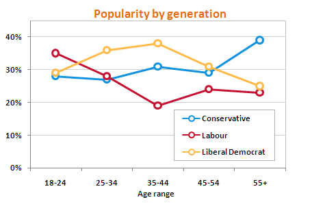
So, let's see if we can rectify some of these issues. Starting with the chart on the right, its main purpose is to illustrate the relationship between age group and party support. In this case it is vital that the reader of this chart can easily navigate from the datapoint which indicated Conservative party support (for example) in one age range the next. With this in a mind, a line chart is much more appropriate and the trends become immediately visible:
Note also the colours, these are no longer arbitrarily assigned. Each political party has a party colour which, if used, allows most people to instantly determine the party each line relates to. The gridlines are also more sensibly placed and we have lost the 'artistic' highlights. Finally, the Y axis starts at zero, this allow the reader to instantly see the scale of the differences between the popularity figures without having to read the axis range.
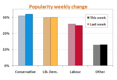
Now, let's turn our attention to the doughnut and the accompanying table. The reader should be able to determine two key pieces of information from these, (1) The relative popularity of each party and (2) The change in popularity since last week. It would be ideal if the two could be combined so that the reader can also compare the scale of this change with the overall difference in popularity. In order to allow this, it is much better to display the information in a single chart:
 With the above chart we can see at-a-glance the relative popularity of each party again displayed in party colours. I must admit it took me a little while to work out how to indicate which columns represented this week's figures and which were last week's. I tried using variations in the column intensity, but this is a hard concept to indicate via a key, I also added small labels, but this just complicates and clutters. Finally I realised that by adding a pattern I could maintain the party colour, yet clearly relate the columns for the previous week (This makes use of the Gestalt Principle of Similarity). Unfortunately Excel 2007, which I used to create these charts, does not support patterns, however I found this excellent add-in from Andy Pope, and I thoroughly recommend it.
I think the two charts I have presented are much clearer than those in the original graphics from the newspaper article. However, a direct comparison between the two would not be entirely fair. The graphics used in the media often have further constraints imposed on them, (1) They are often restricted in size, having to fit within a fixed page size layout, (2) They should be eye-catching and visually appealing, drawing a potential reader towards the article.
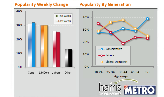
With this in mind, I have re-worked the graphs above into the same layout and size as the originals. I have even added drop-shadows for visual appeal ...
I think the above is a good compromise between providing an artistically pleasing graphic whilst still allowing the reader to understand the data (and from there spot trends etc...).
Regards, Colin E.
Update: Thanks to Graham Odds for a few extra ideas about tidying up the final charts.


