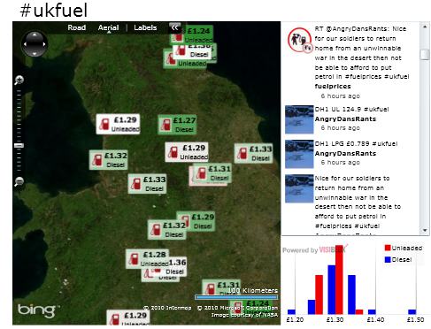
A few weeks ago I blogged about a Twitter / Bing Maps mashup that I had created for tracking snowfall in the UK via the #uksnow twitter hashtag. Last week I spotted a number of people in the uk who were using a new hashtag #ukfuel for tweeting fuel prices together with a postcode to indicate its geographic location. With a few tweaks I was able to modify my mashup to plot fuel prices instead of snowfall.
Click the image below to visit the #ukfuel page and interact with the map:
The colour of each fuel price is coded from green, to red based on whether it is at the cheaper or more costly end of the price spectrum. The chart in the bottom right gives a distribution of all prices.
I wonder what postcode related theme people will start tweeting next?
Regards, Colin E.

