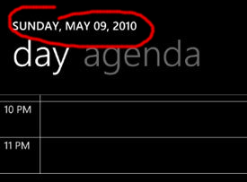
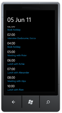
This blog post describes the development of a rolling list location indicator. This indicator mirrors the behaviour seen in the native Windows Phone 7 calendar which rolls from one date to the next as the user scrolls.
For those of you who have not been following my Metro-In-Motion series, I'll briefly recap. My aim is to provide an implementation of the 'fluid' UI transitions and effects seen in native Windows Phone 7 applications but absent from the Silverlight APIs. So far I have covered fluid list animations, 'peel' animations, flying titles , a 'tilt' effect and finally SandwichFlow which brought all these effects together and the series to a close. However, a recent StackOverflow questions inspired me to implement another fluid UI effect found in the native calendar application. When scrolling your list of appointments, the small day indicator at the top of the page displays the current date, with graceful roll transitions as you move from day-to-day:

It's a subtle but the effect is very pleasing!
You can see my implementation of this effect in the video below:
In order to create this indicator, we need to determine the item that is currently at the top of the list while it is being scrolled, and the direction of scrolling. Once we have this data at our disposal, the rest is all just visualisation!
Finding the head of the listThe Silverlight ListBox and ItemsControl do not expose a property which indicates the first visible item, so we need to add this functionality. Adding the properties themselves is simply a matter of defining a FirstVisibleItem and a IsScrollingUpwards attached properties. The logic that computes these properties is a little more complicated!
I have created a boolean ExposeFirstVisibleItem attached property (which acts as an attached behaviour). When this property is set to true, we navigate the visual tree to locate the vertical scrollbar that is located within the ScrollViewer which is part of the ListBox template.
The changed event handler for this attached property is shown below:
private static void OnExposeFirstVisibleItemPropertyChanged(DependencyObject d,
    DependencyPropertyChangedEventArgs e)
{
  if (e.NewValue.Equals(true))
  {
    ItemsControl itemsControl = d as ItemsControl;

    // wire up the scrollbar, handling ValueChanged events
    if (!WireUpScrollbar(itemsControl))
    {
      // if wire-up fails, try again on LayoutUpdated
      EventHandler tryFindScrollBar = null;
      tryFindScrollBar = (s2, e2) =>
      {
        if (WireUpScrollbar(itemsControl))
        {
          itemsControl.LayoutUpdated -= tryFindScrollBar;
        }
      };

      itemsControl.LayoutUpdated += tryFindScrollBar;
    }
  }
}
Note, the method WireUpScrollbar returns true if it has located the scrollbar. However, if the template for our ListBox has not yet been instantiated this will fail. In this case, we handle the LayoutUpdated event and retry until this method returns a success. Note, the EventHandler that removes its own subscription to the LayoutUpdated event, a neat pattern that I will certainly use again!
The WireUpScrollbar method uses Linq-to-VisualTree to locate the ScrollBar.
private static bool WireUpScrollbar(ItemsControl itemsControl)
{
  var sb = itemsControl.Descendants<ScrollBar>()
                      .Cast<ScrollBar>()
                      .Where(s => s.Orientation == Orientation.Vertical)
                      .SingleOrDefault() as ScrollBar;

  if (sb == null)
    return false;

  // set to the initial value
  SetFirstVisibleItem(itemsControl);
  sb.Tag = sb.Value;

  // update value on scroll ...
  sb.ValueChanged += (s, e2) =>
  {
    SetFirstVisibleItem(itemsControl);
    SetIsScrollingUpwards(itemsControl, sb.Value < (double)sb.Tag);

    // store the previous scroll position in the Tag
    sb.Tag = sb.Value;
  };

  return true;
}
The ScrollBar.Tag is used to store the previous scroll location so that we can determine the scroll direction, with SetIsScrollingUpwards setting the attached property on our ListBox (or ItemsControl).
Finally SetFirstVisibleItem locates the first visible item within the list and updated the FirstVisibleItem attached property:
private static void SetFirstVisibleItem(ItemsControl itemsControl)
{
  itemsControl.Dispatcher.BeginInvoke(() =>
  {
    var item = itemsControl.GetItemsInView().First();
    ListUtils.SetFirstVisibleItem(itemsControl, item.DataContext);
  });
}
Note the GetItemsInView extension method which enumerates the visible items. This was implemented in an earlier Metro-In-Motion blog post, however I have extended this implementation to support both virtualizing and non-virtualizing panels, you can see the latest version on codeplex within the Windows Phone 7 Contrib (WP7Contrib) project. The FirstVisibleItem exposes the DataContext of the first visible item, which will be the first visible model object.
With the above code, we simply set the following attached property to true on a ListBox or ItemsControl in order for it to expose teh first visible item and scroll direction:
<ListBox mim:ListUtils.ExposeFirstVisibleItem="true" />The rollover effect seen in the native control is very easy to reproduce with the Silverlight Toolkit TransitioningContentControl, which has proven popular with Silverlight developers wishing to create page transitions. The only problem is that this control has not made it into the WP7 version of the toolkit. So I simply grabbed the source of and placed it directly into my project.
If we look at the calendar example that is shown in the video at the start of this blog post, it has the following XAML:
<StackPanel x:Name="TitlePanel" Grid.Row="0">

  <layout:TransitioningContentControl
                Content="{Binding Path=(mim:ListUtils.FirstVisibleItem).Time,
                                   ElementName=list,
                                   Converter={StaticResource StringFormatConverter},
                                   ConverterParameter='dd MMM yy'}"
                Transition="{Binding Path=(mim:ListUtils.IsScrollingUpwards),
                                   ElementName=list,
                                   Converter={StaticResource BooleanToTransitionConverter}}">
    <layout:TransitioningContentControl.ContentTemplate>
      <DataTemplate>
        <TextBlock Text="{Binding}"
                        FontSize="60"/>
      </DataTemplate>
    </layout:TransitioningContentControl.ContentTemplate>
  </layout:TransitioningContentControl>
</StackPanel>

<Grid x:Name="ContentPanel" Grid.Row="1" >
  <ListBox ItemsSource="{Binding}"
            x:Name="list"
            mim:ListUtils.ExposeFirstVisibleItem="true">
    <!-- template goes here -->
  </ListBox>
</Grid>
Which gives the following layout:

The Content property of our TransitioningContentControl uses ElementName binding and a property path of (mim:ListUtils.FirstVisibleItem).Time, in order to bind to the Time property of the first visible model object. Note that the list contains multiple items that are on the same day but have different times. The Converter associated with this binding (which is a simple implementation of the Silverlight 4 StringFormat binding property), uses the string 'dd MMM yy', which will give the same value for all appointments on the same day. Therefore the content of the TransitioningContentControl control will only change as we navigate between day boundaries.
The TransitioningContentControl already has suitable transitions which give a nice roll-up and roll-down effect. These are selected by setting the Transition property to the named transition. In the example above, this is bound to the attached boolean IsScrollingUpwards property of our list, with a simple value converter that converts this into the required string transition identifier.
And we're done!
I quite like the way that the implementation of this effect is split into two halves, the one which extends the functionality of the list, and the other which visualises the output. This should give great flexibility, as can be seen in the example which indicates the list location within a contacts list.
This code also works with the Jump List I created a few months ago, however, it did require a few changes to that code. My current plan is to move all of the WP7 controls and effects I have created into the WP7Contrib project, so watch this (or that) space!).
You can download the sourcecode for this blog here: MetroInMotionSix.zip
Regards,Colin E.
