With the new Metro UI, Windows 8 has firmly embraced the tablet form-factor, with the interface tailored for touch and multi-touch interactions. Many of the Metro concepts familiar to Windows Phone 7 (WP7) developers are also present in Windows 8. Watching the vieos from the //build/ conference you can see how the team responsible for Win8 Metro have really thought about the tablet experience, with new concepts such as cross-slide and transitions being added to the familiar XAML environment.
One of the most intersting new concepts introduced at build was 'semantic zoom', where a pinch gesture, which is more usually assocaited with optical zoom, is used to switch between different view of the same data. Because a pinch is conceptually a zoom operation, this is most typically used for switching from a more detailed view to a summary, or top-level view. Interestingly, with WP7 we have already seen the semantic zoom concept (minus the pinch gesture). The jump list control provides a mechanism for jumping from one location within a list to another, via jump-buttons. This solves the problem of navigating long lists using swipe gestures. However, semantic zoom does not have to be restricted to jump-list style scenarios, for more ideas see the Microsoft Guidelines for Semantic Zoom.
I thought that a fun way to familiarise myself with semantic zoom would be to use it to create a WP7 style jump list experience in Win8 Metro, you can see a (very poorly filmed) video of my creation below ...
The JumpViewer control provides semantic zoom functionality. This control allows you to specify two views, which would most typically be as follows:
ContentView- the detail view.JumpView- the top-level, or category view.
However, you can provide any two views of your data, as long as there is some meaningful (or semantic!) relationship between the two.Both views must implement IJumpViewerInfo (As an aside, WinRT makes much better use of interfaces than the .NET XAML UIs), which has methods that allows the JumpViewer to instruct a view to make a certain item visible. This allows the two views to colaborate in order to allow navigation. The GridView control, which is part of the WinRT framework, implements this interface, so is a suitable control to use for both views.
The ContentView
So let's create a content view that renders a jump-list style control. You specify each of the view as follows:
<JumpViewer x:Name="jumpViewer">
  <JumpViewer.JumpView>
    <GridView>
      ...
    </GridView>
  </JumpViewer.JumpView>
  <JumpViewer.ContentView>
    <GridView>
       ...
    </GridView>
  <JumpViewer.ContentView>
</JumpViewer>
The JumpViewer requires that you supply a CollectionViewSource to the JumpView in order to render the top-level view. Also, I have found that whereas the ContentView inherits the JumpViewer DataContext, making databinding possible, the JumpView does not. This results in a rather clumsy syntax for supplying data to this control:
var cvs = new CollectionViewSource();
cvs.Source = source;
jumpViewer.DataContext = cvs;
(jumpViewer.JumpView as ListViewBase).ItemsSource = cvs.View.CollectionGroups;
It would be possible to wrap up the above code in an attached behaviour, to allow binding without code-behind, but it is not really worth the effort. I am sure this will be tidied up in future versions!
The ContentView is a GridView which by default scrolls its content horizontally. For my jump-list I wanted to scroll vertically, this can be achieved by setting the following attached properties:
The template for each item, and the panel that the GridView uses to host the items it generates are specified as follows:
<GridView.ItemTemplate>
    <!-- the template for each data item -->
    <DataTemplate>
        <StackPanel Orientation="Horizontal" Width="500">
            <TextBlock Text="{Binding Path=Surname}" FontSize="35"/>
            <TextBlock Text=", " FontSize="35"/>
            <TextBlock Text="{Binding Path=Forename}" FontSize="35"/>
        </StackPanel>
    </DataTemplate>
</GridView.ItemTemplate>
<GridView.ItemsPanel>
    <!-- the top-level container -->
    <ItemsPanelTemplate>
        <StackPanel Orientation="Vertical" />
    </ItemsPanelTemplate>
</GridView.ItemsPanel>
The GridView has built-in support for grouping. In order to use this, the data supplied to the ItemsSource must be a collection of IGroupInfo instances. The WinRT framework does not supply a default implementation of this interface, however, it is very easy to implement by extending a list to add a Key property:
public class GroupInfoList : List<object>, IGroupInfo
{
  public GroupInfoList(object key, IEnumerable<object> values)
  {
    Key = key;
    AddRange(values);
  }

  public object Key { get; set; }

  public new IEnumerator<object> GetEnumerator()
  {
    return (System.Collections.Generic.IEnumerator<object>)base.GetEnumerator();
  }
}
This example renders Person instances (which have Surname and Forename properties). We can group them using a Linq query, to create a sorted list of IGroupInfo instances as follows:
var source = people.GroupBy(person => person.Surname.Substring(0, 1),
                               (key, items) => new GroupInfoList(key, items))
                   .OrderBy(group => group.Key);
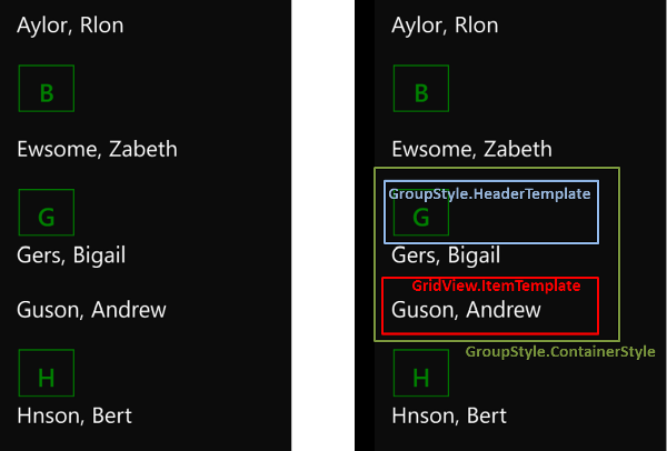
When supplied with grouped data, you can configure how the GridView renders it via the GroupStyle property:
<GridView.GroupStyle>
    <GroupStyle>
        <GroupStyle.HeaderTemplate>
            <!-- the header for each grup -->
            <DataTemplate>
                <Button Content="{Binding Name}"
                        Width="80" Height="80"
                        Foreground="Green" BorderBrush="Green"
                        FontSize="40"
                        VerticalContentAlignment="Bottom"
                        Click="Button_Click"/>
            </DataTemplate>
        </GroupStyle.HeaderTemplate>
        <GroupStyle.ContainerStyle>
            <!-- the 'body' of each group -->
            <Style TargetType="GroupItem">
                <Setter Property="Template">
                    <Setter.Value>
                        <ControlTemplate TargetType="GroupItem">
                            <StackPanel Orientation="Vertical">
                                <!-- renders the header -->
                                <ContentPresenter Content="{TemplateBinding Content}" />
                                <!-- renders the items within this group -->
                                <ItemsControl x:Name="ItemsControl2" ItemsSource="{Binding GroupItems}" />
                            </StackPanel>
                        </ControlTemplate>
                    </Setter.Value>
                </Setter>
            </Style>
        </GroupStyle.ContainerStyle>
        <GroupStyle.Panel>
            <!-- the panel used to render the items within the group -->
            <ItemsPanelTemplate>
                <VariableSizedWrapGrid Orientation="Horizontal"   MaximumRowsOrColumns="1"/>
            </ItemsPanelTemplate>
        </GroupStyle.Panel>
    </GroupStyle>
</GridView.GroupStyle>
This rather complex block of XAML is composed of three parts, the best way to understand how they relate to the rendered output is via a picture:

The JumpView
The jump-view is again a GridView, however, this view is much simpler because it does not render a grouped view. The ItemsSource for the GridView is set to the CollectionViewSource.View.CollectionGroups property. At runtime this property is populated with a collection of DependencyObjects which have a Name property which exposes the Key of each group.
The XAML for the JumpView is given below:
<GridView Foreground="White"
            HorizontalAlignment="Center" VerticalAlignment="Center">
    <GridView.ItemContainerTransitions>
        <!-- disable the default entrance transitions -->
        <TransitionCollection/>
    </GridView.ItemContainerTransitions>
    <GridView.ItemTemplate>
        <!-- the template for each 'category' button -->
        <DataTemplate>
            <TextBlock  Text="{Binding Name}"
                        FontFamily="Segoe UI Light"
                        FontSize="55"
                        Foreground="White" />
        </DataTemplate>
    </GridView.ItemTemplate>
    <GridView.ItemsPanel>
        <ItemsPanelTemplate>
            <WrapGrid ItemWidth="120" ItemHeight="120"
                        Orientation="Horizontal"
                        MaximumRowsOrColumns="4" VerticalChildrenAlignment="Center" />
        </ItemsPanelTemplate>
    </GridView.ItemsPanel>
    <GridView.ItemContainerStyle>
        <Style TargetType="ListViewItem">
            <Setter Property="Margin" Value="4" />
            <Setter Property="Padding" Value="10" />
            <Setter Property="Background" Value="Green" />
            <Setter Property="HorizontalContentAlignment" Value="Center" />
            <Setter Property="VerticalContentAlignment" Value="Center" />
        </Style>
    </GridView.ItemContainerStyle>
</GridView>
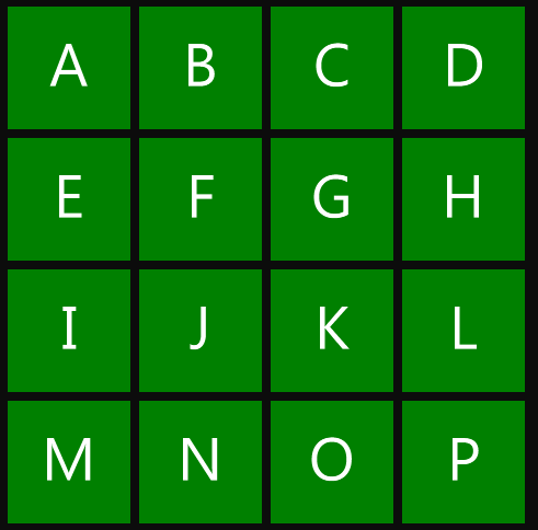
The JumpViewer handles the pinch zoom, hiding the ContentView and showing the JumpView, which looks as follows:

When you click on one of the items displayed in the above view, the JumpViewer detects the item that has been clicked, it then shows the ContentView and instructs it to scroll to show the first item within the clicked group. This works regardless of the layout you define for the ContentView, i.e. it will scroll vertically or horizontally depending on the layout.
The WP7 jump-list switches to the jump-view when the user clicks a category heading. The final step in emulating this control is to handle the click on the category heading and programmatically switch views as follows:
private void Button_Click(object sender, RoutedEventArgs e)
{
  jumpViewer.IsContentViewActive = false;
}
In summary, the JumpViewer is a powerful and flexible control which makes it easy to provide semantic-zoom within Metro applications.
You can download the full sourcecode: SemanticZoomExample.zip
Regards, Colin E.
