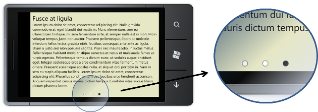
A popular user-interface in the iOS world is the UIPageControl which renders a small set of dots to indicate the number of pages, with the current page highlighted in some way. This is often used in conjunction with a UIScrollView to navigate between pages in a multi-page layout.
Windows Phone 7 has a Pivot control which allows you to swipe in order to navigate content across multiple screens. However, the Pivot control is most often used when each 'page' has some logic header - in some ways it is analogous to a desktop tab control. I decided to use this control, without specifying headers for each PivotItem, then add my own control to render the 'pips'.

The control that displays the location pips is defined in XAML, with the relationship between this control and the Pivot created via an ElementName binding:
<local:PivotLocationView Source="{Binding ElementName=pivot}"
                          HorizontalAlignment="Center"
                          VerticalAlignment="Bottom"
                          Margin="0,0,0,10"/>

<controls:Pivot Margin="0,-30,0,40"
                x:Name="pivot">
  <controls:PivotItem>
    ...
  </controls:PivotItem>
  <controls:PivotItem>
    ...
  </controls:PivotItem>
  <controls:PivotItem>
    ...
  </controls:PivotItem>
</controls:Pivot>
Note the negative top margin for the Pivot, this control still allocates some header space, even when no headers are defined.
The PivotLocationView user control is backed by a simple view model, with model-items for each pip. When the view model is associated with a Pivot control, it creates a child view model for each Pivot Item, then handles the SelectionChanged event in order to keep the selection state synchronized:
public class PivotLocationViewModel
{
  private Pivot _pivot;

  public PivotLocationViewModel()
  {
  }

  public PivotLocationViewModel(Pivot pivot)
  {
    PivotItems = new PivotItemViewModelCollection();
    SetPivot(pivot);
  }

  /// <summary>
  /// Gets or sets the collection of child view-models
  /// </summary>
  public PivotItemViewModelCollection PivotItems { get; set; }

  private void SetPivot(Pivot pivot)
  {
    _pivot = pivot;

    // handle selection changed
    pivot.SelectionChanged += Pivot_SelectionChanged;

    // create a view model for each pivot item.
    for(int i=0;i<pivot.Items.Count;i++)
    {
      PivotItems.Add(new PivotItemViewModel());
    }

    // set the initial selection
    PivotItems[_pivot.SelectedIndex].IsSelected = true;
  }

  /// <summary>
  /// Handle selection changes to update the view model
  /// </summary>
  private void  Pivot_SelectionChanged(object sender, SelectionChangedEventArgs e)
  {
 	  var selectedModel = PivotItems.SingleOrDefault(p => p.IsSelected);
    if (selectedModel != null)
      selectedModel.IsSelected = false;

    PivotItems[_pivot.SelectedIndex].IsSelected = true;
  }

}
The view model for each pivot item is a simple model that implements INotifyPropertyChanged. It has an IsSelected property that reflects the selection state of the Pivot, it also exposes a Color property that indicates the color for each 'pip'. This could have been implemented as a value converter, but there is little point as we already have a view model:
/// <summary>
/// A view model for each 'pip'
/// </summary>
public class PivotItemViewModel : INotifyPropertyChanged
{
  // ... INotifyPropertyChanged implementation

  private bool _isSelected;

  public bool IsSelected
  {
    get { return _isSelected; }
    set
    {
      if (_isSelected == value)
        return;

      _isSelected = value;
      OnPropertyChanged("IsSelected");

      Color = IsSelected ? Colors.Black : Colors.White;
    }
  }

  private Color _color;

  public Color Color
  {
    get { return _color; }
    set
    {
      _color = value;
      OnPropertyChanged("Color");
    }
  }
}
The XAML for this control is very simple, using an ItemsControl to render an ellipse for each 'pip':
<UserControl ...
    d:DataContext="{d:DesignData Source=PivotLocationViewModel.xml}">

  <Grid x:Name="LayoutRoot">
    <ItemsControl ItemsSource="{Binding PivotItems}">
      <ItemsControl.ItemsPanel>
        <ItemsPanelTemplate>
          <StackPanel Orientation="Horizontal"/>
        </ItemsPanelTemplate>
      </ItemsControl.ItemsPanel>
      <ItemsControl.ItemTemplate>
        <DataTemplate>
          <Ellipse Width="12" Height="12" Margin="15,0,15,0"
                   Stroke="Black"
                   StrokeThickness="0.5">
            <Ellipse.Fill>
              <SolidColorBrush Color="{Binding Color}"/>
            </Ellipse.Fill>
          </Ellipse>
        </DataTemplate>
      </ItemsControl.ItemTemplate>
    </ItemsControl>
  </Grid>
</UserControl>
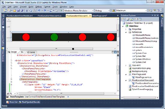
Note, the use of design-time data. The following file defines a view model instance:
<PivotLocationViewModel xmlns="clr-namespace:SlideView">
  <PivotLocationViewModel.PivotItems>
    <PivotItemViewModelCollection>
      <PivotItemViewModel IsSelected="False" Color="Red"/>
      <PivotItemViewModel IsSelected="True"  Color="Green"/>
      <PivotItemViewModel IsSelected="False"  Color="Red"/>
      <PivotItemViewModel IsSelected="False"  Color="Red"/>
    </PivotItemViewModelCollection>
  </PivotLocationViewModel.PivotItems>
</PivotLocationViewModel>
This makes creating the above user control much easier, because it can be visualised in the designer:

And there you have it, a simple user-control, which when used in conjunction with a Pivot, provides an interface where the user can swipe between pages.
You can download the full sourcecode: SlideView.zip
Regards, Colin E.
