UPDATE: I have posted the sourcecode for this control on codeproject.
Recently I have been wondering about the wealth of information that can be gleaned from the 2.5 million programming question on Stack Overflow. A few weeks back I found a tag trending tool, which can be used to measure the rise and fall in popularity of tags over time. Whilst this is a great little tool, I am sure there is much more that can be done with the freely available Stack Overflow data, for example, exploring the relationships between the many technologies people ask questions about.
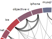
On a recent trip to Copenhagen I decided to put my hours of travelling time to good use and create a Silverlight application that plots the relationships between the various tags. I created an application that downloaded the 1,000 most recent questions via the Stack Overflow API and plotted the relationships between the 20 most popular tags, as seen above.
The graph is constructed as follows:
- The size of each segment is proportional to the number of questions relating to the tag, i.e. android and java are the most popular tags.
- Connections between tags indicate questions that have been tagged with both technologies. The thickness of the connection indicates how many questions share these two tags, i.e. jQuery and JavaScript tags appear together quite often.
- Each segment is coloured based on the number of connections it has, red for many connections, blue for few.
The ordering of segments can be changed using the drop-down control. Probably one of the most interesting views is the one where related tags are clustered. This is done by assigning a 'weight' to the current configuration of the graph by summing the length of all connections, with connections that cross the centre of the circle adding most weight. An iterative process is used to minimise the overall graph weight by moving each segment a few steps left and right, until the least 'weighty' configuration is found. This is the one where each tag is most closely related to its neighbours.
 When clustering is applied we can see small 'pockets' of related technologies, with the following patterns emerging
- The two most popular tags, Java and Android, are very closely related to each other, but have very few other relationships.
- iOS, Objective-C and iPhone form a close-knit group. However, Objective-C questions are sometimes also tagged with C#, C and C++.
- C#, .NET and ASP.NET are clustered, however C# has links with many other tags
- The strongest relationship is between jQuery and JavaScript, probably due to jQuery having become the de-facto framework for JavaScript development, being used on 53% of websites.
- There is a large cluster of connected web technologies, CSS, HTML, JavaScript, jQuery, reflecting the mix of technologies involved in creating web sites and web applications.
- Python, whilst being a popular tag, has very few relationships, only being weakly linked to PHP.
I am planning on tidying up the code for this visualisation, making it more generic, allowing it to be used to graph other datasets. Let me know if you are interested in this!
Here is the same graph, but showing the top 30 tags, again, more interesting relationships start to emerge:
Finally, thanks to Chris P., Adrian C. and Graham O. for their ideas and input!
Regards, Colin E.
