This blog post presents a thorough analysis of the performance of various WPF Charting components. The results show that a new class of charting solutions, which use raster-based graphics as opposed to retained mode vector graphics, provide a considerable performance advantage.

Introduction
Readers of my blog will know that charting and performance are two things that interest me greatly. One of the first things I did back in 2009 when I started working with WPF and Silverlight was have a go with the Microsoft 'toolkit' charts. Unfortunately I found these charts, and the various third party competitors, to be painfully slow when rendering just a few hundred datapoints. As a result of these findings I set about creating a high performance chart for Silverlight and WPF, which eventually became Visiblox charts.
In December 2010 I published a performance comparison that demonstrated that Visiblox was approximately 50-100 times faster than the Toolkit charts and 10 times faster than Visifire charts. At the time the only charts which came close were those developed as part of Microsoft's now abandoned Dynamic Data Display project. Since publishing these figures, a number of the WPF and Silverlight charting vendors have started to take performance much more seriously, with Visifire more than doubling performance amid claims of being the fastest chart, amCharts have also publishing some very good performance figures as have Telerik.
Much has changed in the year and a half since my original performance blog post and I thought it would be a good idea to repeat the tests. However, this time I wanted to be more thorough, including a few different types of tests and also using WPF instead of Silverlight, due to the number of email requests I have had for a WPF charting comparison.
The Test Suite
In order to allow me to collect performance data for a range of WPF charts across a range of tests, I have written an automated performance test suite. The application uses MEF in order to allow me to easily slot in new tests and new charting providers. If you want a copy of the code, please get in touch.
The suite executes the following tests:
- Line Series Frame Rate - this test initially renders a 'streaming' line series which a fixed number of datapoints. New data is added to the chart as quickly as possible, and each time a new point is added to the front and old point is removed in order to keep a fixed number of points in view. The chart axes are auto-scaled (API permitting). The test initially starts with 50 datapoints, with each test run doubling this number.
- Scatter Series Frame Rate - a number of points are added to the chart. The location of these points is then animated in a manner that emulates Brownian motion. The test initially starts with 50 datapoints, with each test run doubling this number.
- Scatter Series Memory Usage - the above test is re-run, but this time rather than measuring render frame rate, the memory consumed as a result of adding the datapoints is recorded.
Initially I used a timer to measure framerate, followed by an attempt to measure via CompositionTarget.Rendering. However, I found that neither method gave an accurate frame rate measure, indeed the WPF team report that the CompositionTarget.Rendering can fire multiple times per frame. Instead, I opted for a more manual measurement using the WpfPerf tool, which makes use of the ETW events emitted by WPF.
Line Series Results
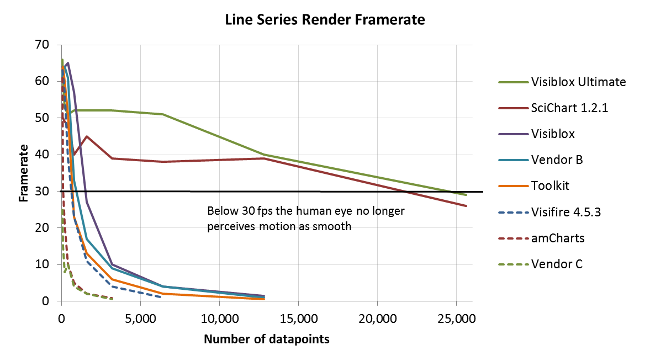
The results of the line series framerate tests are shown below:

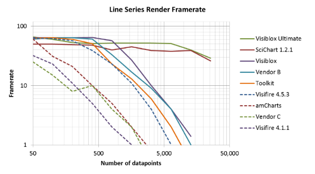
NOTE: I am using a log-log scale for the above chart in order to make it easier to see the shape of the various curves.
Regarding which charting vendors I used for comparison, I tried to include all established and well known vendors in my comparison. For those which have already published performance figures or comments relating to Visiblox, I have included their names. For the others I have simply given them a token name 'Vendor X', in order to comply with the trial licencing terms which typically prohibit the publishing of performance figures.
One thing worth noting is that some charting vendors use sampling in order to improve framerates. I found that Vendor A (not included above) uses sampling without providing a mechanism for turning it off. Whereas most vendors that do support sampling allow you to turn it on or off and configure the sampling algorithm used. In order to provide a fair comparison, sampling was turned off on all the charts.
The chart above reveals some interesting patterns, due to the two very different classes of chart under test.
Vector based charts - WPF UIs are rendered via retained mode vector graphics. Whilst this approach is what has given rise to the very rich UI framework that WPF applications enjoy, it has been found that this approach just doesn't perform as well as the bitmap-based approach used by Windows Forms when faced with complex UIs. This has led some people to use WinForms charts within their WPF applications! We can see that the faster vector charts from Microsoft Toolkit, Vendor B, the updated Visifire and Visiblox charts are all close to the limit of what is possible with this style of rendering.
" ... the major 'partners' cannot create a WPF chart that renders 2000 floating points of data in less that 5 seconds. I have tried them all and they are slow so we have had to regress to a WinForms version that renders the same data in milliseconds." - from the channel 9 forums.
Raster based charts - Because of the limits of the WPF rendering system the two fastest charts in this test, Visiblox (via the new raster series type as part of the Ultimate Editition) and SciChart (a newcomer that exclusively uses this approach) both use a raster / bitmap graphics approach, which the WPF and Silverlight frameworks both have support for via the WriteableBitmap class. This approach yields results which are more than 100 times faster than what is possible with vector graphics.
One of the other common complaints made about WPF charts is the initial render time, with charts containing just a few thousands datapoints taking seconds to show on screen. Whilst this test focusses in framerates, it is also gives a good indication of the initial render times, with raster based charts appearing almost instantly when loaded with tens of thousands of points.
Scatter Series Results
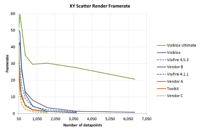
The results of the Scatter series tests are shown below:

Again, the same pattern emerges, with the raster based approach yielding a significant increase in frame rate over the vector based.
Scatter Series Memory Usage
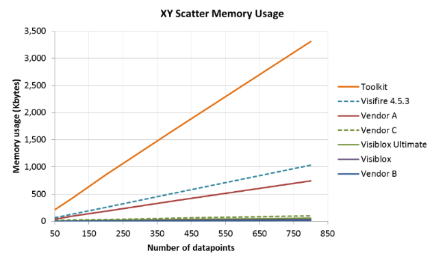
The final test looks at the memory consumption of the various charting providers:

The above shows that the memory consumption is directly related to the number of datapoints present in the chart, however, the scale of this relationship is very different for the charts under test. I have a feeling that the Toolkit charts have a memory leak which contributes to the poor performance in this test.
Conclusions
The overall performance of the charting solutions available to WPF (and Silverlight) developers is improving. However, the performance of the WPF rendering system appears to create an upper limit which constrains what can be achieved. The raster-based approach is not subject to these same constraints and as a result provides a considerable improvement in performance.
If you want to have access to the code I used to make these tests, please get in touch. Also, if you are a charting vendor and think you might be Vendor A, B or C in these tests, and wish to be named, let me know.
