Last week I attended the UX London 2012 conference. This was my first public foray into the world of User Experience and it proved to be both educational and thought-provoking.
Having read his book, Sketching User Experiences, I had high expectations of the opening presentation from Bill Buxton (@wasbuxton) and he didn't disappoint. He introduced the Long Nose Of Innovation: the observation that it takes roughly 20 years for a technology to go from invention to billion dollar industry, with most of that time spent "under the radar". Taking this further, he highlighted how this means we can easily predict the near future by looking at the recent past. He backed this up with various examples, most with the added side-note that the the first patent for a concept often wasn't the original invention. Who knew Xerox didn't invent the mouse, and that in-line skates originate from the early 19th century?!

Anders Ramsay (@andersramsay) had the unenviable task of following Bill Buxton on stage, but his discussion of Agile UX using an interesting rugby analogy went down a treat. His slides are available here and are well worth a look for anyone working in an Agile development environment.
Luke Wroblewski (@lukew) was up next and rammed home the point that not only should we be thinking mobile-first when designing websites, but that our mindset should also be "content first, navigation second". He went on to detail his current thoughts on responsive layouts and responsive navigation patterns. His website is a treasure trove of information on designing for mobile devices and I highly recommend everyone has a dig around in it.
Kristina Halvorson (@halvorson) focused her 45 minutes on the importance and practicalities of content strategy in user experience design. It is obvious that substance and structure should be connected to workflow and governance, and that all content should support and tie to a single core message, but there is clear evidence around us that this is ignored or forgotten in many projects.
The inimitable Jared Spool (@jmspool) outlined what he considers to be the four major forces that make good design so important these days, or as he puts it, The Perfect Storm:
- Sturgeon's Law - "90% of everything is crap" - is as applicable as ever, with Jared supporting this by showing a number of mobile-centric experiences from big brands, such as scanning a QR code, that result in the user going to websites that are not optimized for mobile or, at worst, outright broken on mobile (by using Flash...).
- There is a recurring market maturity cycle: we start with some technology that fills a void, onto which companies start heaping features, before experiences become the key. Clearly this cycle should be broken and companies should just focus on experience straight away.
- The difference between activities and experiences is huge. Jared's comparison of how the Six Flags and Disney theme parks differ emphasised how much value a lot of extra thought and a little extra money can make. "Experience is about filling in all the gaps between the activities"
- The Kano Model provides a powerful insight into user expectations, and where investment should be in order to satisfy them.
We were then given some shorter, case-study based presentations by Harry Brignull (@harrybr), Bill DeRouchey (@billder) and Leif Roy. What stood out the most to me from these presentations was Bill DeRouchey's view that we should let opinions shine through our products because opinions provoke engagement.
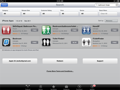
Jon Kolko (@jkolko) was rounded off the day with an impassioned presentation imploring us to apply our design skills to problems that are genuinely worth solving (rather than another Toilet Finder app!). It was inspirational, bigger picture stuff and drove home a rather important point. His slides are available here.
 Yes, there are more than one toilet finder apps... (from Jon Kolko).
The second and third days of the conference consisted of half-day workshops, the first of which was Leah Buley's (@ugleah) UX Team Of One Bootcamp. Much as the name suggests, the workshop centred on practicalities of the common situation where you are the lone UX designer on a project or in an organisation. Leah emphasised that whatever the exact activities are you choose to undertake, the key aspects of your approach should be:
- lowest fidelity possible
- inclusive and participatory
- focused on prioritization
- not rigidly sequential
- bite-sized and with a purpose
The discussion following a subsequent group exercise involving the creation of a project plan for a hypothetical highlighted two important aspects we have a tendency to forget: a buy vs build analysis; and, the question of whether it is the software or people we should be aiming to redesign. Focus then shifted towards the difficulties around communication in the lone UX designer situation, such as explaining to people what you actually do and how to sell the business case for UX.
In the afternoon I opted to indulge myself and opted for Stephen Anderson's (@stephenanderson) wonderfully example-heavy workshop entitled The Quest For Emotional Engagement: Information Visualization. First, Stephen outlined what he sees as a common UI problem that visualisation can solve, namely that we too readily and lazily reach for four often ineffective UI design patterns: spreadsheets, lists, grid views and dashboards. Their common shortcoming is their inability to present relationships in the information such as processes, proportions and changes over time. With the problems identified, we moved to a very detailed walk through Stephen's 5-step process for information visualisation: identify opportunity → frame problem to be solved → identify nodes of information → explore ways to put that together → clean up, test, and iterate!
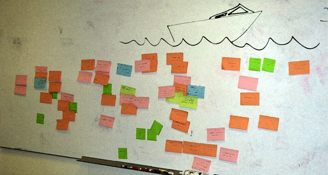
 The speed boat innovation game, from Anders Ramsay.
After being impressed by his presentation on Agile UX on the opening day, I started the final day of the conference with Anders Ramsay's workshop around the same subject. In this very hands-on session, Anders introduced user stories as a means by which design can integrate with and support development in an agile (Scrum) environment. He showed (and we experienced) how product discovery through UX activities such as speed boat innovation game can be used to generate what he terms experience stories - user stories focusing more on why than what. By combining those experience stories with feature stories, the design of the user interface can iteratively take place. In the case of our workshop we did this using a design studio activity. "Standard" development stories can then be extracted from the design to feed into your developers' product and sprint backlogs. As Anders reiterated throughout, for the best results designer and developers should be working collaboratively throughout. After all, "those who need a document should participate in creating it".
Unfortunately, what started off as a really promising workshop from Leisa Reichelt (@leisa about adding user experience as a strategic aspect of an organisation ended up becoming something of a confusing muddle by descending into a lecture heavy on business jargon with few practical examples (not helped by it being a Friday afternoon at the end of a 3-day conference). Based on what I've picked up from her blog, her more sweary, ranty style might have better suited the material and audience.
Also, sponsors Red Gate put Nerf guns in the conference goodybag so get a free shout-out for knowing what all nerds want!
