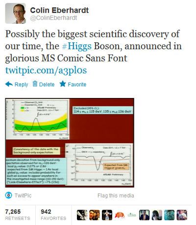
It's been a busy Twitter day for me. A reasonably inane tweet that I posted this morning pointing out that the announcement of the (potential) Higgs Boson discovery was written using the much derided Comic Sans font has been retweeted thousands of times, and has been the top tweet for a few of the trending topics for the last 24 hours:
My ego was interested in finding out just how close this might have some to being the "most retweeted tweet". Unfortunately there are no official statistics gathered. The best I could find was an article that puts me midway between Shakira and Barack Obhama.
The net result of sitting at the top of a few trending topics has been a multitude of questions directed my way via twitter and hundreds more followers for my twitter account. The responses have been pretty varied, many people have 'chuckled along' at the light-hearted joke, some expressed anger that I have mocked such a great discovery, whilst a few have postulated that the font was selected for its legibility and ease of reading for dyslexics. Amusingly I have received numerous questions about the discovery of the Higgs Boson itself, and its potential impact on matters such as space travel. Understandably people have assumed that because Twitter has promoted my tweet, I must be an authority on the subject!
Unfortunately I didn't have time to answer all the questions during the day (you know ... work and all that), so I thought I'd sit down this evening and expand on those surprisingly popular 140 characters which I wrote earlier today.
Comic Sans ... huh?
For many people the point of my tweet was far from obvious. There was an announcement, some charts, science and of course a font - what's the big deal?
The problem is the Comic Sans font has gained a bit of a bad reputation recently. Considering that it is just a font, some people have developed quite strong feelings about it. The font itself is a relatively recent invention, described by Wikipedia as a casual script typeface, it was invented by Vincet Connare in 1994 who modelled the typeface on comic book lettering.
Since the introduction of the font to Microsoft Windows it has been a runaway success, being widely used for posters, letters, flyers and all sorts of light-hearted communications. However, it is often used in contexts where a comic-book font seems inappropriate. This frequent 'misuse' of the font for conveying serious subject matter is at the root of the anti-Comic Sans movement.
I don't much like the Comic Sans font and do cringe a little each time I see it used. But it is interesting to ask yourself why is this font is so popular? Personally I think the problem started in Windows 95 where the font was first introduced. At the time Windows only had a small handful of fonts. Comparing Comic Sans to the two other font options of the time, Ariel and Times New Roman, it really stood out for its light-hearted and fun qualities. Take the same text and switch between Ariel and Comic Sans and you will find that the perceived tone of your document changes significantly, even though you haven't actually changed the text itself. Fonts convey emotions. Fonts matter. A lot!
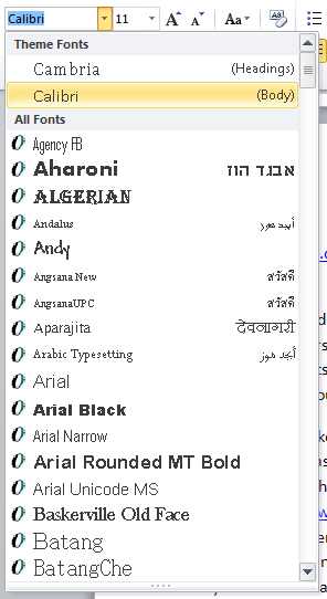
Later versions of Windows have introduced a great many more fonts, but we now have the opposite problem, too many options. Microsoft Word does its best to help by rendering each font directly within the drop-down list. But the choices are many and the ordering of fonts by name certainly does little to help find a font that matches the tone of your document. For that reason people stick to what they know, and that just happens to be Comic Sans.

Personally I feel a much better way of presenting font selection to users would be via some form of classifications, or multiple classifications, formality, flamboyance, script-like etc ...
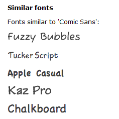
Or, when a font has been selected, similar alternatives could be presented. This can already be achieved via online tools such as Identifont, which suggests the following alternatives to Comic Sans:
If Word and PowerPoint had this functionality built in, I am sure we would see a much more varied and effective use of typography.
Does it really matter that the CERN announcement was written using Comic Sans? Not at all. In my mind it doesn't detract from the amazing science being presented. It was just an amusing faux pas on the part of the presenter.
Higgs Boson ... huh?
I have been asked a surprising number of questions about the Higgs Boson and just what this discovery means. Unfortunately, despite my degree in Physics, I'm afraid I don't understand the discovery in detail. I could keep up with the theories of Newton and on a good day Einstein's relatively almost made sense, but the recent proliferation of sub-atomic particles and how they fit together to form the universe that we observe is way beyond my understanding!
Despite my own personal lack of understanding, I do think that this is a genuinely exciting discovery. The nature of mass, that property of matter that gravity acts upon, and gives us what we most commonly describe as 'weight', has eluded physics for a long time. The Standard Model, which the Higgs Boson is an important part of, has been a hypothesis for decades. This recent discovery might just be the proof required to verify it. This is a big deal.
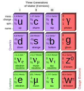
It certainly doesn't help that the so called "best explanation of the Higgs Boson" is an utterly ridiculous analogy. Personally I think a much better explanation draws parallels between the Periodic Table and the Standard Model. The Periodic Table, which we are hopefully all taught about at school, is a classification of the elements which are the basic building blocks of everything around us. It just so happens that the atoms described by the Periodic Table are composed of an even more basic set of building blocks, and these are described by the Standard Model:
This Higgs Boson is an important part of this model, and goes some way to validating the model itself. In a few decades when further evidence is collected, and the model better understood, we could see it being taught in high school physics classes.
This is really exciting stuff. Perhaps a kind font designer will provide CERN with their own font for their next announcement ... something with a bit more gravitas!
Regards, Colin E.


