
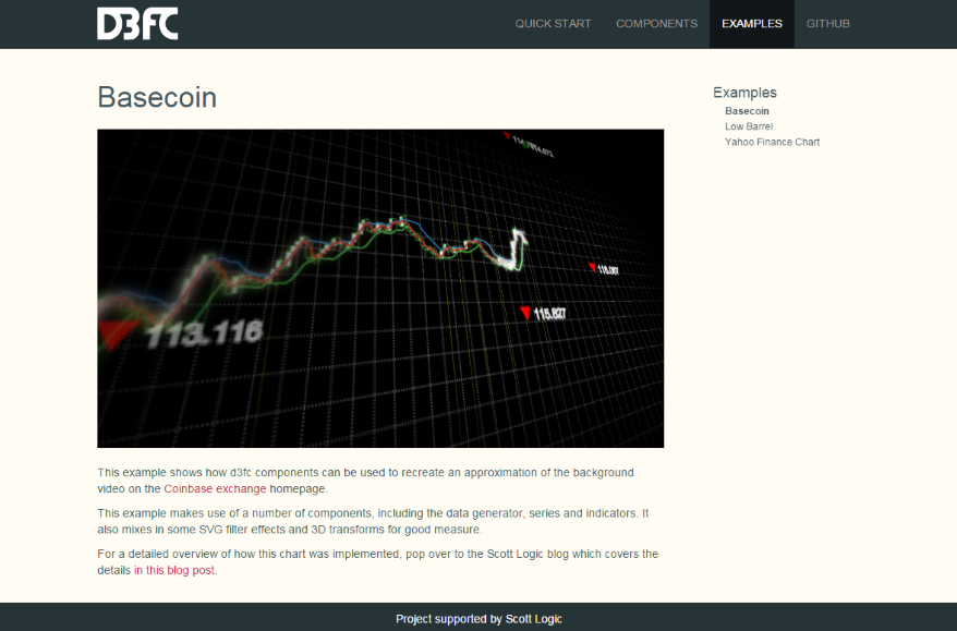
I’ve been working on an open-source charting library called d3fc. And following Colin’s lead, was looking for a creative example to replicate: I think I found it…
Once upon a time
The story starts with Coinbase, a well-known(/funded) Bitcoin company. I was hunting for a freely available streaming data feed that we could use to provide some more realistic examples. A Bitcoin feed is the obvious choice, they’re generally a lot more accessible without onerous licensing agreements and despite (because of?) recent turbulent times, are far more interesting than most financial products.
As you’d expect, the Coinbase Exchange has an API and the public market data is freely-available in historic and streaming forms. I quickly knocked up a little wrapper which has evolved into this to make the historic API easier to deal with and was about to start on a pretty boring example when I noticed a tab I still had open -

Now that chart in the background looks interesting.
Where to start
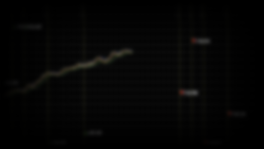
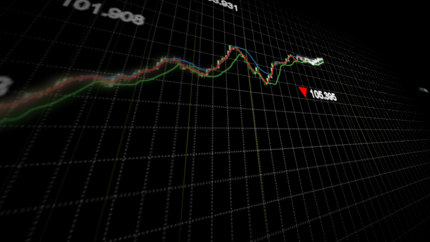
I dug in to the source and found that the chart was in fact a looping video. Here’s a screenshot -
I’m going to go out on a limb and assume this isn’t a real chart from their platform. However, it does contain a number of recognisable components from real charts -
- Candlestick series
- Indicator lines
- Gridlines
- An upward trending dataset
- Vertical annotation lines
- Free-floating labels with arrows
- Fixed label annotation (green 965.33)
Also missing from the static screenshot are the parallax (elements moving over each other as the camera moves) and depth of field (blurring of elements outside of the camera’s focus) effects. Now this isn’t exactly the kind of a chart d3fc was designed for but we do claim that it’s flexible, let’s see how far we can get.
Data
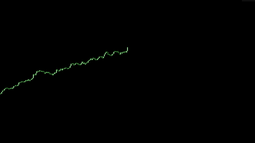
Let’s just say that the dataset used in the video is optimistic. I don’t think we can rely on a real stream to give us results like that! We could just use some hard-coded data but the library comes with a configurable random data generator so let’s use that.
The fc.data.random.financial component uses a GBM model. The model includes two configurable properties: the percentage drift (mu) and the percentage volatility (sigma). This tool lets you play with and see the effect of these values. In this case we want a relatively high positive drift with relatively low volatility -
var dataGenerator = fc.data.random.financial()
    .mu(0.2)                     // % drift
    .sigma(0.05)                 // % volatility
    .filter(fc.util.fn.identity) // don't filter weekends
    .startDate(new Date(2014, 1, 1));
var data = dataGenerator(150);
Series
Next up we need a candlestick series. In d3fc (and D3) before we can add a series, we need some scales to control how to map the domain values (e.g. dates, prices) into screen values (i.e. pixels) -
// SVG viewbox constants
var WIDTH = 1024, HEIGHT = 576;

var xScale = d3.time.scale()
    .domain([data[0].date, data[data.length - 1].date])
    // Modify the range so that the series only takes up left half the width
    .range([0, WIDTH * 0.5]);

var yScale = d3.scale.linear()
    .domain(fc.util.extent(data, ['low', 'high']))
    // Modify the range so that the series only takes up middle third of the the width
    .range([HEIGHT * 0.66, HEIGHT * 0.33]);
Then we just wire up the candlestick series -
var candlestick = fc.series.candlestick()
    .xScale(xScale)
    .yScale(yScale);

d3.select('#series')
    .datum(data)
    .call(candlestick);
And sprinkle on some CSS -
svg {
    background: black;
}

.candlestick.up>path {
    fill: white;
    stroke: rgba(77, 175, 74, 1);
}
.candlestick.down>path {
    fill: black;
    stroke: rgba(77, 175, 74, 1);
}
Our progress so far -
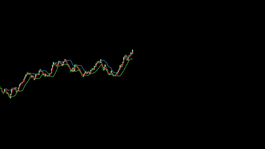
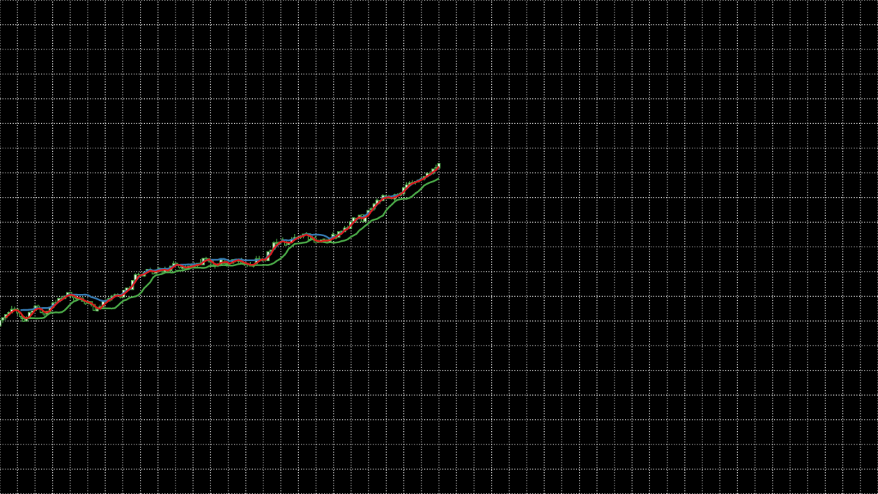
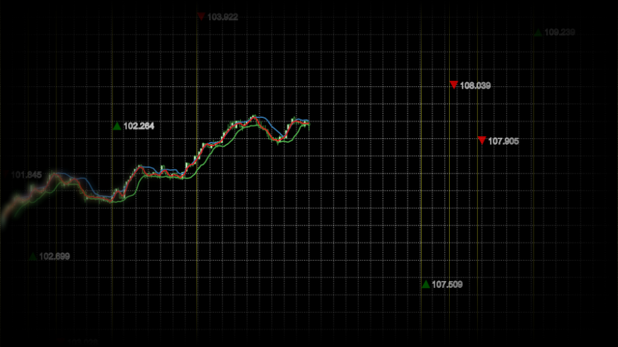
Indicators
Unfortunately, I don’t recognise the algorithm behind the indicator lines but I’m happy to put that down to my own ignorance rather than imply they’re made up! To me they look a little bit like Bollinger Bands (blue/green) with an EMA (red) running through them, we’ll go with that.
In d3fc indicators are normally composed of two parts, algorithms which augment the data with the derived indicator values and renderers which provide a default representation of those values. Some simple indicators (such as EMA) don’t have associated renderers, in those cases we just use a line series -
fc.indicator.algorithm.bollingerBands()
    // Modify the window size so that we more closely track the data
    .windowSize(8)
    // Modify the multiplier to narrow the gap between the bands
    .multiplier(1)(data);

fc.indicator.algorithm.exponentialMovingAverage()
    // Use a different window size so that the indicators occasionally touch
    .windowSize(3)(data);

var bollingerBands = fc.indicator.renderer.bollingerBands();

var ema = fc.series.line()
    // Reference the value computed by the EMA algorithm
    .yValue(function(d) { return d.exponentialMovingAverage; });
Now that we have multiple series to add to the chart, rather than manually creating containers for each of them we can use a multi series. The multi series will also take care of propagating through the scales and allow us to decorate (more details) the created containers with appropriate class names we can use for styling -
var multi = fc.series.multi()
    .xScale(xScale)
    .yScale(yScale)
    .series([candlestick, bollingerBands, ema])
    .decorate(function(g) {
        g.enter()
            .attr('class', function(d, i) {
                return ['candlestick', 'bollinger-bands', 'ema'][i];
            });
    });
The styling this time is a little bit more involved because we need to hide the area and average elements which the bollingerBands component creates by default (of course another option would be to wire up two line series to the calculated values rather than use the renderer) -
.bollinger-bands>.area,
.bollinger-bands>.average {
    visibility: hidden;
}
.bollinger-bands>.upper>path {
    stroke: rgba(55, 126, 184, 1);
    stroke-width: 2px;
}
.bollinger-bands>.lower>path {
    stroke: rgba(77, 175, 74, 1);
    stroke-width: 2px;
}

.ema>path {
    stroke: rgba(228, 26, 28, 1);
    stroke-width: 2px;
}
It’s not quite the same but I think it looks close enough at this stage -
Components
Just before we jump in and add any more functionality, it’s worth restructuring our code so that we don’t end up with spaghetti. The easiest way to do this is to adopt the D3 component pattern that is also used by the d3fc library. A component is just a factory which returns a function which operates on a selection, so the existing code becomes -
// Obviously you should use ES6 modules and mutiple files for this. I'm
// trying to keep the example as simple (and copy/paste-able) as possible.
var basecoin = {};

basecoin.series = function() {

    return function(selection) {

        selection.each(function(data) {

            // ... (the original code)

            d3.select(this)
                .call(multi);
        });
    };
};

// ... (code which doesn't belong to the component)

var series = basecoin.series();

d3.select('#series')
    .datum(data)
    .call(series);
Gridlines
The easiest thing to do now would be to add a new gridlines component to the multi. Only that’s not going to give us quite the effect we’re looking for. We want the gridlines to span the entire area of the SVG and we want them to remain static rather than moving with the data. So instead we’ll add a new sibling g element to contain the crosshairs and define a separate set of scales incorporating the whole of the SVG.
Firstly, the DOM changes -
<svg viewbox="0 0 1024 576">
    <g id="gridlines"/>
    <g id="series"/>
</svg>
Our new gridlines component is incredibly simple -
basecoin.gridlines = function() {

    return function(selection) {

        selection.each(function(data) {

            // Use the simplest scale we can get away with
            var xScale = d3.scale.linear()
                // Define an arbitrary domain
                .domain([0, 1])
                // Use the full width
                .range([0, WIDTH]);

            // Use the simplest scale we can get away with
            var yScale = d3.scale.linear()
                // Define an arbitrary domain
                .domain([0, 1])
                // Use the full height
                .range([HEIGHT, 0]);

            var gridline = fc.annotation.gridline()
                .xScale(xScale)
                .yScale(yScale)
                .xTicks(40)
                .yTicks(20);

            d3.select(this)
                .call(gridline);
        });
    };
};
And finally the styling -
.gridline {
stroke: white;
stroke-width: 0.5;
stroke-opacity: 0.5;
stroke-dasharray: 3, 5;
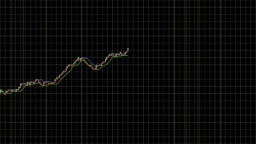
}It’s looking a little cluttered at the minute, but we’re be adding in some transforms shortly which should help sort things out -
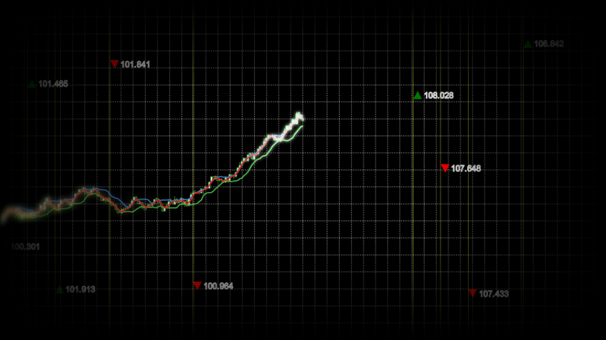
Annotations
Vertical line annotations are normally used to highlight events such as relevant news stories or instrument events. However, as there isn’t any context in this case and they look a little like they follow a Fibonacci sequence, let’s use that as the starting point for our version.
Again we create a new component for the vertical lines which itself uses the line component -
basecoin.verticalLines = function() {

    return function(selection) {

        selection.each(function(data) {

            var xScale = d3.time.scale()
                .domain([data[0].date, data[data.length - 1].date])
                // Use the full width
                .range([0, WIDTH]);

            // Use the simplest scale we can get away with
            var yScale = d3.scale.linear()
                // Define an arbitrary domain
                .domain([0, 1])
                // Use the full height
                .range([HEIGHT, 0]);

            var line = fc.annotation.line()
                .value(function(d) { return d.date; })
                .orient('vertical')
                .xScale(xScale)
                .yScale(yScale);

            d3.select(this)
                .call(line);
        });
    };
};
The plumbing this time is a little bit more complicated, we want the vertical lines to appear across the whole of the width and yet share x-values with the main series. Therefore we need to double the amount of generated data but then filter it down appropriately for each component -
var data = dataGenerator(300);

data.forEach(function(d, i) {
    // Mark data points which match the sequence
    var sequenceValue = (i % (data.length / 2)) / 10;
    d.highlight = [1, 2, 3, 5, 8].indexOf(sequenceValue) > -1;
});

var verticalLines = basecoin.verticalLines();

d3.select('#vertical-lines')
    // Filter to only show vertical lines for the marked data points
    .datum(data.filter(function(d) { return d.highlight; }))
    .call(verticalLines);

// ...

d3.select('#series')
    // Filter to only show the series for the first half of the data
    .datum(data.filter(function(d, i) { return i < 150; }))
    .call(series);
As we want the vertical lines behind the gridlines and we don’t want them to share a scale we manually create a container -
<svg viewbox="0 0 1024 576">
    <g id="vertical-lines"/>
    <g id="gridlines"/>
    <g id="series"/>
</svg>
And add some appropriate styling -
.annotation>line {
stroke: rgb(255, 255, 51);
stroke-dasharray: 0;
stroke-opacity: 0.5;
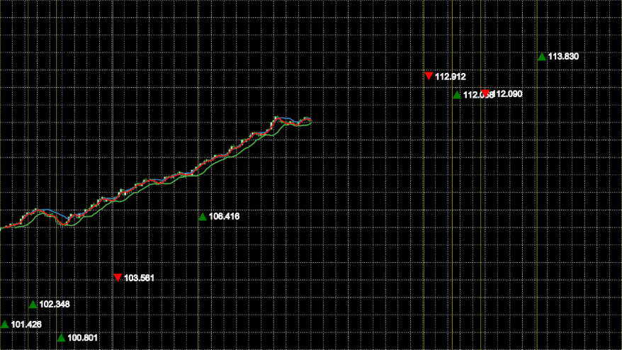
}We’re inching closer -
Labels
The only component we’re missing now is the labels. Whilst the line annotation provides a label which we could decorate (more details) with the arrow graphic, in order to achieve a later effect we need the labels in a different container element. As there’s no appropriate component in d3fc, we’ll create one from scratch.
Most of the d3fc components are built on top of the dataJoin component, it provides a couple of useful extensions to the D3 concept of data-join but can be considered identical for the purposes of this example. When each data-joined g element enters the document it will have a path element added to it for the arrow graphic and a text element for the label itself. Then on every update we want the transform to be updated to reflect any changes to the location calculated from the scales.
In code, this looks something like -
basecoin.labels = function() {

    return function(selection) {

        selection.each(function(data) {

            var xScale = d3.time.scale()
                // Match the output extent of Math.random()
                .domain([0, 1])
                // Use the full width
                .range([0, WIDTH]);

            var yScale = d3.scale.linear()
                .domain(fc.util.extent(data, ['low', 'high']))
                // Use the full height to amplify the relative spacing of the labels
                // (minus the height of the labels themselves)
                .range([HEIGHT - 14, 0]);

            var dataJoin = fc.util.dataJoin()
                // Join on any g descendents
                .selector('g')
                // Create any missing as g elements
                .element('g');

            var update = dataJoin(this, data);

            var enter = update.enter();

            // Add a path element only when a g first enters the document
            enter.append('path')
                // Pick between a down arrow or an up arrow and colour appropriately
                .attr('d', function(d) {
                    return d.open < d.close ?
                        'M 0 14 L 8 0 L 15 14 Z' : 'M 0 0 L 8 14 L 15 0 Z';
                })
                .attr('fill', function(d) {
                    return d.open < d.close ?
                        'green' : 'red';
                });

            // Add a text element only when a g first enters the document
            enter.append('text')
                .attr({
                    'class': 'label',
                    // Offset to avoid the arrow
                    'x': 18,
                    'y': 12
                })
                .text(function(d) {
                    return d.close.toFixed(3);
                });

            // Position the g on every invocation
            update.attr('transform', function(d) {
                return 'translate(' + xScale(d.date) + ',' + yScale(d.offset) + ')';
            });
        });
    };
};

// ...

data.forEach(function(d, i) {
    // Mark data points which match the sequence
    var sequenceValue = (i % (data.length / 2)) / 10;
    d.highlight = [1, 2, 3, 5, 8].indexOf(sequenceValue) > -1;
    // Add random offset for labels
    d.offset = Math.random();
});

// ...

var labels = basecoin.labels();

d3.select('#labels')
    // Filter to only show labels for the marked data points
    .datum(data.filter(function(d) { return d.highlight; }))
    .call(labels);
And yet again we need some DOM and styling changes -
<svg viewbox="0 0 1024 576">
    <g id="vertical-lines"/>
    <g id="gridlines"/>
    <g id="series"/>
    <g id="labels"/>
</svg>
.label {
stroke: white;
}Other than the odd overlapping label, I think it’s a passible approximation for realistic data -
SVG mask
In the original you get the impression of an infinite surface. Obviously we can’t do that but we can fade out the edges for a similar effect and the easiest way to do this is to use an SVG mask.
A mask is just an offscreen graphics surface onto which you add elements in the normal way. Once all the elements have been rendered, the black areas are used to create the mask. In spec terms, the pre-multiplied greyscale value of each pixel is taken as the alpha of corresponding pixel in the image being masked.
We’ll use two stacked linear gradients to get the effect we want, and for now, apply it to the whole SVG -
<svg viewbox="0 0 1024 576" mask="url(#mask)">
<defs>
<mask id="mask">
<rect width="1024" fill="white"/>
<rect width="1024" fill="url(#mask-horizontal-gradient)"/>
<rect width="1024" fill="url(#mask-vertical-gradient)"/>
<linearGradient id="mask-horizontal-gradient" x1="0" x2="1" y1="0" y2="0">
<stop offset="0%" stop-opacity="1"/>
<stop offset="30%" stop-opacity="0"/>
<stop offset="70%" stop-opacity="0"/>
<stop offset="100%" stop-opacity="1"/>
</linearGradient>
<linearGradient id="mask-vertical-gradient" x1="0" x2="0" y1="0" y2="1">
<stop offset="0%" stop-opacity="1"/>
<stop offset="30%" stop-opacity="0"/>
<stop offset="70%" stop-opacity="0"/>
<stop offset="100%" stop-opacity="1"/>
</linearGradient>
</mask>
</defs>
<!-- ... -->
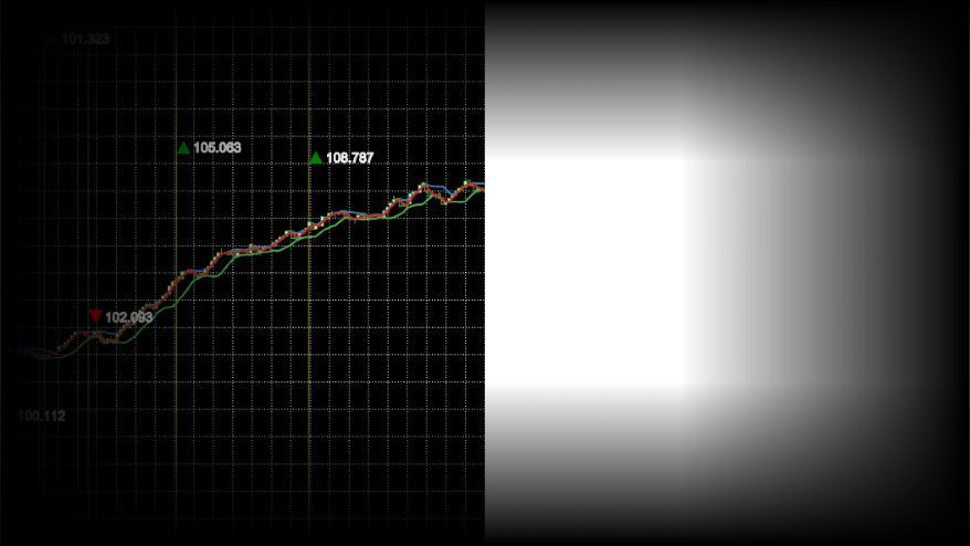
</svg>There are no code or styling changes needed. It ends up looking like this, on the left is the actual result, on the right I’ve included the raw mask -
SVG blur filter
A real depth of field effect would require us to track the relative depth values of all elements, z-order them and then apply the appropriate blur to each one. If we wanted to do that we’d be far better off using WebGL. However, we can achieve a poor-mans version relatively simply because we know that the camera will have a fixed focus on the center of the image.
Adding a blur effect in SVG requires creating a filter. A filter is in many ways like a mask, but instead of using the standard graphics elements, you use custom filter primitives. In this case we want to use feGaussianBlur (the stdDeviation attribute controls the strength of the effect) -
<svg viewbox="0 0 1024 576" mask="url(#mask)" filter="url(#blur)">
    <defs>
        <!-- ... -->
        <filter id="blur">
            <feGaussianBlur stdDeviation="8"/>
        </filter>
    </defs>
    <!-- ... -->
</svg>
Which unsurprisingly adds a blur to the entire SVG -
We don’t want the effect applied to the whole SVG though, we want a progressive blur from the left tapering out after a before it reaches the center. To get that effect we need to add a little bit more to the filter and then combine the last two techniques.
There’s no built in support for progressive blur, so we’re going to need to cheat. We’ll apply a blur to a copy of the graphic and then progressively blend between it and the original graphic -
<svg viewbox="0 0 1024 576">
    <defs>
        <!-- ... -->
        <filter id="blur">
            <feImage xlink:href="#series" x="0" y="0" width="1024" result="image"/>
            <feGaussianBlur in="image" stdDeviation="5"/>
        </filter>
        <mask id="blur-mask">
            <rect width="1024" fill="url(#blur-mask-gradient)"/>
            <linearGradient id="blur-mask-gradient" x1="0" x2="1" y1="0" y2="0">
                <stop offset="0%" stop-color="white"/>
                <stop offset="30%" stop-color="black"/>
            </linearGradient>
        </mask>
        <mask id="inverted-blur-mask">
            <rect width="1024" fill="url(#inverted-blur-mask-gradient)"/>
            <linearGradient id="inverted-blur-mask-gradient" x1="0" x2="1" y1="0" y2="0">
                <stop offset="0%" stop-color="black"/>
                <stop offset="30%" stop-color="white"/>
            </linearGradient>
    </defs>
    <!-- ... -->
    <g id="vertical-lines" mask="url(#mask)"/>
    <g id="gridlines" mask="url(#mask)"/>
    <g mask="url(#inverted-blur-mask)">
        <g id="series"/>
    </g>
    <g filter="url(#blur)" mask="url(#blur-mask)"/>
    <g id="labels" mask="url(#mask)"/>
</svg>
As well as moving around where the masks and filters are applied, the above snippet introduces a couple of new things -
feImageallows us to grab a copy of a graphic element by ID.- The
resultandinattributes allow us to be explicit about how the filter primitives are chained together. Always use them if you’re using more than one primitive otherwise their implicit application gets incredibly confusing!
And here’s the result -
SVG flare effect
My favourite feature of the animation is the flare effect which follows the tip of the data and gives it a really dynamic feel. However, from my point of view it’s probably also the most intimidating feature to deconstruct. There are a number of techniques at play and I’ve had to guess at a combination which I think look about right.
Let’s start with the most striking feature, the intensity of the flare. As white is the brightest we can go, we’ll start with a white copy of the original graphic -
<svg viewbox="0 0 1024 576">
    <defs>
        <!-- ... -->
        <filter id="flare">
            <feImage xlink:href="#series" x="0" y="0" width="1024" result="image"/>
            <feFlood flood-color="white" result="white-flood"/>
            <feComposite in="white-flood" in2="image" operator="atop" result="white-image"/>
        </filter>
    </defs>
    <!-- ... -->
    <g filter="url(#flare)"/>
    <!-- ... -->
</svg>
The above snippet introduces the feComposite primitive which allows us to control how two source primitives are composited. In this case we’ve chosen the atop operator which will take the white flood and apply it only when the opacity of the image is non-zero. Here’s the rendered result -
Next, we’ll blur the result, mix in an over saturated version using the feColorMatrix primitive and apply an appropriate mask -
<svg viewbox="0 0 1024 576">
    <defs>
        <!-- ... -->
        <filter id="flare">
            <feImage xlink:href="#series" x="0" y="0" width="1024" result="image"/>
            <feFlood flood-color="white" result="white-flood"/>
            <feComposite in="white-flood" in2="image" operator="atop" result="white-image"/>
            <feGaussianBlur in="white-image" stdDeviation="3" result="white-blur"/>
            <feColorMatrix type="saturate" in="image" values="10" result="saturated-image"/>
            <feComposite in="white-blur" in2="saturated-image" operator="over"/>
        </filter>
        <mask id="flare-mask">
            <rect width="1024" fill="url(#flare-mask-gradient)"/>
            <linearGradient id="flare-mask-gradient" x1="0" x2="1" y1="0" y2="0">
                <stop offset="40%" stop-color="black"/>
                <stop offset="45%" stop-color="white"/>
            </linearGradient>
        </mask>
    </defs>
    <!-- ... -->
    <g filter="url(#flare)" mask="url(#flare-mask)"/>
    <!-- ... -->
</svg>
And here’s the end result -
CSS 3D transforms
So far everything’s been rendered to a flat surface but to achieve the camera movement and parallax effects seen in the video, we need to kick a dimension. Again SVG isn’t the technology if you want real 3D, but we can get a similar effect if we split the scene into layers and position those in 3D space.
We’ll go with 3 layers -
- Background: vertical lines
- Midground: gridlines and series
- Foreground: labels
Each layer will be positioned in 3D space using CSS transforms. Unfortunately, we can’t apply CSS transforms directly to the graphics elements themselves so we must create an SVG for each layer and apply the transforms to them. The layers will then be placed within an inner container which we’ll use to position the camera relative to the elements and an outer one to act as a viewport.
That translates into the following HTML -
    <div id="viewport">
        <div id="camera">
            <svg id="background" viewbox="0 0 1024 576">
                <g id="vertical-lines" mask="url(#mask)"/>
            </svg>
            <svg id="midground" viewbox="0 0 1024 576">
                <defs>
                    <!-- ... -->
                </defs>
                <g id="gridlines" mask="url(#mask)"/>
                <g mask="url(#inverted-blur-mask)">
                    <g id="series"/>
                </g>
                <g filter="url(#blur)" mask="url(#blur-mask)"/>
                <g filter="url(#flare)" mask="url(#flare-mask)"/>
            </svg>
            <svg id="foreground" viewbox="0 0 1024 576">
                <g id="labels" mask="url(#mask)"/>
            </svg>
        </div>
    </div>
To which we apply the following styling -
#viewport {
    background: black;
    overflow: hidden;
    perspective: 100px;
    transform-style: preserve-3d;
}

#camera {
    padding-bottom: 56.25%;
    transform-style: preserve-3d;
    transform: rotateX(10deg) rotateY(10deg) translate3d(200px, -50px, 10px);
}

#background {
    position: absolute;
    transform: translateZ(-30px);
}

#midground {
    position: absolute;
}

#foreground {
    position: absolute;
    transform: translateZ(20px);
}
Most of the styling is self-explanatory but the following is worth a little more explanation -
- The
perspectiverule controls how “3D” the elements look and should be set relative to the z-translation values being used. I’ve previously blogged about it a long time ago! - Setting
transform-styletopreserve-3dkeeps the layers positioned in 3D space rather than flattening them and losing the effect. - The percentage value for
padding-bottomis a trick I picked up from stack overflow which allows the height to be set based on the width whilst keeping the aspect ratio.
This all ends up rendering as -
Animation
There are two animations at play, one is the camera movement and the other is the rolling data. We can set the camera movement up easily enough with a CSS animation of the transform property -
@keyframes camera-path {
    from {
        transform: rotateX(13deg) rotateY(9deg) translate3d(165px, -4px, 26px);
    }
    to {
        transform: rotateX(-1deg) rotateY(8deg) translate3d(165px, -4px, 52px);
    }
}

#camera {
    /* ... */
    animation: camera-path 15s linear 0s infinite alternate;
}
Rolling the data is conceptually just as easy, we’re going to treat the data like a rolling buffer. Inside a new render loop we’ll push a new point on the front and shift one off the end -
    function enhanceDataItem(d, i, data) {
        // Mark data points which match the sequence
        var sequenceValue = (i % (data.length / 2)) / 10;
        d.highlight = [1, 2, 3, 5, 8].indexOf(sequenceValue) > -1;
        // Add random offset for labels
        d.offset = Math.random();
        return d;
    }

    var data = dataGenerator(300)
        .map(enhanceDataItem);

    var frame = 0;

    function render() {

        var d = dataGenerator(1)[0];
        d = enhanceDataItem(d, data.length + frame, data);

        // Roll the data buffer
        data.shift();
        data.push(d);

        // ...

        frame++;
        requestAnimationFrame(render);
    }

    render();
In d3fc and indeed D3, components invocations are idempotent. In this case that means that no state is maintained in the component, you could create an instance of a component to render the first frame and use a completely new instance to render the second. So we can just move the existing component creation into our render loop -
   function render() {

        // ...

        // Filter to only show vertical lines and labels for the marked data points
        var highlightedData = data.filter(function(d) {
            return d.highlight;
        });
        // Scales which receive a subset of the data still it's full extent
        highlightedData.xDomain = [data[0].date, data[data.length - 1].date];

        var verticalLines = basecoin.verticalLines();

        d3.select('#vertical-lines')
            .datum(highlightedData)
            .call(verticalLines);

        var gridlines = basecoin.gridlines();

        d3.select('#gridlines')
            .datum(data)
            .call(gridlines);

        var series = basecoin.series();

        d3.select('#series')
            // Filter to only show the series for the first half of the data
            .datum(data.filter(function(d, i) { return i < 150; }))
            .call(series);

        var labels = basecoin.labels();

        d3.select('#labels')
            .datum(highlightedData)
            .call(labels);

        frame++;
        requestAnimationFrame(render);
    }

    render();
So far all you’ve seen is static screenshots. That was for a good reason…
Performance
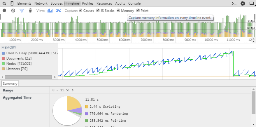
Times like these call for the Chrome Timeline view. In this case it really doesn’t make pretty reading -
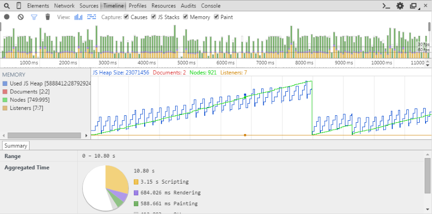
There are a number of things we can see from the results -
- Our per-frame JavaScript processing time (the yellow section of the vertical bars at the top) is eating, and often exceeding, our 60fps time budget (the lower horizontal black line). In fact the loop is so slow Chrome is choosing to occasionally skip it to bump the CSS animation frame rate…
- There is also a huge painting time associated with each frame (the green section of the vertical bars at the top).
- There’s some good news in the memory stats, we don’t appear to have a memory leak (the blue line series). Although we are creating and disposing of ~250 nodes every ~8 seconds (the green line series), it would be good to bring that down to speed up GC.
Luckily there are a few tricks we can use to speed things up, let’s start with the JavaScript processing.
Optimising the components
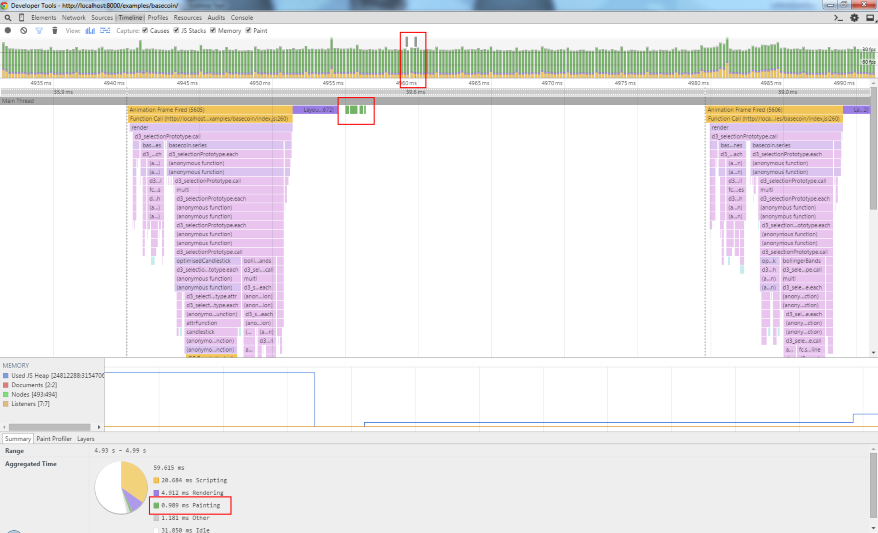
As always with performance profiling it’s easy to guess wrongly at the cause of any problems, so let’s take an analytical approach using the Chrome Debug tools. Here’s the CPU profile flamegraph for a frame (left to right is time, top to bottom is an inverted call stack) -
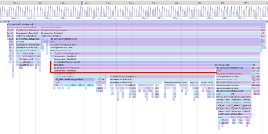
The candlestick rendering is taking a huge proportion of the frame processing time, let’s start with that. Out of the box it generates the following DOM structure for every bar -
<g class="candlestick up" transform="translate(0, 373.4747302706794)" style="opacity: 1;">
    <path d="M-1.2885906040268438,3.842759099129694h2.5771812080536876V1.9734192579970795h-2.5771812080536876V3.842759099129694zM0,1.9734192579970795V0M0,3.842759099129694V3.9332679334513045"></path>
</g>
Whilst that will work well for a small number of bars, it seems an overly complicated structure for our needs. As we’re rendering 150 bars, that’s a significant amount of DOM nodes to manage. Luckily, the library is designed in a layered fashion so if candlestick isn’t working for us, let’s pull it apart.
Peeking into the source of the component, you can see that the actual candlestick path generation is being done by a separate component fc.svg.candlestick. As we want to get things running as fast as possible and we don’t need to decorate (more details) individual bars (the reason behind the g elements), let’s directly use this underlying component.
Starting with the foundation of any component -
basecoin.candlestick = function() {

    var optimisedCandlestick = function(selection) {
        selection.each(function(data) {

        });
    };

    return optimisedCandlestick;
};
We’ll add in a configurable xScale and yScale so that we can use it with multi -
basecoin.candlestick = function() {

    var xScale = fc.scale.dateTime(),
        yScale = d3.scale.linear();

    var optimisedCandlestick = function(selection) {
        // ...
    };

    optimisedCandlestick.xScale = function(x) {
        if (!arguments.length) {
            return xScale;
        }
        xScale = x;
        return optimisedCandlestick;
    };
    optimisedCandlestick.yScale = function(x) {
        if (!arguments.length) {
            return yScale;
        }
        yScale = x;
        return optimisedCandlestick;
    };

    return optimisedCandlestick;
};
Then configure the candlestick SVG path generator -
basecoin.candlestick = function() {

    // ...

    var candlestick = fc.svg.candlestick()
        .x(function(d) { return xScale(d.date); })
        .open(function(d) { return yScale(d.open); })
        .high(function(d) { return yScale(d.high); })
        .low(function(d) { return yScale(d.low); })
        .close(function(d) { return yScale(d.close); })
        .width(5);

    var optimisedCandlestick = function(selection) {
        // ...
    };

    // ...
};
Now we’re going to bring it all together and use dataJoin to add two singleton path elements, one for the up bars and one for the down bars (they require slightly different styling) -
basecoin.candlestick = function() {

    // ...

    var upDataJoin = fc.util.dataJoin()
        .selector('path.up')
        .element('path')
        .attrs({'class': 'up'});

    var downDataJoin = fc.util.dataJoin()
        .selector('path.down')
        .element('path')
        .attrs({'class': 'down'});

    var optimisedCandlestick = function(selection) {
        selection.each(function(data) {
            var upData = data.filter(function(d) { return d.open < d.close; }),
                downData = data.filter(function(d) { return d.open >= d.close; });

            upDataJoin(this, [upData])
                .attr('d', candlestick);

            downDataJoin(this, [downData])
                .attr('d', candlestick);
        });
    };

    // ...
};
Finally a small tweak to the styling, due to the DOM changes -
.candlestick>.up {
    fill: white;
    stroke: rgba(77, 175, 74, 1);
}
.candlestick>.down {
    fill: black;
    stroke: rgba(77, 175, 74, 1);
}
And it looks exactly the same visually, but what’s that done to the performance -
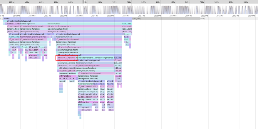
That’s done the trick! Let’s see what that’s done to the timeline -
We’re now within the magic 60fps for processing time (yellow section of vertical bars), we’ve reduced the DOM node thrashing (green lines) and paint time (green section of vertical bars). However, we’re still losing a lot of time to painting.
Optimising the effects
Digging into the painting problems is going to require a less analytical approach. Whilst the frame-by-frame view at the top of the timeline shows a significant paint time, the flame chart is showing barely any painting time and the aggregated time at the bottom shows a very different story -
Time for some old-skool binary debugging i.e. turning things off to see what improves performance. Before we do that thought, let’s add a little snippet to give us some hard numbers -
var frame = 0;
var frameTimings = [];

function render() {
    frameTimings.push(performance.now());

    // ...

    if (frame % 300 === 0) {
        var sum = frameTimings.reduce(function(sum, d, i, arr) {
            if (i < arr.length - 1) {
                sum += arr[i + 1] - d;
            }
            return sum;
        }, 0);
        console.log('avg', sum / (frameTimings.length - 1));
        frameTimings.length = 0;
    }
    frame++;
    requestAnimationFrame(render);
}
This will give us an average of the inter-frame time over 300 frames. The baseline number in Chrome 43 on my machine is 40-41ms.
As a first stab let’s look at the SVG filters and masks. As with everything, in graphics you want to be doing as little work as possible. As it stands we’re applying the filters to the whole image and then masking it back to only a subset of the image. What if instead we restricted the filter to only the subset of the image which would be visible after the mask had been applied?
Using the configurable filter effects region defined in the spec, let’s add constraints to the blur and flare effects -
<filter id="blur" x="0%" y="0%" width="30%" height="100%">
  <!-- ... -->
</filter>
<mask id="blur-mask" x="0%" y="0%" width="30%" height="100%">
  <!-- ... -->
</mask>
<mask id="inverted-blur-mask" x="0%" y="0%" width="100%" height="100%">
  <!-- ... -->
</mask>
<filter id="flare" x="40%" y="30%" width="11%" height="40%">
  <!-- ... -->
</filter>
<mask id="flare-mask" x="40%" y="30%" width="11%" height="40%">
  <!-- ... -->
</mask>
That’s dropped the inter-frame timings to around 33 and whilst that’s not the silky smooth 60fps I was hoping for, it’s good enough for this example. If I had to get the performance improved I’d probably look at ways of painting to surfaces once and then moving the surfaces (rather than doing full repaints each time) but that’ll have to wait for another day.
The end result
To see the end result you’ll need a webkit-based browser; testing with other browsers reveal that their support for feImage doesn’t extend to referencing local elements by ID, you’re only able to reference external images. I have an idea on how I can work around that but again that’ll have to wait for another day.