
We have recently been working on concept designs for a banking app aimed at the new generation of bank users. The main screen of one of such concepts hinges on a seamless transition between different views to communicate the relationship in the underlying data.
While we often work with smaller, simpler animated touches in UI, the complexity and importance of this animation was beyond what we had previously attempted. We knew rough prototypes using Keynote or animations using pre-made libraries would not enable us to capture or communicate our idea sufficiently, so we opted to use Adobe After Effects even though our experience with it was relatively limited.
In this blog post, I wanted to share the main steps we went through for creating this prototype video, along with what we learned along the way. This is not intended to be an in-depth tutorial about the concepts or tools involved, but I will provide references for further reading where appropriate.
Sketching
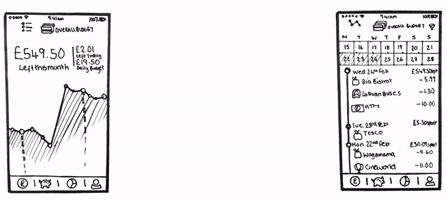
The main screen of the concept contains both an overview focusing on the user’s budget – with their money and spending plotted over time – and a detailed list of all the underlying transactions. Since the displayed time span was shared between these views, a seamless transition between them could help establish a clear understanding that they represent the same underlying information.
A few sketches (viewed above) were enough to capture our initial idea for the transition between the two views - the chart of the overview would “flatten” as the time axis moves from its horizontal orientation to a vertical transaction list.
Medium to High Fidelity
Since we were primarily focused on experimenting with the animated aspect of this design, we wanted to make a rough video prototype as quickly as possible, so we didn’t dwell in the sketching phase very long. To that effect, we decided to skip straight over the intermediary fidelity steps we would typically use to explore other aspects of the design and translated the sketches directly into reasonably high fidelity.
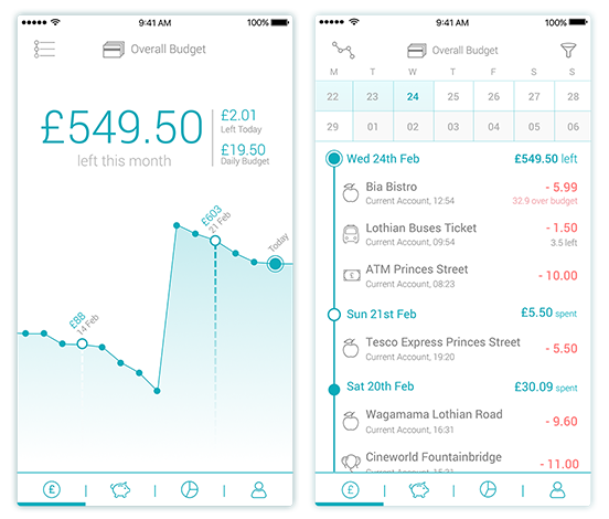
The additional fidelity meant we were able to start thinking in more detail, and with more ambition, about the animation. We wanted the chart movement to feel like a metal chain that would move in a mechanical, precise fashion. Instead of the chart spikes flattening, each dot would now be pulled down by an invisible force, which would force the chart to align to a vertical position. The hope was that this would give it a sharp, realistic feeling that would complement the overall minimalistic look.
We also realised that the user’s focus should be kept on the right-most dot on the chart - the most recent entry of the screen - since it would be the point of alignment between the overview screen and the transaction list, thus maintaining orientation between the two different scales.
The higher fidelity designs also brought to light other UI elements that needed further consideration. For example, the icon for the view toggle button should ideally also reflect the transition between the two views. Many of these little details required us to go back to sketching on paper multiple times.
For now this all seems theoretical and hard to imagine - and that is the real issue. No matter how many sketches and post-its we filled, no matter how much we might talk through our ideas, without a reasonably high fidelity prototype of an animation your ideas may still seem obscure to those working with you.
Preparing Documents
Having created the higher fidelity mock-ups in Sketch, we had to go through a few steps to import the assets into After Effects so that we could manipulate the UI elements appropriately.
We first exported the two screens separately as SVG. Illustrator is able to open these files, but generally creates a mess of layers that would be awkward to track and control in After Effects. Fortunately, using the “Create Layers” tool described in this video makes the necessary tidy-up relatively straightforward.
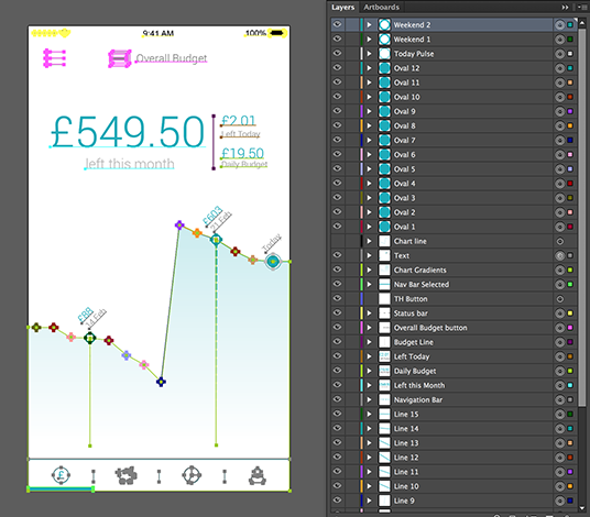
Having repeatedly gone back and forth between the Illustrator file and After Effects to improve our starting point, we recommend careful consideration of the following when planning your layers: * Depending on the complexity of the interaction, you might end up with dozens of layers to manage in the animation timeline. Giving them names you will recognise later on will greatly speed up the workflow. * Objects in the same layer are moved as a group in After Effects, so judicious layering can save time and effort. Thankfully, updates in the Illustrator file are automatically synced into After Effects if you need to go back and separate objects.
The now-tidy Illustrator file was then imported into a new After Effects composition, maintaining layer sizes (as also shown in the aforementioned video).
We also broke some of the elements into further nested After Effects compositions that could be worked on in isolation. This makes the timeline less daunting to work with, since there are less layers to deal with at any given time, which means that a small tweak to part of the animation does not have significant repercussions elsewhere.
Making Things Move
At this point, it’s probably best to start by showing how the animation turned out, so that we can discuss some points individually.
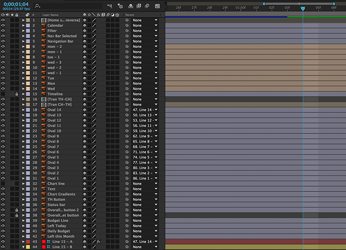
To achieve the desired chain-like movement, each dot was animated separately along individual arched paths. By rigging the chart line as a skeleton using a plugin called DUIK (and this very useful DUIK tutorial), moving a dot caused the lines in between to move automatically, thus maintaining the connection between nodes and achieving the desired effect with significantly less effort. Arching the motion paths made movement feel more natural – a little hint we picked up from the 12 principles of animation.
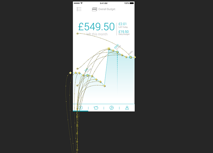
Timing was equally important to achieving the desired feel. Through trial and error, we realised that our initial approach of having the dots start moving after equally spaced short intervals lacked the feeling of an invisible force pulling the chain. Instead we had to create reverse inertia by having the first dots move faster than the later ones, so that both the movement of individual dots as well as the whole was eased. This effect means the last dot aligns slowest, allowing focus to remain on that key point to help the viewer process the transition.
Finally, the reverse screen transition was made by duplicating the original composition, reversing it, and inverting the sequence’s timings. The icon’s animation was made in a separate composition and then included in the final master, coinciding the timings. The entire clip was looped before capturing it as a GIF (using Giphy Capture) for easier sharing amongst the team.
On Reflection
Creating this reasonably detailed video prototype has helped us realise that there is another pragmatic balance between effort and outcome when it comes to animation and that this probably shouldn’t always be a “rapid” process in its purest sense. Sometimes taking the time and care to explore an animation idea, with the right level of motion detail, is necessary to truly assess its potential.
No matter how “smooth” and “cool” the animation looks like in our head, it is difficult to convincingly convey the idea through words, still pictures and awkward gesticulations - a huge exercise in telepathy that a semi-polished video prototype may just be best equipped to solve.
