Recently I attended a software testing conference held in Manchester. While I was at the conference I had a conversation with Andrew Morton (@TestingChef) about Twitter. Andrew told me he had a theory that at conferences people tweeted more in the morning than in the afternoon. As an active Tweeter and passionate R user I thought it would be interesting to try collect some real data, take a look and see what was happening.
Once the conference was over and I had finished my write up of the event I made a new github repository and started playing around with R. R, sometimes also called Rstats, is a an open source programming language used for statistical analysis and generation of graphics. I wanted to gather up all the tweets about Test Bash Manchester so I could start looking at them. I found that there was an R package called twitteR specifically designed to mine tweets out of Twitter.
Mining Twitter For Data
I went to http://dev.twitter.com and created a new application in order to get hold of a key and secrets so I could start accessing the Twitter API.
To get around storing my secrets in plain text in my script (I didn’t want anyone to be able to read them straight out of github), I used environment variables to keep them safe.
The process of mining tweets from Twitter was quite straight forward. Install the twitteR package, include the twitteR library, give it all the keys and secrets, call a function to authenticate then call another function to search. There was even a nice helper function to convert the big long list of tweet data returned into a dataframe so it could be manipulated easily.
Here is a basic example I wrote that will collect the 100 most recent tweets containing the hashtag #cat
The code snippet above assumes the API secret is stored in an environment variable called TWITAPISECRET and the access token secret is stored in an environment variable called TWITTOKENSECRET
Its worth mentioning that the Twitter API does not hold on to all tweets forever. I found that tweets are generally available for about 10 days before they are gone forever. However because R is awesome it is possible to save a batch of tweets that can be loaded and investigated at a later date.
On 29-10-16 I mined and saved 2840 tweets tagged #testbash which spanned a period of the previous 10 days covering the day of the conference. I did this by converting tweets into a dataframe and using saveRDS() and readRDS() functions to save and load my dataframe as a .Rda object.
The tweets I mined required a little bit of clean up. I had mined on the #testbash hash tag which also included tweets about Test Bash conferences in Brighton, Philadelphia and Netherlands so I discarded tweets which were not specifically about the Manchester event. I also only focused on tweets created on 21st October 2016, the day of the conference. It is also worth mentioning that all the tweet data to UTF-8 to resolve problems caused by tweets containing emojis.
Top 5 Most Favourited Tweets
Immediately after mining the tweets it was very easy to see the top 5 most favourited from the day of the conference. They were as follows:
1st Place - 50 hearts
Created an environment today for 250 people to confer&talk about #testing, wow, so proud. Appreciate all attendees, TY. #TestBash
— Richard Bradshaw (@FriendlyTester) October 21, 2016
2nd Place - 37 hearts
When you do a feedback wall, genuinely wanting feedback! and this is the first and currently only comment... #TestBash pic.twitter.com/snWv8aiVgS
— Richard Bradshaw (@FriendlyTester) October 21, 2016
3rd Place - 35 hearts
Our awesome #TestBash speakers #GirlPower ! pic.twitter.com/wGp33gtXAd
— Kristīne Corbus (@e_tester) October 21, 2016
4th Place - 32 hearts
The #testbash crowd after my 99 second talk on talking! I got pictures with 43 people today, not including this photo! pic.twitter.com/59GPxERQPk
— Cassandra H. Leung (@Tweet_Cassandra) October 21, 2016
5th Place - 31 hearts
The queue for 99 second talks. It's where it all started for me! #TestBash pic.twitter.com/xgovsUfzBn
— Richard Bradshaw (@FriendlyTester) October 21, 2016
Examining Frequency Patterns
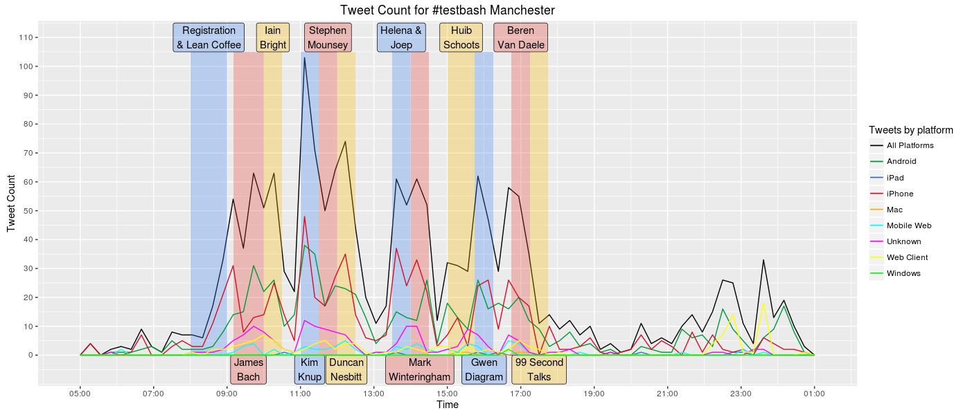
A few months ago I started learning how to draw advanced graphics in R using a package called ggplot2. I was able to use this package to create a frequency polygon of the conference day tweets and identify some of the different platforms the tweets had originated from. Please use this link to view the full size image and get a better look

I used a black line to represent the total tweet frequency and different coloured lines to show the quantity of tweets originating from different platforms. I added annotations to the plot to indicate who was speaking at the time.
Straight away it became very clear that there was a spike in Twitter activity during Kim Knup’s talk on positivity. This was one of my favourite talks of the day and I’m not surprised it got people talking on Twitter.
Tweeting activity can be seen to drop during the breaks and is especially low at lunch time. Possibly because during lunch everyone is focused on eating, not tweeting.
The level of twitter activity in the afternoon does not appear to be lower than the level of activity for the first two talks of the day.
It is also interesting to see how the number of tweets from Android and iPhone devices starts to fall by 18:00pm. I know the battery in my Android phone was at about 3% charge by 17:30pm which stopped my tweeting efforts. It’s also noticeable that there aren’t many tweets between 20:00pm and 22:00pm. This coincides with timing of the 2016 Dyn Cyber Attack that brought Twitter to its knees making it too slow to use between 20:00pm BST and 22:10pm BST.
Looking at times and quantity of tweets is one thing, but it does not tell us very much about the content of these tweets. I wanted to perform sentiment analysis to dig deeper and try discover more.
Lexicon Based Sentiment Analysis
A good place to start with sentiment analysis is to compare the tweets to a lexicon of positive and negative words. Then score each tweet +1 for containing a positive word and -1 for containing a negative word.
I used a lexicon created by Minquing Hu and Bing Liu at the University of Illinois. This Lexicon can be downloaded from: http://www.cs.uic.edu/~liub/FBS/opinion-lexicon-English.rar
It is very important however to tailor any lexicon you may use for this purpose to the subject matter it is evaluating. Some of the changes I made to the lexicon included:
- Adding words specific to the domain of software development e.g.’wagile’ , a negative term used to describe agile development which has reverted back to waterfall.
- Made some corrections based on context, e.g. I reclassified the word ‘buzzing’ from negative to positive.
- Added UK spellings along side US counterparts e.g. ‘honour’ as only US version ‘honor’ was present.
I also removed all the positive and negative words present in titles of each speakers talk from the word lists. I did this to try mitigate bias as words in talk titles are mentioned more frequently but used to identify talks and do not carry a sentiment.
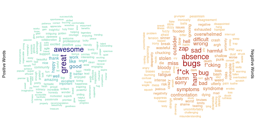
Once I had managed to identify positive and negative words in the conference day tweets, I was able to use this data to draw some word clouds. Some of the text is quite small on the image below so here is a link to the full size image.

I drew two clouds, one positive and one negative. The larger, darker words in the centre appear more frequently than the smaller, lighter words towards the edge of the cloud. Be aware however that people on Twitter do swear and as such any data mined from Twitter may contain profanity. I chose to censor the profanity in my plots with the addition of some strategically placed asterisks.
Once all the tweets had been scored for sentiment, this made it possible to identify the most positive tweet on conference day:
@gwendiagram Thanks! I learned quite a few things building it. :-) @HelenaJ_M
— Joep Schuurkes (@j19sch) October 21, 2016
And also the most negative:
Using a bug reports to beat up developers.testers didn't talk to them we just tried to make them cry @Punkmik #testbash bad old days wagile
— Ian Bell 2i (@ianbell2i) October 21, 2016
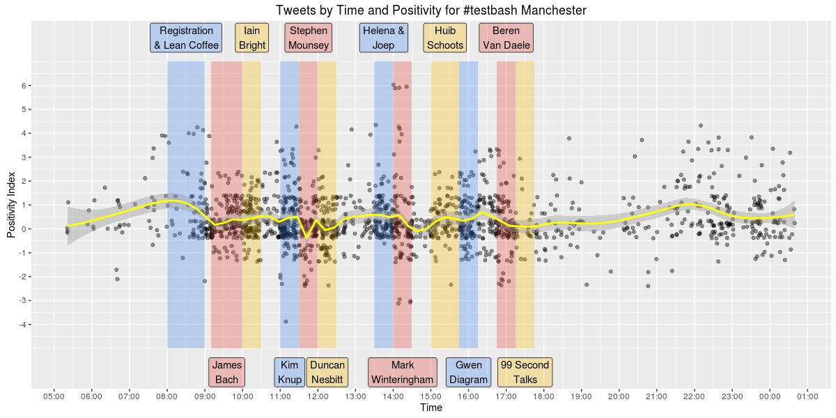
I wanted to plot all the conference day tweets by their sentiment score to see which parts (if any) were especially positive or negative. I was able to do this using a scatter plot. Again, the image below is quite small so please use this link if you wish to view the plot at full size.

This plot uses ‘jitter’ which adds a small amount of noise to uniformly distributed variables. So rather than having all the tweets with the same sentiment score in a perfect horizontal line, it shakes them up a bit and moves them a tiny distance in a random direction. I also reduced the alpha transparency level for each point on the scatter plot to make it easier to see areas where the tweets were more densely packed. I added a yellow line to the plot which is a smoothed conditional mean using a loess model. This line shows roughly how the positivity levels of tweets change throughout the day.
Positivity builds in the run up to the start of registration at 8:00am and remains positive between 0 and 0.5 until around 11:30 when it suddenly drops during Stephen Mounsey’s talk. I was curious as to what was being tweeted around this time so I took a look.
@stephenmounsey claiming that we don't really listen or something. Wasn't really paying attention 😀#testbash pic.twitter.com/IZav5FpbGv
— Del Dewar (@deefex) October 21, 2016
Seems there quite a few tweets about not listening, this may explain the negativity during this section.
Positivity levels also dipped again during Mark Winteringham’s talk at around 14:15 I checked the tweets again to see what was going on.
My 60 sec 99 second talk (yes, I'm still bitter) at #testbash 2015 was about @2bittester's topic. I'd be right there ranting with him
— Andrew Morton (@TestingChef) October 21, 2016
Tweets about ranting and what not to do with acceptance scenarios were responsible for lowering positivity levels during this section of the conference.
Its also worth noting that after all the talks were done positivity seemed to rise again, peaking at around 22:00. I like to believe this was due to the drinking and socialising that was done afterwards but 22:00pm was around the time Twitter came back online after the DDOS attack :)
I have made the script I wrote to generate all these plots (along with the Twitter data I analysed) available on git hub for anyone interested in looking at the tweets themselves or building upon the analysis that I did.
And now a shameless plug: If you are local to Newcastle and interested in finding out more about Twitter mining and sentiment analysis, I am giving a talk at Campus North on 12th December 2016 as part of the R North East bi-monthly Meetups and it would be great to see you there!
This post was also published on my software testing blog Mega Ultra Super Happy Software Testing Fun time.
