
Any company owning several different brands, or selling a customisable product, will have to decide a technical approach to white-labelling.
With new versions of web technology constantly emerging it can be hard keeping any solution up to date. Here I present a simple way to style an application with multiple themes.
The tech
The canvas for this demonstration will be a simple, one page, application.
The packages used include:
I won’t go into the details of the application itself here, but the keen reader can find the full implementation here.
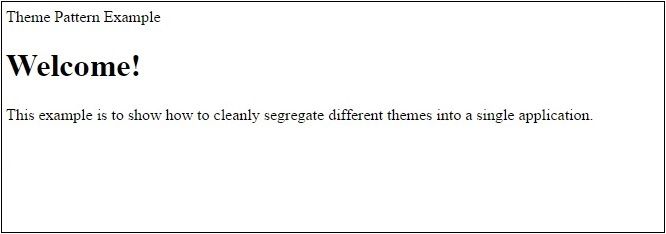
Here is the rendered page shown here in all its naked glory:
1 There’s no reason this solution couldn’t be extended to any framework of choice, for example Angular 2.
Let’s get a-stylin’
The app will use two themes, ‘light’ and ‘dark’, and will differ by their colour schemes.
To be able to swap out any particular theme we’ll create a layer of semantic variables for the components to use, behind which the palette will sit.
Let’s create a sensible folder structure for these themes:
src
|
+---themes
    |
    +---dark
    |   |
    |   ---colors.css
    |   ---theme.css
    +---light
        |
        ---colors.css
        ---theme.css
And then construct the themes themselves:
// Light theme
@import './colors'

:root
  --header-background-color: var(--dark-grey)
  --header-text-color: var(--white)
  --heading-large-color: var(--dark-grey)
  --body-text-color: var(--light-grey)
  --body-background-color: var(--off-white)
  --default-font-family: Arial, Helvetica, sans-serif
  --heading-font-family: var(--default-font-family)
  --body-font-family: Cambria, Georgia
// Dark theme
@import './colors'

:root
  --header-background-color: var(--dark-blue)
  --header-text-color: var(--black)
  --heading-large-color: var(--light-blue)
  --body-text-color: var(--light-grey)
  --body-background-color: var(--dark-purple)
  --default-font-family: Arial, Helvetica, sans-serif
  --heading-font-family: var(--default-font-family)
  --body-font-family: Cambria, Georgia
The first thing to notice is that each file defines the same number of variables with the exact same names. These theme files can be thought of as defining interfaces for the styling of the application. Therefore any time a new variable is made, or a name is changed, the developer must be mindful to update the other themes too.
Each theme can separately define its colours as has been done here, for example
// Light colours
:root
  --dark-grey: #231f20
  --light-grey: #888
  --white: white
  --off-white: #efe8e8
No other file but the corresponding theme.css should use these definitions, or else you run the risk of having some components of the application not changing theme.
Components
Time to start using our shiny themes. Let’s start with the simplest component, Title.
import React from 'react'

import styles from './Title.css'

export default function Title({ children }) {
  return (
    <h1 className={styles.title}>{children}</h1>
  )
}
Here we use css-modules to import the styles for this component and apply them. Nothing untoward here.
Delving into the stylesheet:
// Title.css
@import 'theme'

.title
  color: var(--heading-large-color)
  font-family: var(--heading-font-family)
  margin: 0
  margin-bottom: 30px
So we see the theme being imported, and then the semantic variables painted across the file.
Now whenever the imported theme is swapped out all the components will fall in line and fly the banners of the new theme.
But hang on a minute! This import isn’t absolute or relative… how can this guy know where the theme is, let alone if it’s the right one?
The magic
Because we’re using postcss, we can hook into the resolve feature of post-css-smart-import2.
Using this feature we can scan the imports to see if they match theme, and resolve the path to the correct brand using a build variable.
The build variable can be configured in the package.json:
"config": {
  "theme": "light"
},
And here is the updated postcss.config.js:
module.exports = {
  parser: 'sugarss',
  map: false,
  plugins: [
    require('postcss-smart-import')({
      resolve: function (id, baseDir, importOptions) {
        const theme = process.env.npm_package_config_theme
        const newId = id === 'theme' ?
          path.resolve(__dirname, `src/themes/${theme}/theme`) :
          id

        return customResolve(newId, baseDir, importOptions)
      }
    }),
    require('precss')({ }),
    require('autoprefixer')({ })
  ]
}
So we’re looking to the configured theme, and then scanning the imports ready to replace any @import 'theme' with the correct file. This relies on the folder structure defined above so we can replace the correct part of the path with the configured theme.
customResolve is a reimplementation of the default behaviour in postcss-smart-import shown here.
And with that we’re ready to go!
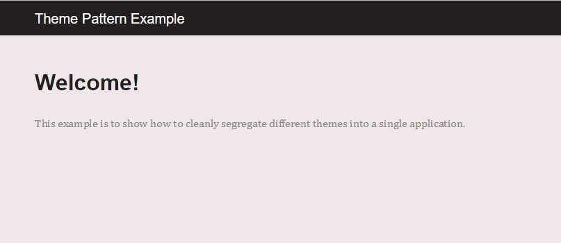
Light theme:
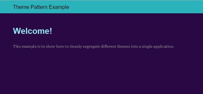
Dark theme (forgive the colouring):
2 If we weren’t using postcss, and were say using SASS, the same effect shown above could be achieved by using a webpack alias. It’s not possible here because postcss gets its hands on these imports from right under webpack’s nose.
Conclusion
This is one of many different ways white-labelling can be achieved. If you’re into javascript styling, including styled components then this pattern of definitions and build time replacements can still be used.
If you need the application to be able to switch the theme on the fly then tweaks are needed here to include both themes in the final stylesheet, instead of specifying at build time.
