
Intro
For our 12-week summer internship, Paulius Pocius and I were tasked with making the office foyer screen responsive and customisable, with a view to eventually having it installed locally on all office desktops. In this post I will discuss how we did this, and talk about some of the challenges we found along the way.
The foyer screen is an in-house project created by the previous year’s interns, designed to show information specific to each office such as the status of local transport, weather and news. You can read their post on the topic here. At the time the plan was to display the foyer screen on the monitor in the new office, however when setting it up, it turned out that the resolution wasn’t quite what the display had been designed for. This highlighted the lack of responsiveness of the layout and components, which until now was remedied by zooming in on the browser.
Old Vs New
Here’s a comparison between the default display before and after our time here:
Before:
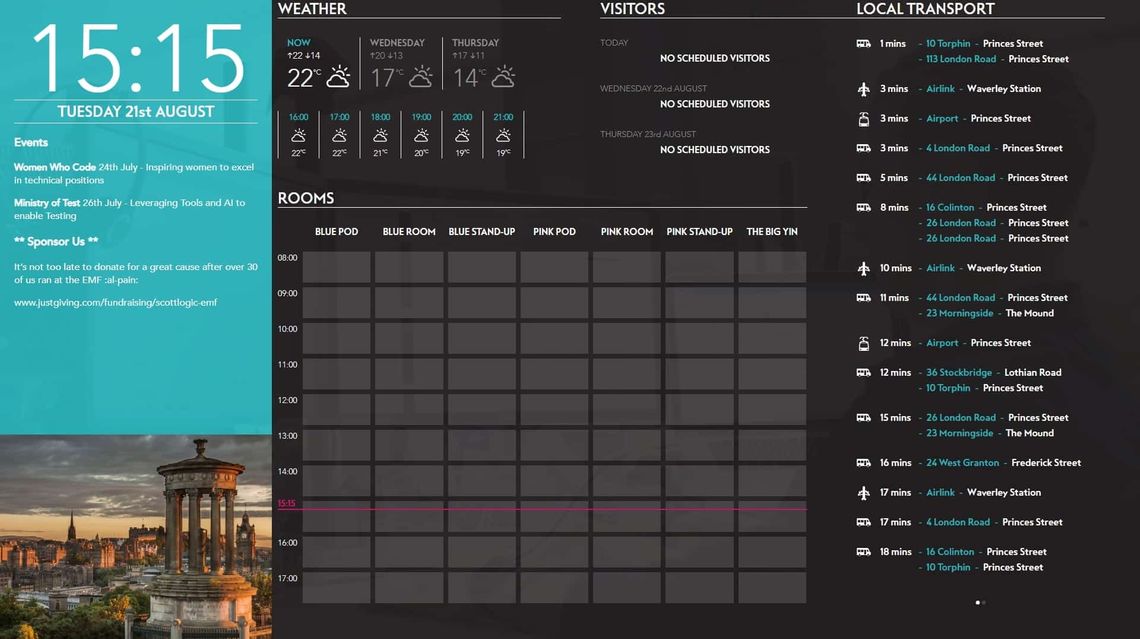
After:
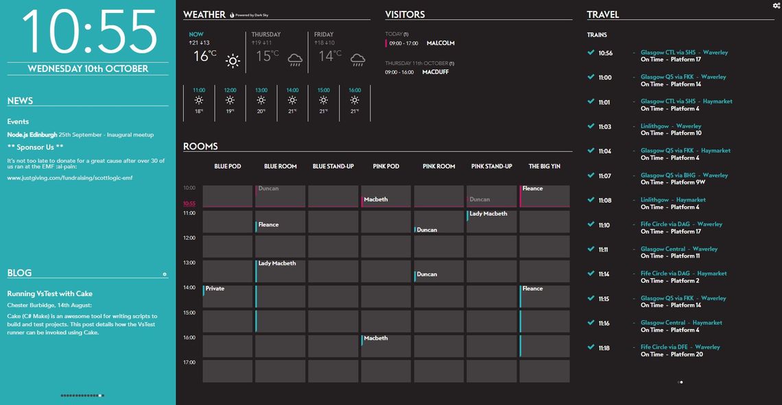
The changes we’ve made are mostly interactive, so this isn’t very illuminating. Here are some alternative layouts:
If you just want to change things around:
If the weather means a lot to you:
If travel takes priority:
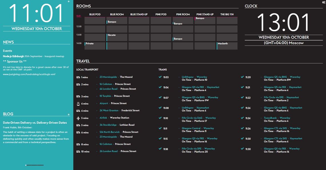
Or if you’re really interested in the time:
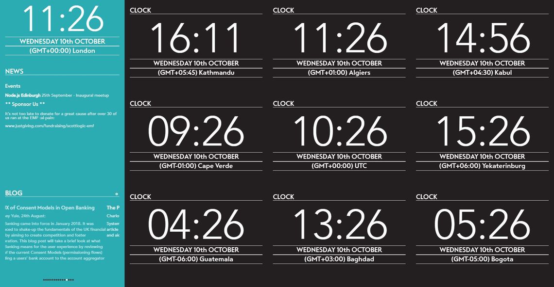
N.B We realised too late that showing a constant GMT offset is incorrect for many time zones (it can change through the year), but that’s now a problem for someone else to tackle.
Getting Started
When we began the World Cup was in full swing, which meant much of our effort was focussed on maintaining the World Cup widget despite FIFA’s best efforts to break it - we were having to scrape their web page for live results. Another problem we ran into was when passing FIFA World Cup data from backend to frontend, the map data structure wasn’t being sent correctly through the websocket, so we had to replace it with an object. When we weren’t wrestling with regex we had time to get familiar with the foyer screen as it existed. Neither of us had any previous experience with React, Redux, or working on an established codebase for that matter, so it took a while for us to get a grasp of what was going on.
Our first task was creating a component to display recent posts from the Scott Logic blog. We did this using the same scrolling technique as in other components to cycle through the posts, which are taken from the blog’s atom feed and parsed using a package called feedme. An opacity gradient at the bottom of posts softens the text cut-off if there’s not enough room for a post. While making this component we got a good insight into how the rest of them work, setting the stage for our main task.
The Project
Once we were settled in, we were presented with the task of turning the static display into a responsive one, with interactive elements. It was to respond to changes in window/screen size and be user configurable for content and layout.
Our approach
The main package behind the responsiveness is react-grid-list which provides draggable, resizable containers. Adapting the old display to fit into a grid was fairly straightforward thanks to the existing grid-like design. The page has breakpoints at which the number of columns changes, adapting as the window shrinks and expands. It took some time for us to understand how to reconcile the Redux store state with the grid’s internal state, as they influenced each other and the flow of data was sometimes hard to follow.
The display is divided into two, the section with the blue border is a static grid that currently shows the time, news and recent blog posts. Having this section separate provides a space for management to place important content somewhere it can’t be accidentally removed or ignored. This grid is split into 12 rows, allowing granular placement and sizing of components, reducing wasted space.
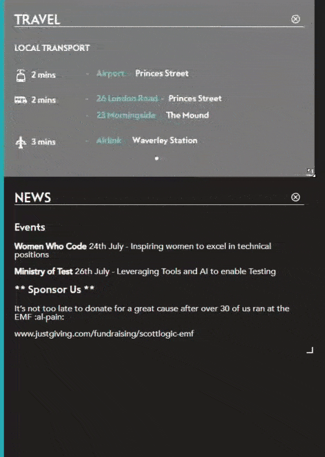
The other, larger section of the display is fully customisable by clicking the cog in the top right of the screen. This opens ‘layout editing mode’ which allows the user to manipulate components, as well as providing options to save the current layout, or reset to default. This section consists of 6 rows rather than 12, in an effort to reduce the complexity of configuring layouts.
The components initially had lots of code that was common between them. We were able to refactor this using React’s render props pattern, where a component to render is passed down through props inside a function, which can then be called from the child. This layer improved our encapsulation, concealing several props that the component didn’t need to be directly aware of, such as its own location in the grid.
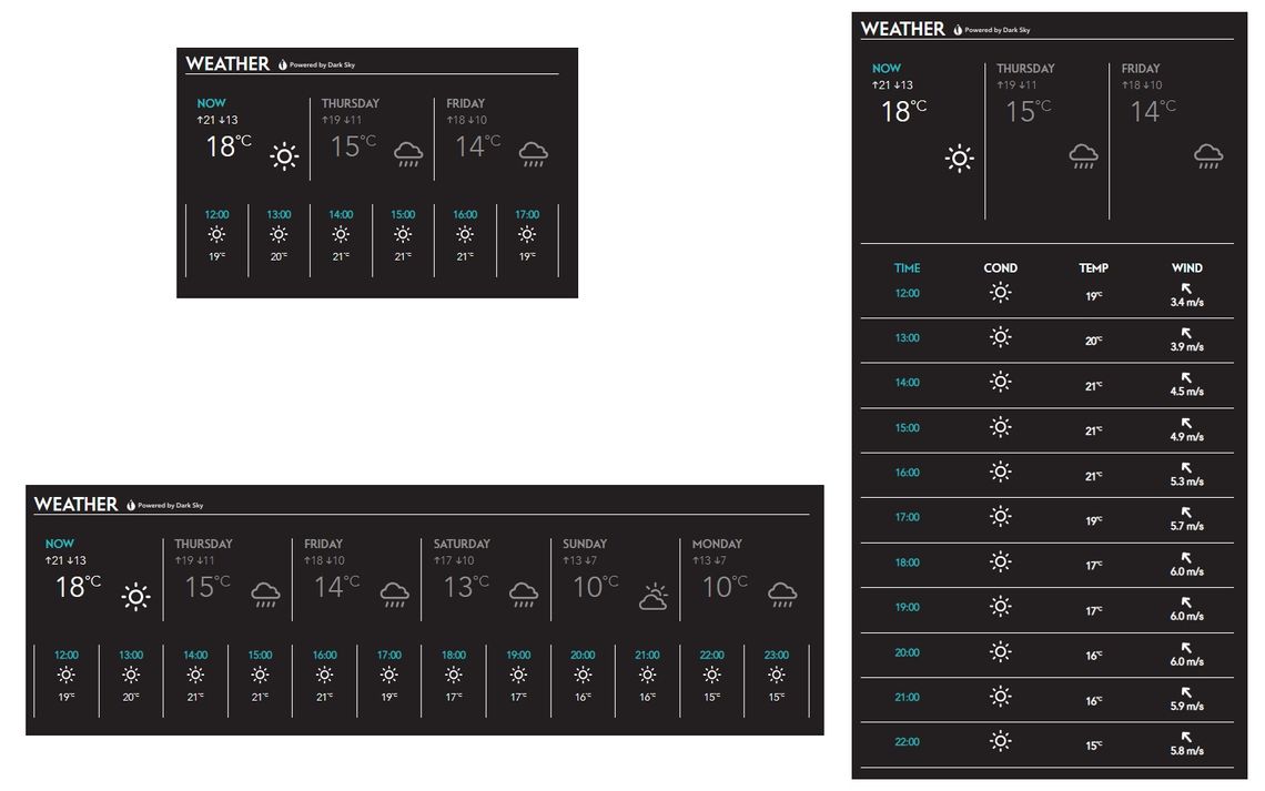
After making the top level interactive, the next challenge was making the individual components capable of adapting to their new possible dimensions. This was a fairly large task, as in several cases not just the look but the behaviour of the component had to change depending on its height and width. Each component has minimum and maximum sizes set for each breakpoint, which allowed us to focus on developing for a more reasonable use case, instead of worrying about what would happen if someone made the weather component 20 stories tall.
When stretched vertically, the hourly section of the Weather component is displayed in a more detailed tabular form:
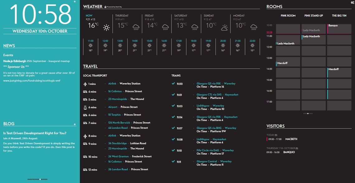
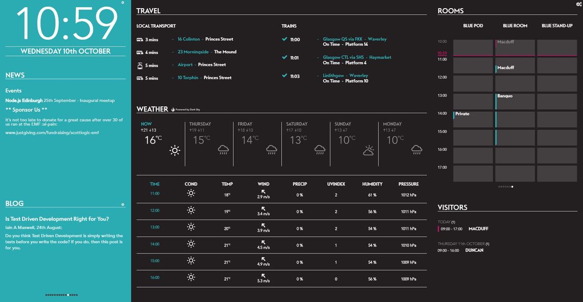
When the Rooms component is squashed vertically, it focuses on the current time and immediate future. When squashed horizontally, rooms are scrolled through if there’s not enough space to display them:
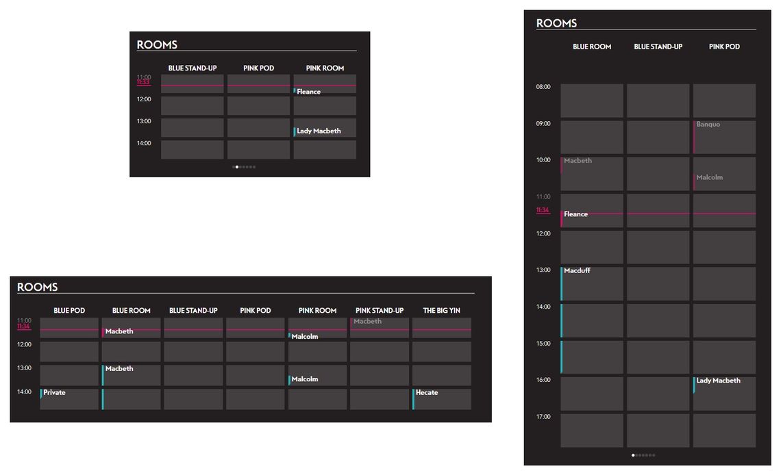
As a rule, when components got smaller we tried to prioritise information relative to the immediate future, with the lookahead increasing with the component’s size
Much of the work done on the styling consisted of replacing static sizes with CSS flexboxes, allowing elements to contract and expand to fill the available space. This immediately provided some flexibility, which we then tweaked to get sensible results as components were manipulated.
Once the responsive aspect was in order, we started looking toward making components customisable. A clickable settings cog appears next to components that have options, which open up over the top of the component itself. Options include picking a time zone for the clock, which travel routes to display and which rooms to showing meetings for. These settings menus are programmatically generated from options defined when the components are created. Here’s an example of the settings object for a Room component:
      Rooms-11: {
        options: {
          selectedRooms: {
            title: 'Rooms',
            value: [
              'Blue Pod',
              'Pink Stand-up',
              'The Big Yin'
            ],
            type: 'list',
            possibleValues: [
              'Blue Pod',
              'Blue Room',
              'Blue Stand-up',
              'Pink Pod',
              'Pink Room',
              'Pink Stand-up',
              'The Big Yin'
            ]
          }
        }
Currently there are four possible types of options:
- boolean
- integer
- list with one selected value
- list with multiple selected values.
however it would be fairly trivial to add others
Technology
For the most part the tech stack hasn’t changed, and can be read about in more depth in this post by last year’s interns. The project is split into frontend and backend, which are built separately. The backend runs on Node.js and the frontend uses React Redux, both of which were transpiled from TypeScript which I was glad for, as I generally prefer working with type safe languages.
Process
For the first 6 weeks we worked fairly freely, without much structure. This was partly due to the nature of working on the World Cup widget, as issues could arise at any moment. After this period, we started to use an Agile workflow with a sprint length of 1 week and daily stand-ups. Overall, I preferred time we spent using the more structured approach as a lot of our work involved making UX decisions and the regular meetings allowed us to get feedback quickly.
We worked with a test engineer, with the idea that development and testing would all be finished by the end. Generally we finished the stories by the end, but not with enough time left to finish testing by the end of the sprint. We did get closer to achieving this as we reached the end of the internship.
One challenge we faced in our process was git branch management. We got used to using Git Flow early on, but when we started working on the responsive layout things started to stall. Because we were used to pushing changes to develop and then merging into master, we didn’t want to push the responsive layout to develop in a broken state. This made it difficult for other devs to review our code once it was ready to merge, as it was one huge pull request. After correcting this by feature branching into a new branch, we were back to making small, frequent PRs that were more easily reviewed.
Our CI setup was helpful throughout, as it’s easy to forget to run tests after polishing a feature. CircleCI is configured to run the whole test suite every time the repo gets pushed to, and it’s a requirement that they pass before merging PRs.
Challenges
Getting used to the unidirectional data flow of React Redux took some time, and there are still some artefacts of our misunderstanding in the code (apologies to next year’s interns). Despite this, at the end of the project we both feel much more confident working with React Redux and I look forward to being able to use it in my own projects.
We didn’t have a full design specification for the responsiveness, which gave us some freedom in deciding how things should look and behave. This is a bit of a double-edged sword - I occasionally found myself surprised at how hard it can be to make decisions from a UX point of view. Some designs were intuitive - for example when stretching the weather component horizontally, it made sense to continue adding information in the same fashion, however when stretching the same component vertically, another design was required.
Some of the technical aspects of achieving responsiveness proved a challenge as well, for example the rooms component had to be almost completely restyled to cope with displaying only a select range of hours.
Retrospective
Testing is something that we should have invested much more time into. Neither of us had much experience in writing frontend unit tests and we often forgot to account for time taken to test during sprint planning meetings, which resulted in not many being written. This reduced the confidence we had in our code and resulted in a few unpleasant surprises.
We also once found ourselves spending time on a feature that wasn’t desirable, which ended up being removed later on. This highlighted the importance of discussing and clarifying requirements, as well as sometimes stopping to think about whether the feature you’re working on really moves you towards one of your goals.
The code reviews we’ve received have been very valuable, shedding light on bad practices and offering tidy ways of replacing verbose code. I think these are especially important when getting to grips with a new language at the same time as working on a project, as misunderstandings left to linger can cause bigger problems later on.
Looking forward
There are a few things we’d like to have done, but didn’t have the time to:
- Improve unit test code coverage
- Use a config file to define layout of important components
- Make the screen installable as a Progressive Web App
- Increase the number of components, possible additions include:
- Personal notes
- GitHub integration
- Slack integration
- Office league information
- Support mobile screens
- Improve transitions for resizing components
Hopefully the foyer screen will continue to be iterated upon, and possibly see some of these features implemented.
Summary
Both Paulius and I feel that we’ve massively improved our front-end dev skills, particularly in working with React Redux. The experience of working in an Agile team has been invaluable, and it’s encouraging to have developed something that will actually see some use. Working on an in-house project provided a great low-pressure environment to improve our software engineering capabilities, and I’m sure the experience we’ve gained will help us greatly in the future.
