Introduction
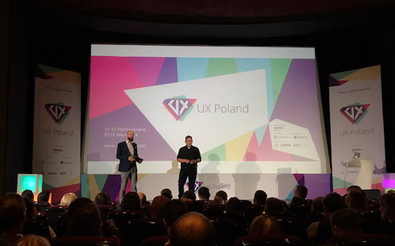
In mid-October, I had the opportunity to attend UX Poland conference, which was held in iconic Luna cinema in the heart of Warsaw. Once a popular spot for dates during the times of communist Poland, the cinema has been renovated to host a range of innovative events – including UX Poland, the biggest conference of its kind in the Polish UX/Service Design industry.
This year’s edition focused on the talent in the Polish UX community, with the biggest names and UX thought leaders giving talks and inspiration. The companies that had a presence on the conference floor included some of the best known in the world – Deloitte Digital, Opera Software, Spartez (Atlassian) and Raiffeisen bank just to name a few.
In this article, we will focus on topics which I believe are the future of good user experiences, and aspects we, as designers, should be looking into and evangelise in our industry. This includes promoting honesty with simplicity in our design, cross-app integrations, and the rise of progressive web apps as the future of mobile experiences.
Honesty and simplicity in design as a Unique Selling Point
Honesty online can be a difficult thing to come by in times when everybody is concerned with profits and conversion rates. We are often being bombarded by UX dark patterns that sometimes try to bully us into making a conversion.
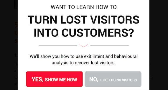
Hubert Turaj (@hturaj) argued in his talk that users expectations have changed, where honesty and transparency are a paramount trait in experiences that users want. Users understand that things don’t always go the desired way, and that sometimes mistakes, or errors happen; but when they do happen, they don’t want to be misled. Honest design is one where we are transparent and truthful with the user, we start to build a bond based on trust. Trusting users become more attached to us and develop a deeper bond which is great for brand loyalty and repeat business. Honesty is also interlinked with user freedom and allowing users what they want to do within reason. For example, allowing users to delete their accounts might not be liked by some in the management of the organisation, but it is something that users should be able to do if they are to build trust.
Trust is something that can’t be bought and sometimes needs a lengthy process of users slowly maturing and opening themselves to our organisation. As designers, we should make our products honest and simple, which in the long term will benefit our clients and establish a relationship built on goodness.
 (Example of how VW marketers used honesty and humour to convey an advantage of their product)
Re-design of legal documents as a way of building trust with customers
Another talk that touched on this subject was given by Anna Kwiatkowska from Play mobile network operator, which is the biggest Polish operator with 15m+ active subscribers. Anna presented a re-design case study for the user-facing language used to communicate with the customers. It included a complete overhaul of legal documentation and contracts signed by clients. The goal of the project was to make the contracts more transparent, clear and honest.
According to Logios Research, Play’s existing legal documentation was rated as FOG 18-21 which is a band that indicates language understandable to a person on a Doctoral studies path. This immediately highlighted the scale of the problem to the design team. In addition to difficult language, the legal documentation was unreadable and clustered together in a way that required a lot of cognitive energy and willpower just to get through.
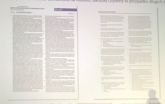 (Existing contract and new re-designed version)
Customers that signed up for mobile contracts often did not read the contract due to inability to understand the very legal nature of the language used. A relationship between a business and a customer that starts without mutual understanding isn’t comfortable or trustworthy to the user.
The talk discussed the various stages of the re-design, with the main goals being transparency, ease of understanding the language, removal of unnecessary information, and a friendlier yet formal language tone. As an example, the language was changed from “the company” to “us” and “customer” to “you”. Unnecessary sentences were removed; the whole document was shortened by 24%.
The re-design process was a success overall as ease of understanding jumped from 62% to 80%, based on feedback from the users. The new legal contract dropped from previous FOG 18-21 to FOG 7-9 which is a band given to language understandable by a high school student. In addition to better customer experience, the contract ended up substantially shorter, needing two fewer A4 sheets of paper, that converted into monetary and environmental savings. The results of the project made Play invest into the re-design of more communication, including text messages sent to the customers, bills, welcome letters and other.
App in app integration – connecting experiences users love into one
Tomasz Dymowski (Raiffeisen bank) along with Paweł Haltof (@pawelhaltof, Efigence) started their talk with a showcase of an omnichannel banking redesign which aimed to create an experience inspired by those offered by UK-based challenger banks such as Monzo, Atom or Starling Bank for a predominantly traditional banking client base.
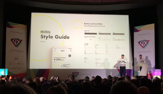
The redesign involved a completely new design of Raiffeisen website, mobile application, documentation and even the in-branch experience. The whole process was given a green light from the very top of the organisation, in an attempt to grab a substantial market share before challenger banks including Monzo and Atom establish a presence in the Polish market.
Going the extra mile for an innovation
However, Raiffeisen wanted to go one better: not only did they want to create a great experience which could compete with challenger banks, but they also wanted to add value to the users that other banks did not yet have.
What they decided was to add integration of various services into their banking app which would enable customers not only to manage their money from the app but also to buy and store public transport tickets, cinema tickets, pay for parking, confirm identity and many other public services. Enabling Raiffeisen customers to buy simple necessities such as a tram, train ticket or pay for parking without the need for cash from the comfort of their mobile phone while safely storing those purchases in a single place all thanks to cross-app integration.
App integrations have been available for some time in a few variants, however, this user-facing, interactive model is one which is still emerging and believed to have a lot of potential for the future of mobile experiences.
For example, Google Maps has recently added Spotify integration that allows users to effortlessly control their music while inside the Maps app. This type of integration improves the user experience of both apps and makes driving safer for all road users.
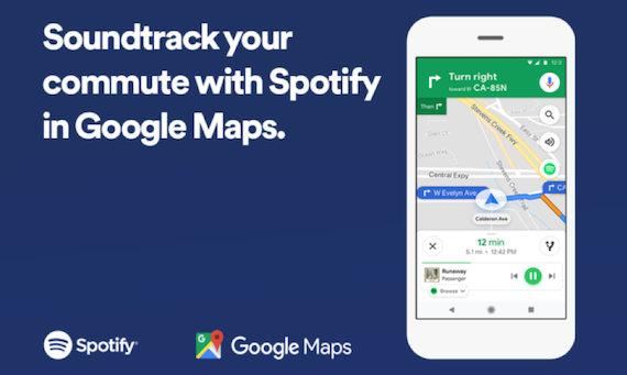
After the talk, I believe that more apps will try to integrate into other services, as solutions like these are usually beneficial to both parties. What could the future hold for this technology? Ordering a pizza within the Netflix app? Buying a product with a single tap on Amazon while watching its advert on YouTube? Ordering an Uber while checking directions in Google Maps? This, however, raises a question whether larger services such as banks should be providing a more comprehensive experience to their users, and whether users need or even want them - which only time will tell for Raiffeisen bank.
Progressive Web Apps – the future of apps?
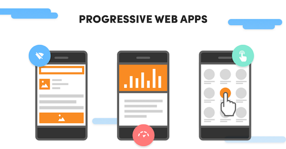 One of the talks also discussed PWAs – Progressive Web apps, given by a CEO of Divante Group and e-commerce guru Tomasz Karwatka (@tomik99). The talk argued that native apps downloaded through the means of Google Play/App store are becoming less relevant to the users and bring limited returns to their owners due to falling download rates, low usage and high costs of development. The app markets have also become bloated with subpar quality apps which made the users download less content and use fewer apps (which has also been touched on by Scott Logic’s Chris Price @100pxls, in his talk “Once Upon a Time, There Was An App Store”). In addition to all of the above, many apps suffer from slow loading times and poor performance which directly impacts the user experience of those products.
One of the solutions for the above problems is PWA: mobile apps that behave like any other app but are installed in a single tap from the point of a mobile web browser. In addition to increased conversion rates, PWAs can have a largely shared codebase between Android/iOS which make it a lot less effort to fully support both operating systems. As well as shared codebase, PWAs can offer performance improvements compared to using traditional websites which improves user experience and reduces bounce rates. However, it’s important to mention that there are various alternative solutions to these problems which have existed before PWAs - and in that aspect PWAs are not an innovation. Although PWAs are a relatively new technology, analytics data published by Twitter shows huge conversion and engagement gains to be had using PWA vs native technology:
- 65% increase in pages per session
- 75% increase in Tweets sent
- 20% decrease in bounce rate
PWA Advantages
In addition to user convenience and higher conversion, PWAs can offer a substantial performance boost, due to the ability to pre-load data and offline use without the need of a 3G/4G cellular connection. Tomasz’s numbers argued that on average a mobile website takes 19s to fully load on a 3G connection and 14s on 4G, where 53% of mobile visits are abandoned if pages take longer than 3 seconds to load which is a substantial problem for UX – especially in e-commerce. PWAs can enable data to be cached and pre-loaded when needed which can bring the time to load a page under 5s.
The above numbers represent a complete page load performance; it is important to note that a complete load performance is not as important to users as perceived performance. Perceived performance is a part of the experience noticeable to the user - where good perceived performance can make the experience frictionless even if a complete page load performance is poor. For instance, if a page takes over 14s to load but the user doesn’t perceive the slowdown as we keep them occupied (or allow them to navigate the page), it might not be a huge problem; on the other hand showing a blank screen to the user for 14s will significantly impact the experience and make bounce rates grow exponentially.
As UX Designers we can harness PWA’s performance and convenience gains to offer users great experiences on the go while reducing costs and increasing conversion rates for our clients.
End words
Overall, I thoroughly enjoyed myself at UX Poland 2018 as I found the talks to be interesting and inspiring. Hearing case studies of other people’s work made me think how I can incorporate those into projects of my own, and how I can change my attitude to be a better designer. Being able to attend UX Poland has motivated me to think about a topic for a talk that one day I’m hoping to present at UX Poland conference floor.


