In this post, I share my take on the Big Data LDN 2018 conference that I attended recently.
When it comes to Big Data, many of the issues we face relate to the 3 Vs (Volume, Velocity and Variety). Most speakers at Big Data LDN 2018 advocated solutions to problems relating to one of these factors but it seemed that:
The variety and quality of data is still the biggest challenge.
This is perhaps because organisations have a lot of options to choose from when it comes to dealing with volume and velocity challenges. This might change with the introduction of 5G as it will substantially increase the volume of data and thus present new challenges. However, until then, they have a variety of solutions to suit their needs. The more difficult problem organisations face relates to how to manage the variety and quality of the data, and the problems are that:
1- Collection of all the right data is difficult
2- Ensuring only relevant data is collected and analysed is difficult
3- Cleaning the data collected takes too long
Dr. Michael Stonebraker, professor at MIT, who was a keynote speaker at the conference said that “it is often so difficult to extract, clean, and integrate data, that data scientists can spend up to 90% of their working time doing those tasks”.
Data scientists end up spending only 10% of their time doing data science.
The valuable work data scientists want to concentrate on is to extract knowledge from their data and I think this is about:
1- Proving what you know
2- Verifying an assumption
3- and/or discovering something new
One way of extracting knowledge from data is by spotting patterns, anomalies, or something that stands out in the data set and that you can start investigating.
Dr. Hannah Fry, Professor in the mathematics of cities, presented a lot of examples that highlighted instances where patterns or anomalies appeared.

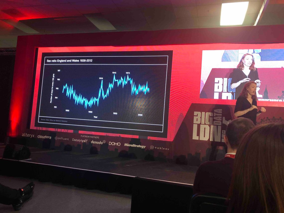
Dr. Hannah Fry presenting at Big Data LDN 2018: Visualisation displays the number of boys for every 100 girls in England and Wales between 1838 and 2012.
One of Dr. Fry’s examples shows a spurt in the ratio of boys to girls born in England and Wales in 1919, 1945 and 1973. Detecting this anomaly in the data and having it as recurrent allows recognising it as a pattern and investigating the circumstances that lead to it. A couple of the spurts happened after the end of a war when men returned back home. Mating more frequently increases the chances of women getting pregnant early on in their cycle. It turns out that women getting pregnant at the start of their menstrual cycle increases the chance of a baby boy.

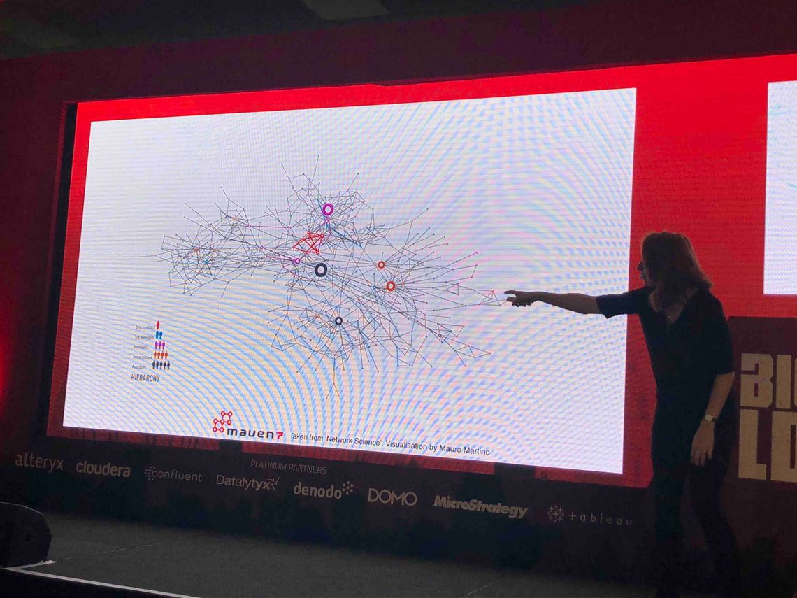
Dr. Hannah Fry presenting at Big Data LDN 2018: Visualisation displays the network of individuals in a company, connection based on who they nominated as the person they would turn to for advice.
Another example Dr. Fry mentions is about a company that wanted to find out who was spreading rumours about intentions of higher management. They asked each employee to name one person they would go to for advice. They created a visualisation where they connected individuals if one nominated the other. The map identifies highly influential individuals, appearing as large hubs. The result revealed that the associate in charge of safety and environmental issues was the source of the rumours. His position meant that he was connected to all employees except top management. He was passing information while visiting the different offices although he had no knowledge of the true intentions of management.

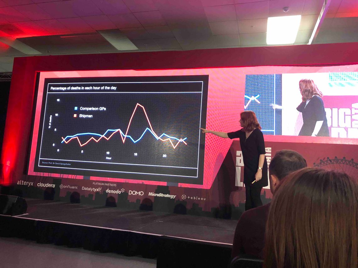
Dr. Hannah Fry presenting at Big Data LDN 2018: Visualisation shows the percentage of death per hour of the day for Dr. Shipman’s patient in comparison with other GPs
The last example I’ll highlight from Dr. Fry talk is about Dr. Harold Shipman, a general practitioner and one of the most prolific serial killers in history. He killed about 250 victims. How could we know that his patients were killed by him rather than died of medical or natural causes? A chart showing the percentage of death per hour of the day for patients of other GPs makes it clear that there isn’t a specific time of day where patients are more likely to die. When we compare it to the percentage of deaths in each hour of the day for Dr. Shipman’s patient, we notice that at a particular hour of the day, the percentage of Dr. Shipman’s patients that died was much higher.
Dr. Fry’s talk was the highlight of that conference not merely because of the interesting examples she shared but also because of her exceptional skill at storytelling and lively presentation.
This is the second time I attend the Big Data LDN conference and It’s been as inspiring as the first time. I would definitely recommend it.


