
Riders of public transportation rely on real-time traffic information (RTI) systems to make informed decisions. But really how accurately are those systems? With the advent of the Open Data movement, answering this question has become so much easier. It may take just a little bit of curiosity and know-how.
A local mystery in Bristol
This story is about the curious case of disappearing buses that happens with the bus service in Bristol, where my office is located. Like in many cities in the UK, real-time traffic information is provided to riders, and it shows the promised arrival time of the upcoming buses for a given bus stop. The information is disseminated on smartphone apps, webpages, and display boards mounted on bus stops (Figure 1).
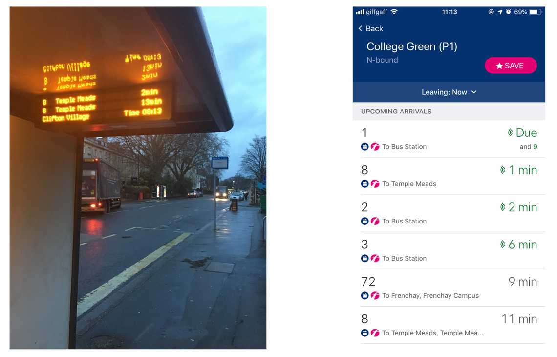 Figure 1: Real-time Traffic Information shown on a display board (left) and on a smartphone app (right)
However, Bristol riders often observe the following phenomenon. Standing on a bus stop and waiting for a certain bus (say, Bus Number 8), they see a promise from the RTI that the next bus is coming in, say, 5 minutes. One minute later, the promise updates to 4 minutes. As time progresses, the promise counts down to 3 minutes, 2 minutes, 1 minutes, and then “due”. At this point, the bus is supposed to show up – except that it does not always, and then a moment later the RTI would say that the next bus will arrive in 10 minutes. In other words, the earlier promised bus just disappeared from the system!
This has happened more than a few times to my colleagues and myself. I sensed that what I saw was not just bad luck and perhaps something is going on and is worth investigation. Over the last holiday season (2018), I got a little bit of free time for self-directed study, so I decided to crack this case.
Limitations
Before I proceed, let me accurately characterise this study. This is a thoroughly under-sampled and utterly unscientific study. I only measured a few days of data, and focused only on a few lines of bus services and a few bus stops in Bristol.
Despite these limitations, I think this study may provide some interesting insights into the system and hopefully it can inspire some larger-scale studies on the topic.
Bristol API
Bristol City Council has offered public access to the real-time information since January 2016 (Press Release). The public now can access the information through a REST API called Bristol API.
The API offers endpoints such as this
GET https://bristol.api.urbanthings.io/api/2.0/rti/stopboard?stopID=0100BRP90327
where the query parameter and value stopID=0100BRP90327 designates a particular bus stop (in this case, it is the College Green (P1) bus stop in Bristol).
And the response to such a GET request would be like this:
{
    "success": true,
    "data": {
        "stopID": "0100BRP90327",
        "timeStamp": 636840946840000000,
        "sourceName": "BCC/Transix",
        "stopBoards": [
            {
                "headerLabel": "STOPBOARD",
                "rows": [
                    {
                        "isrti": true,
                        "groupID": "3",
                        "vehicleMode": 3,
                        "serverRouteToken": "U3RvcElEQW5kTGluZU5hbWUsMDEwMEJSUDkwMzI3LDM=",
                        "idLabel": "3",
                        "mainLabel": "Cribbs Causeway",
                        "timeLabel": "1min",
                        "timeMajorLabel": "1",
                        "timeMinorLabel": "min",
                        "sortKey": 636840947620000000,
                        "vehicleCode": "FB_FB-32090"
                    },
                    ...
In each response, the field data.stopBoards.rows is an JSON array. Each element corresponds to one line of display in a real-time traffic information system. Within the element, these are most interesting fields for our discussion:
timeMajorLabelseems to be the promised time (minutes into the future) of the next busgroupIDshows the bus number (Number 3 in this example)vehicleCodeuniquely identifies the vehicleisrtiindicates whether or not the information is real-time or just scheduled bus informationmainLabelis the destination of the bus
Data Collection
Postman Scripts
Using an API development environment called Postman, I could very quickly write some pre-processing and post-processing scripts (in Javascript) and extract the key information from these responses. I wrote my script so that the GET request will be fired once a minute for a certain duration (say 60 or 75 minutes). To save the data into a CSV file, I followed the suggestion from a Postman blog and programmed my script so that it would post the data to a separate local express server (written in Node.js) which will then write the data into a CSV file using file I/O (using modules fs, body-parser, and csv-stringify). The first few lines of the CSV file look like these:
Report Time,stopId,Bus Number,Promised Delta,Vehicle Code,Is RTI,Main Label
2019-01-02T07:47:01.673Z,0100BRP91008,8,12,FB_FB-47437,1,Temple Meads
2019-01-02T07:47:01.673Z,0100BRP91008,505,17,CTP_CTP-YX17NSU,1,Long Ashton P&R
2019-01-02T07:47:01.674Z,0100BRP91008,8,42,FB_FB-47438,1,Temple Meads
2019-01-02T07:47:01.674Z,0100BRP91008,505,50,CTP_CTP-YX62DKE,1,Long Ashton P&R
2019-01-02T07:47:01.674Z,0100BRP91008,8,08:49,,,Temple Meads
2019-01-02T07:47:01.674Z,0100BRP91008,8,1hr,FB_FB-47437,1,Temple Meads
2019-01-02T07:47:01.674Z,0100BRP91008,505,1hr,CTP_CTP-YX17NSN,1,Long Ashton P&R
2019-01-02T07:47:01.674Z,0100BRP91008,8,1hr,FB_FB-47438,1,Temple Meads
2019-01-02T07:47:01.674Z,0100BRP91008,505,1hr,CTP_CTP-YX17NSU,1,Long Ashton P&R
2019-01-02T07:47:01.674Z,0100BRP91008,8,09:45,,,Temple Meads
2019-01-02T07:47:02.699Z,0100BRP91004,8,13,FB_FB-47437,1,Temple Meads
2019-01-02T07:47:02.699Z,0100BRP91004,505,18,CTP_CTP-YX17NSU,1,Long Ashton P&R
2019-01-02T07:47:02.699Z,0100BRP91004,8,43,FB_FB-47438,1,Temple Meads
2019-01-02T07:47:02.699Z,0100BRP91004,505,52,CTP_CTP-YX62DKE,1,Long Ashton P&R
2019-01-02T07:47:02.699Z,0100BRP91004,8,08:50,,,Temple Meads
2019-01-02T07:47:02.699Z,0100BRP91004,8,1hr,FB_FB-47437,1,Temple Meads
2019-01-02T07:47:02.699Z,0100BRP91004,505,1hr,CTP_CTP-YX17NSN,1,Long Ashton P&R
2019-01-02T07:47:02.699Z,0100BRP91004,8,1hr,FB_FB-47438,1,Temple Meads
2019-01-02T07:47:02.700Z,0100BRP91004,505,1hr,CTP_CTP-YX17NSU,1,Long Ashton P&R
2019-01-02T07:47:02.700Z,0100BRP91004,8,09:46,,,Temple Meads
Please note that in my CSV file I also renamed the field timeMajorLabel to Promised Delta to reflect the semantics of the data – it is promising the rider how many minutes into the future (delta) the bus will arrive.
ID and Name of Bus Stops
You may wonder how I knew that the ID of the bus stop in the first place (That is, stopID=0100BRP90327 will get me information about the College Green (P1) bus stop). Well, this was also previously obtained through the Bristol API, with a request like this
GET https://bristol.api.urbanthings.io/api/2.0/static/transitstops
The GET request takes four query parameters – minLat, minLng, maxLng, and maxLat – for the latitude and longitude of the North-East and South-West corners of a geographical area. The response will contain information about the ID and name of bus stops. With that I also can construct a mapping file like this one that will help me later, during the data-analysis phase, to translate the ID back to bus stop name:
index,stopId,stopName
0,0100BRP91008,Christ Church
1,0100BRP91004,Clifton Village
2,0100BRP90326,College Green
Measurement Days
I ran my script in a few days in early January of 2019. When the script was running, I also went down to the bus stop to collect the ground truth on the actual arrival time of the buses.
In the following discussion, I will be mainly discussing the measurements from two of the measurement days.
- 2nd January, 2019
- 3rd January, 2019
Data Analysis
Tool: AWS QuickSight or Tableau?
Initially I intended to use AWS QuickSight for data analysis. As it turned out, as will be explained later, I ended up using Tableau instead. ( I was using the free version of Tableau called Tableau Public. )
Interactive workbooks
The plots shown in this section have also been published online as interactive workbooks on Tableau Public. You can gain more insight by exploring the data interactively. For example, you can mouse over a data point to see the exact values associated with the data point. The link to each workbook will be shown underneath each plot.
Basic breakdown of data
Figures 2a and 2b show the basic breakdown of the data of the 2nd and 3rd of January 2019 respectively. There were 2,125 and 883 records respectively in each set of data. The first set has 60 minutes of measurements for three bus stops; while the second set has 75 minutes of measurements for one bus stops. The charts show the breakdown of the data by bus stop and by bus number.
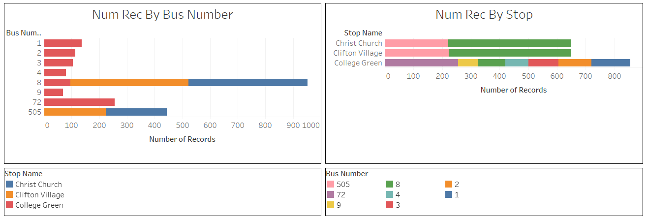 Figure 2a: Data of the 2nd of January, 2019 ( Interactive Workbook: Data of 2nd January, 2019 - Basic Breakdown )
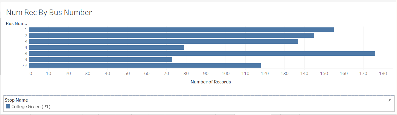 Figure 2b: Data of the 3th of January, 2019 ( Interactive Workbook: Data of 3rd January, 2019 - Basic Breakdown )
Promised Delta
Figure 3 shows (a partial view of) the distribution of the values of the field Promised Delta. As you can see this field actually contains four possible types of values:
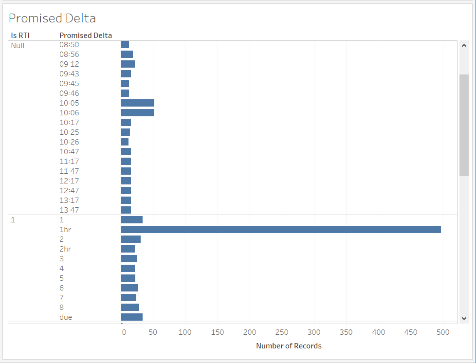 Figure 3: Distribution of
 Promised Delta ( Interactive Workbook: Data of 2nd January, 2019 - Promised Delta )
- a string like
09:45, which indicates a scheduled bus time (i.e. not really real-time data – this is also evident from the fact that theisrtifield isnull(false)) - a string like
1hror2hr. I do not know the exact reason for these strings, but I can imagine that perhaps the bus company thinks the time is so far-out that a real-time prediction is not practical or necessary. I call these data Pseudo-real-time Type 1 - a string of
due, which probably means 0 minutes and that the bus should have arrived at the stop (there is also a string value ofnearbut this is not visible in the view above) - a string that is an integer (
1,2,3, etc). Only these are really promised delta.
From these we can learn that in the data stream there is an assortment of data of varying qualities: real-time, pseudo-real-time, and scheduled (non-real-time).
Promised Time
Using Promised Delta and Report Time (the timestamp when the measurement was done), we can compute a value called Promised Time. But in the process, we also need to handle the various special cases when the field value is not an integer of promised delta. This can be computed using a feature called calculated field. The calculation formula is as follows:
IF ([Promised Delta]=='due') THEN
    [Report Time]
ELSEif ([Promised Delta]=='near') THEN
    dateadd('second', 30, [Report Time])
ELSEIF  ([Promised Delta]=='1hr') THEN
    dateadd('minute', 60, [Report Time])
ELSEIF  ([Promised Delta]=='2hr') THEN
    dateadd('minute', 120, [Report Time])
ELSE
    dateadd('minute', INT([Promised Delta]), [Report Time])
END
By the way, I mentioned that I ended up using Tableau but not AWS QuickSight. Here is the reason: with AWS QuickSight I seemed to have run into a bug in calculated field and I noticed that many records would be thrown away unnecessarily. I had limited time to troubleshoot the problem so I decided to switch to use Tableau instead.
Plotting Promised Time against Report Time
With the new calculated field we can now make really interesting plots – by putting Promised Time on the Y-axis and Report Time on the X-axis.
Since this type of visualisation may not be immediately intuitive to the readers, I have also included four illustrative examples in a subsection after next titled Illustrative Plots of Promised Time against Report Time. If you find the following discussion a little bit hard to understand, you can jump ahead to that section to first look at how the plot should look like under four illustrative situations.
Figure 4 shows such a plot for the data of the 2nd of January. Here we have filtered the data so that the plot shows only the data for one bus stop (Clifton Village) and one bus line (Bus Number 8).
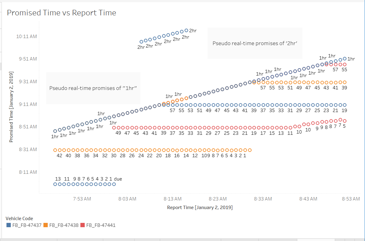 Figure 4: Plotting Promised Time vs Report Time ( Interactive Workbook: Data of 2nd January, 2019 )
There were a lot of data points, but very quickly I realized that the series of dots that came from Promised Delta values of 1hr and 2hr (seen at top portion of the chart) were just noise that we should not care about. Furthermore, we probably also do not care about any promised delta that are for more than 20 minutes away.
Therefore I constructed another calculated field called isFarOut and used it as a filter to exclude all the far out, uninteresting, data (promised time is 20+ minutes away).
IF DATEDIFF("minute", [Report Time], [Promised Time] )>20
THEN 1
ElSE 0
END
More importantly, I also indicate on the chart the actual times that the bus did arrive. These are shown as horizontal lines on the chart. The result is shown in Figure 5.
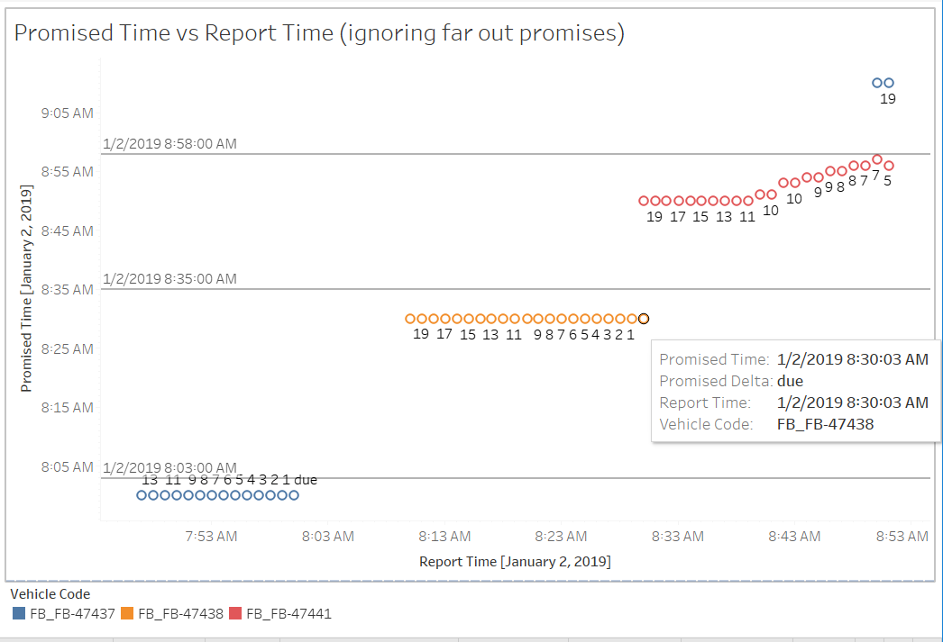 Figure 5: Ignoring far out promises and adding ground truth ( Interactive Workbook: Data of 2nd January, 2019 )
We can observe two distinct types of pattern from Figure 5:
-
Pattern 1: The blue and orange dots show a fixed promised time (8:00 and 8:30 respectively). The promised time did not change. More importantly, the ground truth proves that the promised times were wrong – The buses actually arrived at 8:03 and 8:35 respectively, meaning that the bus were late for 3 and 5 minutes respectively. In other words, the dots show a pattern that was too good to be true, and later proven to be wrong. It appears that the promised time was some interpolated values and there was no feedback loop to adjust them to reality. I call these Pseudo-real-time data Type 2 (Type 1 are those showing ‘1hr’ or ‘2hr’ as we have seen in Figure 2)
-
Pattern 2: In contrast, the red dots keep updating the promises and at the end the promise matched the ground truth quite well. These appeared to be genuine real-time data
The data of Pattern 1 can explain the phenomenon of disappearing bus. The system seems to suppress the reporting of a bus when its promised time already past the current time (That is, it will never show a negative value for promised delta). As a result, during this interval before the actual arrival time, the bus will disappear from the RTI system.
Note that when that happens, the RTI system may still report the same bus on ‘downstream’ bus stops – as long as the promised time for these bus stops have not passed the current time. This can be seen from Figure 6, when we put the data of three bus stops in the same chart (the bus goes to the stops in this order “Christ church” -> “Clifton Village” -> “College Green”). As you can see when the bus (blue dot – Vehicle 47437) disappeared from the display for Clifton Village between 8:01 and 8:03, it was still being reported on on the display in a downstream stop (College Green).
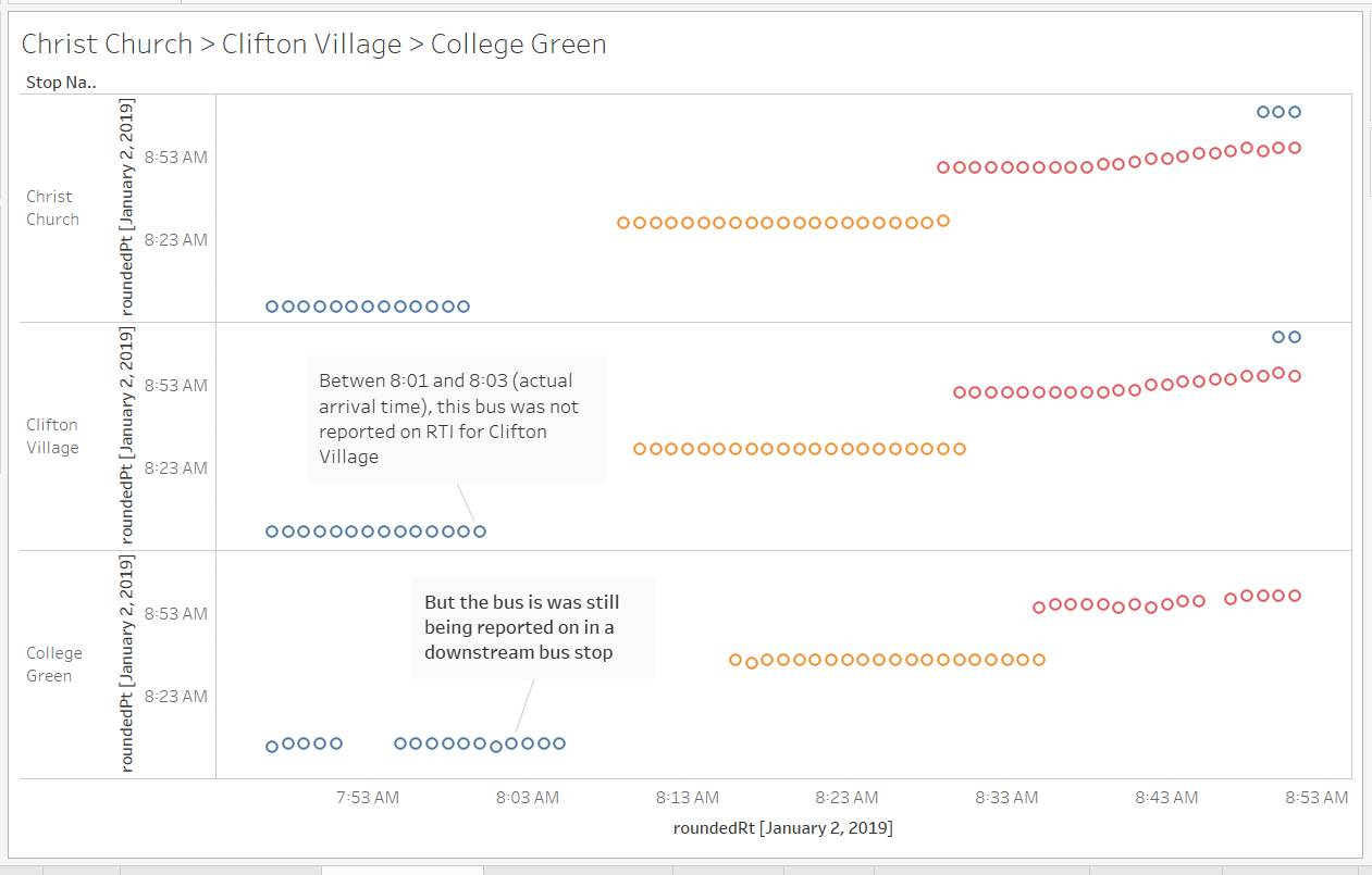 Figure 6: Data with three bus stops ( Interactive Workbook: Data of 2nd January, 2019 )
How prevalent are pseudo-real-time data?
In Figure 5, we saw that in one hour, two out of three buses are showing pseudo-real-time data instead of genuine real-time data. So how prevalent are they?
Below I am showing more data with different buses measured on the 3rd of January. We can see that pseudo-real-time (Type 2) data also were detected with other bus lines, although not as prevalent.
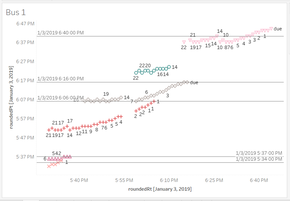 Figure 7a: Bus 1 ( Interactive Workbook: Data of 3rd January, 2019 - Bus Number 1 )
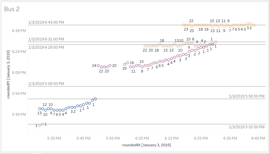 Figure 7b: Bus 2 ( Interactive Workbook: Data of 3rd January, 2019 - Bus Number 2 )
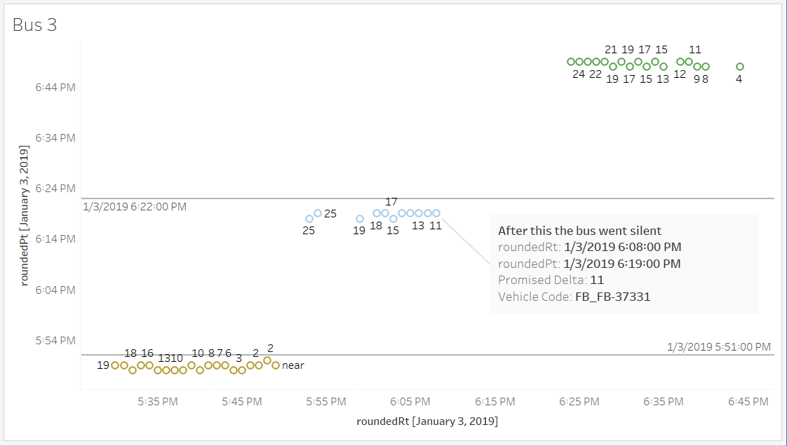 Figure 7c: Bus 3 ( Interactive Workbook: Data of 3rd January, 2019 - Bus Number 3 )
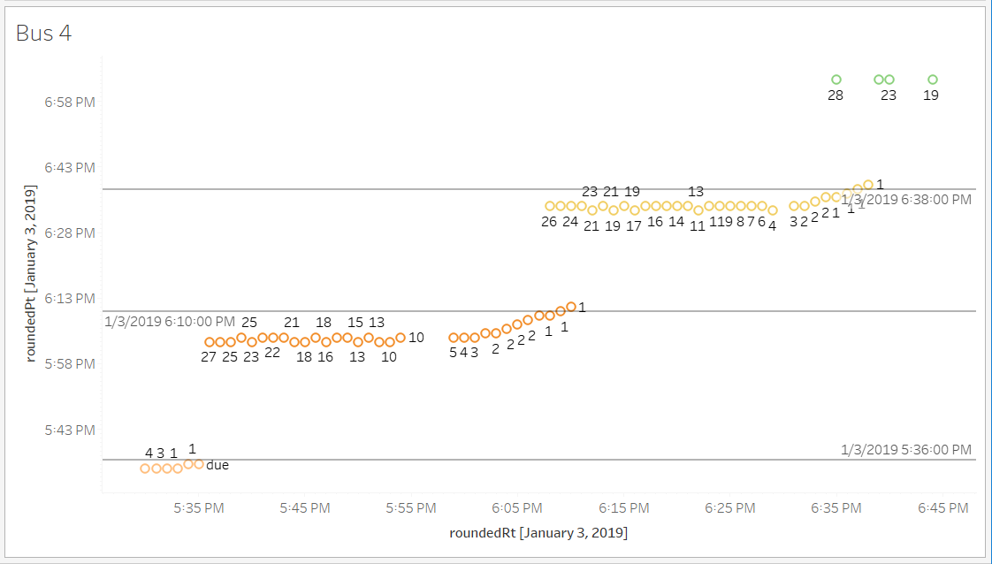 Figure 7d: Bus 4 ( Interactive Workbook: Data of 3rd January, 2019 - Bus Number 4 )
In this limited-scoped study, I cannot establish an estimate on how prevalent are Type 2 pseudo-real-time data, but I can be quite certain that they exist.
Illustrative Plots of Promised Time vs Report Time
To help the readers to more easily visualise the intuition behind the plot type of Promised Time vs Report Time , here I include four plots that illustrative how would the chart look like under four different qualities of data feed. In each case, we assume that the actual arrival time is 7:53 am
- Pseudo Real-time : The RTI system promised a static constant arrival time of 7:50 am, which turned out to be wrong. At 7:51 am, information about the bus disappeared from the system. And then the bus showed up at 7:53 am
- Genuine Real-time with No Delay : This is an idealized situation that there is no traffic on the road that delayed the bus, so the promise arrival time of 7:53 was correct all the way through.
- Genuine Real-time with Delay : Realistically this should happen more often. The bus was delayed a bit by traffic, but the RTI knew the actual location of the bus and could take the real-time information as feedback and update the promised. Eventually the last few promises converged to accurate predictions. The slope of the trend line is correlated with the severity of the traffic congestion as well as the inaccuracy of prediction.
- Genuine Real-time with Adaptive Prediction : Compared to the last one, this one is assuming that the system has an advanced mechanism (machine learning, maybe) that can adaptively predict more accurate promised time. For example, if a traffic jam was detected at 7:54 or 7:55 am, the system can immediately forecast more delays ahead and adjust the promised time more aggressively than the last case. The first few promised were compromised by the traffic condition, but the system can adapt and gave out more accurate promised time subsequently. The slope of the later part of the curve indicates that it was giving out more accurate predictions despite the same severity of traffic congestion as in the last case.
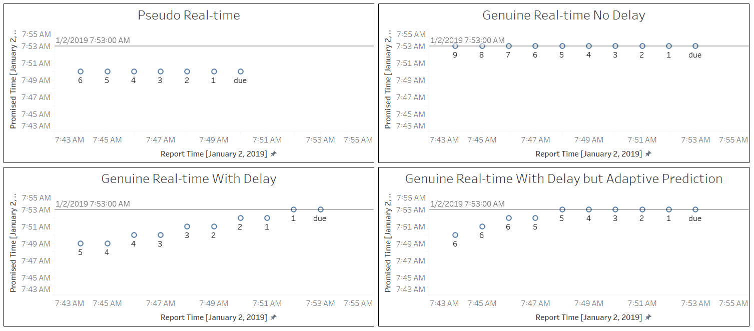 Figure 8 : Four illustrative plots of Promised Time vs Report Time ( Interactive Workbook: Illustrative Plots )
Conclusions
So what have we learned? One thing we are sure is that data of different qualities – genuinely real-time, pseudo real-time (Type 2 and Type 1), and non-real-time (scheduled) data – all present in the data stream.
Among these the most interesting are Type 2 pseudo real-time data. They appear to be the root cause of the phenomenon of disappearing buses.
Type 2 pseudo-real-time data are not totally bogus. One possible explanation of their existence can be this. The bus company has limited but not full tracking information on some of their buses. For example, it may know the location of a bus only when the bus leaves the bus terminal. Instead of not showing any data at all about the bus, the bus company uses interpolation to predict the locations of the bus, and reports these as if those are real-time data.
Tips for riders
If you are waiting for a certain bus and the bus disappeared in the RTI system, chances are that the system has been showing you Type 2 pseudo-real-time data. The bus may have been delayed long enough that the promised delta goes below 0, and the RTI system has decided to stop reporting on the bus. In this case, the bus may still be on its way.
After this study, I actually did change my bus-waiting strategy. When a bus disappears from the RTI, I would keep waiting. There have been multiple times I could see the “disappearing” bus eventually showed up a few minutes later.
Suggestions to the bus companies and/or Bristol API
The existence of pseudo-real-time data (Type 2) is a negative of the system. It erodes riders’ confidence in the RTI system and should ideally be replaced with genuine real-time data.
In this study, I have to be physically present on a bus stop to establish the ground truth of whether a promised arrival time did materialise. This is a labour-intensive way of data collection. If, however, the bus company, can also expose the real-time GPS coordinates of each bus, then the labour-intensive process can be automated.
Final words
Open Data promotes transparency and is a healthy force in a modern, open, and democratic society. Without it this study would not have been possible. I hope more public services will open up their data and let public to have greater insights into their service quality.

