What is Clean Design?
The first thing that might spring to your mind when I refer to Clean Design in the context of UX is a pixel perfect mockup. What I refer to as Clean Design is the cleanliness of your design files and the practices of creating these files rather than the design outcome you generate from them. This includes the file and folder structure, what you name your design pages, layers and artboards, what you use symbols for and their hierarchy, and your consistency in organising your work.
This concept of cleanliness is more familiar to developers who are used to the practices of writing Clean Code. Developers often pay as much attention to the quality of their code as to the functionality it allows them to do. Clean Design often seems to be overlooked by UX Designers who sometimes tend to focus only on the quality of the mockups they create. This is perhaps because the deliverable in Design is usually the mockup. In contrast, in development, the code itself is considered a deliverable as well as what it allows you to do.
The benefits of Clean Design
We might not realise the pitfalls of unclean design especially if we’re the only designer on a project. While working on a project, we are usually able to find what we need and remember how we’ve structured our files. Problems become more evident when we hand over our work to another designer, collaborate with other designers, or even look at our own files months later. Clean Design can help avoid some of these problems because it:
-
Enables a more efficient maintenance of the Design
-
Allows working faster and finding things we need
-
Helps avoid inconsistencies
-
Facilitates sharing styles with developers
-
Eases onboarding for new team members
-
Establishes good practices and helps us be organised
Four simple ways to avoid the mess
1. Choose descriptive names for your layers / group of layers and symbols
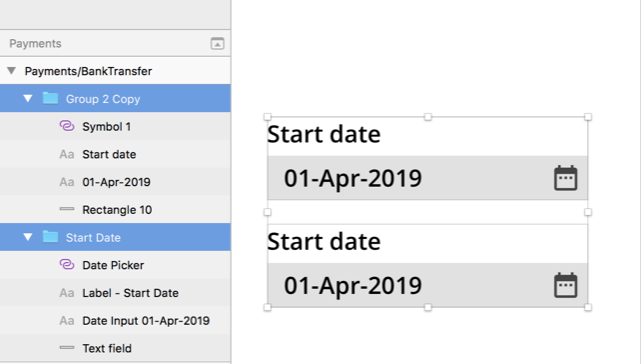
Rename the default non text layers created by the design tool you’re using so you don’t end up with layer names like “Group 2 copy” or “Rectangle 10”. The earlier you start editing these layer names, the easier it will be to maintain a clean design. Naming every layer in your file especially when working under tight deadlines is not always realistic and I won’t claim to be doing that. However, naming at least a group of layers especially ones you will copy a lot should be achievable and will make it easier to find and select the correct layers. Having a descriptive name for your layers/group of layers could help you spot if they are not under the correct artboard.

Example of non-descriptive (top) vs. descriptive (bottom) names for layers/ group of layers in Sketch
When it comes to naming symbols, choosing descriptive names can also be useful when sharing designs with developers. For example, If you export Sketch symbols to Zeplin, the names of the symbols are preserved under the components section in Zeplin.
2. Name your artboards following the hierarchical structure of your application
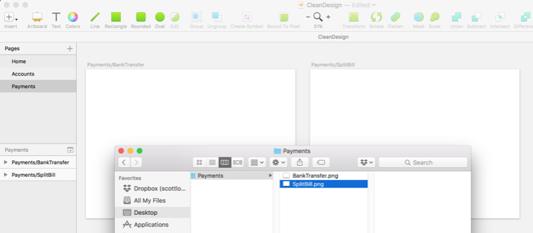
If you use the forward slash in Sketch while naming your artboards, a hierarchical structure of folders is created when you export the artboards. For example, if you create 2 artboards and name them “Payments/BankTransfer” and “Payments/SplitBill” then, when you export the artboards, a “Payments” folder will be created with the 2 files “BankTransfer” and “SplitBill”.

Example of use of the forward slash in Sketch
This makes it easier to keep your file structure following the structure and navigation of your application but also it makes it easier to override exported PNGs. If you follow this convention of naming your artboards, you could select all artboards on a page and export them to override existing ones under the corresponding folders.
3. Use symbols but use them efficiently
When it comes to symbols, knowing how much is enough is key. We use symbols to save time and improve our workflow. There is a fine line between saving time editing components globally via symbols, and wasting time creating symbols and customising them via overrides. If it takes longer or as long to customise the symbol with overrides than it does to edit the component on each mockup, then we should reconsider whether making the component a symbol in the first place was the right decision.
When I want to decide on whether a component would work better as a symbol, I ask myself 3 questions:
-
How often will this component be used? This allows me to think about whether I will use the component enough to justify making it a symbol.
-
How many instances/variations of this component are there? This allows me to think about whether it would be faster to update the symbol rather than update the component on each mockup.
-
Am I likely to need to change the design of this component throughout the project? This allows me to think about how likely the component is to change and thus whether there is a need to make it a symbol or not.
It is difficult to answer some of these questions at the start of a project, which is why I tend to create symbols throughout the project as I get a better holistic vision of the project rather than at the start.
The navigation menu is a good example for something that works well as a symbol. It tends to be used on every mockup and without any variation except the section that is selected. It is likely to change throughout the project because you may need to add more sections as you design additional parts of the application. You may decide to change visual elements like colours. The behaviour of the navigation menu tends to remain consistent across the application. Tables on the other hand can get more complicated and do not lend themselves intrinsically to a symbol.
I also found that creating too many nested symbols can considerably increase the time you spend editing them and can be counterproductive.
4. Keep your folder structure and file versions organised
If you don’t have a version control system like Dropbox, then name your files with a version number. This might seem trivial, but I have seen this mistake done too many times not to mention it: Do not use your name or colleague’s name for your file names because it doesn’t provide meaningful information about what you are designing.
Having a template for a folder structure allows you to find things faster. No two projects are the same so it is not easy to come up with a template for a folder structure that fits every situation. The template can be used as a guide. You can base it on the type of projects you work on and the things that are recurrent in the work you do. I have used many folder structures in the past. There isn’t a correct way to structure your folder. The goal is to be consistent across projects and for your template to be flexible enough to support different types of projects.
Here is one example of folder structure I created that may work for you:

Conclusion
While Clean Design has not yet become a focal point for UX Designers, we’re certainly starting to see some interest in it and in creating ways to facilitate it. Designers at Monzo have tried to automate parts of this process. They created a Sketch plugin to help automatically delete duplicates, rename layers, generate styles following the layer names, and merge duplicate symbols etc. I would not be surprised to see more of these tools / plugins emerge soon and I look forward to testing them.


