D3 is great for creating bespoke visualisations, and is often used for showing charts. Our d3fc library extends D3 with some commonly used components such as series, and a simple way to compose them all together as a cartesian chart.
The d3fc cartesian chart
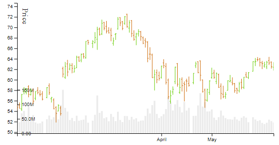
The d3fc cartesian chart is designed for simple charts with a single x and y axis, and a plot area. This keeps the API simple, which makes perfect sense. The documentation notes that for charts that don’t follow these layout conventions, you’ll need to construct it from more basic / fundamental components. Here’s an example that uses two vertical axes to show both price and volume on the same date scale:
This got me wondering: Would it be possible to move a few bits and pieces around to create an API that retains the simplicity of the cartesian chart (mostly), while offering a lot more flexibility?
Layers
In the example above, there are effectively two charts that share the same x-axis and plot area. So lets think of each of these charts as a “layer”, and the new chart component can be composed of one or more layers.
All of the properties of chartCartesian that apply to the axes or plot area now move onto the layer. To keep things familiar, lets retain the same set of properties and behaviour. The new chart component will still be responsible for the chart-level labels, but as there’s more flexibility now, we’ll rename them to topLabel, leftLabel etc…
Here’s a simple example from chartCartesian:
const cartesian = fc.chartSvgCartesian(d3.scaleLinear(), d3.scaleLinear())
  .yLabel('Sine / Cosine')
  .xLabel('Value')
  .yOrient('left')
  .yDomain(yExtent(data))
  .xDomain(xExtent(data))
  .plotArea(multiSvg);
With the my alternative API, that becomes:
const chart = fcFlexi.chart()
  .leftLabel('Sine / Cosine')
  .bottomLabel('Value')
  .layers([
    fcFlexi.svgLayer(d3.scaleLinear(), d3.scaleLinear())
      .yOrient('left')
      .yDomain(yExtent(data))
      .xDomain(xExtent(data))
      .plotArea(multiSvg)
  ]);
As you can see, all the same elements are still there, just moved around a little. You can still interact with the x/y axes and scales via properties like xTickArguments etc, but those are now properties of the layer.
Flex-Chart
Here’s my d3fc-flexi-chart component on GitHub.
In the above example, you may have noticed that the layers property is an array. You can add any number of layers here. It seems to make sense that the layers share at least one axis (if not, then what are they doing in the same chart?), but that isn’t enforced by the API.
I could split the “Sine” / “Cos” series out into different layers like this:
const chart = fcFlexi.chart()
  .leftLabel('Sine')
  .rightLabel('Cosine')
  .bottomLabel('Value')
  .layers([
    fcFlexi.svgLayer(d3.scaleLinear(), d3.scaleLinear())
      .yOrient('left')
      .yDomain(ySineExtent(data))
      .xDomain(xExtent(data))
      .plotArea(sineSeries),
    fcFlexi.svgLayer(d3.scaleLinear(), d3.scaleLinear())
      .yOrient('right')
      .yDomain(yCosExtent(data))
      .xOrient('none')
      .xDomain(xExtent(data))
      .plotArea(cosSeries)
  ]);
Both layers use the same xDomain, so they’ll share the same x-scale and x-axis. Notice the .xOrient('none') line in the second layer, to hide its x-axis. Without that we’d get the x-axis shown twice. Each layer has its own yDomain, and we render the “Sine” axis on the left with the “Cosine” axis on the right.
We need to add one more thing. The two different layers are likely to need different data, so as with seriesMulti, we can use a mapping function:
  .layers([sineLayer, cosLayer])
  .mapping((data, index, layers) => {
    switch(layers[index]) {
      case sineLayer:
        return data.sine;
      case cosLayer:
        return data.cos;
    }
  })
Candlestick / Volume
Let’s go back to the original example, where we wanted to show both price and volume against the same date scale. It’s a simple matter to create a “prices” layer and a “volume” layer, then compose them together
const chart = fcFlexi.chart()
  .bottomLabel('Date')
  .rightLabel('Volume')
  .leftLabel('Price')
  .layers([pricesLayer, volumeLayer]);
Going too far
I can’t think of an example of a chart that requires more than two vertical axes, so it’s probably not a good idea. I wanted to show what the flexiChart is capable of though, so why not? We’re running out of places to render more axes, but we can use colour coding instead:
flexiChart will stack up the axis components on each of the four sides of the chart, as required.
In that last example, I also combined a SVG layer (the Sine/Cosine series with gridlines) with two Canvas layers.
Conclusion
Most of the time, the standard d3fc chartCartesian is sufficient. However, I think composing a chart as a set of layers is a small enough change that it doesn’t add significantly to the complexity. At the same time, it does allow for those much less common scenarios where we do actually want to do something different.