Introduction
As the team of 2019 Edinburgh summer interns, we (Adam, Ali, Jerome, Marcin) were tasked with developing a web-based art installation that would be displayed on one of the wall-mounted screens in the office. The initial briefing suggested a pair of eyes that, when coupled with a webcam, would follow people as they moved through its field of view. Beyond this description we were assigned to be the product owners and thus given the creative freedom to take the project in a direction we believed to be suitable. With the helpful advice from our mentors and our artistic consultant, we ventured down the paths of computer vision and front-end development.
This article will describe the app and how it was developed. Additionally, it will describe our experience at Scott Logic and what you can expect as an intern.
The Tech Stack and its Progression
The Web Front-End / Python Back-End Prototype
In the first week of our internship we prototyped an HTML/JavaScript front-end that connected to a Python back-end. At the time, this seemed like an ideal solution due to the numerous available computer vision and image-processing libraries in python, which allowed us to develop prototypes quickly with different motion tracking and face detection libraries.
We tested various tracking libraries and methods, such as motion-tracking and Haar Cascades in OpenCV. These methods were fast but they weren’t particularly accurate.
This led us to our first implementation which passed static images to the back-end via web sockets, where the required image processing could be done with the help of ImageAI. In these early stages of development, the back-end was just a locally-run Flask server. On this server, the target position was derived and sent back to the front-end to position the eyes, which at these early stages were implemented using D3.
While great for prototyping and flexibility, this solution was less than ideal given that it added significant latency to detections and came with obvious privacy concerns in streaming live video of the office to an external server. In development this was overcome by hosting the Flask server locally, but it was clear that this would not be a scalable solution.
The Pure JavaScript / HTML Implementation
After experimentation from our first week, we researched JavaScript libraries which could perform image-processing and object-detection directly in the browser, relieving our need for a back-end entirely. We briefly considered compiling non-JavaScript libraries to WebAssembly, but this idea was put aside after our discovery of native-JS image-processing libraries. While a front-end solution incurred obvious performance penalties, the benefits in reduced latency, privacy and scalability outweighed the drawbacks hugely.
For image processing, we made use of TensorFlow.js which included a selection of pre-trained models for object recognition. Our model of choice was Coco SSD, a model specialising in object detection across eighty classes of objects one might find in an office, including people, mugs, forks and, of course, giraffes.
Unfortunately, as we began adding more features, it became evident that a pure JavaScript implementation did not inherently encourage a specific structure, resulting in an interesting amalgamation of coding styles between the four of us.

The Final React Implementation
On our mentors’ recommendation, we considered a third transition to TypeScript in combination with React. This change helped us overcome our previous challenge to add meaningful structure to the project as we developed in unison.
React provided a natural structure for the eye graphics, which we rendered as a group of concentric SVG circles. Further down the line we added visual improvements via more SVG, such as a line pattern centred around the iris and a glint in the top-right corner.
The third and final implementation of Looking At You is still a static web page, but we swapped from traditional JavaScript to TypeScript and made use of the React framework. It was natural to split the eye graphics up into a React-appropriate hierarchical structure, and TypeScript’s safe typing kept the four of us on the same page; this was important as in a small scale project such as this we expected there to be a relatively large amount of overlap in what code and files each of us was working on, which would lead to conflicts.
Most of us had little-to-no experience in React and TypeScript, so we were excited by the learning opportunity. Both React and TypeScript are well documented online, and they are popular at Scott Logic, so advice was more readily available from our mentors.
State is managed in the Redux store, with different stores for the config menu, the webcam objects, and the detections from the webcam feed.

Development Process
Agile
The project was developed with an agile approach, specifically using scrum and weekly sprints. A stand-up was held each morning with mentors and all four interns in attendance, and we finished each week with a demo of our progress followed by a sprint planning session for the next week. An agile approach is taken to real client projects developed at Scott Logic, typically with one- or two-week sprints, so this process was a realistic and enriching insight into a career as a developer at Scott logic. Version control, issue tracking and sprint tracking was done through GitHub.
Code Review
All code written by us was reviewed and, after changes made due to comments, approved by one of our mentors, which proved a very informative experience. As the project progressed, we gained more experience and became more self-sufficient, thanks to the reviews. We started reviewing each other’s code to speed up the process and familiarise ourselves with the rest of the team’s work.
Gitmoji
Gitmoji is set of standards for using emojis in Git commits, and the Gitmoji Interactive Client is a command line tool for inserting emojis preceding each commit message. The idea of using Gitmoji started as a joke, after some emojis had snuck their way into our Git issues, but after installing the NPM package and using it for a few sprints we decided to keep it around. Gitmoji encourages developers to start each commit message with an emoji from its set of standardised emoji, with each emoji representing the purpose that commit has. A bug fix is represented by a bug emoji, a commit that adds tests is represented by a check-mark emoji, and so on. This encouraged us to compartmentalise our commits - each commit should have a single purpose - and thus to commit regularly. This was especially beneficial to those of us without much experience of collaboration and proper version control. Gitmoji also makes it far faster to take in at a glance what a commit history on GitHub really represents. Gitmoji gets a five-star recommendation from us and we’d strongly recommend all developers try it. 👌
The Final Application and its Features
Tracking
The basic tracking feature as described in our initial requirements was implemented quickly, but it has been refined throughout the project. To more reliably track the same target between frames, we implemented a custom tracking solution. The tracking utilises a combination of momentum prediction and colour detection. While the momentum prediction worked by applying an exponential decay function to a history of changes in position between frames (weighing most recent changes more heavily); colour detection considered the values of more recent colours with less weight.
In addition to this, several other features were brainstormed and implemented to make the application more user-friendly and more interactive.
Reflection
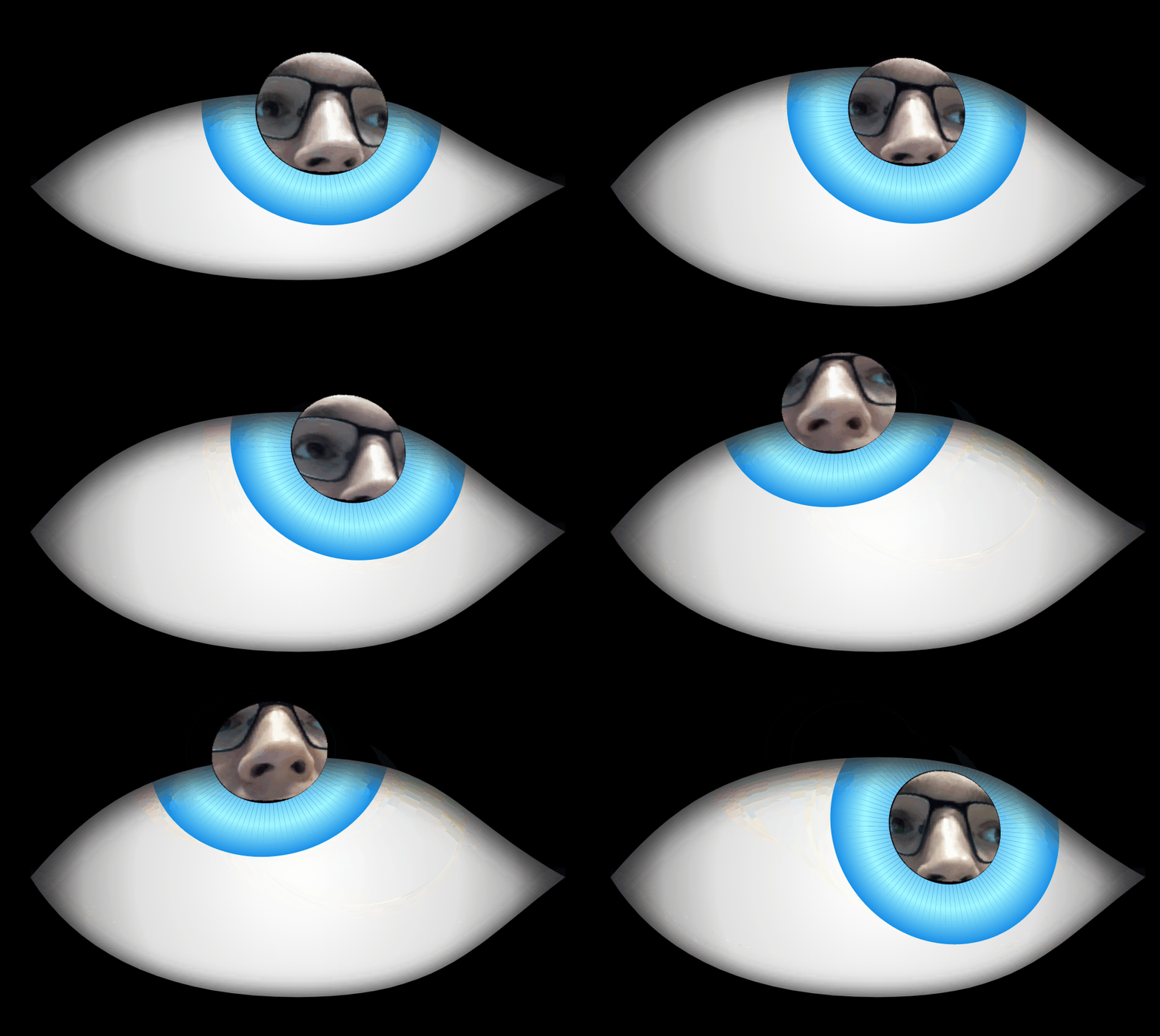
The user’s face is reflected at them in the pupil. This was implemented after receiving feedback that there should be some stronger indication of who the eye is following. This was achieved by drawing a crop of the video feed on a canvas underneath the pupil and making the pupil slightly transparent.
Settings Menu
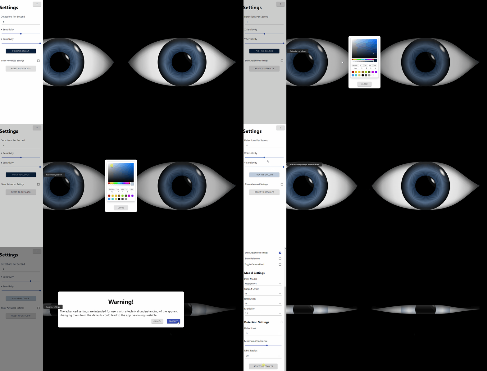
We realised early on that users would need to configure the “sensitivity” of the eyes to moving either horizontally or vertically. We could not completely determine where the eyes should move to base on the camera feed, as field-of-view varies between cameras and the eyes would need to move less or more based on real-world screen size. To solve this, we implemented a settings menu. To keep the application immersive (the app should not have any disruptive UI elements when it is left running in the background) the settings menu was set up such that it is only visible shortly after the mouse has been moved, or when the mouse is already hovering over the settings menu. As you can see below, the settings menu was expanded throughout the project to improve both our experience as developers and the user experience in setting up the app.

Intelligent Movement and Animations
With only tracking implemented the eyes appear inhuman. We were advised by our artistic consultant to make the eyes more realistic. This led to the redesign of the eyes to a more lifelike shape and led to implementing various animations. The eyes blink regularly - less regularly when focused on a target - and dilate in bright light, and more.
Pose-detection
Our choice of detection library, Posenet, provides a full set of key points (coordinates for various body parts e.g. wrist, nose, hip) based on the pose of anybody detected in the camera feed. We took advantage of this and implemented pose-detection and interaction in the application. If the user waves, the eye winks back with the corresponding eye; if the user raises their hands, the eyes roll in exasperation - and there are more interactions to be found.

Challenges
Optimisation
The application suffered from an array of performance issues. The image processing alone took large amounts of computation and required fine-tuning of the model settings as well as ensuring that we call the person-detecting functions the minimum amount of times based on the “detections per second” setting. Lots of the application’s state is handled in a Redux store, so we could make use of memoised components to ensure that the “detect person” function is called once and only once for each frame, and similar optimisations for other functions.
At one stage we considered using web-workers to boost the performance by giving us parallel computation which would have allowed us to separate the animations from the object detection. However, TensorFlow.js with off-screen canvases does not support hardware acceleration in web-workers which caused a single detection to take too much time.
Additionally, the very frequent state updates require that the React components update several times per second. As some of us were new to React, and new to high-performance applications such as this, our early implementations of the project did not account for this performance issue. Our early implementation had large components that could have been better separated into subcomponents, and state updates were not batched. This resulted in far more state updates, and thus renders, than was desirable. We solved this by further splitting up our React components.
Two Camera Support
In the early stages of the project, we implemented two-camera support in such a way that each eye has a camera assigned to it. This meant that the eyes could move somewhat independently, and thus depth perception was simulated. This was difficult in practise. While progress was made in coordinating the eyes in such a way that they did not, for example, go cross-eyed, they still tended to fly off in independent direction in a somewhat unsettling and spooky manner. The performance hit was also large - twice the cameras requires twice the image-processing.
Testing
Automated unit tests could be written for much of the application, but when it comes to testing against requirements: it’s not practical to write automated tests for a requirement such as “the eyes should follow people in a realistic way”. Thus, we had to perform a fair amount of manual testing - often going back to the drawing board with an idea of how we might improve the application but no concrete bugs to solve.
Being Both Developer and Product Owner
We were in the unusual position of being both developer and product owner for the project. This means that we had the responsibility of developing and testing the product, and the role of deciding what features need to be implemented. Some conflicts arose from this early on given that we knew we were going to be developing the features that we ourselves have defined, we often felt that we knew them well enough in our head and thus didn’t define features formally enough. This led to some confusion among the team and we learnt to be more detailed in our requirements and Git issues. An advantage of this developer/owner dynamic, however, is that it allowed us the flexibility of defining and implementing new features earlier than usual, if we found that we had spare time on our hands towards the end of a sprint.
Merge Wars
Due to the small scale of the project, it was inevitable that the areas of code each of us was working on overlapped somewhat. This was particularly problematic in merging to the master branch, and often resulted in us hastily merging out branches after a pull request was approved to not be left to deal with conflicts. This led to further problems where the hasty merges to master might fail tests or might not even compile.
Chromegate
With two weeks of the internship left, finishing touches to the application were being made so that it would be left in a more complete and maintainable state. But disaster struck when Chrome Update 76 released. This update changed heuristics that determine when to activate hardware acceleration, which, combined with a bug from 2012, broke our application. The bug caused the reflection in the pupil (a canvas wrapped in an SVG foreign object) to always render on top of all shapes which shared an SVG ancestor, creating a somewhat unsettling effect.

We were assured by Chromium contributors that this Chrome update bug has given us the authentic front-end web developer experience. The issue was solved by pulling out the various shapes (eyelids, pupil, iris, reflection, etc.) into separate SVG elements that are now rendered in the correct order. Not a clean solution, unfortunately, but with two weeks left of the internship there was no time to investigate radically different solutions.
The Ballad of Santhosh 1
Google’s motto “Do no evil”,
Seems to us to be very feeble.
In a pushed update,
Our functionality would break
And our app was left in pieces.
The reflection was broken,
While we were left hoping,
that Santhosh, our hero,
would come.
Instead we were told,
with a message feeling cold,
that our problems were
our own
So we received,
Full exposure,
to the world of web dev,
and JavaScript closures.
By sensational mentors,
our code was reviewed.
The application battered
but quickly reglued
The internship, coming to a close,
would forever be honoured,
in this blog much verbose.
Working at Scott Logic
Internship Structure
Throughout the internship we had four software developers as mentors giving feedback on our code and the project. The feedback and help we received from the developers was invaluable and they taught us a lot about how to make readable and maintainable code. Since most of us had never used React the mentor interaction was a valuable learning experience and acted to strengthen our code-writing skills. We also had an artistic consultant, who gave us advice on stylistic improvements as well as ideas on how best to make the app interact with users, and the internship coordinator. The advice from our artistic consultant and internship coordinator proved important and gave us a different perspective on what the app should be.
The Social Side
Throughout our time at Scott Logic we have been invited to a variety of aspects of Scott Logic life, such as leagues and friendly games of FIFA or Magic the Gathering at lunch time. As soon as we arrived at Scott Logic we felt instantly welcomed, and everyone was keen to involve us in the various things going on in the office; for instance we took part in the lunch time FIFA league, as well as going along to the office five-a-side. Alongside the regular social events and lunch-time games, there is a variety of other things such as the lively Slack community, a book group, Burrito Tuesdays, and more. During the initial weeks we were taken out for lunch and there was office-wide sushi-making which let us get know our colleagues a bit better - and eat some sushi too. 🍣
Finally…
All four of us have learnt a lot in our time at Scott Logic. Looking at just the technical side, we’ve learnt new frameworks and technologies with React and Redux, thanks to guidance and code-review from our mentors. While we’d all learnt about Agile “in theory” at university, this was our first time following the methodology for real, and it’s put us in great stead for future careers. Additionally, the practise gained in proper use of version control and collaboration was a great boon, and an experience that will surely help us in our final year at university and beyond.
-
Santhosh was our helpful Chromium contributor ↩

