Read the follow on post to this one which optimises the loading behaviour to use Apache Arrow.
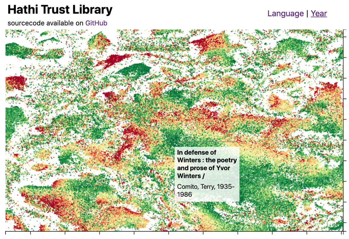
This blog post introduces the WebGL components which we recently added to D3FC, this suite of components make it easy to render charts with a very large number of datapoints using D3. Throughout this post I’ll describe the creation of the following visualisation, which displays 1 million books from the Hathi Trust library as showcase for what these components are capable of:

(You can view and explore this visualisation online)
I’ll also look at streaming data into the browser, creation of D3 annotations and fast spatial indexing with Quadtrees. But first, let’s take a look at why we need WebGL when handling large datasets …
SVG vs Canvas vs WebGL
D3 charts are most often rendered using SVG, a retained mode graphics model, which is easy to use, but performance is limited. SVG charts can typically handle around 1,000 datapoints.
Since D3 v4 you’ve also had the option to render charts using canvas, which is an immediate mode graphics model. With Canvas you can expect to render around 10,000 datapoints whilst maintaining smooth 60fps interactions.
However, if your dataset is really large, neither technology is suitable. Your only option is to employ some form of sampling and render a subset of the data.
If you really do need to render the entire dataset there really is only one option, and that is to make use of your GPU (Graphical Processing Unit), a specialised processor which is specifically designed for high-performance graphics. These processors are most often used for creating highly realistic scenes for computer games, however, there is no reason why they can’t be used to render charts.
WebGL provides a JavaScript API that allows you to create GPU-accelerated graphics. But while the APIs are readily available, the main obstacle to using them is their complexity. The WebGL APIs do not provide any form of abstraction over the underlying shader language.
With D3FC we have created a suite of components that makes it easier to create charts with D3, extending its vocabulary from SVG paths, rectangles and groups, into series, annotations and charts. Recently we have added support for WebGL, making it really easy to render series using GPU-accelerated graphics. Here’s a simple example that demonstrates a WebGL series component:
const width = 500, height = 250;
const data = d3.range(0, 50).map(d => Math.random());

const xScale = d3.scaleLinear()
    .domain([0, 50])
    .range([0, width]);

const yScale = d3.scaleLinear()
    .domain([0, 1])
    .range([height, 0]);

const canvasgl = d3.select('#line-webgl').node();
canvasgl.width = width;
canvasgl.height = height;
const gl = canvasgl.getContext('webgl');

// the webgl series component that renders data, transformed
// using D3 scales, onto a WebGL context
const webglLine = fc.seriesWebglLine()
    .xScale(xScale)
    .yScale(yScale)
    .crossValue((_, i) => i)
    .mainValue(d => d)
    .context(gl);

webglLine(data);

This blog post explores these new components to create an interactive chart that allows you to explore a dataset with ~1M datapoints. It also explores other challenges, such as how do you load a 70MB dataset into the browser?
You can see the complete example online.
Hathi Trust Library Dataset
For this demonstration we’re going to need a large dataset. One that I saw recently that I found quite fascinating is a visualisation of the Hathi Trust library that was created by Ben Schmidt. If you are interested in how this plot was generated, it’s worth reading about Word Embedding, which generates high-dimensional vectors that describe a vocabulary, and T-SNE, a method for dimensional reduction while maintaining clustering. With this approach you can cluster books based on the similarity of their text. Exploring the dataset you’ll find obvious clusters based on language, but also more interesting ones - for example clusters of medical texts or poetry.
Anyhow, I digress; this is a fascinating dataset, but for the purposes of this blog post our main interest is its size!
The previous section already demonstrated a D3FC WebGL line series component. For this dataset we want to render a scatter plot, in which case the seriesWebglPoint is suitable. To use this component you supply a couple of accessor functions (mainValue and crossValue) that select the required properties from each datapoint in the ‘bound’ data.
This series component can be supplied to a D3FC chart component, which is rendered using the standard D3 approach via selection.call
const pointSeries = fc
  .seriesWebglPoint()
  .crossValue(d => d.x)
  .mainValue(d => d.y);

const chart = fc
  .chartCartesian(xScale, yScale)
  .webglPlotArea(pointSeries)

d3.select("#chart")
    .datum(data)
    .call(chart);
The D3FC chart constructs a pair of axes, using the supplied scales, which it associates with the series components you provide via the SVG, Canvas or WebGL plot area. One other important (and very useful) feature of the D3FC chart is that it automatically redraws by handling window resize events, allowing for the creation of responsive charts (a topic that a lot of D3 developers struggle with!)
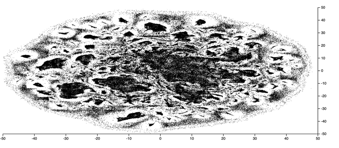
Here’s the Hathi Library data rendered as a scatter plot:

As the values on the X & Y scales are somewhat meaningless, I’ve hidden them via CSS and updated the chart layout to use up the space this saves. The D3FC chart uses CSS grid for layout, making it easy to adjust:
d3fc-group {
  grid-template-columns: 1em auto 1fr 1em 0;
  grid-template-rows: 0 auto 1fr 1em 0;
}

.tick text {
  display: none;
}
While WebGL allows us to render this static chart far more rapidly than an SVG or Canvas equivalent, it’s real power comes from the ability to re-render this chart at 60fps while the user interacts with the data. In the next section we’ll start looking at how to make this a more interactive chart …
Adding Pan and Zoom
D3 has a Zoom component which handles user interactions on the DOM element which it is associated with, storing the current state as a zoom transformation. In order to create an interactive chart you have to handle zoom state changes, update the respective scales and redraw.
The following code shows how this can be integrated with the chart component:
const xScaleOriginal = xScale.copy();
const yScaleOriginal = yScale.copy();

const zoom = d3
  .zoom()
  .on("zoom", () => {
    xScale.domain(d3.event.transform.rescaleX(xScaleOriginal).domain());
    yScale.domain(d3.event.transform.rescaleY(yScaleOriginal).domain());
    redraw();
  });

const chart = fc
  .chartCartesian(xScale, yScale)
  .webglPlotArea(pointSeries)
  .decorate(sel =>
    sel
      .enter()
      .select("d3fc-svg.plot-area")
      .on("measure.range", () => {
        xScaleOriginal.range([0, d3.event.detail.width]);
        yScaleOriginal.range([d3.event.detail.height, 0]);
      })
      .call(zoom)
  );

const redraw = () => {
  d3.select("#chart")
    .datum(data)
    .call(chart);
};
There are a few different things going on here …
The original scales are stashed allowing the zoom component to use the rescale functions which are a convenient mechanism for computing a new scale based on the current zoom transform.
The zoom component is associated with the plot area of the chart via the decorate function. This is a fundamental D3FC pattern which all of the components implement. This pattern exposes the underlying data join used to render the component, allowing you to modify and add elements etc …
In this case a measure.range event handler is added, which is emitted by the d3fc-svg element that is one of the basic building blocks of the chart. The d3fc-* custom elements provide lifecycle events that handle resizing and redraw, to create a responsive chart.
Finally, the D3 selection that renders the chart is wrapped in a redraw function so that it can be called repeatedly whenever the chart changes. The basic principle is that the chart render function should be an idempotent transformation of the data. There is no need to redraw the specific elements that have changed, just redraw the lot and let D3 / D3FC work out the most effective way to update the DOM (or Canvas).
One of the most performance-intensive functions involved in rendering series using WebGL is loading the data into a buffer (these are the primary mechanism for loading data into the GPU where it is manipulated by shaders). When the user manipulates the chart via pan / zoom the data rendered by the series does not change, and as a result there is no need to re-load all of this data.
By default each time the series is rendered it assumes that the underlying data has changed and the buffers are re-loaded. In order to optimise this process you need to supply an equals function that determines whether the data the series has been asked to render differs from the previous. Reference equality is good enough for our purposes:
const pointSeries = fc
  .seriesWebglPoint()
  .equals((previousData, currentData) => previousData === currentData)
  .size(1)
  .crossValue(d => d.x)
  .mainValue(d => d.y);
The WebGL series have some very smart optimisations that they employ under-the-hood. Rather than make use of D3 scales, it re-creates the scaling logic within the shaders resulting in very fast data-transformation and high performance. This example uses a D3 zoom behaviour allowing you to explore the dataset, an interaction which doesn’t change the data rendered in the chart, it just modifies the domain of each scale. By moving the scaling logic into the GL shaders, these operations can be handled entirely by the GPU, giving super-smooth interactions.
Loading Large Datasets with Streams
An immediate challenge I faced when creating this chart was the size of the dataset. Whilst the WebGL series component can readily render a huge number of datapoints, loading these datasets into the browser can take a long time. The example I’m using for this post is ~75MBytes.
A fairly standard approach to this problem is to split the data into chunks, loading each as separate files. This allows you to incrementally add data to the chart so that the user doesn’t have to wait for the whole dataset to arrive before seeing something of interest.
However, the new Streams API provides a much better way of achieving a similar effect. Previously JavaScript has only been able to access a file once it has been downloaded in its entirety, now with the Streams API you can access the data bit-by-bit as it is downloaded, using similar APIs that you’re probably familiar with from Node.
Within browsers that support the Streams API, the response from fetch request can be exposed as a ReadableStream, which can be read via ReadableStream.getReader().
The following code shows how to read chunks of data from the returned reader, passing each to a TSV (tab-separated value) parser. A callback is invoked as each chunk arrives.
const tsvParser = tsvChunkedParser();

// fetch a TSV file
const response = await fetch(filename);

// create a readable stream to handle this data
const streamedResponse = new Response(
  new ReadableStream({
    start(controller) {
      // access the stream reader
      const reader = response.body.getReader();

      const read = async () => {
        // read the next chunk of data
        const { done, value } = await reader.read();
        if (done) {
          controller.close();
          return;
        }

        // parse the data
        const items = tsvParser.parseChunk(value);

        totalBytes += value.byteLength;

        // invoke the callback with the new data
        callback({ items, totalBytes });

        controller.enqueue(value);
        read();
      };

      read();
    }
  })
);

const data = await streamedResponse.text();

callback({ items: [], totalBytes: data.length});
The TSV parser (not shown) is able to parse a TSV file that is supplied in chunks, rather than waiting for the entire file to download. For my Hathi Library visualisation I wrapped the above code in a Web Worker, using postMessage to communicate data, rather than callbacks, moving work involved in parsing this large TSV file into a separate thread.
Point fill colour
With D3FC the series components do not directly expose an API for setting their rendering style, i.e. you will not find fill, stroke or color properties. Instead, they allow you to modify the rendering style using D3 and the Canvas APIs directly. The documentation provides a few examples which illustrate how this is achieved via the decorate pattern. For SVG series this is much the same as the standard D3 approach, for example using the style property of the D3 selection. For Canvas series the decorate pattern exposes the context, allowing you to modify properties such as the fillStyle.
When it comes to WebGL things are a little different - as mentioned previously writing shaders can be quite challenging. In order to make it easier to create these shaders, we have added a number of low-level components that facilitate building shaders and WebGL Programs.
There are also components that can be used to specify the fill, stroke and symbol (for point series), used to render each datapoint.
The following example creates a D3 sequential colour scale, with the domain set to the year range 1850-2000. This is used to supply color values to a webglFillColor component, which is in turn supplied to the point series via the decorate function:
const yearColorScale = d3
  .scaleSequential()
  .domain([1850, 2000])
  .interpolator(d3.interpolateRdYlGn);

const fillColor = fc
  .webglFillColor()
  .value(d => webglColor(yearColorScale(d.year)))
  .data(data);

pointSeries.decorate(program => fillColor(program));
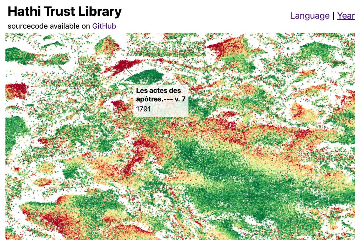
This renders the dataset colored by the year of publication of each book:

Once again, these calculations are cached on the GPU if the underlying data doesn’t change (based on the value returned by theequals function).
Annotations
In order to allow the user to interact with this visualisation I wanted to add a ‘callout’ style annotation which highlights the closest datapoint to the mouse cursor. D3FC doesn’t have a ‘callout annotation’ component, however we don’t need one as Susie Lu has built a fantastic and feature rich annotation library for D3 (I’d also recommend trying her D3 legend).
Creating annotations is quite straightforward, construct and configure the component (which has quite a versatile API), and render it in the standard way via selection.call:
const makeAnnotations = d3.annotation()
  .notePadding(15)
  .accessors({
    x: d => d.x,
    y: d => d.y
  })
  .annotations(annotations)

d3.select("svg")
  .append("g")
  .attr("class", "annotation-group")
  .call(makeAnnotations)
There are a few different ways an annotation could be added to a D3FC chart. One option is to use the decorate function which we’ve seen previously, adding an annotation at a suitable location within the DOM. However, as the annotation is data-driven, it actually makes more sense to add it to the chart as a series, supplying the location that we wish the annotation to be rendered via data-join / datum.
D3FC series components must expose xScale and yScale properties, these are set by the chart when a series is added to the plot area. Wrapping the annotation component so that it can be rendered as a series is really quite straightforwards - here’s the code with various comments outlining the approach:
export const seriesSvgAnnotation = () => {
  // the underlying component that we are wrapping
  const d3Annotation = d3.annotation();

  let xScale = d3.scaleLinear();
  let yScale = d3.scaleLinear();

  // a D3FC data join, which simplifies the D3 data join pattern
  const join = fc.dataJoin("g", "annotation");

  // function invoked by selection.call
  const series = selection => {
    selection.each((data, index, group) => {

      // map the data adding x & y properties which indicate the
      // location of the annotation (in pixels)
      const projectedData = data.map(d => ({
        ...d,
        x: xScale(d.x),
        y: yScale(d.y)
      }));

      // supply the data to the annotation component
      d3Annotation.annotations(projectedData);

      // render via the data join
      join(d3.select(group[index]), projectedData)
        .call(d3Annotation);
    });
  };

  // standard accessor pattern for xScale / yScale not shown

  // re-expose all the annotation properties on this series component
  fc.rebindAll(series, d3Annotation);

  return series;
};
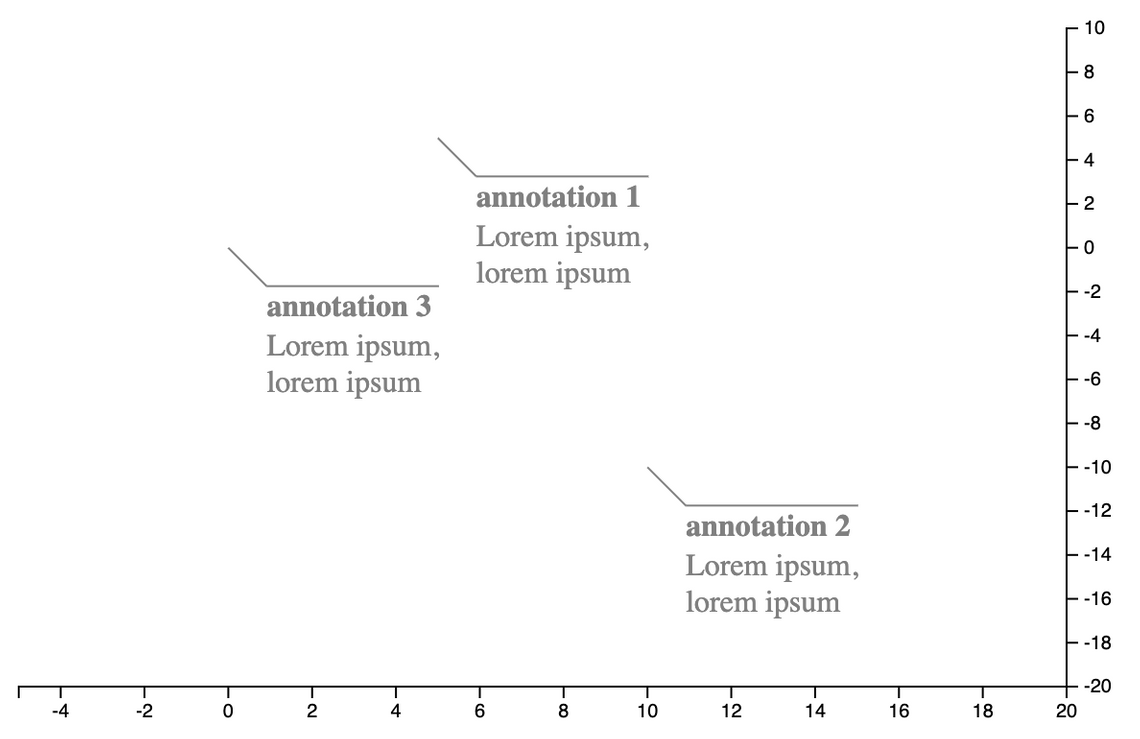
This annotation series component can be aadded to a D3FC chart in exactly the same way as any other series - rendering the data ‘bound’ to the chart via D3 data-join:
import { seriesSvgAnnotation } from "../annotation-series.js";

const xScale = d3.scaleLinear().domain([-5, 20]);
const yScale = d3.scaleLinear().domain([-20, 10]);

const annotationSeries = seriesSvgAnnotation();
const chart = fc.chartCartesian(xScale, yScale)
  .svgPlotArea(annotationSeries);

const createAnnotationData = (title, x, y) => ({
  note: {
    title,
    label: "Lorem ipsum, lorem ipsum"
  },
  // annotation location
  x, y,
  // offset from annotated point
  dx: 20, dy: 20
});

d3.select("#chart")
  .datum([
      createAnnotationData("annotation 1", 5, 5),
      createAnnotationData("annotation 2", 10, -10),
      createAnnotationData("annotation 3", 0, 0)
    ])
  .call(chart);

An advantage of this approach is that whenever the annotation location needs updating (i.e. when tracking mouse location), all you need to do is update the bound data and redraw the chart. Once again, making use of the idempotent nature of the chart (and D3 data-joins themselves).
Spatial Search of Large Datasets
You can track the mouse location using the D3FC pointer component, and for small datasets a linear search to find the datapoint closest to the pointer location is sufficient. However, for large datasets a linear search is far too time consuming. A common technique used to improve the performance of searches is to create a spatial index using an Quadtree, a hierarchic structure that group nearby datapoints together withing nested bounding boxes.
Fortunately D3 has it’s own Quadtree implementation, which is very simple to use. First build the index:
quadtree = d3.quadtree()
  .x(d => d.x)
  .y(d => d.y)
  .addAll(data);
Then whenever the user moves the mouse / pointer, the index is searched to locate the closest neighbour:
// convert from screen coordinates to domain coordinates
const x = xScale.invert(coord.x);
const y = yScale.invert(coord.y);
// find the closest point
const closestDatum = quadtree.find(x, y);
And if this point is sufficiently nearby, a single data point is added to the data (array) which is bound to the annotation series described above.
Putting it all together
So far I’ve covered the various component parts, streaming TSV data via a Web Worker, creating an annotation series, and fast spatial searches. Assembling these component parts is all quite straightforwards, I’ll not describe it here, instead I’ll direct you to the code on GitHub for the details.
One point I do want to re-iterate is just how simple the redraw process is. Whenever new data is added (as the chart loads), the user selects a point, or the chart is zoomed, all you have to do is invoke the redraw function:
const redraw = () => {
  d3.select("#chart")
    .datum({ annotations, data })
    .call(chart);
};
This couldn’t be simpler!
Hopefully this blog post has inspired you to take a look at the newly added D3FC WebGL components, and you’ll be able to put them to good use in your own charts and visualisations.
Read the follow on post to this one which optimises the loading behaviour to use Apache Arrow.

