Design handover involves communicating the visual styles and behaviours of your design so they can be translated into code.
Back in the Dark Ages of digital design, the only way to clearly define styles and spacings was through a process called redlining. This involved painstakingly adding markup on top of designs to show colours, fonts, widths, heights, spacings and more.
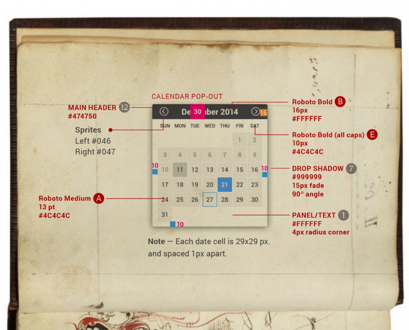
The creation of the Sketch Measure plugin helped to somewhat streamline this process, but it still remains low on most designers’ lists of ‘Things I Enjoy Doing’, just below ‘watching paint dry’.
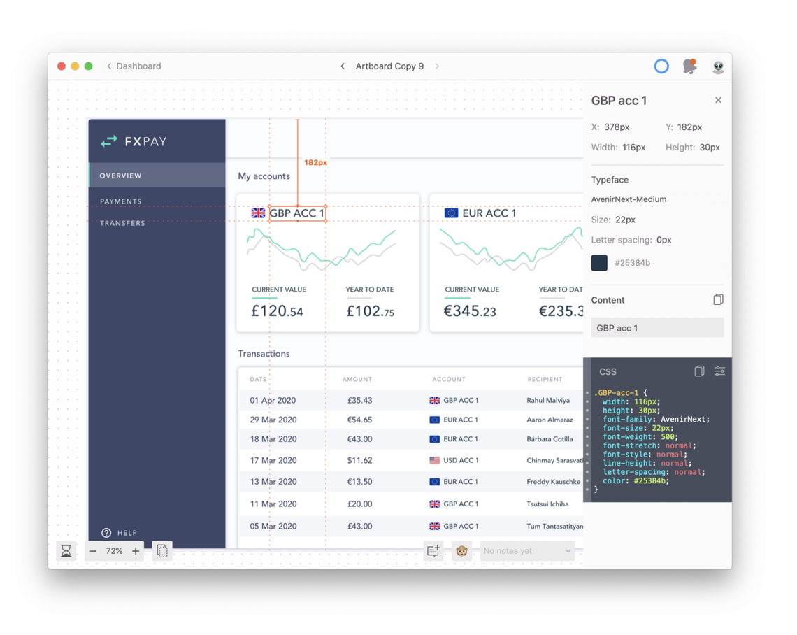
Recently, a whole range of tools have been introduced promising to fully automate visual specs and free designers forever from the horrors of redlining. Tools like Zeplin, Invision Inspect, Google Gallery and many more allow you to upload your design files and share them with developers, who can inspect and extract the styles of every element.
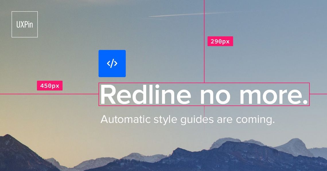
Designers everywhere rejoiced as they waved goodbye to ever having to produce redlines again. But is it really that simple?
Just like other forms of automation that are taking place, there are pros and cons to these tools that it’s important to consider.
✅Positives: Saving time + showing all information
The most obvious advantage to automatic speccing tools is the time saved by not having to create redlines.
All the styles and spacing information is already there. Developers can come in and easily find exactly the information that they need. What could possibly go wrong?
❌ Negative: Too much information
By showing all styles we remove the ability to show which ones matter. Developers can see the width and height of every element and how it is spaced in relation to every other element. But the intention behind these pixel values is not clear.
For example, an element could be shown to be 50px wide — but is this a set width or does it take the width based on its contents? Does it have a maximum width? Creating manual specs allows us to specify this, while purely automated specs leave it up to interpretation.
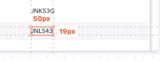
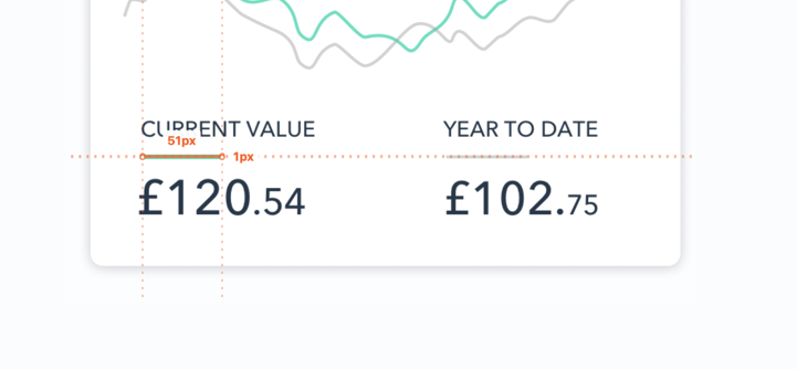
Additionally, designs have to be consistently pixel perfect, or you could be asked questions like “Why is this line 50px on this screen, but 51px on the next?.” 🤦♀️
Making every single screen pixel-perfect can be more time-consuming than just doing the visual specs manually.
✅ Positive: Style guide and component adoption
One area that these tools are really starting to shine in is documenting design tokens and components.
Instead of just displaying static styles and components in the code view, you can link them to your style guide or component library to encourage adoption.
For example, Zeplin allows you to set up a spacing system which is shown instead of pixel values when inspecting. 😮
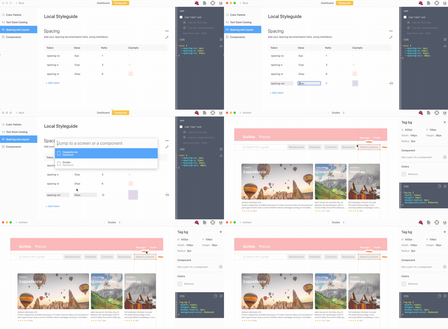
With design systems and atomic design becoming more commonplace, being able to integrate these into handover tools is a very powerful development in the design workflow.
❌ Negative: Displaying responsive behaviour
However, there are some things that automated handover tools can’t show. Most will display designs as static images on a fixed screen size, but this is rarely the reality. Communicating responsive behaviour is not widely supported across these tools, although some have made steps towards it.
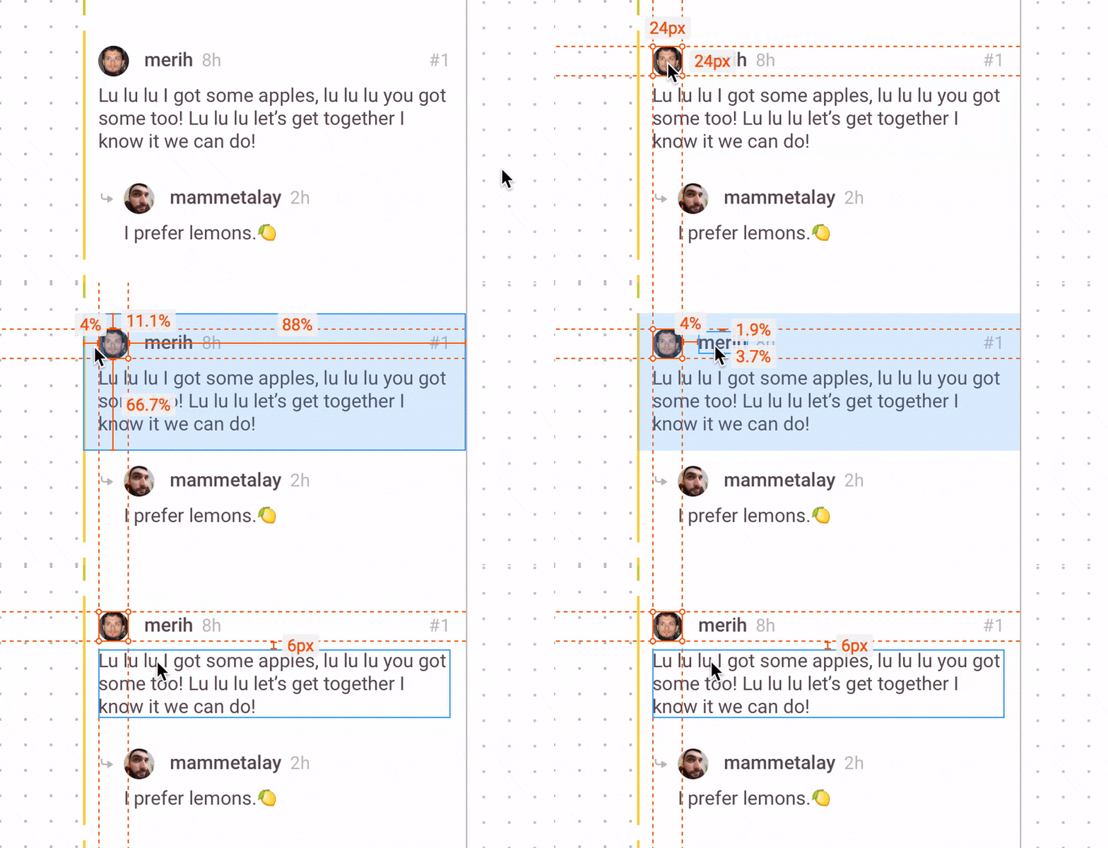
Zeplin can show percentage width instead of pixels, and also has the ability to show the underlying layout grid. This is amazing if the developers are using similar tools to code the responsive behaviour. But if they are using different techniques, then we are left having to specify it manually or leave it up to guesswork.
For example, two of the responsive techniques I use the most are maximum/minimum widths and setting constraints/pinning.
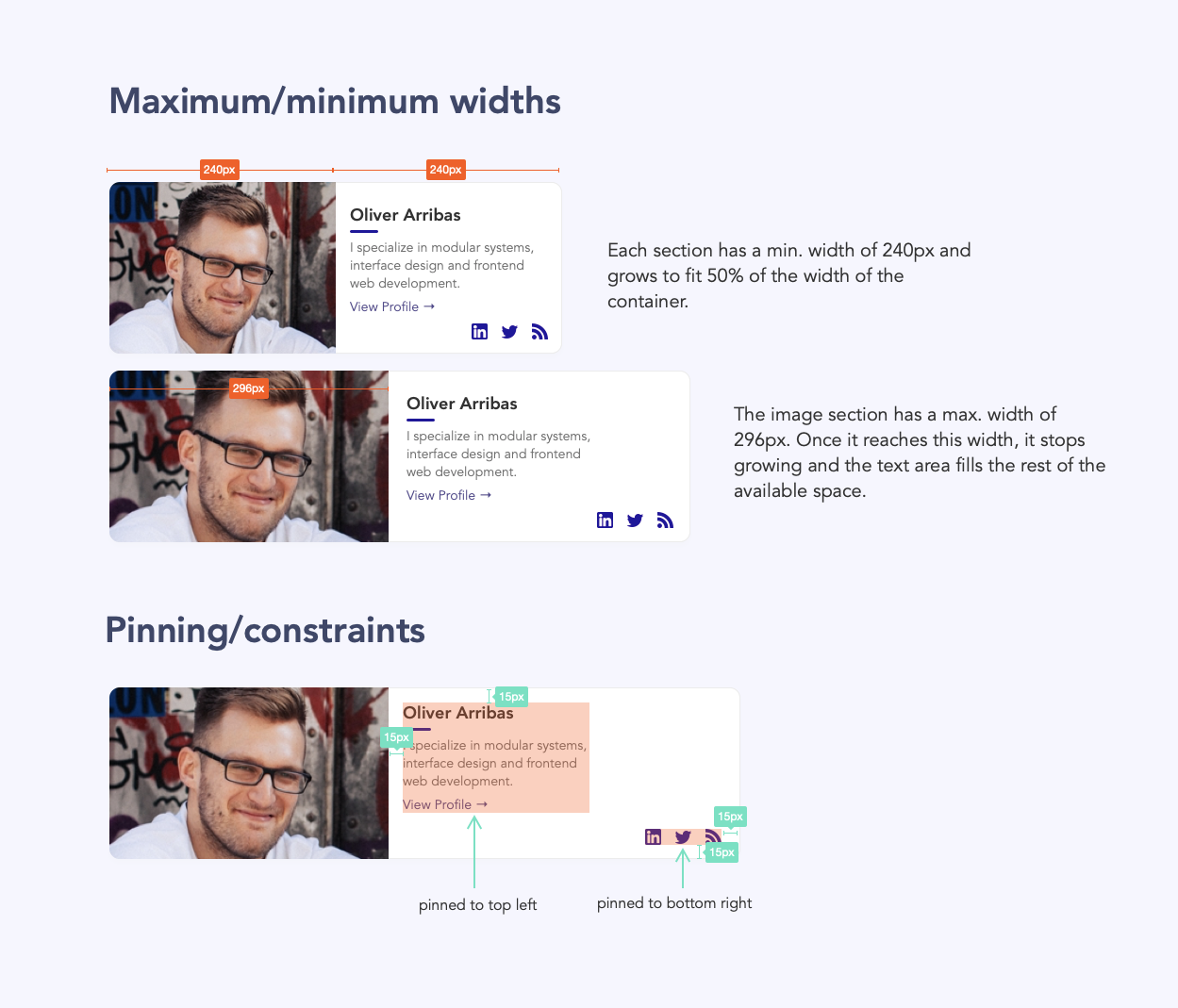
Responsive design/development is a huge area with many different techniques. While we can automate handover for some of these techniques, others still rely on manual specs and explanation to make them clear.
✅ Positive: A single source of truth
Most (if not all) of these tools work by creating a shared link that allows others to view the design online. This makes specs easy to share and keep up-to-date. This means there is a single source of truth and you don’t have to worry about multiple versions of the same spec document floating around. 🙌
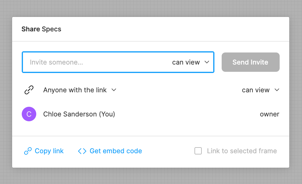
I have found this to be hugely beneficial as I often end up making changes to specs following refinement sessions with developers. The cloud-based approach allows me to attach links to stories on Jira so that the up-to-date specs are always available.
❌ Negative: Cloud storage
Depending on the company you’re designing for, there could be tight security procedures prohibiting the upload of work onto 3rd-party cloud services. This makes manual specs the only option for some cases. However, as adoption of cloud services becomes more commonplace and secure, the number of companies enforcing these rules is shrinking.

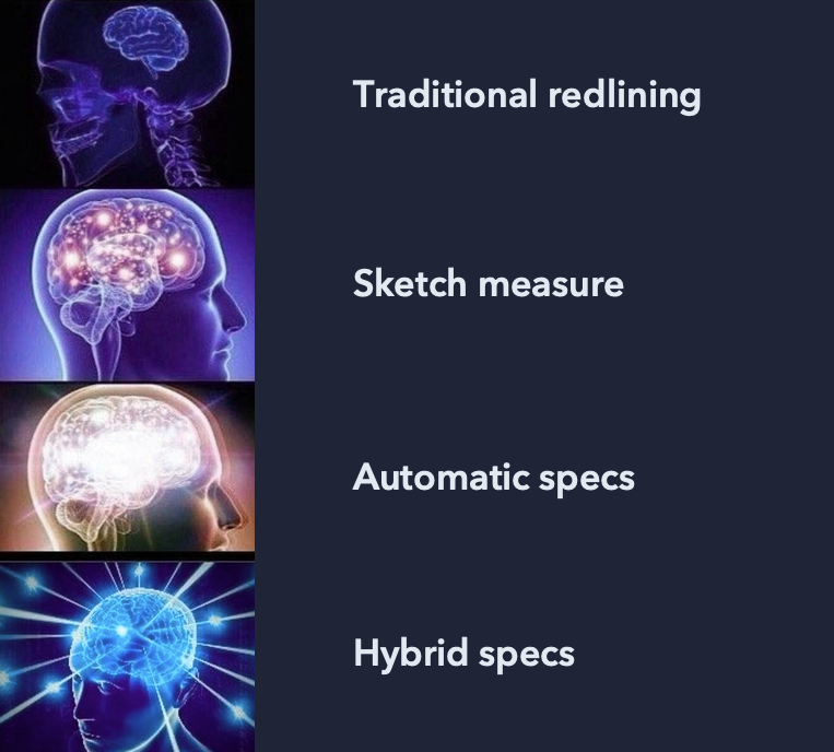
Introducing: Hybrid specs
Neither method is perfect, and it depends entirely on your individual project and workflow. I have found a mixture of manual and automated specs works best, when possible. I call them ‘hybrid specs’.
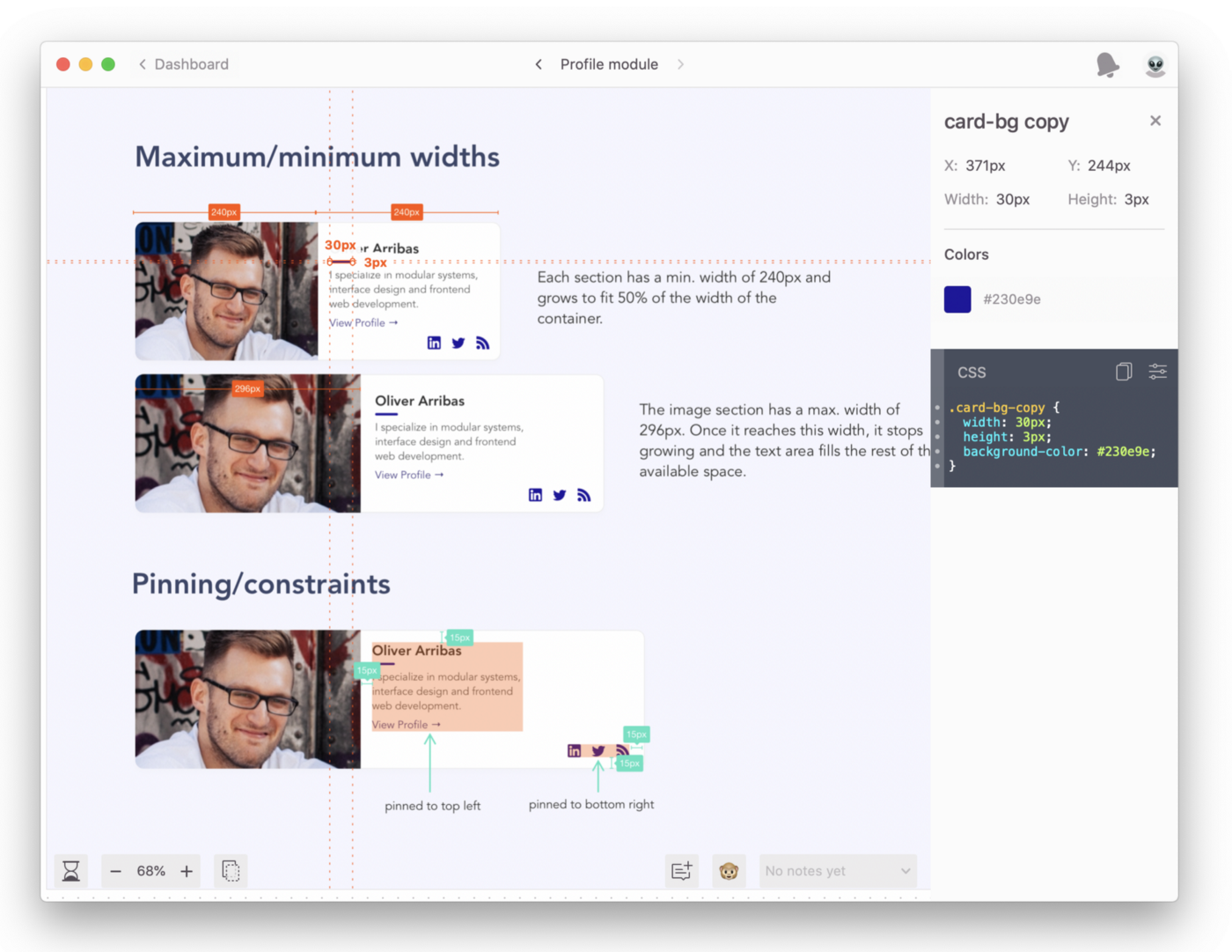
I create my visual and behavioural specs, documenting responsive behaviours and important sizes and spacing. These are then uploaded to an automatic speccing tool so that developers can check text sizes, colours, and any other information that I didn’t specify.
Getting the balance right
Automated handover tools can’t solve all your redlining problems. But they can cut down dramatically on the amount of time it takes to create a visual spec. They can also be a powerful tool for encouraging the adoption of shared styles and reusable components.

However, we should careful not to rely on them too much. The goal of specifications is to specify — we want to avoid leaving things unclear or open to interpretation. We still need to distinguish the important information from the noise and communicate the parts of the design that can’t be conveyed through static images alone.
The best thing about these tools is that they automate the more monotonous tasks, leaving you free to spend more time effectively communicating the more complex parts — instead of spending hours documenting every single text style and colour. 🎉

