“The power of the Web is in its universality. Access by everyone regardless of disability is an essential aspect.”
- Tim Berners-Lee, W3C Director and inventor of the World Wide Web
For the past two years, WebAIM has performed an accessibility evaluation of the home pages of the top 1,000,000 web sites. Their results show that accessibility errors are still incredibly prevalent, even on popular web sites.
- “Across the one million home pages, 60,909,278 distinct accessibility errors were detected — an average of 60.9 errors per page.”
- “Users with disabilities would expect to encounter detectable errors on 1 in every 14 home page elements with which they engage.”
In total, 98.1% of home pages had detectable WCAG 2 failures - an increase from 97.8% the year before.
As part of their analysis, WebAIM shared what the six most common WCAG failures were.
| WCAG Failure Type | % of home pages in Feb 2020 | % of home pages in Feb 2019 |
|---|---|---|
| Low contrast text | 86.3% | 85.3% |
| Missing alternative text for images | 66.0% | 68.0% |
| Empty links | 59.9% | 58.1% |
| Missing form input labels | 53.8% | 52.8% |
| Empty buttons | 28.7% | 25.0% |
| Missing document language | 28.0% | 33.1% |
In this post, I will describe each of these failures, and answer why they are important and how we can fix them. Live demos for each of the failures can be seen with the demo app.
Low Contrast Text
“On average, home pages had 36 distinct instances of low-contrast text.”
Web sites should have a high colour contrast between all text and the background colour behind it. In other words, the brightness of the text shouldn’t be too close to the background brightness.
Low contrast text makes it more difficult for the reader to distinguish the shapes and edges of the characters, reducing reading speed and reading comprehension. This problem is emphasised as the text size decreases, making this issue increasingly important as the number of mobile users continues to grow.
(Try hovering your mouse over the previous paragraph to see for yourself.)
The difficulties with low contrast text are magnified for those who experience low vision. One in twelve people cannot see the full spectrum of colours. Many older people lose contrast sensitivity from ageing. A person with low vision will be unable to read text which is against a background without sufficient contrast.
How to fix it
One of the reasons low contrast text is so common is that it’s so hard to detect. When writing or reviewing some code, you may see the text has a hex value of #f2f2f2, and the background has a value of #808dd1. Is that a sufficient colour contrast? Even checking how it looks on screen, it’s hard to determine whether the contrast is sufficient for those with low vision or on smaller screens.
Fortunately, there are several tools which can measure the colour contrast automatically and highlight any which fail to meet the success criterion.
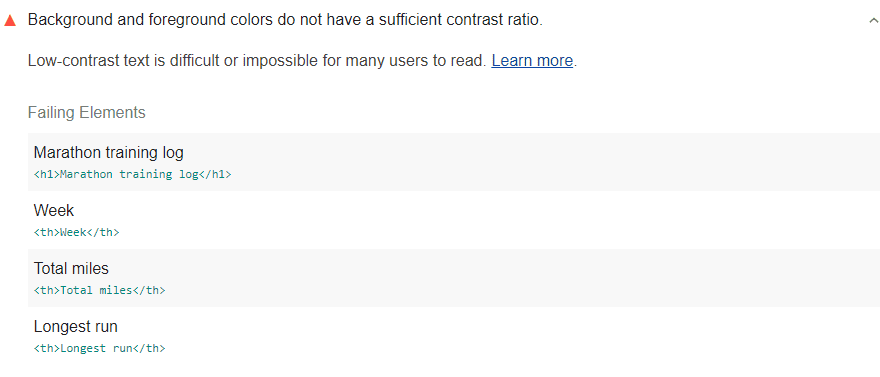
Lighthouse is a tool created by Google and is already built into the browser if you’re using Google Chrome (there are also browser extensions for other browsers). Running an audit will generate a report which will flag the accessibility issues on the web site. It will list any elements it detects whose text background and foreground colours don’t have a sufficiently high contrast ratio.

Once you’re aware of the elements which fail to meet the success criteria, you can adjust the background and foreground colours to increase the contrast.
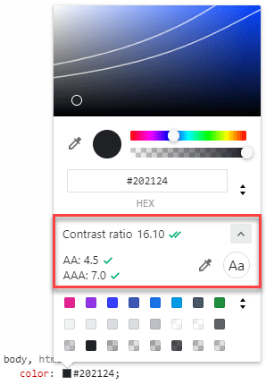
There are multiple colour contrast analysers which can help you find two colours with sufficient contrast. If you are using Google Chrome, you can use the Chrome DevTools’ colour picker, which will display two white lines to show the AA and AAA thresholds.

WCAG defines the success criterion for text contrast as a contrast ratio of 4.5:1. For our Hello World example above, we can see that the colour contrast is only 2.82, which doesn’t reach the threshold. By increasing the contrast, we can improve the readability and accessibility of the element.
Missing Alternative Text for Images
“31.3% of all home page images (12 per page on average) had missing alternative text…
“These data show that one can expect nearly half of the images on the web to have missing, questionable, or repetitive alternative text.”
All images should have alternative text to convey their meaning to screen reader users.
A screen reader is used by those who are blind or visually impaired. It transmits the visual information on the screen in another form, such as by reading the text aloud.
Screen readers have no way of translating an image into words. Therefore, it is necessary to give each image a short, descriptive alternative text which will be used by the screen reader to convey the image’s content and purpose.
How to fix it
Alternative text should be short and descriptive. It should describe the image’s content and purpose while avoiding any irrelevant details which will dilute the useful details.
There are three main ways to add alternative text to an image:
- If the image is shown using an
imgtag, you can use thealtattribute. - If the image is shown with another tag, such as the background image of a
div, you can use thearia-labelattribute. - If the image is described by the content of another element, you can use the
aria-labelledbyattribute.
<!-- ❌ Missing alternative text -->
<img src="cow.jpg" />

<div class="cool-bg-image" />

<div class="another-cool-bg-image" aria-labelledby="non-existent" />

<!-- ✅ With alternative text -->
<img src="cow.jpg" alt="a sad seal" />

<div class="cool-bg-image" aria-label="an angry alligator" />

<div class="another-cool-bg-image" aria-labelledby="my-label" />
<div id="my-label">a happy hyena</div>
If an image is purely decorative, you can give the image an alternative text of "" to indicate to the screen reader that it shouldn’t be read aloud. This stops the screen reader reading out information that isn’t useful.
<img src="decoration.jpg" alt="" />
Empty Links and Empty Buttons
Link and button text should be discernible by a screen reader. This includes alternative text for images when used as links or buttons.
It is common on the web for links and buttons to be shown as symbols or images. This is particularly useful when space is limited, such as on smaller screens and mobile devices. However, screen readers will struggle to translate the purpose of these elements to the user.
For example, we are very used to seeing buttons with a “+” sign to represent adding something to a list, or a logo to represent a link.
<!-- ❌ Missing descriptive labels -->
<button>+</button>
<a href="...">
  <img src="twitter.svg" />
</a>
When read by a screen reader:
- the button will be read as “plus button”.
- the link will be read as either the image file name or the URL of the page being linked to.
These descriptions may be fine when you can see the whole screen and understand the context of the button/link, but a screen reader won’t be able to provide those additional details.
How to fix it
Descriptions can be added to buttons and links by using the aria-label and aria-labelledby attributes. These descriptions will then be read by the screen reader, giving the user a more clear understanding of the purpose of the element.
<!-- ✅ With descriptive labels -->
<button aria-label="Add a playlist">+</button>

<a href="..." aria-label="View our Twitter page">
  <img src="twitter.svg" />
</a>
Missing Form Input Labels
“55% of the 4.2 million form inputs identified were not properly [labelled]”
Each element of a form should have a programmatically associated label element.
Useful form labels are necessary to understand the purpose of each form element. This purpose can often be inferred by sighted users, by using information such as the proximity of the label to the element, or the element’s placeholder. However, a screen reader cannot make these assumptions, so it requires that the label be programmatically associated with the element.
Clicking a programmatically associated label element also activates the control. This benefits users with impaired motor skills, or any user using a small screen, by providing a larger clickable area.
How to fix it
There are three main ways to add a label to a form element:
- Nest the input element within the label element.
- Give the label a
forattribute, which is equal to theidof the input element. - Give the input element an
aria-labelledbyattribute, which is equal to theidof the element acting as a label.
<!-- ❌ Missing input labels -->
<label>Name</label>
<input />

<div>Name</div>
<input />

<!-- ✅ With input labels -->
<label>Name: <input /></label>

<label for="name">Name</label>
<input id="name" />

<div id="name">Name</div>
<input aria-labelledby="name" />
Missing Document Language
The HTML document element should contain a valid lang attribute.
When users configure a screen reader, they select a default language. If the language of a web site is not specified, the screen reader uses the default language set by the user.
If the user speaks multiple languages, they may be visiting a web site written in a language which is different from the default on their screen reader. If the wrong language library is used, the pronunciations of the words will be strange, making the web site impossible to use.
How to fit it
Add a lang attribute to the html element whose value represents the primary language of the web site. Possible values for the attribute can be found in the IANA Language Subtag Registry or by using the Language Subtag Lookup tool.
<!-- ❌ Missing lang attribute -->
<html>
  <!--document head and body-->
</html>

<!-- ✅ With lang attribute -->
<html lang="en">
  <!--document head and body-->
</html>
If the language changes within the web site, you can specify this with another lang attribute. If the language is written right to left, you should also specify that with the dir attribute.
<p>Text in one language <span lang="es">texto en otro idioma</span></p>

<p lang="ar" dir="rtl">النص العربي هنا</p>
Conclusion
“Accessibility is essential for developers and organizations that want to create high-quality websites and web tools, and not exclude people from using their products and services.”
It can be hard to remember to include accessibility in your web site as you’re building it, especially as a person who may not be affected by the failures. Fortunately, tools and resources can help us.
As mentioned above, Lighthouse is an incredible tool for checking the quality of a web site. It can create an audit in several categories, including performance, SEO, and accessibility. They offer browser extensions and, if you’re using Google Chrome, it is already built into the Chrome DevTools.
Deque also offers the Axe browser extension for Chrome and Firefox. Like Lighthouse, this extension will list the accessibility issues for the current page. If you select an issue, you can highlight each of the elements with that issue. It also provides details such as what the issue is, the severity of the issue, and provides a link where you can learn more about it.
By using these tools, we can easily improve the accessibility of our web sites, and help meet the goal of the Web “to work for all people, whatever their hardware, software, language, location, or ability”.


