
All companies want high performance systems. Usually the easiest method to achieve this is simply to buy that performance. Faster and more powerful hardware is becoming increasingly available, but this is especially true in a cloud environment, where you can quickly configure your system to use different hardware. As a result, it is easier than ever to buy that better performance. Of course, this comes at an additional, ongoing cost for our clients. What if we could avoid that extra expense? What if, instead, we fine-tune our existing systems to achieve greater performance? Where do we even start when it comes to diagnosing poor performance, especially in a system with multiple services? This is exactly the situation I found myself in recently during a client engagement.
Starting Point
All of the things I’ll discuss in this blog centre around a software system we developed for a client. For the rest of the post to make sense, I’d like to give a brief overview of how it’s structured.
The system in question is a serverless data pipeline. Some information comes in as part of a message and is processed. We then distribute that message accordingly to various consumers interested in it. This processing takes the form of various “hops” through a range of services in the pipeline. For example, one service collates messages that are about the same topic to produce a complete state. This completed state is then passed to another service which customises the final output according to a range of customer-specific configuration. The final distribution service formats and sends appropriate messages to any connected customers that have “subscribed” to a given topic. These services are deployed on Google Cloud Platform (GCP). Individual parts of the system are deployed as Google Cloud Functions (GCFs), which are serverless functions triggered by some event, or as Kubernetes services through Google Kubernetes Engine (GKE).
The only performance metric we are interested in is the complete end-to-end time for a message, from the moment it arrives to when it is distributed to our consumers.
We already had some concepts in place to help track the journey of a message through the system using structured logging. As part of this defined structure, each log message includes a correlation ID, generated for a given message when it first arrives. All logs related to this message will contain the same correlation ID.
This makes it easy to identify the time it took a specific message to get through the system, but does not offer an easy way to collect data at the scale needed to make informed decisions about performance.
What can GCP do for you?
Log-based metrics
As part of the suite of services GCP offers, you can create log based metrics. This allows you to create graphs and dashboards from values you output in your structured logs. This led to the first restructuring of our logging.
When a message first arrives and receives its correlation ID, we also add a timestamp to the message. When this message gets all the way to the other end of our pipeline and we distribute it to customers, we output another log message to show that we’ve finished processing that message, including the time in milliseconds between that timestamp and the current time. This gives us an end-to-end time.
Metrics explorer
Since this is a structured field guaranteed to be present on every message with the “finished processing” message, we can create a log-based metric using this value. GCP will automatically let you view the results as a graph. These graphs will look something like this:
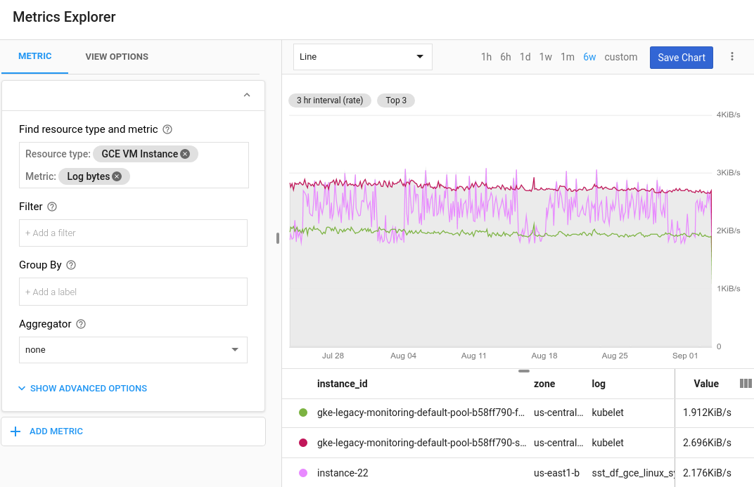 Source - Configure charts and alerts | Cloud Logging | Google Cloud
In our case, we can view this graph as a heatmap, showing how long various messages spent in the system over time, and choose specific percentiles to be shown as lines. This was great for keeping the client up to date on the current performance of the system and required minimal configuration on our part. The metric could initially be created through the GCP User Interface, and later formalised and deployed as part of infrastructure as code, we did this – using Terraform.
It is also worth noting that these log-based metrics can also be used to create alerting policies in GCP. You could for example raise an alert if the system performance was below a certain speed for a given period of time.
Logs explorer
This end-to-end time also allowed us to identify and investigate messages that took a particularly long time. Through querying the GCP logs, we could easily filter on “finished processing” messages with an end-to-end time above a certain value. The GCP Logging Query Language is straightforward to use and pretty powerful, making it easy to find specific logs you’re looking for.
The high end to end time query could be something as simple as this:
jsonPayload.message = “Finished processing”
jsonPayload.e2eTime > 2000
The jsonPayload is our structured log, and we are extracting all “Finished processing” messages that had an end-to-end time of more than two seconds (our e2eTime is in milliseconds) – simple!
Remember, we are also including that correlation ID on our structured log. Once we have the results of our first query, we can query on that specific ID in order to dig through all the logs for that message’s journey, to try and identify what part of the system was taking the time.
jsonPayload.correlationId = "some-guid-correlation-id"
Diving Deeper
With some manual investigation, this gave us some idea of what was causing the biggest slowdowns for some individual messages (99th percentile). But what we really needed was to identify a pattern. We found ourselves needing more granular data, profiling multiple messages to really address the underlying cause(s) of our performance issues.
We need more data!
With this in mind, we just added more timestamps as each message progressed through the system. With the same idea as the original end-to-end measurement, we wanted to capture the performance of individual services. Broadly, this meant adding a timestamp for when a message arrived in each service and another when it left. We could then calculate more “deltas” – both the time taken inside a given service, and the time lost due to data transfer in-between services. This gave us a lot more data, and with it, the problem of how to effectively display it.
GCP can help! (again)
As well as viewing individual metrics as graphs in the metrics explorer, GCP allows you to create monitoring dashboards. These dashboards are made up of multiple widgets, and each widget can be a log-based metric. Similar to the metrics themselves, these dashboards can also be defined and deployed through code! The dashboards can even be represented as JSON objects, to go with your Terraform resource, making them quite simple to create. This was a useful way to monitor performance of individual parts of the system. Once again, we found this very useful for reporting how our investigation was going to the client.
Sadly, this was where the built-in GCP tools reached their limit. We needed one additional level of visualisation to really come up with some ideas to tackle the problem.
GCP can help even more, with some other tools
I want to talk about some scripts we created ourselves outside of GCP. Though easy to set up, the base GCP tools lacked the versatility to display data in all the ways we wanted. The final objective was to display the total end-to-end time for a range of events across a given time period, broken down by delta. Fortunately, using the GCP command line APIs, we can query a large number of logs. We put together a script a little bit like this:
gcloud logging read ' jsonPayload.message="Finished processing" timestamp>="2022-04-08T08:50:00Z" AND timestamp<="2022-04-08T09:10:00Z"' > gkelogs.yaml

cat gkelogs-dev.yaml | yq e '.jsonPayload.e2eDeltas.correlationId = .jsonPayload.correlationId' - | yq e '.jsonPayload.e2eDeltas.ingressTime = .jsonPayload.ingressTime' - | yq e '.jsonPayload.e2eDeltas' -o=j - | mlr --ijson --ocsv cat > gkelogs.csv
This made no sense to me when I first saw it, so to try and break it down – this is just using the GCP log querying language to grab all the “finished processing” messages from a certain time window, with the results saved to a yaml file. From there, we use yq to produce a csv file with all of our deltas alongside the correlation ID and ingress time for a message. From there, we could produce somewhat intimidating Excel graphs like this:
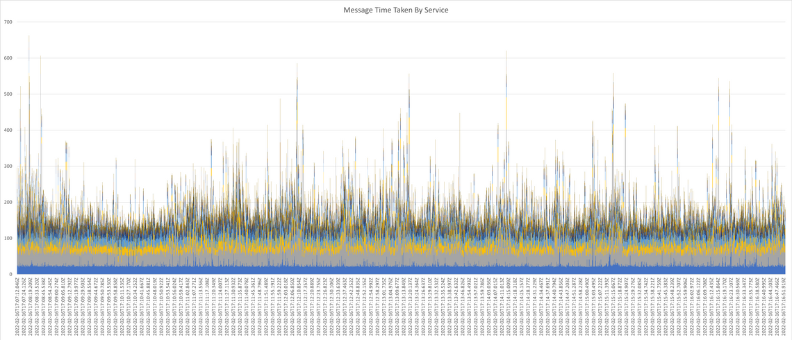
This graph breaks down each individual end-to-end time by service. Each coloured slice is one of the many deltas mentioned above. By the end, these deltas included anything from specific database interactions to particularly complex parts of the business logic that we thought might be cause for slowdown. This allowed us to identify meaningful patterns, and focus our investigation accordingly when it came to performance.
Conclusion
As you can probably tell from the length of this blog, it took us some time to even get to this point. From here, we still had to dig through code and analyse individual messages to form concrete explanations for sometimes very intermittent slow performance. Once we had some theories, the work began to design and implement performance improvements. This performance work was some of the most interesting and varied I have done; it could be the subject of a blog post on its own.
We did manage to make it faster in the end, so I think all of this investigation was worth it and ultimately necessary. The benefits were two-fold. The alternative was to go with our best guess for what might help, but we ultimately wouldn’t have been able to have confidence our changes would make a difference. Additionally, we were able to repeat the same tests again after we’d made a change to (hopefully) show improvement, which again was extremely important to the client.
Although time-consuming in the short term, this investigation stage allowed us to make meaningful changes that improved performance without the additional cost of purchasing more expensive hardware. Furthermore, establishing robust methodology for investigating performance meant it was much easier to diagnose any future performance problems.
Hopefully this blog post has shown that although it can be difficult to narrow down the cause of poor performance in a cloud microservice environment, there are lots of tools available to both aid in that investigation and communicate with clients in a more easily understandable and visual way.