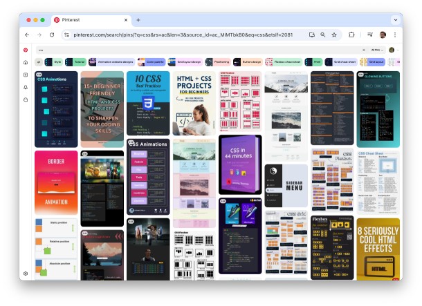
As a web-developer you might have come across the term “Masonry”. If you’re not familiar with it, this article will hopefully shed some light on the topic. The most famous example for masonry layout is pinterest.com. At first glance it looks like simple grid of items but notice that each item is slightly different height whilst they all stack neatly with varying gaps between them.
From a designer’s point of view, my colleague Marcin Palmaka argues that layouts should adhere to certain typography rules. i.e., the weight of the container and columns should derive from your font size, and your gutters should relate to your baseline (font size * line height). For additional information on that aspect, he recommends the book - Grid systems in graphic design - Josef Muller-Brockmann.
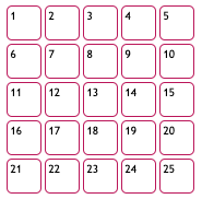
The big challenge in masonry layout is that the items are ordered horizontally while stacked vertically - if there were only 5 items, we would expect them fill a single row (and not be stacked in a single vertical column). There’s no denying that masonry looks good, but do you really need it? If all your items are of the same height, you can use a simple grid without any issue.
If your content is fixed, ie. It’s always the same items; you can use one of the many grid generators. Even if your layout is fixed, for example - the first item is always big, you shouldn’t have any issue.
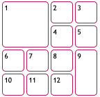
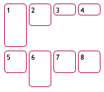
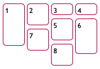
This layout is also called “bento box”, and it was inspired from Microsoft Windows 7 Metro design.

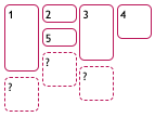
The problem begins when items are load dynamically with different sizes and still needs to be nicely laid out. The common case is like Pinterest: same width, different heights. Let’s say we have this line of items, and we now wonder where the next item should appear.
If you’re not into reinventing the wheel, there are JS-based libraries such as Masonry.js. Alternatively, you can use the new CSS feature grid-template-rows: masonry;. The only problem with it is that it’s only available on Firefox and must be explicitly enabled. The feature has been available in Firefox since 2020 but it’s still not commonly used.
display: grid;

grid-template-columns: repeat(4, 3rem);

grid-template-rows: masonry;
 disabled
 |
 enabled enabled |
Behind the scenes, the masonry.js library adds the next item to the shortest column iteratively. Behind the scenes, masonry js-library can do one of the following - - Change the actual order of HTML elements; - Change the visual layout using CSS transition feature but keep the HTML elements at their original order. When deciding between the two, you should take keyboard-navigation into consideration: When the user hit “next” on the keyboard, where should the focus go?
The next step beyond standard masonry is both widths and heights are different sizes. The algorithm becomes far more complicated - it’s no longer adding an item to the shortest column as the previous libraries did, rather trying to fit each element wherever possible, but of course there’s no need to re-invent the wheel - the problem is called “rectangle-packing” and there are ready made libraries for it such as rectangle-packer.
So, what are the takeaways?
For anything static, avoid overcomplicated code. Use a css-grid generator to set the layout. For dynamic items of various heights (or width, just as long as one of the dimensions is fixed), use the existing library masonry.js. If you’re in a controlled environment where you can ensure everyone is using Firefox you may use the css feature, but avoid it otherwise. For anything more complicated, use the rect-packing algorithm.