This blog post describes the development of a lookless radial gauge control. In this post I will explore the use of an attached view model in order to move view specific properties and logic out of the control code in order to give a truly lookless control.
Today I had to get up far too early in order to catch an early morning flight to Copenhagen with a connection in Amsterdam. What to do for the six hours I would be travelling? Armed with a netbook and Visual Studio 2010 Express I thought it would be fun to have a go at developing a Silverlight gauge control. I know that there are already one or two free ones out there, with a decent looking one available on codeproject, however, it still felt like a good way to pass the time!
In order to make things a little more challenging I wanted to create a control that was truly lookless. So, what do I mean by this? Firstly a gauge control in its simplest sense displays the location of some indicator between a maximum and minimum value. There is nothing inherently circular about a gauge, thermometers are a good example of a linear gauge. So, I don't want any 'circular' logic in the control itself. Secondly, custom controls often have certain expectations about the presence of named elements within their template. By this I mean that the template must contain, for example, a Path element called 'needle' which the control code will manipulate (The gauge published in the codeproject article above requires the presence of four named elements in the template). This forces certain constraints regarding how the control can be templated, this isn't really lookless is it?
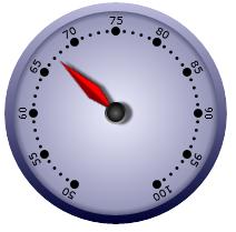
The following example shows the gauge control which I created, and the rest of this post describes the implementation:
<local:GaugeControl Value="65" Width="200" Height="200"
                    Maximum="100" Minimum="50"
                    x:Name="gauge">
  <local:GaugeControl.QualitativeRange>
    <local:QualitativeRanges>
      <local:QualitativeRange Color="Yellow" Maximum="75"/>
      <local:QualitativeRange Color="Orange" Maximum="90"/>
      <local:QualitativeRange Color="Red" Maximum="100"/>
    </local:QualitativeRanges>
  </local:GaugeControl.QualitativeRange>
</local:GaugeControl>
The Starting Point
The first step was to create a Gauge custom control with Value, Maximum and Minimum dependency properties. The only logic defined within the control itself is to set the DataContext of the root visual element to the control instance itself. This is quite a common approach to control design, allowing elements within the template to bind to the control properties:
public override void OnApplyTemplate()
{
  base.OnApplyTemplate();

  Grid root = GetTemplateChild("LayoutRoot") as Grid;
  root.DataContext = this;
}
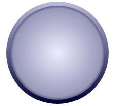
The first thing I added to the control template was the 'face' of the radial gauge. This is simply an Ellipse with a pretty gradient fill and stroke:
<!-- dial background and outer border -->
<Ellipse Stretch="Fill" StrokeThickness="8">
  <Ellipse.Fill>
    <RadialGradientBrush Center="0.5,0.5">
      <GradientStop Color="#EEF"/>
      <GradientStop Color="#99B" Offset="0.9"/>
      <GradientStop Color="#335" Offset="1"/>
    </RadialGradientBrush>
  </Ellipse.Fill>
  <Ellipse.Stroke>
    <LinearGradientBrush StartPoint="0,0" EndPoint="0,1">
      <GradientStop Color="#BBD" Offset="0"/>
      <GradientStop Color="#003" Offset="1"/>
    </LinearGradientBrush>
  </Ellipse.Stroke>
</Ellipse>
Adding the Needle
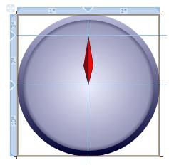
The next thing I added to the control was a needle. This is rendered using a simple Path with a LinearGradient in order to give it some sense of depth. I want the needle to have a length of approximately 70% of the gauge's radius, a simple way to achieve this is to construct it within a Grid that uses 'star' widths / heights to provide a proportional layout and configure the Path to stretch to fill the cell it occupies:
<!-- the needle path -->
<Grid>
  <Grid.RowDefinitions>
    <RowDefinition Height="3*"/>
    <RowDefinition Height="7*"/>
    <RowDefinition Height="10*"/>
  </Grid.RowDefinitions>
  <Grid.ColumnDefinitions>
    <ColumnDefinition/>
    <ColumnDefinition/>
  </Grid.ColumnDefinitions>

  <Path Stretch="Uniform"
      Grid.Row="1" Grid.ColumnSpan="2"
      HorizontalAlignment="Center"
      Stroke="Black" StrokeThickness="0.5"
      Data="M 0,0 l 10,60 l -10, 40 l -10 -40">
    <Path.Fill>
      <LinearGradientBrush StartPoint="0,0" EndPoint="1,0">
        <GradientStop Color="DarkRed" Offset="0"/>
        <GradientStop Color="DarkRed" Offset="0.45"/>
        <GradientStop Color="Red" Offset="0.55"/>
        <GradientStop Color="Red" Offset="1"/>
      </LinearGradientBrush>
    </Path.Fill>
  </Path>
</Grid>
Here you can see how the needle is scaled by its parent Grid:

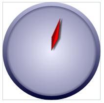
Rotating the needle to reflect the current Gauge Value is achieved quite simply via RotateTransform. However, this needs to be converted into a rotation angle which depends on the Gauge Maximum /Minimum values together with the overall angle of sweep on the gauge. I initially approach this problem by applying bindings via value converters and multibindings, however I found myself repeating the same conversion logic in numerous places within the template in order to render the ticks etc... Ideally the angle of rotation would be something that the template could bind to. The template DataContext is bound to the Gauge control itself, however as stated earlier I do not want 'circular' concepts to leak into the control.
An attached View Model
The solution I came up with for this problem was to create a view model that lives entirely within the control template that acts as an adapter for the Gauge, supplementing its properties with the needed 'circular' concepts. In keeping with my aims I could not instantiate this view model within the Gauge control itself, so instead it is created via an attached behaviour within the control template:
<Style TargetType="local:GaugeControl">
  <Setter Property="FontSize" Value="10"/>
  <Setter Property="Template">
    <Setter.Value>
      <ControlTemplate TargetType="local:GaugeControl">
        <Grid x:Name="LayoutRoot" >
          <Grid>
            <!-- attached the view model -->
            <local:RadialGaugeControlViewModel.Attach>
              <local:RadialGaugeControlViewModel/>
            </local:RadialGaugeControlViewModel.Attach>

            <!-- ... control template goes here ...  -->
          </Grid>
        </Grid>
      </ControlTemplate>
    </Setter.Value>
  </Setter>
</Style>
The view model defines the Attach property and in its change handler performs the logic required to bind to the DatatContext of the parent (which is the Gauge control itself), and set itself as the DataContext of the Grid to which it is being attached. This allows the rest of the template to bind to properties of the RadialGaugeControlViewModel.
public class RadialGaugeControlViewModel : FrameworkElement, INotifyPropertyChanged
{
  #region Attach attached property

  public static readonly DependencyProperty AttachProperty =
      DependencyProperty.RegisterAttached("Attach", typeof(object), typeof(RadialGaugeControlViewModel),
          new PropertyMetadata(null, new PropertyChangedCallback(OnAttachChanged)));

  public static RadialGaugeControlViewModel GetAttach(DependencyObject d)
  {
    return (RadialGaugeControlViewModel)d.GetValue(AttachProperty);
  }

  public static void SetAttach(DependencyObject d, RadialGaugeControlViewModel value)
  {
    d.SetValue(AttachProperty, value);
  }

  /// <summary>
  /// Change handler for the Attach property
  /// </summary>
  private static void OnAttachChanged(DependencyObject d, DependencyPropertyChangedEventArgs e)
  {
    Grid targetElement = d as Grid;
    RadialGaugeControlViewModel viewModel = e.NewValue as RadialGaugeControlViewModel;

    // handle the loaded event
    targetElement.Loaded += new RoutedEventHandler(Grid_Loaded);

  }

  /// <summary>
  /// Handle the Loaded event of the Grid to enable the attached
  /// view model to bind to properties of the Grid Parent element
  /// </summary>
  static void Grid_Loaded(object sender, RoutedEventArgs e)
  {
    FrameworkElement targetElement = sender as FrameworkElement;
    FrameworkElement parent = targetElement.Parent as FrameworkElement;

    // use the attached view model as the DataContext of the element it is attached to
    RadialGaugeControlViewModel attachedModel = GetAttach(targetElement);
    targetElement.DataContext = attachedModel;

    // bind the DataContext of the view model to the DataContext of the parent.
    attachedModel.SetBinding(RadialGaugeControlViewModel.DataContextProperty,
      new Binding("DataContext")
      {
        Source = parent
      });
  }
}
It is now possible to expose a property on the view model which provides the Gauge Value as an angle:
public double ValueAngle
{
  get
  {
    if (Gauge == null)
      return 0.0;

    return ValueToAngle(Gauge.Value);
  }
}

private double ValueToAngle(double value)
{
  double minAngle = -150;
  double maxAngle = 150;
  double angularRange = maxAngle - minAngle;

  return (value - Gauge.Minimum) / (Gauge.Maximum - Gauge.Minimum) *
      angularRange + minAngle;
}
This can then be bound to in the template in order to rotate the needle. For an extra 'flourish' a drop shadow is also added to the needle which binds to this same rotation angle in order to give a subtle '3D' effect:
<Path Stretch="Uniform"
    Grid.Row="1" Grid.ColumnSpan="2"
    HorizontalAlignment="Center"
    Stroke="Black" StrokeThickness="0.5"
    Data="M 0,0 l 10,60 l -10, 40 l -10 -40"
    RenderTransformOrigin="0.5,1">
  <Path.RenderTransform>
    <!-- rotate the needle -->
    <RotateTransform Angle="{Binding Path=ValueAngle}"/>
  </Path.RenderTransform>
  <Path.Fill>
    <LinearGradientBrush StartPoint="0,0" EndPoint="1,0">
      <GradientStop Color="DarkRed" Offset="0"/>
      <GradientStop Color="DarkRed" Offset="0.45"/>
      <GradientStop Color="Red" Offset="0.55"/>
      <GradientStop Color="Red" Offset="1"/>
    </LinearGradientBrush>
  </Path.Fill>
  <Path.Effect>
    <DropShadowEffect Color="Black" Direction="{Binding Path=ValueAngle}"
                      BlurRadius="3"
                      Opacity="0.6"
                      ShadowDepth="5"/>
  </Path.Effect>
</Path>
Adding a Scale
The gauge control needs to have tick marks and labels render around the dial face at regularly spaced intervals between the Maximum and Minimum values. Here the view model comes into its own by providing a list of 'Tick' value objects, each of which provide the view with the required information to render tick marks and their labels:
public IEnumerable<Tick> MajorTicks
{
  get
  {
    if (Gauge == null)
      yield break;

    double tickSpacing = (Gauge.Maximum - Gauge.Minimum) / 10;
    for (double tick = Gauge.Minimum; tick <= Gauge.Maximum; tick += tickSpacing)
    {
      yield return new Tick()
      {
        Angle = ValueToAngle(tick),
        Value = tick.ToString("N0"),
        Parent = this
      };
    }
  }
}

public class Tick
{
  public double Angle { get; set; }
  public string Value { get; set; }
  public RadialGaugeControlViewModel Parent { get; set; }
}
The XAML which renders the major tick marks uses an ItemsControl to create each tick instance:
<!-- major ticks -->
<ItemsControl ItemsSource="{Binding Path=MajorTicks}"
              VerticalAlignment="Center" HorizontalAlignment="Center">
  <ItemsControl.ItemsPanel>
    <ItemsPanelTemplate>
      <Canvas></Canvas>
    </ItemsPanelTemplate>
  </ItemsControl.ItemsPanel>
  <ItemsControl.ItemTemplate>
    <DataTemplate>
      <Ellipse Fill="Black" Width="8" Height="8">
        <Ellipse.RenderTransform>
          <TransformGroup>
            <!-- centre the ellipse -->
            <TranslateTransform X="-4" Y="-4"/>
            <!-- offset to the edge of the gauge -->
            <TranslateTransform X="0"
                Y="{Binding Path=Parent.GridHeight, Converter={StaticResource ScaleFactorConverter},
                                                                 ConverterParameter=-0.37}"/>
            <!-- rotate -->
            <RotateTransform Angle="{Binding Angle}"/>
          </TransformGroup>
        </Ellipse.RenderTransform>
      </Ellipse>
    </DataTemplate>
  </ItemsControl.ItemTemplate>
</ItemsControl>
As you can see each tick is simply an ellipse. The clever part is how each Ellipse is transformed to position it appropriately. It is first centre to make subsequent transforms a little simpler, it is then translated y an offset which moves it to the edge of the gauge face. The offset factor is computed as some fraction of the overall size of the gauge control. In order to achieve this I reluctantly had to angle SizeChanged events on the template Grid in order to expose its ActualHeight / ActualWidth, this is because ElementName binding on these properties appears to be broken.
On attachment the view model handles SizeChanged events as follows:
/// <summary>
/// Handle SizeChanged events from the grid so that we can inform elements
/// of changes in the ActualHeight / ActualWidth
/// </summary>
private void Grid_SizeChanged(object sender, SizeChangedEventArgs e)
{
  OnPropertyChanged("GridHeight");
  OnPropertyChanged("GridWidth");

  Grid.Clip = new EllipseGeometry()
  {
    RadiusX = _grid.ActualWidth / 2,
    RadiusY = _grid.ActualHeight / 2,
    Center = new Point(_grid.ActualWidth / 2, _grid.ActualHeight / 2)
  };
}

public double GridWidth
{
  get { return _grid.ActualWidth; }
}

public double GridHeight
{
  get { return _grid.ActualHeight; }
}
Adding tick labels and minor tick marks both use a simple variation on the above described approach:

I also added a 'qualitative value' range which renders a colour coded band beneath the needle. Again, this uses variations on the same approach, with the view model adapting the properties of the Gauge control and the template binding to these properties, together with the Grid size information in order to provide any required scaling.
The last flourish was to add a 'glass' effect to the Gauge. This was 'borrowed' directly from this fantastic codeproject article on creating 'round glassy buttons'.
The finished Gauge is shown below, where its value is bound to a Slider control:
Conclusions
I am pretty happy with how this Gauge control turned out, visually I think it looks pretty good. I am also happy that I have succeeded in my initial aim of making it completely lookless. The attached view model within the control template is an interesting approach that moves view specific concepts (in this case angular properties) into the view, which is where the belong.
This radial Gauge control could certainly be improved to allow a more flexible scale calculation. Also, the RadialGaugeControlViewModel could also expose some of the view specific properties such as the radial sweep angle (currently hard-coded to 300 degrees) allowing them to be set in the template. For now, I think I will leave this control as it is.
Tomorrow I am on another early flight, this time heading back home. I might take this as an opportunity to provide a view for this control making use of a different attached view model.
You can download the full source for this article: GaugeControl.zip
(Apologies for the lack of project structure, this code was written using VS 2010 Express).
Regards, Colin E.
