This blog post looks at the new concept of 'transitions' that WinRT, within Windows 8, introduces. This concept makes it very easy for you to create a fluid and interactive UI without going anywhere near storyboards!
I have to admit it, I am a big fan of the Metro Design Language; the clean chrome-free graphics, combined with typography inspired by signage and designed for maximum legibility, has given Windows Phone 7 an instantly recognisable style. However, whilst Silvelight applications developed for Windows Phone 7 look like the native metro phone apps, they do not move like them. Motion is an important part of metro, with one of the tenants being that it is "Alive In Motion". This lead me to publish a multi-part blog series, called Metro In Motion, which provided implementations of the various native animations and transitions (1, 2, 3, 4, 5, 6 & 7).
Windows 8 again is built using the Metro Design Language, and again the tools make it easy for you to create an application which has the Metro look. However, where Windows 8 differs from Windows Phone 7 is that developer APIs make it very easy for you to create applications that move like a Metro application. WinRT introduces a new XAML concept, transitions, which is the focus of this blog post.
I was inspired to explore transitions after watching John Papa's excellent //build/ session "Stand out with styling and animation in your XAML app", I would thoroughly encourage you to watch it!
I have a (very shaky) video of the demo code included with this blog post below:
With WinRT UIElement, the base class for any element that is added to the visual tree (UI), has a Transitions property. You can use this to specify a collection of transitions for an individual element:
<Rectangle>
    <Rectangle.Transitions>
        <TransitionCollection>
            <RepositionThemeTransition/>
            <EntranceThemeTransition/>
        </TransitionCollection>
    </Rectangle.Transitions>
</Rectangle>
Each transitions is an animation that the WinRT framework plays in response to certain 'events'. We'll take a look at the various transitions in turn...
EntranceThemeTransition
When elements are added to the UI they appear instantly (as you might expect), however, with the EntranceThemeTransition elements gracefully fade and slide into location.  This animation will fire whenever your element is added to the UI, this could be as a result of:
- The application first loading, any element with this transitions specified will animate when the application starts.
- The element being added programatically or as a result of binding (e.g. within a bound list)
- The element being added as a child of another element
Basically, you can rely on this animation being fired whene your element is first visible to the user.
ChildrenTransitions
If you add multiple elements to the UI at the same time, or a UserControl is loaded that contains a number of animated elements, their EntranceThemeTransition animations will fire at the same time. However, if you have a panel that contains a number of elements, you can make them appear in sequence by adding the EntranceThemeTransition to the ChildrenTransitions property of the panel. For example, any element added to the WrapGrid defined below, will animate as it appears:
<WrapGrid>
    <WrapGrid.ChildrenTransitions>
        <TransitionCollection>
            <EntranceThemeTransition/>
        </TransitionCollection>
    </WrapGrid.ChildrenTransitions>
</WrapGrid>
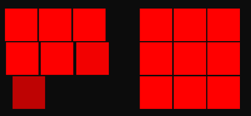
Here we can see nine rectangles being animated as they slide into location:

The animations are fired in sequence, no matter how the elements are added to the panel. For example, if you add a couple of elements in code-behind, they will appear in sequence.
(As an aside, this is really quite cool, I can imagine how I might implement the animations on individual elements in WPF / Silverlight, however, the child-transitions concept would be vary hard to implement!)
One thing to note is that the framework fires the animations in the order that elements appear in the Panel.Children collection, this is not necissarily the order they appear in the UI. For example, the following example shows elements added in a Grid, where the elements are defined in a random order within XAML:

This doesn't look quite so good!
RepositionThemeTransition
When you change the positions of an element, either directly or as a result of its parent layout changing, it will move into its new location instantly. By adding a RepositionsThemeTransition, the WinRT framework will animate the element as its moves location.
A few things I have observed:
- The
RepositionThemeTransitionis not fired when you apply a RenderTransform to an element, possibly because transitions are applied via render transforms - The
RepositionThemeTransitionis not fired when an elements position within a Canvas changes. This is probably because Canvas.Left and Canvas.Top do not have any impact on layout. - This transition, and none of the others discussed in this blog post, work when the elements are hosted within a
FlipView(not sure why, this feels like a bug)
Again, if you add a RepositionThemeTransition to the children of a panel via ChildrenTransitions, the animations are fired in sequence. In the below image an element has been removed from the top of a WrapGrid:

(Trust me - this looks much better in action! try running the sample code with this blog-post)
One point of interest, you can simplify the XAML for adding ChildrenTransitions when using an ItemsControl (Or ListBox, GridView or other subclasses) from the following:
<ItemsControl Grid.Row="1"
                x:Name="itemsTwo">
    <ItemsControl.ItemsPanel>
        <ItemsPanelTemplate>
            <WrapGrid>
                <WrapGrid.ChildrenTransitions>
                    <TransitionCollection>
                        <RepositionThemeTransition/>
                    </TransitionCollection>
                </WrapGrid.ChildrenTransitions>
            </WrapGrid>
        </ItemsPanelTemplate>
    </ItemsControl.ItemsPanel>
</ItemsControl>
By using the ItemContainerTransitions property as follows:
<ItemsControl Grid.Row="1"
                x:Name="itemsTwo">
    <ItemsControl.ItemContainerTransitions>
        <TransitionCollection>
            <RepositionThemeTransition/>
        </TransitionCollection>
    </ItemsControl.ItemContainerTransitions>
    <ItemsControl.ItemsPanel>
        <ItemsPanelTemplate>
            <WrapGrid/>
        </ItemsPanelTemplate>
    </ItemsControl.ItemsPanel>
</ItemsControl>
This property specifies a collection of transitions that will be set on the item-container.
AddDeleteThemeTransition
This transitions is intended for use with panels, it animates the process of adding / removing elements. This transitions is added to the ChildrenTransitions (or ItemContainerTransitions) just like the others. As items are added, they fade into place, and as they are removed they slide out and the other elements reposition themselves. One thing that is really cool about this transitions is that it 'understand' the layout of the panel.
Here you can see elements being repositioned within a WrapGrid when the first element is being removed. You can see that the elements are moved in batches based on their row / column:

Very cool!
ContentThemeTransition
The final transition I want to look at is the ContentThemeTransition. For those of you who have worked with Silverlight or WP7, this provides the same functionality as the popular TransitioningContentControl from the Slverlight toolkit - now this feature is delivered by the framework itself (at last!)
To enable this, add a ContentThemeTransition to the ContentTransitions property (note, not, the Transitions property!).
<ContentControl x:Name="contentCtrl>
    <ContentControl.ContentTransitions>
        <TransitionCollection>
            <ContentThemeTransition HorizontalOffset="200"/>
        </TransitionCollection>
    </ContentControl.ContentTransitions>
</ContentControl>
Whenever the content of this control is changed, either by setting the Content property directly, or as a result on the databound content changing, the new content gracefully slides into place.
Conclusions
Whilst WinRT borrows much from Silverlight and WPF, it brings some great new controls and features and transitions are probably one of my favourite new features. They really help you create fluid applications with minimum effort.
I have covered all the theme-transitions except one, ReorderThemeTransition, I have not yet found out how to use this transition, I think this might be because of a lack of sorting / filtering of collections in WinRT. This is probably functionality that will be added at a later date.
You can download the full sourcecode for this blog post: WinRTTransitions.zip
Regards, Colin E
