This article looks at a recent change to the BBC Weather website as an example of how over-use of information visualisation techniques and inconsistent design decisions can undermine what is otherwise an excellent content-first experience.
I have watched with fascination over the last year as the BBC have undergone an extensive redesign of their entire online offering. They have clearly adopted a more user-focused approach than in previous revamps, and their openness about the process has been very refreshing. In my opinion, there have been many positive changes, but some aspects have also changed for the worse*. However, there was one area of the site where the changes really caught my eye: the weather forecasts.
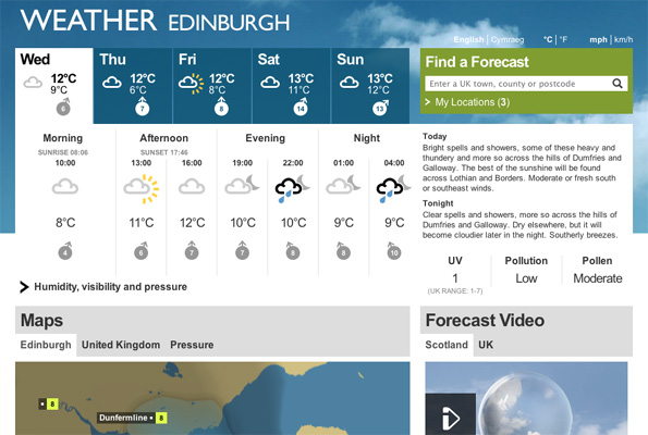 The redesigned BBC Weather site
The old site was rather dense, and it often felt like you had to wade through an awful lot of extraneous bumf just to get to the main content: the forecast. Furthermore, the days in the forecast run top to bottom rather than adhering to our more intuitive view of time running left to right. The redesigned BBC Weather site addressed these issues and others, creating a much better overall experience of the tool, even if it did still have some issues. The designers involved even published a lovely article detailing the project's design process.
The redesigned site is also an excellent advert for the bold, content-first, Swiss-style (and dare I say it, Metro-ish) design style I like so much.
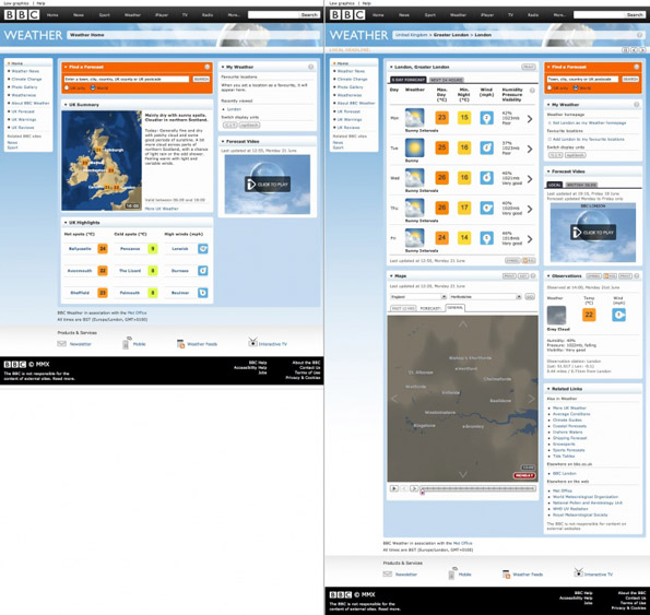 The old BBC Weather site
The redesigned BBC Weather site has recently been tweaked. At first glance the changes seem reasonably minimal and those who are aware of my love of whitespace might even naively suggest to me that it is an obvious improvement. Unfortunately, closer examination highlight various issues that, in my opinion, have resulted in the site taking a step backwards.
An additional, somewhat ill-conceived, infographical element has been added into the design of the forecasts, the single most important part of the site. The weather symbols and temperatures are now presented as if they are on a time vs temperature graph. You might think "cool, now I can quickly see what times of the day are hottest or coldest" (is this ever likely to deviate much from "colder at night than during the day"?), but it actually has a misleading side-effect. The y scale of the graph varies for each day, as its range is always the minimum temperature to the maximum temperature for that day. So although two forecasts on different days might be in the same vertical position, this does not mean they have the same temperature at all. The result is that doing any kind of comparison between days using the graph without actually reading the values is only going to mislead, and if we have to read the values then the abstraction a graph is meant to introduce is broken.
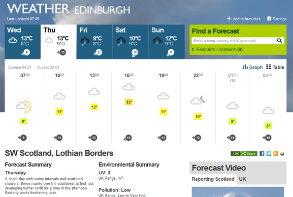 The tweaked BBC Weather site
One other change that might be argued helps mitigate the issue is the additional of the coloured backgrounds to the temperatures (although I would question whether this was intentional!). This potentially makes it easier to recognise differences in values on the graph by the colours, but given that it is very difficult to consciously see the colour without reading the value this would be a pretty weak design. And you do have to consciously see the colours because, depending on your monitor settings, the differences are very subtle. The choice of a stepped colour scale rather than continuous scale solves the colour differentiation problem a continuous scale would introduce, but, unfortunately, also makes you question why the degree difference between 9° and 10° is significant when that between 8° and 9° is not (ok, maybe I'm being a tad facetious here). My guess would be that the real motivation behind this background colour is to match up to the design used on the interactive maps (but then the maps don't have the ° symbol after the number, so maybe I'm wrong...). However, I would argue that the static forecast and interactive map contexts are very different and that a big number without the relatively meaningless distraction of a coloured background, as in the original redesign, is much more immediate.
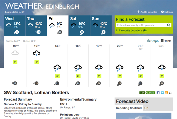 The tweaked BBC Weather site (again)
The real problem the graph concept introduces is that it makes scanning across the weather for the day awkward because of the varying vertical position. It results in making intra-day comprehension and comparison more time-consuming than it need be. Even the designers appear to have acknowledged this issue, since they provide a mechanism to switch between Graph and Table modes. Pleasingly, as the name suggests, the Table mode organises the information into a more easily readable, tabular layout. Somewhat bizarrely the Table mode also results in more information being displayed than is available in the Graph mode. Such inconsistency is very frustrating to a user, since it may force the user to flick between modes just to get to the information they desire. Unfortunately, the Table mode also introduces labels for the rows of data. Where as in Graph mode it was sensibly recognised that users would know that a weather pictogram represents the weather conditions, a value with a ° symbol is a temperature and a directional arrow with a number represents wind speed and direction, in Table mode we are explicitly told this is the case. The designers should have decided that in this particular case either the context is sufficient for users to easily deduce what a value represents, or the context is not sufficient (hint: it is!).
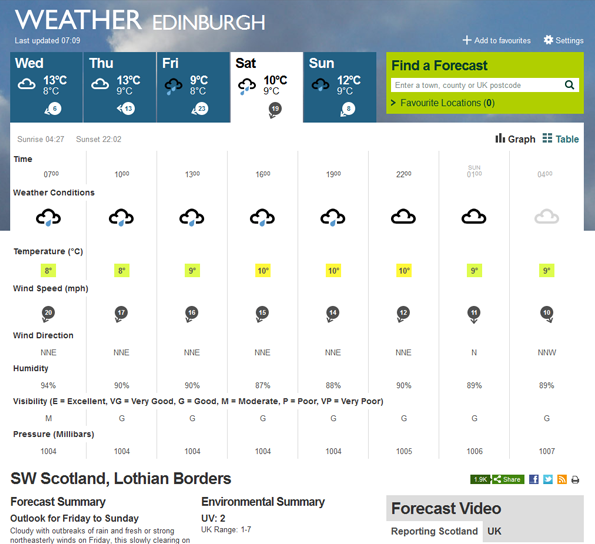 The tweaked BBC Weather site in Table mode
The designers have also changed their minds on the "do we need to label this or not?" question elsewhere, sometimes for the better, sometimes for the worse. In the original redesign it was felt necessary to inform users that 7am and 10am are the morning, 1pm and 4pm are the afternoon, and so on. Fortunately in the recent update they have recognised that these labels are superfluous and only distract from the genuine content by adding to the density of information on the page. In contrast, the tweaked design has introduced huge, overbearing labels for the "Forecast Summary" and "Environment Summary" where previously they were deemed unnecessary. I would argue that these labels add no meaning and, if anything, only distract from the actual content. Their prominence results in the user only reading the label when scanning over the page, rather than briefly scanning the textual content as they would in the previous version to quickly understand what is being presented.
Hopefully the designers and developers involved with the BBC Weather site will pick up on these issues and address them, or, even better, have extensive user testing results that contradict my observations. Either way, I believe this serves as an interesting case study to highlight the kinds of gadfly-ish questions that should always be asked when designing or re-designing anything.
* Horizontal scrolling is suitably intuitive on mobile devices, but isn't a great option for the desktop factor these days (see exhibit A: the mouse scroll wheel). And who thought "headlines" makes sense as a title for a section with the smallest size of text on the screen, squished in amongst loads of eye-catching glossy photos?!
