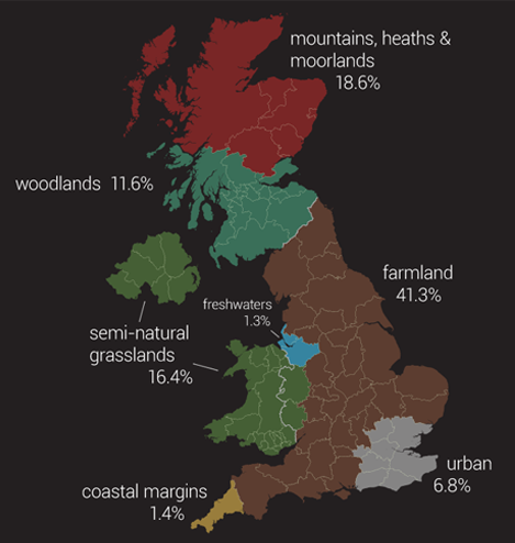
I published a graphic last week that tried to put habitat figures from the UK National Ecosystem Assessment into some kind of understandable context. It has got a fair bit of attention since then, largely because Mark Easton kindly tweeted about it, resulting in the BBC website linking to it in various high-profile places. As may be evident from my blog, I like to critically appraise visualisations, so it would be hypocritical not to openly do the same for my own creation.

By representing the total habitat areas on a commonly recognised geographic map the graphic immediately provides a rough, but more comprehensible, context for the figures. However, the graphic doesn't effectively support any real analysis beyond this. The complexity of shapes on geographic maps means that attempts to compare areas is cumbersome and error-prone, meaning that we actually just read and compare the percentage figures labels rather than the areas themselves. Even then, the arbitrary, scattered layout of the labels make it cumbersome to scan across them and difficult to get an overall collective view of the numbers.
One way I think the visualisation would have been improved is if the map regions were given more explicit context to better communicate the total area of each habitat. This could be achieved by showing the county borders around which the regions were designed, as below. As a result it is easier to recognise that, for example, the 6.8% urban area of the country is roughly equivalent to an area covering Greater London, Surrey, Kent, West Sussex, East Sussex, Essex and Hertfordshire.

What also becomes clearer when the county borders are shown is that in designing the graphic I chose to sacrifice accuracy in favour of clearer stories. For example, the coastal margins habitat is represented as the same area as Cornwall. However, the actual area for coastal margins given in the report is 336,000ha where as Wikipedia (and Google Maps) give the area of Cornwall as 354,900ha. This is a not insignificant discrepancy, but given that the values in the report are rounded estimates and derivations, I believe the explanation that coastal margins in the UK roughly equate to the area of Cornwall is far more meaningful to most people than 336,000ha.
Note that where county sizes could not be roughly match to habitat areas I opted to use smaller administrative regions. Where even that didn't suffice, as is the case in Scotland and North Ireland maps, completely artificial, straight-line borders were created as appropriate.
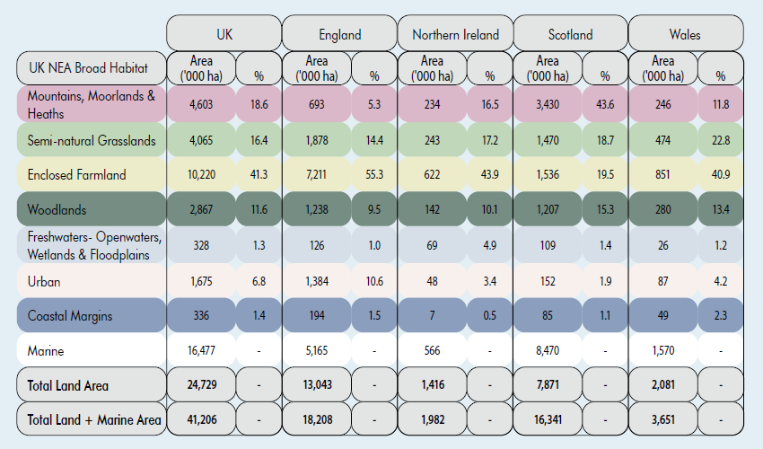
Ultimately, if accuracy and any more detailed analysis is desired, I believe a simple table is the best way to present the information in this case. The original report does a half-decent job of this:

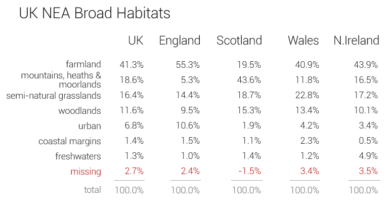
However, after taking a closer look at the data presented in the report's table something doesn't seem entirely right. As I've highlighted in the table below, the figures don't appear to add up. The report indicates the values were derived and estimated from a couple of different sources, so one can only assume these anomalies result from whatever method was used. The way the data is presented in the table, with totals and percentages, immediately suggests to the reader that this is part-to-whole information, and few people would actually do the arithmetic to spot that this isn't quite the case. However, the tabular representation of the data does make it much easier to potentially spot this issue than my map graphic because it inherently encourages and supports scanning across multiple values with minimal effort.

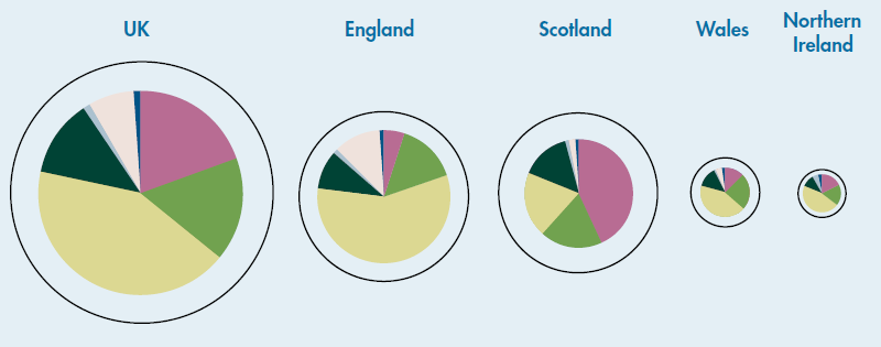
To make matters worse, the report goes on to further mislead about the data (probably unintentionally!) by complementing the data table with everyone's favourite graphic for presenting part-to-whole data: pie charts. Ignoring that pie charts are a somewhat flawed visualisation (see Stephen Few's Save the Pies for Dessert paper for an explanation), their design is such that the complete circle represents the whole, i.e. the total or 100%, and the slices represent the parts. However, as highlighted above, the individual broad habitat values do not add up to the total, so either the total represented by the pie charts do not represent the totals in the data table they are linked to or the segments are not accurate reflections of the habitat proportions.

Apologies for the slight side-track, but I think it is worth highlighting issues like the pie charts above to remind everyone that visualisations should always be viewed with some skepticism because it is very easy to put all sorts of misinformation in them, whether intentionally or unintentionally.
So do I think my visualisation is any good? Well, yes and no. It does a reasonable job of specifically addressing the question it was originally intended to answer — what does "6.8% of the UK's land area is now classified as urban" actually mean in real terms? — in an attractive way, but does little to support any other meaningful analysis, to the point that some data quirks are almost completely hidden.
