Don Norman, of MIT and the University of Pennsylvania is something of an interaction design and user experience figurehead. In his seminal book, The Design of Everyday Things, Norman (henceforth affectionately referred to as ‘The Don’) defines and describes one of the most fundamental concepts in interaction design: affordance.
Affordances provide strong clues to the operations of things. Plates are for pushing. Knobs are for turning. Slots are for inserting things into. Balls are for throwing or bouncing. Don Norman, taken from Design of Everyday Things
As seemingly intuitive as the concept of affordance may be, rarely do we stop and consciously deconstruct the intuitive - it is for that reason that something manages to truly be ‘intuitive’. Intuition, by definition, implies understanding without conscious reasoning. The Don intentionally uses the word ‘clues’ when defining affordance.
Clues are implicit. They do not insist; they afford. They are subconsciously derived from their context.
Studying the often used metaphor of ‘doors’ in relation to affordance and, more largely, interaction design, helps us understand the concept a little better.

Ideally, we’re more concerned about getting from point A to point B rather than how to use the door
It’s reasonably abnormal to consider a door, or any ubiquitous interface for that matter, separate from its function. Interfaces (doors included) facilitate our actions and objectives. When we interact with almost any interface, we’re concerned with what we’re getting out of that interaction and why we’re doing it, not necessarily how it’s actually being done. When we interact with a door, we’re moving from point A to point B, or we’re preventing people from point A from entering point B, etcetera, etcetera. When executing any of those objectives, we subconsciously scan for bits of information to show us how to achieve our goals.

No affordance, no idea
A door is, at its most basic, solid material, fixing mechanisms (hinges), and operational mechanisms (knobs, handles, plates). If we start with the material alone, we aren’t offered any clues as to how to use the door.
Does it open inwards? Is it sliding? Are we to wait for someone on the other side to open it? Is it a magic door?
Without any affordance presented to us, the door as an interface and its resulting interactions are frustrating, ultimately making the design fail.
Let’s try adding some affordance.

Hinges offer certain contextual clues as to how a door works
Et voilà: hinges. These hinges instantly change the understanding of this door and its behaviour. Through subconscious and real-life understanding of how material behaves when it is fixed to other material, we are afforded the knowledge that should we wish to open this door, we’d find more luck with the side that’s not fixed.
Even though we’re offered much more in the way of clues as to how to use the door with hinges (as contrasted with the plain sheet of material) we still don’t necessarily know how to open it. The clues may be a bit too subtle yet.
So how about a slightly better form of affordance?

A push plate shows us how to use a door without explicitly saying a single thing
The push plate - a highly effective form of affordance. It’s palm sized. It affords no ambiguity; you cannot grasp it nor can you turn it - you can only push it. It’s a different colour and material; those contrasts stand out to us. Its presence alone tells us to be interested in that side of the door, implying the other side of the door to be fixed. Using a push plate in this instance offers so much information about the door and how to use it without explicitly saying a single thing.
All from a rectangle on another rectangle.
So how about a-less-than-ideal way to do it?
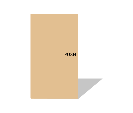
Explicit instructions force conscious thought
Explicit instructions. Not in the rude four letter word sense of explicit, but in the sense of conscious-thought-required explicit. When we see letters arranged in order, such as the example of ‘PUSH’ above, we cannot help but scan our brains to see if they represent a word. As soon as we understand them as a word, we cannot ignore its semantic meaning, and then apply its meaning to its context.
So what happens when there’s little-to-no affordance?
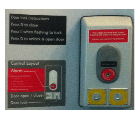
One of many examples of train toilet doors…missing affordance; but hey - at least there’s diagrams and instructions…
A train toilet door. Many of us will have seen something like this and with it will have found mixed success.
There are words that we commonly associate with doors present (open, close, lock), but removed from any forms of affordance we associate with doors (and, for that matter, any kind of affordance at all). Instead of visually distinct opening and locking mechanisms, we’re presented with step-by-step instructions, a diagram replicating the interface, and several ominous warning messages.

A traditional, more easily understood example of a door opening/closing mechanism in conjunction with a distinct locking interface
Compare the demands made of us by the train toilet door with those of a more conventional paradigm. While there are hundreds of thousands of permutations of door handles and lock combinations, the above affords two very different interactions thanks to the distinct designs of the handle and lock.
Our original objective of securing controlled privacy (our reason for closing and locking a toilet door in the first place) has become convoluted, difficult, and in some instances, unintelligible. There are no real contextual clues at work here - only explicit, heavy-handed, and frankly confusing instructions.
A lack of affordance and the resulting breakdown of the effectiveness of an interface has a profound effect on a user experience.
The definition and components of a user experience can change depending on who you’re talking to or what you’re reading, but it always represents a sum greater than that of its parts. Much like a door, the components of a user experience separated from themselves don’t mean a whole lot to an end user. But, when they’re carefully and logically put together, they become a functional, positive experience - something impossible on their own.
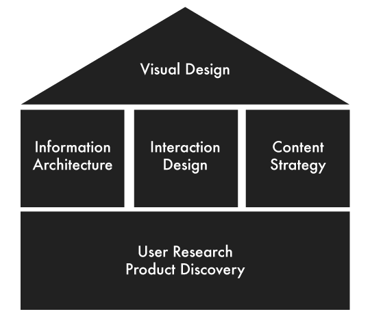
Scott Logic’s UX Practice often uses this diagram to illustrate the various components of UX and what we consider pivotal
Conversely, if there’s a breakdown in that assimilation and any one component fails its brethren, the experience crumbles.
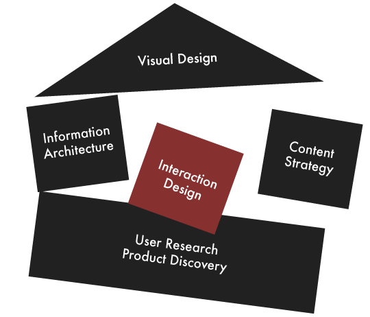
A weak or failing aspect of user experience can lead to the entire experience falling apart
As alluded to, the concept of affordance does not begin and end with doors, nor do they begin and end in the tangible world. Affordance is just as important in the digital realm.
For example, take this excerpt from an article by Rachel Andrew from A List Apart.

The blue text inherently stands out to us
Because our seeing similarly coloured elements as being part of a group (see the Gestalt Principles, for more, the Head of UX Practice at Scott Logic Graham Odds’ presentation on data visualisation), we see the blue text ‘Cascading To Do List’ as inherently different from the surrounding text. This difference draws our attention, signifying that there may be something functionally different about it. If we move our cursor over this blue text, we trigger more actions:

Underlining the text creates extra emphasis, and further evidence that there is a level of interactivity associated with this text vs. the rest of the text

The cursor changing from an arrow to a pointer shows a change in function, and one that we subconsciously look for when clicking on links
Our cursor changes from a regular arrow to a pointer-finger; simultaneously, an underline appears under the blue text. These extra clues reinforce an understanding of what this blue text means. The blue text initially drew us in. The subsequent actions and reactions convinced us that there was some form of interactivity to this text. Indeed, actually clicking on the text provides the anticipated result: linking to another page. All of these forms of affordance work together to tell us that there’s something worth investigating about this underlined text, and, more realistically, that this text represents a hyperlink without explicitly stating: “this is a link - click on it”.
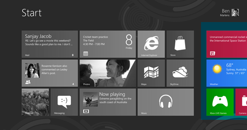
Windows 8 is flawed in many ways, but in this instance their use of implicitly truncated tiles is an effective form of affordance - particularly in mobile technologies where screen space is limited
Leveraging our understanding of how real material/’content’ would appear if it was leaving our field of view/sight, these tiles continue off the viewport, hinting that there is more content to be had in that direction. There are no explicit cues at work here; nothing is explicitly stating “Scroll to the right to discover more content”. The tiles and their nested content being clipped by the edge of the viewport subconsciously imply this.
Unlike the train toilet door, but like the push plate, these forms of digital interfaces afford; they do not insist. Breakdowns in interaction design often begin with a poor use of affordance. Forcing users to stop and consider how to achieve their task takes them away from their reasons for performing their task to begin with. Strong interaction design is born from a strong use of affordance. Affording users to subconsciously understand how while focusing on the more important what and why leads towards a positive experience.

