
Homies. Rags to riches. Samples. Disses. User centred design.
The link between hip hop and UX design doesn’t come up often, but it should. Critics of hip hop often suggest its wordsmiths are misogynistic, vapid, and violent.
They’re wrong. Hidden in hip hop artists’ rhymes are the sentiments of studied UX designers.
Here’s five things hip hop artists tell us about UX Design:
#1
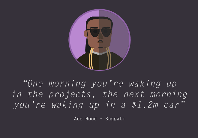
Translation: Starting with low-fidelity designs leads to high quality products.
Mr. Hood insinuates that his life began in the projects. And by ‘projects’ he means that he prefers to begin designing with pen and paper - the rough, unrefined stage of design. Much like the projects, low-fidelity design sees many hustlers (ideas) discarded into obscurity. Only the finest hustlers (ideas) making it out of the hazardous concrete (paper) jungle. This, Mr. Hood argues, is essential to his design process. It allows him to cycle through iterations until he finds one suitable to make the move out of the projects. And into Photoshop, or a similar high fidelity tool.
Using the metaphor of waking up in an automobile of immense monetary value, Mr. Hood illustrates the calibre designers can aspire to by following his process. Because he spent time ideating and iterating in the projects, he was able to swiftly identify the most valuable ideas and wake up in a new Bugatti.
#2
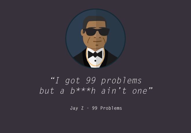
Translation: Don’t design for the problems you don’t need to. Focus on the problems you do have.
Throughout ‘99 Problems’, Jay Z speaks to feature creep and coherence in design - an issue that every designer struggles with at some point in their career. Indeed, designing for everything and everyone is designing for nothing and no-one.
Jay reminds his fellow designers that we must remove extraneous issues during all of our design iterations. From ideation through higher fidelity prototyping, a targeted level of coherence is essential. To achieve this, we must be aware of the problems we don’t have to solve. Knowing this whilst designing affords us greater focus on the problems we do have to solve. Hova knows that a b***h isn’t one of his problems; he can focus on designing the other 99.
#3
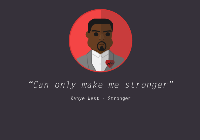
Translation: Utilising and repurposing established paradigms expedites and strengthen your design process.
Philosopher and all-around humble human being Kanye West has a penchant for a conceptual approach to the arts (and life itself). A sentiment he lives by comes from one Pablo Picasso.
Good artists copy; great artists steal. Pablo Picasso
Yeezy brings Picasso’s point to life by sampling Daft Punk’s ‘Harder Better Faster Stronger’. In doing so, Mr. West is able to create a fruitful canvas for further work/interpretation with minimal effort.
Yeezus’ implicitly shows that taking the work of others and building upon it is a superb way to springboard ideas into success. A designer’s work does not and should not live in silos, Mr. West asserts. To make our designs stronger, we should be building upon ideas and lexicons established by our peers. We can utilise and build on their strong points, creating a familiar yet enhanced terrain for our users. As a result, we make our design process and designs better, faster, and stronger.
#4
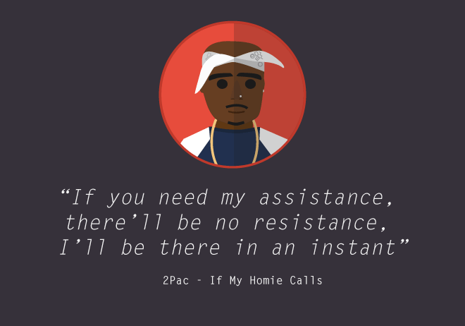
Translation: A healthy and open critiquing process is essential for great design teams.
Entrenched in many wars of lyrical attrition, Mr. Shakur understood the power and art of the critique. He did this to better the quality of both his, and his cohorts’ craft. He understood this so well that he frequently participated in many critiques of his contemporaries - notably with The Notorious B.I.G..
To an untrained ear, Mr. Shakur’s critiques could be misinterpreted as emotive and inciting violence. The trained ear, however, can understand that 2Pac was merely exercising a metaphor about collaborative design.
He insinuates that as designers, we must be there for our homies. And when our homies are there for us, we must make sure they’re met with no resistance, conflict, or ego. We cannot afford to be precious about our designs; we should be keen for constant improvement. We must be receptive to different, often contrasting viewpoints. Mr. Shakur lived and died for any collaborative-critique driven approach to team-based UX design.
#5
Translation: While business input is important, user feedback is paramount. User adoption of a design is pivotal to its long-term success and must inform business decisions.
In ‘Hood Gone Love It’, Jay Rock confronts an awkward dynamic UX designers often face. Steering groups and business-level stakeholders have strong opinions in the design direction of a project. The problem is that such opinions are often polarised and disconnected from what the hood (their users base) desires.
Mr. Rock passionately reminds us that we must guide those running the project with feedback from the hood itself. Through any number of hood research techniques, we can prove to these business personnel that what really matters is how the hood feels. If the hood is going to like it, then so should they. It is, after all, a project for the hood.
Bonus!
#6
Translation: Affordances allow users the ability to focus on what they’re trying to achieve, as opposed to how they’re going to achieve it.
Main Source’s ‘Looking at the Front Door’ is a homage to the notion of affordance.
Throughout the song, the rapster trio weave a story of an individual keen on exiting his current premises. Instead of writing ‘keep looking’ at the front door, thinkin’ how to operate it’, they speak to his intention and ultimate goal: evacuating.
The last thing he wants is a complicated interface and convoluted interaction design. The door he’s looking at affords him the ability to focus on his task, and not how he achieves it.
In closing:
Whenever next you listen to a hip hop track and hear something that on the surface level seems controversial, stop and remember: the lyricist is almost certainly a frustrated UX designer. When he says “**** the ****** with ******* and *****, you ******”, he’s more than likely teaching you an important lesson about UX design.
Word up.
Simon ‘2 Sharpiez’ Duncan


