
This blog post shares the results of my analysis of 250,000 screenshots from the Apple App Store. By analysing the 19.5 billion pixels within these screenshots I discovered that Finance and Business apps favour blue tones, apps within the Music and Sport categories tend to be quite dark and Finance apps have very muted tones.
As a quick taster, the image below shows the hue histogram plotted from all the screenshots I analysed:
Introduction
A couple of weeks ago I published a blog post which showed the results of my analysis of 75,000 apps from the Apple App Store. I used the Search API in order to download the app meta-data in JSON format. This time I went a step further, downloading every screenshot from this selection of 75,000 apps, giving me an impressive 25GBytes of data to analyse.
Hue
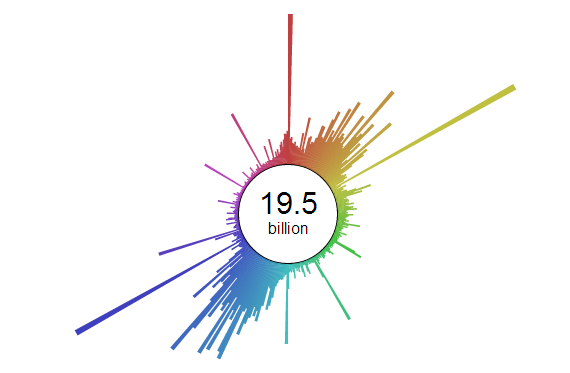
As developers we typically represent colours as RGB values, however HSL (hue, saturation, lightness) is a more intuitive representation and provides a better basis for comparison. The first analysis I undertook was to create a hue-histogram for all of the screenshots. The results are shown below as a circular plot - rendered using d3 (mouse-over to see the number of pixels represented by each 'bar'):
Hue is circular, with values ranging from 0-360 degrees. However, if you prefer a more traditional column chart rendering, see below:
The above histogram shows that the app screenshots favour reds, oranges and blues, whereas there is very little use of greens, pinks and purples. You can also see very sharp spikes representing the primary colours and their derivatives.
Some colours are always going to be more popular than others - a hue histogram from a random selection of images taken from the internet could look just the same as the one I generated from these screenshots. In order to find further patterns, I generated a hue histogram for each of the 22 app categories:
You can see from the above that the 'colour signature' clearly varies between app categories. Business, Finance and Medical make relatively little use of reds and oranges instead favouring blues, whereas Books and 'Food & Drink' are the opposite.
Lightness
The next component of the HSL colour model I analysed was lightness. The following shows the lightness histograms for the screenshots in each category:
You can see from the above that certain categories, such as Music, favour dark screens, whereas others like Navigation favour light screens. The lightness histogram for most categories seems to have two peaks, one light and one dark. My feeling is that this is due to the need for contrast in order to make text legible.
Saturation
The final component I explored was saturation, which indicates how 'vivid' the colours within the screenshots are.
You can see from the above that Finance apps have very muted tones, making very little use of 'colour'. Surprisingly the colours within the Book app screenshots are highly saturated - this is because many books have cartoon or hand-illustrations which tend to be quite vivid.
Hopefully you've enjoyed this analysis. If you have any questions or ideas for further exploration, please leave a comment
Regards, Colin E.
