One of my colleagues, Sam Davies, recently gave a presentation on functional reactive programming in iOS (For those of you who are interested, a recording of the talk is available from the BrisTech YouTube channel). The concepts introduced in that talk were very interesting, so I was inspired to investigate how you might go about implementing them in the Javascript world. This blog post describes the results of that investigation.
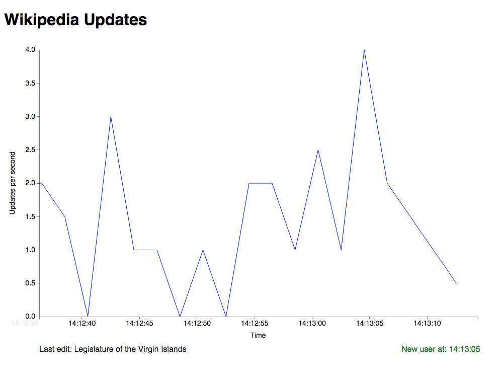
As a quick taster, the results of the work done in this post will look something like this.
So what is functional reactive programming (FRP)? Reactive programming can be described as a paradigm orientated around data flows and the propagation of change. The aim of this concept is to make it easier to express dynamic data flows. As one part of your data model changes, that change should automatically propagate through your model, potentially changing other parts of it.
An example of this would be a modern spreadsheet program. Spreadsheet cells can contain both literal values, or formulas such as “=B1+C1” that are evaluated based on other cells. Whenever the value of the other cells change, the value of the formula is automatically updated.
Functional programming is a paradigm where computation in a program is treated as the evaluation of mathematical functions, and where state and mutable data are avoided. The output value of a function depends only on the arguments which are input to the function, so calling a function f twice with the same arguments will produce the same result f(x, y) both times. Javascript is a language suited to functional programming as it treats functions as first-class objects.
So, now that we’ve introduced some of the core concepts, let’s write some code!
Reactive programming with Bacon.js
I’ve worked with the Bacon.js library for this blog post, but there are others available such as Elm or RxJS. Feel free to try them out if you want to compare how they work. I picked Bacon.js as it was relatively simple to learn and powerful to use.
Event streams
The first and probably the most important building block of FRP is the event stream. An event stream is a representation of a time-based series of discrete events. You could think of it as a channel that you subscribe to in order to be notified about events in your program. Events in the stream can happen at any time. Unlike traditional events (such as those provided by the browser or jQuery), the power of event streams is that they can be merged, filtered or transformed in any number of ways before you handle the events they convey.
So let’s create our first event stream. I’m going to shamelessly borrow the idea used by Sam in his presentation, of listening to update events in Wikipedia. Sam has very kindly deployed a web socket to the Heroku dev center which publishes Wikipedia update events. We’ll connect to this web socket, then build an event stream on top of it.
// Create our websocket to get wiki updates
var ws = new WebSocket("ws://wiki-update-sockets.herokuapp.com/");
ws.onopen = function () {
    console.log("Connection opened");
};

ws.onclose = function () {
    console.log("Connection is closed...");
};

var updateStream = Bacon.fromEventTarget(ws, "message").map(function(event) {
    var dataString = event.data;
    return JSON.parse(dataString);
});
Let’s look at the last part of that snippet more closely. First, we create an event stream for any messages which are sent from the web socket. We do this using the fromEventTarget function which is provided by Bacon.js. This creates an event stream from events on a DOM EventTarget or Node.js EventEmitter object. Bacon.js also provides methods to create event streams from jQuery events, promise objects or functions which accept a callback. I would recommend taking a look at the Bacon.js docs for more information on this.
When we receive a message event, we take the data string it contains and parse that into a JSON object. We do this using the map function, which takes an event stream and returns a new event stream, containing the transformed events rather than the original ones.
Filtering and sampling event streams
Now that we have a stream of update events from Wikipedia, let’s look at pulling out the events which are of interest to us. The schema used for updates in Wikipedia isn’t the clearest, but it seems that updates with type “unspecified” mainly refer to edits. Let’s filter our event stream so that we just pull out edits.
// Filter the update stream for unspecified events, which we're taking to
// mean edits in this case
var editStream = updateStream.filter(function(update) {
    return update.type === "unspecified";
});
editStream.onValue(function(results) {
    console.log(JSON.stringify(results));
});
To do this, we’ve used the filter method provided by Bacon. This takes in an event stream, and returns a filtered one which only emits events when the given predicate is satisfied. We use the onValue method to subscribe a handler function to the filtered stream. Any time we receive an edit event, we log it to the console. Not very exciting, but we’ll get on to visualisations later!
Another type of event we can subscribe to is new user events. These have the type “newuser” within the Wikipedia schema. We do that in a very similar way.
// Filter the update stream for newuser events
var newUserStream = updateStream.filter(function(update) {
    return update.type === "newuser";
});
newUserStream.onValue(function(results) {
    console.log(JSON.stringify(results));
});
Finally, we’re going to collate some stats about the rate at which Wikipedia is being updated. We’ll keep a count of the number of update events we receive, and calculate how many updates we see every 2 seconds. This will allow us to count the rate of updates which are being made per second.
First we use the scan method provided by Bacon. This takes a seed value and an accumulator function, and results in a property. A property in Bacon is like an event stream, except that it also contains a current value, which is updated each time an event occurs. We’ll use the scan method to keep a running count of the number of events we have received.
var updateCount = updateStream.scan(0, function(value) {
    return ++value;
});
We’ll sample this count every 2 seconds. Bacon provides a method, sample, which facilitates this.
var samplingTime = 2000;
var sampledUpdates = updateCount.sample(samplingTime);
Now that we are sampling the number of updates received every 2 seconds, we can calculate the number of updates received since the last sample, and hence the rate at which Wikipedia is being updated.
var totalUpdatesBeforeLastSample = 0;
sampledUpdates.onValue(function(value) {
    var updateRate = (value - totalUpdatesBeforeLastSample) /
                    (samplingTime / 1000);
    console.log(updateRate);
    totalUpdatesBeforeLastSample = value;
    return value;
});
Now that we have defined our functional pipeline for events, it’s time to do something more exciting with it than just logging to the console! For this, we’ll use D3.
Visualising data with D3
D3 is a powerful Javascript library for binding data sets to a Document Object Model (DOM). It makes it easier to create good-looking visualisations of your data, and facilitates advanced features such as interactivity or transitions.
In this example, we’ll display a line chart showing the rate of Wikipedia updates over time. We’ll display some text below the chart showing when new users are created and showing the subject of the latest Wikipedia edits.
First, let’s update our HTML page to contain an SVG element. We’ll use this to display our chart and text.
<!DOCTYPE html>
<head>
  <meta charset="utf-8">
  <meta http-equiv="X-UA-Compatible" content="IE=edge">
  <title>FRP with Bacon</title>
  <meta name="description" content="">
  <meta name="viewport" content="width=device-width, initial-scale=1">
  <link href="frp-with-bacon.css" rel="stylesheet">
</head>
<body>
    <h1>Wikipedia Updates</h1>
    <svg></svg>

    <script src="Bacon.js"></script>
    <script src="d3.js"></script>
    <script src="frp-with-bacon.js"></script>
</body>
</html>
As you can see, our HTML page is fairly minimal. It just contains the SVG element along with a header. We create references to the Javascript files we are using. Our work so far has been saved in frp-with-bacon.js. Now that we have an SVG element on our page, we’ll update our Javascript to add a D3 chart to it.
var updatesOverTime = [];

var width = 960,
    height = 600,
    margins = {
        top: 20,
        bottom: 50,
        left: 70,
        right: 20
    };

var svg = d3.select("svg")
    .attr("width", width)
    .attr("height", height + 200);

var xRange = d3.time.scale().range([margins.left, width - margins.right])
    .domain([new Date(), new Date()]);
var yRange = d3.scale.linear().range([height - margins.bottom, margins.top])
    .domain([0, 0]);
var xAxis = d3.svg.axis()
    .scale(xRange)
    .tickSize(5)
    .tickSubdivide(true)
    .tickFormat(d3.time.format("%X"));
var yAxis = d3.svg.axis()
    .scale(yRange)
    .tickSize(5)
    .orient("left")
    .tickSubdivide(true);

var xAxisElement = svg.append("g")
    .attr("class", "x axis")
    .attr("transform", "translate(0," + (height - margins.bottom) + ")")
    .call(xAxis);

// Add a label to the middle of the x axis
var xAxisWidth = ((width - margins.right) - margins.left) / 2;
xAxisElement.append("text")
    .attr("x", margins.left + xAxisWidth)
    .attr("y", 0)
    .attr("dy", "3em")
    .style("text-anchor", "middle")
    .text("Time");

var yAxisElement = svg.append("g")
    .attr("class", "y axis")
    .attr("transform", "translate(" + margins.left + ",0)")
    .call(yAxis);

// Add a label to the middle of the y axis
var yAxisHeight = ((height - margins.bottom) - margins.top) / 2;
yAxisElement.append("text")
    .attr("transform", "rotate(-90)")
    .attr("y", 0)
    .attr("x", -(margins.top + yAxisHeight))
    .attr("dy", "-3.5em")
    .style("text-anchor", "middle")
    .text("Updates per second");

// Define our line series
var lineFunc = d3.svg.line()
    .x(function(d) { return xRange(d.x); })
    .y(function(d) { return yRange(d.y); })
    .interpolate("linear");

svg.append("defs").append("clipPath")
    .attr("id", "clip")
    .append("rect")
    .attr("x", margins.left)
    .attr("y", margins.top)
    .attr("width", width)
    .attr("height", height);

var line = svg.append("g")
    .attr("clip-path", "url(#clip)")
    .append("path")
    .attr("stroke", "blue")
    .attr("fill", "none");
There are a few things going on in that last code snippet, so let’s go through it in a little more detail. First we define a variable which will hold our update data. We’ll update this in response to events being handled in our functional pipeline. We then set the size of the SVG element on our HTML page, and add our chart to it. The chart contains an x axis and a y axis, and it displays its data in a line chart. We format the x axis to display date/time values. Initially both the x and y axes have zero ranges. We’ll update these as data comes in. We set the attributes of our line series, but we don’t actually bind it to a data set yet. We’ll do that later on. We also define a clipping area, which we apply to the line series. I’ll explain the need for this in the next section.
Now that we have a line chart on our page, we need to define a function to update it when new data comes in.
var maxNumberOfDataPoints = 20;

function update(updates) {
    // Update the ranges of the chart to reflect the new data
    if (updates.length > 0)   {
        xRange.domain(d3.extent(updates, function(d) { return d.x; }));
        yRange.domain([d3.min(updates, function(d) { return d.y; }),
                       d3.max(updates, function(d) { return d.y; })]);
    }

    // Until we have filled up our data window, we just keep adding data
    // points to the end of the chart.
    if (updates.length < maxNumberOfDataPoints) {
        line.transition()
            .ease("linear")
            .attr("d", lineFunc(updates));

        svg.selectAll("g.x.axis")
            .transition()
            .ease("linear")
            .call(xAxis);
    }
    // Once we have filled up the window, we then remove points from the
    // start of the chart, and move the data over so the chart looks
    // like it is scrolling forwards in time
    else    {
        // Calculate the amount of translation on the x axis which equates
        // to the time between two samples
        var xTranslation = xRange(updates[0].x) - xRange(updates[1].x);

        // Transform our line series immediately, then translate it from
        // right to left. This gives the effect of our chart scrolling
        // forwards in time
        line
            .attr("d", lineFunc(updates))
            .attr("transform", null)
            .transition()
            .duration(samplingTime - 20)
            .ease("linear")
            .attr("transform", "translate(" + xTranslation + ", 0)");

        svg.selectAll("g.x.axis")
            .transition()
            .duration(samplingTime - 20)
            .ease("linear")
            .call(xAxis);
    }

    svg.selectAll("g.y.axis")
        .transition()
        .call(yAxis);
}
In the update method, we refresh the ranges of our axes to reflect the ranges of the new data. We bind the line series to the updates variable which we pass into the function. Let’s look at the transitions we apply to the line series and the x axis in more detail. Until we have a set number of data points in our charts, we add data points to the end of the chart. Once the chart contains that amount of data, we display a moving window on the data - as we add data to the end of the chart, we remove data from the start. In order to give the effect of the line series scrolling forwards in time, we apply a translation to the line series when we update it. This is why we needed to define the clipping area earlier, this ensures that any section of the line series which is translated to the left of the y axis is clipped. We set the duration of the transition to be slightly shorter than the sampling interval - this ensures that the translation is done by the time we update the chart again.
Now that we have a function to update our chart when new data is received, let’s make use of it in our functional pipeline. Let’s take the method we defined earlier which takes samples of update events, and update it to refresh our chart.
sampledUpdates.onValue(function(value) {
    updatesOverTime.push({
        x: new Date(),
        y:(value - totalUpdatesBeforeLastSample) / (samplingTime / 1000)
    });
    if (updatesOverTime.length > maxNumberOfDataPoints)  {
        updatesOverTime.shift();
    }
    totalUpdatesBeforeLastSample = value;
    update(updatesOverTime);
    return value;
});
Great, so now our chart will update each time we take a new sample. We define each value in the updatesOverTime array as an object with an x and a y value. We set the x value to be the time at which the sample is taken. We are taking a moving window view of our data - we use the 20 most recent samples and throw older data away.
Earlier we defined an event stream to filter out new user events from the main stream. Let’s update that to refresh our UI instead of logging to the console. To do this, let’s add a text element below the chart. We configure it to be lined up with the right hand side of the chart. This will display the time at which the last new user was added. At the same time, we can add a function to update this element.
var newUserTextWidth = 150;
svg.append("text")
    .attr("class", "new-user-text")
    .attr("fill", "green")
    .attr("transform", "translate(" +
        (width - margins.right - newUserTextWidth) + "," +
        (height + 20)  + ")")
    .attr("width", newUserTextWidth);

var textUpdateTransitionDuration = 550;
var updateNewUser = function(newUser)   {
    var text = svg.selectAll("text.new-user-text").data(newUser);

    text.transition()
        .duration(textUpdateTransitionDuration)
        .style("fill-opacity", 1e-6)
        .transition()
        .duration(textUpdateTransitionDuration)
        .style("fill-opacity", 1)
        .text(function (d) { return d; });
}
To improve the look and feel of the change, we apply fade transitions to the text. It first of all fades out the old text, then fades in the new one. Now we’ll update our new user event stream to call this update method.
newUserStream.onValue(function(results) {
    var format = d3.time.format("%X");
    updateNewUser(["New user at: " + format(new Date())]);
});
Finally, it would be interesting to see the subjects which are being edited in Wikipedia as well as seeing the rate of updates. To do this, we’ll add another text element below our chart.
// Add a text element below the chart, which will display the
// subject of new edits
svg.append("text")
    .attr("class", "edit-text")
    .attr("transform", "translate(" + margins.left + "," +
        (height + 20)  + ")")
    .attr("width", width - margins.left);
We set the text element to be displayed below the chart, lined up with the edge of the y axis. We can now add a function to update the text element in response to new data.
var updateEditText = function(latestEdit)   {
    var text = svg.selectAll("text.edit-text").data(latestEdit);

    text.transition()
        .duration(textUpdateTransitionDuration)
        .style("fill-opacity", 1e-6)
        .transition()
        .duration(textUpdateTransitionDuration)
        .style("fill-opacity", 1)
        .text(function (d) { return d; });
}
When we receive a new edit event, we update the text element to display it. We apply the same fade transitions as we did for the new user text element.
Earlier, we defined a stream to filter out edit events from the main stream. Let’s update that to refresh our text element when new edit events are received.
editStream.onValue(function(results) {
    updateEditText(["Last edit: " + results.content]);
});
So there you have it. We now have a chart and associated text which updates in response to updates in Wikipedia. The iframe below shows the GitHub page I’ve published for this project (http://dangorst.github.io/frp-with-bacon/).
The source code for this blog post is available on my GitHub page: https://github.com/DanGorst/frp-with-bacon.
If you have any thoughts, ideas or comments, please let me know!
Acknowledgements
The inspiration for this blog post came from Sam Davies’ recent presentation at BrisTech. You can find the video of the talk on the BrisTech YouTube channel.
A lot of the concepts in this post were new to me before I started writing it, so I made heavy use of other blogs and tutorials online while I was learning. Thanks go to: