In this article I’m going to create two simple, reusable D3 components for adding line annotations to charts. One of the things I appreciate most about D3 components is that, regardless of the complexity of the component itself, adding one to a chart is typically a really simple process, and these components will illustrate that elegance.
Quick update - the code in this article was used as the starting point for components in the d3fc project. It’s a bit more advanced than this article, but you might find it interesting to see what this code evolved into!
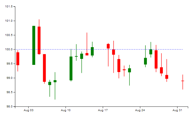
The first component will be a horizontal line at a fixed y-value; adding it to the chart will take only 4 lines of code…
var line = sl.series.annotation()
    .xScale(xScale)
    .yScale(yScale)
    .yValue(annotationValue);
… to create a chart that looks like this:
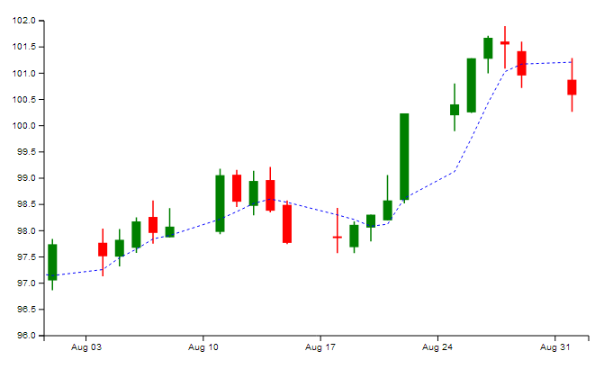
The second component will be a line which follows any field on the data model, and includes an optional moving average calculation; adding it to the chart will take only 6 lines of code…
var line = sl.series.tracker()
    .xScale(xScale)
    .yScale(yScale)
    .yValue('close')
    .movingAverage(5)
    .css('tracker-close-avg');
… to create a chart that looks like this:
I’m not proposing to cover what D3 is in this post; Tom’s done that admirably in his article on OHLC and candlestick components, and in fact I’m going to be lazy and build on the chart he developed there.
Line Annotation Component
I’m going to start off by considering the most basic case I can think of - a simple horizontal line.
Although a horizontal line at a fixed Y-value is perhaps the simplest chart annotation you could imagine, it’s not without its uses; from the consumer’s point of view it’s often useful to show a visual ‘callout’ for a particular value - consider, for example, a sales target on a chart containing retail data - and from a technical point of view we’re going to use this code as the basis for the second (more programmatically interesting) component later on.
To add the annotation to the chart, we have three steps. First we build the annotation component, then we add it to the chart, then finally we style it appropriately - it’s really as simple as that.
I’m creating the annotation as a reusable component, following the convention that D3 creator Mike Bostock has described - a closure with get/set accessors.
Annotation component
Here’s the complete code for the component.
sl.series.annotation = function () {

    var xScale = d3.time.scale(),
        yScale = d3.scale.linear(),
        yValue = 0;

    var annotation = function (selection) {

        var line = d3.svg.line();
        line.x(function (d) { return xScale(d.date); })
            .y(yScale(yValue));

        selection.each(function (data) {

            var path = d3.select(this).selectAll('.annotation')
                .data([data]);

            path.enter()
                .append('path');
            path.attr('d', line)
                .classed('annotation', true);
            path.exit()
                .remove();
        });
    };

    annotation.xScale = function (value) {
        if (!arguments.length) {
            return xScale;
        }
        xScale = value;
        return annotation;
    };

    annotation.yScale = function (value) {
        if (!arguments.length) {
            return yScale;
        }
        yScale = value;
        return annotation;
    };

    annotation.yValue = function (value) {
        if (!arguments.length) {
            return yValue;
        }
        yValue = value;
        return annotation;
    };

    return annotation;
};
You can see that this is a pretty standard D3 component - we start off by initialising some fields (chart X and Y scales and the value we’re going to display), then we have the component function itself, and finally we have the get / set methods for accessing these fields.
The function is very simple - we start by defining an SVG line and telling it how to calculate its X and Y co-ordinates, then we iterate through the selection, selecting elements with the ‘annotation’ class and binding the data to them, then adding a path element if it doesn’t yet exist, setting the line onto it and giving it the ‘annotation’ class, and finally removing it if it leaves the view.
Adding the component to the chart
With that done, it’s relatively simple to add our annotation to the chart. The first thing to do is to specify the value we want to call out.
var annotationValue = 100;Then we create an instance of the component, letting it know about our chart’s scales so that it can position the line correctly and giving it the value we want it to display.
var annotation = sl.series.annotation()
    .xScale(xScale)
    .yScale(yScale)
    .yValue(annotationValue);
The only bit of real code that we need to write is to scale the chart’s Y axis to ensure that our line is always visible - we do this by making sure the Y-scale domain includes the value we’re calling out.
var yMin = d3.min(data, function (d) { return d.low; });
var yMax = d3.max(data, function (d) { return d.high; });
yMin = (yMin < annotationValue) ? yMin : annotationValue;
yMax = (yMax > annotationValue) ? yMax : annotationValue;
yScale.domain([yMin, yMax]).nice();
Now it’s just a case of adding the annotation to the chart plot area itself.
plotArea.append('g')
    .attr('class', 'annotation')
    .datum(data)
    .call(annotation);
Obviously, one final step is to style the line - I’ve chosen to display it as a dashed line using the stroke-dasharray property.
.chart .annotation {
    fill: none;
    stroke: blue;
    stroke-width: 1;
    stroke-dasharray: 3, 3;
}
This is all we need to display the chart.
Enhancements
We can easily imagine how this simple component might be improved - perhaps it would be useful to add a Boolean property which, when toggled on, displays the annotation value at the right-hand end of the line, for example. Alternatively, we could make the component interactive by adding a vertical line to create crosshairs, and making the intersection point follow the mouse pointer (presumably we’d also want this component to ‘snap’ to data points when it gets sufficiently close).
Data Tracker Component
So we currently have a simple horizontal line annotation component, which is all well and good - certainly useful in some situations, but it’s a bit simplistic. Let’s see if we can use this code as a basis for creating a much more useful, flexible line series component.
This new component I’m going to create will be able to show a horizontal line at a fixed Y-value, as before, but it’ll also be able to follow any of the data fields in the model (open, high, low, close) with an optional moving average calculation thrown in for good measure.
Tracker Component
Here’s the code for the component.
sl.series.tracker = function () {

    var xScale = d3.time.scale(),
        yScale = d3.scale.linear(),
        yValue = 0,
        movingAverage = 0,
        css = '';

    var tracker = function (selection) {

        var line = d3.svg.line();
        line.x(function (d) { return xScale(d.date); });

        selection.each(function (data) {

            if (!isNaN(parseFloat(yValue))) {

                line.y(yScale(yValue));
            }
            else {

                if (movingAverage === 0) {

                    line.y(function (d) { return yScale(d[yValue]); });
                }
                else {

                    line.y(function (d, i) {

                            var count = Math.min(movingAverage, i + 1),
                                first = i + 1 - count;

                            var sum = 0;
                            for (var index = first; index <= i; ++index) {
                                sum += data[index][yValue];
                            }
                            var mean = sum / count;

                            return yScale(mean);
                        });
                }
            }

            var path = d3.select(this).selectAll('.tracker')
                .data([data]);

            path.enter().append('path');

            path.attr('d', line)
                .classed('tracker', true)
                .classed(css, true);

            path.exit().remove();
        });
    };

    tracker.xScale = function (value) {
        if (!arguments.length) {
            return xScale;
        }
        xScale = value;
        return tracker;
    };

    tracker.yScale = function (value) {
        if (!arguments.length) {
            return yScale;
        }
        yScale = value;
        return tracker;
    };

    tracker.yValue = function (value) {
        if (!arguments.length) {
            return yValue;
        }
        yValue = value;
        return tracker;
    };

    tracker.movingAverage = function (value) {
        if (!arguments.length) {
            return movingAverage;
        }
        movingAverage = value;
        return tracker;
    };

    tracker.css = function (value) {
        if (!arguments.length) {
            return css;
        }
        css = value;
        return tracker;
    };

    return tracker;
};
This component has the same structure as the previous one (fields, component function, accessors). The only difference with the fields is that in addition to the xScale, yScale and yValue fields we also have a movingAverage field (initialised to 0 so that it’s off by default) and a css field to make its appearance a little more configurable for the user. Naturally we’ve also added accessors for these two new fields.
The important changes lie in the component function.
We start off by specifying our SVG line, as before, but this time we can only define its X value - the Y value depends on our component’s configuration.
Once we’re inside the selection.each() block, we can get to work.
I wanted this component to be able to display a simple horizontal line, as before, but also to be able to use any field from the data model. To enable this, we first check whether our yValue field is a number - if it is, the line.y calculation is just as before.
If it isn’t a number, I’m assuming that it’s the name of a field in the data model. What we do next depends on whether we want the component to perform a moving average calculation.
-
If not (i.e. movingAverage is 0), the line.y calculation simply scales the value for the data model field the user has specified.
-
If we do want a moving average, it’s a bit more complicated. We first work out how many data points we can use for the calculation (at the very beginning of the dataset we won’t have enough for obvious reasons) and from this we calculate the index of the first data item we’re going to use. We then iterate over the data from this item to the current item to sum the values, then we calculate the mean. We can then calculate the Y position as before using this value.
Finally we set up our path as before - the only difference here is that we’re using the css field to allow the user to style the line as they see fit (this is especially useful if, for example, the user has two or more instances of this component on the same chart).
Adding the component to the chart
Now to add the component to the chart. First, we create an instance of the annotation, setting whatever configuration we want to see.
var tracker = sl.series.tracker()
    .xScale(xScale)
    .yScale(yScale)
    .yValue('close')
    .movingAverage(5)
    .css('tracker-close-avg');
As we’ve described above, the yValue attribute is pretty flexible - it can take a number as a parameter, or the name of any of the fields on the data object - in this case I’m telling it to follow the close field. I’m also telling it to display the mean of the last 5 values for this field rather than the field itself by specifying a value for the movingAverage attribute.
Once that’s done we can add the component to the chart, just as before.
plotArea.append('g')
    .attr('class', 'tracker')
    .datum(data)
    .call(tracker);
Finally we style the line (I’m cheating slightly by using the same style as before).
.chart .tracker-close-avg {
    fill: none;
    stroke: blue;
    stroke-width: 1;
    stroke-dasharray: 3, 3;
}
And here’s the result:
Notice that the blue dashed line seems to lag behind the data; this is because of the moving average calculation.
That’s all there is to it - a relatively small amount of code, but it gives us a number of different ways to display information on our chart.
Enhancements
When I see a moving average on a financial chart, my mind immediately jumps to Bollinger Bands - so that’s how I’d extend this component further. Alternatively, the particular moving average calculation we’re using here is called ‘simple moving average’ - there are other moving averages we could add, and allow the user to specify the type of calculation they want.
Conclusion
Starting out with a very simple horizontal-line component, we’ve now built a tracker component which can display a horizontal line at a specified y-value, or track any given field on the data model with an optional (and configurable) moving average calculation.